We are going through some tough economic times right now: high rates of inflation (generally exceeding wage growth) with the strong possibility of a recession in the near future. In times like this, I think it is useful to also consider the historical perspective. The US economy has gone through challenging times in the past, but the long-run track record is impressive.
Here is one way to show the data. It comes from the Census Bureau, and shows the total money income of households in the US. The data is, of course, adjusted for inflation, and not just with the regular CPI-U: they use the superior CPI-U-RS, which attempts to maintain a consistent methodology for how prices are measured (BLS is constantly improving the CPI, but that sometimes makes historical comparisons challenging). I present the data both as a percent of the total number of households, and the absolute numbers.
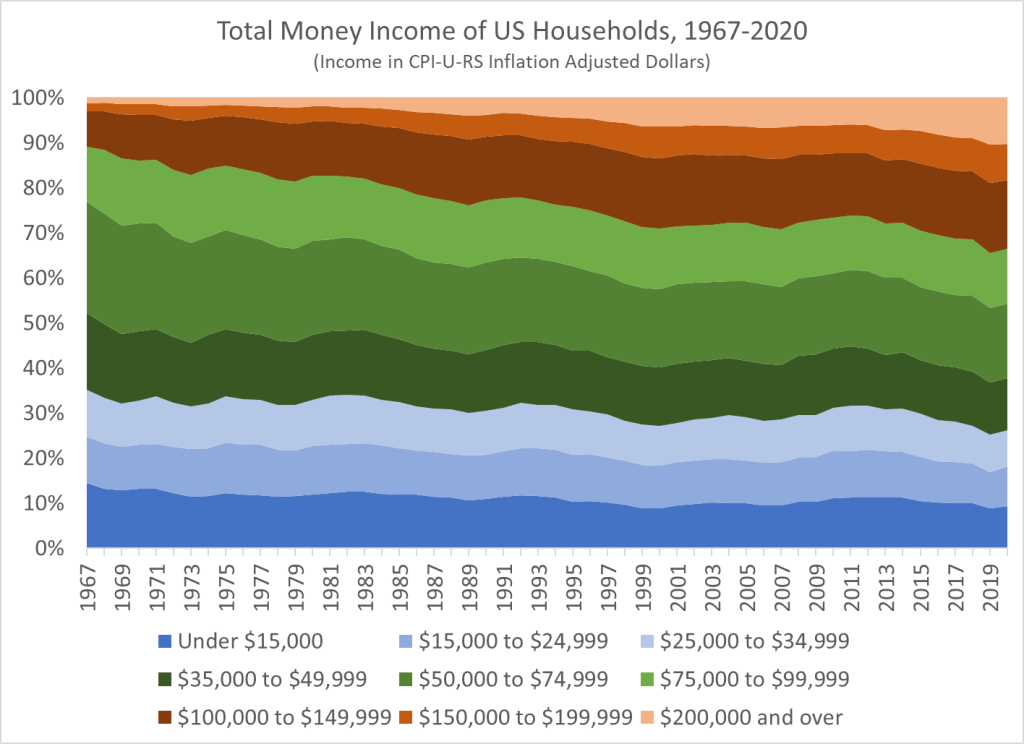
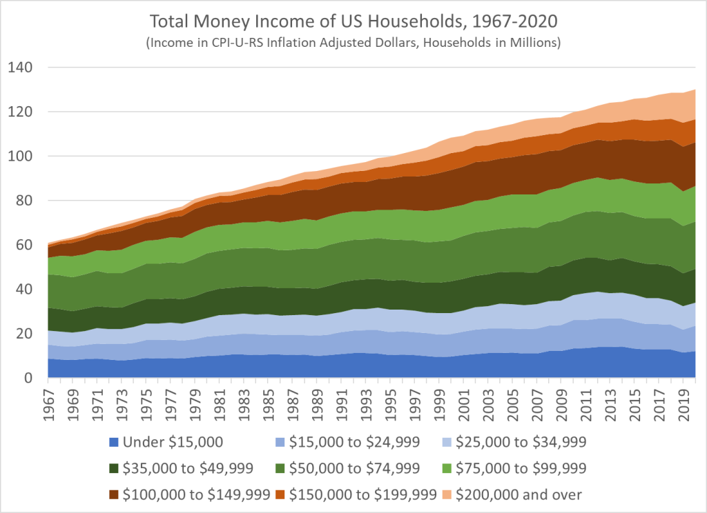
I’ve shaded the chart to suggest that over $100,000 of annual income is high income, and under $35,000 is low income, with everything else considered “middle class.” By these definitions, the number of high-income households in the US increased dramatically from 6.6 million (10.9% of the total) in 1967 to 43.7 million (33.6% of the total) in 2020. The number of low-income households also rose, unfortunately, from 21.4 million in 1967 to 34 million in 2020, but the portion of the total fell (from 35.2% to 26.2%) since it increased slower than the overall growth of the number of households. Today, there are more high-income households (43.7 million) than low-income households (34 million) in the US.
But even if you don’t like those definitions, I’ve provided as much detail in the chart as Census makes available publicly. For example, let’s say you think $200,000 is what makes you high income. There were fewer than 1 million of these households in 1967 (1.3% of the total). Today, there are over 13 million of them (10.3% of the total). However we slice the data, there are a lot more high-income households in the US than in the past. (Remember remember, this is all adjusted for inflation.)
Many people found this data interesting when I posted it to Twitter, including the world’s richest person. But among the many objections raised is that this is driven by the rise of female employment and dual-income households. And indeed, that is a factor. But how much of a factor?
Let’s dig into the data.
Among married-couple households, about 30% were dual-income in the 1960s, compared with about 60% today. It would be great if the Census data from above was available publicly broken down by number of earners, but unfortunately it’s not. So, let’s look at some other measures.
Census does have available data on median household income available separated by number of earners going back to 1987. This is a shorter timeframe, but still one in which there were large income gains for households (by the >$100,000 definition, high-income households increased from 22.4% to 33.6%).
In fact, this is also a period when the number of two-income households shrunk, from 35% in 1987 to 32% in 2020. During this time period, overall household income increased by 18.5% (inflation-adjusted with the CPI-U-RS). For households with just one earner, income increased by almost the exact same amount (19.1%). Income of two-earner households did increase even more (37.7%), so seeing the full distribution would be very useful.
Another measure we can look at is median personal income, and compare it to household income. Median personal income looks at the income of individuals, and the data stretches back far enough for a comparison with our 1967 starting point. From 1967 to 2020, median personal income increase by 53%, which is more than the increase in median household income of 39% (both are adjusted for inflation). There are large differences in median personal income (inflation adjusted) by sex since 1967: for men, it only increased by 14%; for women, it increased by 139% (wow!). This does suggest that women entering the workforce, and seeing more parity with male earnings, is important in the story of household income growth. But we shouldn’t necessarily jump to the opposite conclusion: in the alternate reality where women hadn’t entered the labor force in large numbers, male income gains would likely have been much larger.
Finally, let me object to the objection. If total money income of households is increasing because more women are working, that’s actually a good thing in most cases. Yes, these households will now have to spend some of that income on childcare, perhaps more money on dining out rather than having home-cooked meals, and ideally we would adjust the data for these additional expenses. But at the end of the day, if the woman also decides to work, most households will have a lot more money than if the woman doesn’t work, even after accounting for the additional expenses. Some households are possibly right at the margin where total income doesn’t go up much, but this is unlikely to be true for most households.
Furthermore, if we are doing a full accounting we should also include the non-money benefits of women working. Most importantly, many women find satisfaction and personal fulfillment in working. Some women find fulfillment in raising children and taking care of the home — and there is nothing wrong with this preference either! But when given the choice, many more women are choosing to work rather than take care of the home. How do we know this is a result of preference rather than necessity? Let me offer a few pieces of evidence suggesting this is the case.
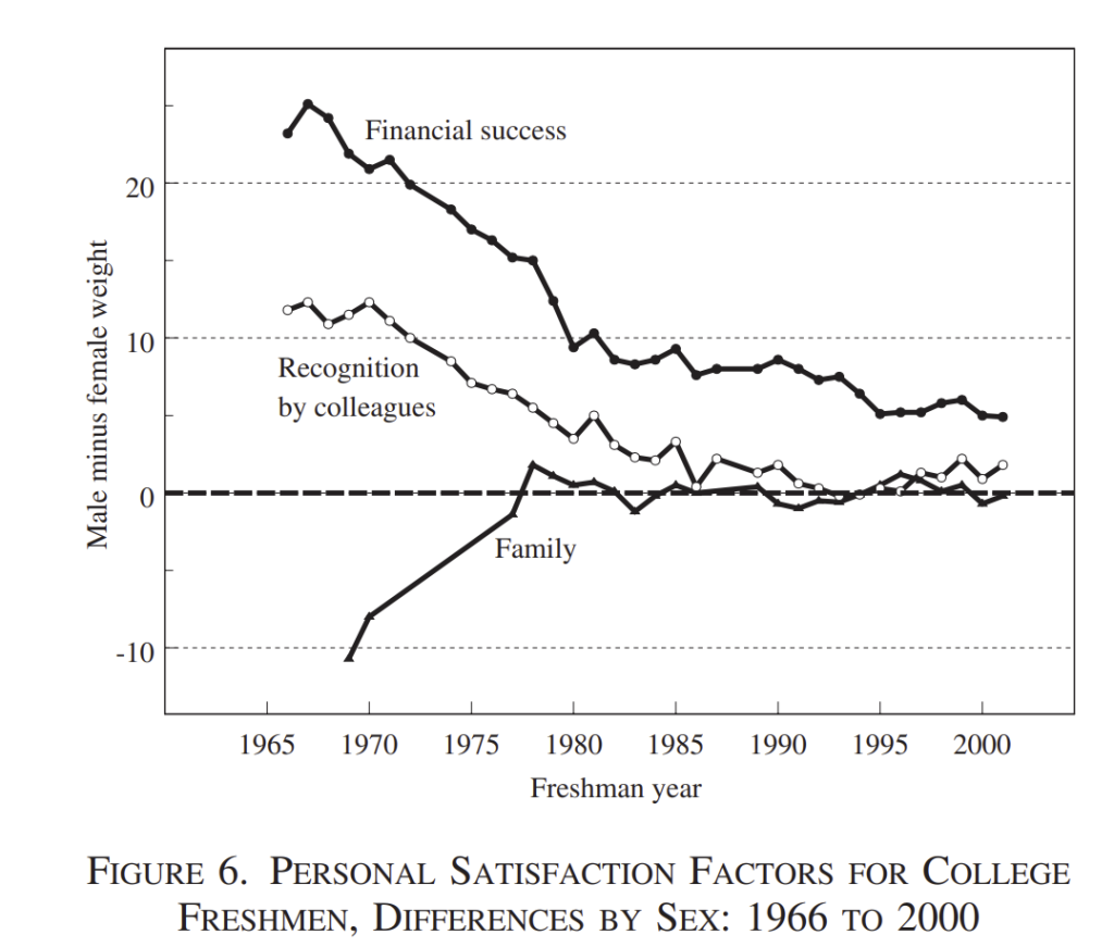
The biggest one is that the attitudes of young women towards work and family clearly changed starting in the late 1960s. The chart below is from Claudia Goldin’s excellent article “The Quiet Revolution.” It’s a survey of college freshmen, and the y-axis shows the difference between what young men and women identified as being “essential” or “very essential” to their personal satisfaction. In the late 1960s, women were more likely to say that family was important than men where; by about 1980, that gap had completely closed. And in the late 1960s, men were much more likely to say that financial success and recognition by colleagues was important than women were to say the same thing. Today, those gaps are significantly smaller. Young men and women (at least those choosing to go to college), seem to value family and work very similarly in their own personal satisfaction.
As a final piece of evidence that women really do want to work, rather than need to as a financial necessity (the so-called “two-income trap”), we can look to other survey evidence. For example, the General Social Survey has asked a question for years about whether you would keep working even if you had enough money to “live as comfortably as you would like for the rest of your life.” The variable name is “richwork,” and sociologists have long used this variable answer various questions about whether people are working for out of financial necessity or for other personal benefits.
The most recent years of the survey indicate that men and women think very similarly about this issue. In 2021 among men 64% said they would continue working, as did 63.5% of women. Of course, 2021 is a weird year for the labor market, so the prior survey year was 2018, when about 73.5% of men and 70.5% of women answered that they would continue working. The drop from 2018 to 2021 is interesting, but the gender differences are small in both, especially contrasted with the first year the question was asked in the GSS, 1977, when 75% of men said they’d keep working, but only 62% of women said they would. I imagine if we had the same numbers for 1967, women would be even less likely to say they’d continue working.
Bottom line: most women don’t say they are working because they need to financially, and that number is similar to the number of men that say the same thing.
Of course, in the end we can’t say exactly how much household incomes would have increased without women entering the workforce in large numbers and the rise of dual-income households as the dominant type. The simple answer is: they would have increased less, but not zero. In the end, households are much richer than the past, whether we start from 1967 or 1987.

Very interesting chart, tells a lot on how values shifted from ’60s to ’70s.
LikeLike
Where did you get your economics training?
LikeLike
..the chart on personal satisfaction factors.
LikeLike
Reblogged this on Utopia, you are standing in it!.
LikeLike