If you count president Trump, the number of living former presidents is at a historic high of five (Clinton, G.W. Bush, Obama, Trump, Biden). The number of living ex-presidents can increase for three reasons. 1) More people becoming president, 2) ex-presidents having longer lifespans, and 3) presidents leaving office earlier in life. Why do we have so many right now?
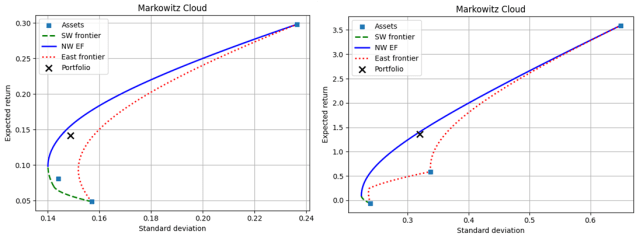
The historical maximum number of people who both 1) leave office and 2) live simultaneously with others is five. It first happened in 1861 when Abraham Lincoln (16th) was president for just under a year before John Tyler (10th) died in 1862. Since then, the number of living ex-presidents has been mostly below four if not below 3. The figures below graph the number of people living who have been US president. The left graph uses daily data and the right uses the annual average (weighted by day).
In fact, besides Washington, we’ve had four other periods when there were ZERO ex-presidents living. The first was under Grant (18th). This changes my perspective of that period. Living ex-presidents provide a sense of continuity – that something from the past continues today. They give us hope that our country will continue into the future. Grant presided over part of the reconstruction era. For part of this presidency, there was no one else who knew how he felt and no living person who had been in his position. What a tenuous time!*
The other presidents who, at some point, had no living predecessors were Theodore Roosevelt (26th), Herbert Hoover (31st), and Richard Nixon (37th). But since 1981, we’ve had three or more living presidents. So, most of us feel like that’s “normal”. Imagine if there was just Trump, and that’s it. That’d feel jarring.
1) Are More People Becoming President?
A presidential term is four years and only one president was in office for more than two terms, Franklin Roosevelt (32nd). Let’s take a 24-year trailing average. With 8-year tenures, the least number of presidents is 3. With 4-year tenures, the greatest number of presidents is 6. Assassinations and other deaths of sitting presidents can push the number higher. The graph below is the number of unique people to act as head of state over the prior 24 years (I say ‘unique’ because Cleveland (22nd & 24th) and Trump (45th & 47th) both served two non-consecutive terms).
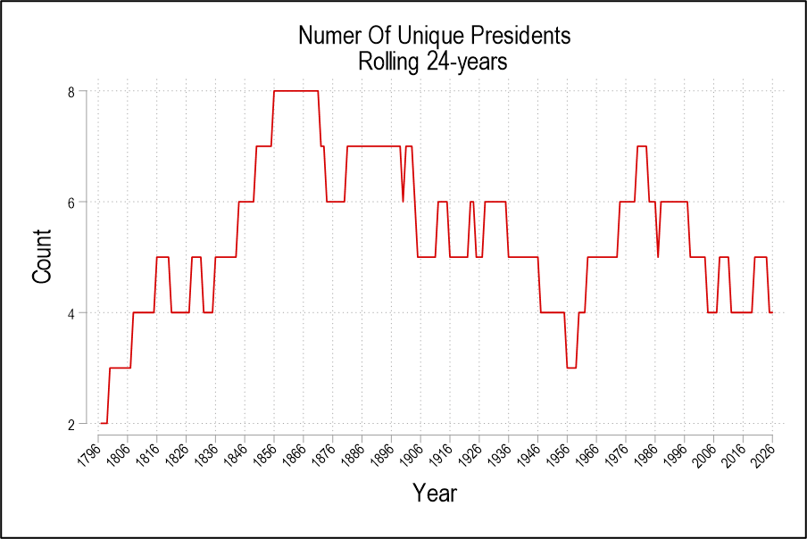
We can conclude that the number of unique presidents is not exceptionally high at this time. The historical average is about 5.2 unique presidents. We’ve been below that since 1998 owing to a higher proportion of two-term presidents since then. Before Biden (46th), Bush (41st) was the last time that we had a one-term president. So, in terms of executive regimes, the 21st century has been unusually stable. But this stability also places downward pressure on the number of surviving ex-presidents. So, we’ve had many living ex-presidents despite our few regime changes. Reason 1) doesn’t explain why we have so many living ex-presidents now.