I wrote a post about debt delinquency way back in 2023. At the time, people were concerned about an impending recession. I argued that, if there were to be a recession, then debt defaults would not be the cause. The delinquency numbers were low and stable. Though delinquencies did rise some, no recession materialized. I’ll say a little more about how to interpret the numbers and give an update.
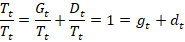
There exists a stock of loan balances. Most loans are in good standing with scheduled payments being made. This is good debt. Some debt is delinquent, meaning that payments are not being made. This is bad debt. What happens to bad debt? Sometimes those borrowers catch up on their payments and their loan balances switch to being good debt. Borrowers can also transform their bad debt into good debt by restructuring it with new terms. Temporary administrative adjustments can also change the classification from bad to good debt. At any moment, the total stock of debt is composed of good and delinquent debt. We can express these as proportions of all debt.

But the lenders also recognize that not all bad debt will be made good. For one reason or another, sometimes borrowers just don’t repay. It doesn’t make sense to list delinquent debt as a balance sheet asset if it will never be paid. Rather than accumulating more bad debt every year that will never be paid, banks ‘charge off’ some of that bad debt. Charging off bad debt lets banks realize losses and makes for a more realistic balance sheet. The flow of charge offs is deducted from the stock of delinquent debt.
If banks charge off some delinquent debt, then the proportion of delinquent debt should be lower in the next period, all else constant. But all else isn’t constant. Some good debt will become delinquent and some delinquent debt will become good. Though, after a charge off it’s true that delinquent debt is less than it would have been otherwise. Below, I denote the net flow of good & bad debt transitions as ‘r’ and solve for it.


The variable ‘r’ is the net transition to good or to bad debt after charge offs. If r>0, then net new delinquencies occurred faster than banks realized their losses with charge offs. Is that good or bad? A higher rate of net new delinquencies can be bad because it reflects that people aren’t paying their contractually obligated debts. But it can also be good if the new delinquencies are a result of experimental entrepreneurship and an innovative economy. The bad interpretation is probably relevant cyclically as a short or medium run variable. The innovation interpretation probably changes in the medium or long run as a structural variable.
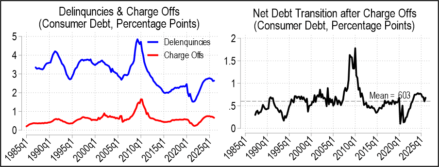
Let’s look at the numbers. There are several categories of loans, but let’s start with just consumer loans.
The delinquency rate is higher than it was after the pandemic stimulus checks, but is still lower than historical rates. The charge off rate is also near the historical average. Below right graphs ‘r’ and it’s always greater than zero, meaning that there’s always more people transitioning from good debt to delinquency than the reverse. There was more debt becoming delinquent as post-pandemic interest rates rose, but net delinquency transitions have been falling since 2024q1 until 2026q1 when they mildly up-ticked. In other words, the aggregate consumer debt picture looks pretty average except for the secular decline in rates of delinquency. I don’t know why that is. Maybe banks have gotten better are identifying risk? Or maybe newer forbearance rules are friendlier to borrowers who need to pause payments?
Below are the same two graphs for single-family residential mortgages. These delinquencies are close to historical lows and charge offs are average. However, the ‘r’ graph below has been rising for a decade and is currently at a twelve-year high. Since the data only goes back so far, it’s hard to say whether the low numbers of the late twenty-teens were an aberration of the post GFC, low interest rate environment or whether we should be concerned. It is worth noting that the ‘r’ values are often below zero, which means that people do often come back from delinquency. We know it’s not simply charge offs doing the work there since the charge off rate has been steady and very low.
Continue reading