The basic idea is that we want to compare the performance of different portfolios or their managers. This is relatively easy as long as the portfolios contain the same assets. Then, the portfolios are simply characterized by the different weights among the different assets. But how do we compare the performance of portfolios whose assets are different? In finance, we usually assume that everyone can invest in everything. But there are plenty of cases in which that’s a bad assumption: when clients want exposure to particular industries, when there are statutory limitations on holding certain assets, or when an individual company is considering specific projects within the same company under conditions of scarce financing.
The most primitive step is to compare the return and standard deviation of two different portfolios. However, higher risk investments tend to have higher returns in dynamic equilibrium. So, if we were to compare the returns of a tech company to a utility company, then we’d often see the tech companies performing better. But, if we compare the volatilities, then the utility companies would tend to perform better. Sharpe stepped in with a ratio to express the excess return (benefit) per standard deviation (the cost). This way, we can compare the price of volatilities between two portfolios. We’ll stick with just these basic 3 measures: return, standard deviation, and Sharpe ratio. (Others do exist)
Let’s put some meat on this with an example. Say that we have two portfolios, each composed of different assets. There’s a utility portfolio that’s composed of NEE, DUK, and SO. There’s also a tech portfolio that’s composed of AMD, MSFT, and NVDA. Both portfolios have weights of (0.33, 0.33, 0.34). The results of the utility versus the tech portfolio are:
- Returns: 14.2% vs 136.3%
- Standard Deviation: 14.9% vs 32%
- Sharpe: 0.684 vs 4.134
Goodness me! The tech portfolio returns much more in absolute terms and much more per unit of risk. It’s twice as volatile as the utility portfolio, but the returns are almost ten times as high. If you could, then many of us would choose the tech portfolio over the utility portfolio. But, what if, for one reason or another, you can only invest in one of the two industries? Or, what if you want to invest your money with a skilled manager, rather than a risky one?
One way to tackle this problem is to introduce the Markowitz cloud. Specifically, we can essentially list out all of the possible portfolios along with their return and standard deviations. Then, we can compare the actual performance to the entire menu of possible performances within each set of assets. Below are the possible performances for the utility (left) versus the tech (right) portfolio. The actual portfolios are marked with an X.
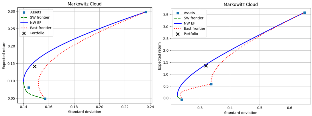
One way to evaluate the two portfolios is to compare their return, standard deviation, and Sharpe ratio to the other candidates that were achievable with the same assets. As we can see, conditional on the assets, neither portfolio minimized the volatility, maximized return, nor maximized the Sharpe ratio. Furthermore, assuming that the realized rate of return was the goal, neither portfolio minimized the conditional volatility. Assuming that the realized volatility was the goal, neither portfolio maximized the conditional return. Below are two tables that describe some candidate alternatives and how they differ from the realized portfolio.
           asset |   w_o    |     Max r|Same sd          Min sd|Same r             Min Var              Max Return             Max Sharpe
  ----------------------------------------------------------------------------------------------------------------------------------------------
               r | 0.141812 |  0.155156  +0.013343 |  0.141812  +0.000000 |  0.098622  -0.043191 |  0.298170  +0.156358 |  0.298170  +0.156358 |
              sd | 0.148833 |  0.148833  +0.000000 |  0.145230  -0.003603 |  0.140119  -0.008714 |  0.236532  +0.087699 |  0.236532  +0.087699 |
          sharpe | 0.684071 |  0.773724  +0.089652 |  0.701044  +0.016972 |  0.418370  -0.265701 |  1.091480  +0.407409 |  1.091480  +0.407409 |
  ----------------------------------------------------------------------------------------------------------------------------------------------
  weights      0 | 0.330000 |  0.340413  +0.010413 |  0.281710  -0.048290 |  0.112802  -0.217198 |  1.000000  +0.670000 |  1.000000  +0.670000 |
               1 | 0.330000 |  0.659587  +0.329587 |  0.699431  +0.369431 |  0.666911  +0.336911 |  0.000000  -0.330000 |  0.000000  -0.330000 |
               2 | 0.340000 |  0.000000  -0.340000 |  0.018859  -0.321141 |  0.220287  -0.119713 |  0.000000  -0.340000 |  0.000000  -0.340000 |
          asset |   w_o    |     Max r|Same sd          Min sd|Same r             Min Var              Max Return             Max Sharpe
  ----------------------------------------------------------------------------------------------------------------------------------------------
               r | 1.363323 |  1.407011  +0.043688 |  1.363323  +0.000000 |  0.097237  -1.266086 |  3.590555  +2.227232 |  3.590555  +2.227232 |
              sd | 0.320144 |  0.320144  +0.000000 |  0.314749  -0.005395 |  0.224227  -0.095917 |  0.649474  +0.329329 |  0.649474  +0.329329 |
          sharpe | 4.133520 |  4.269984  +0.136464 |  4.204370  +0.070850 |  0.255264  -3.878256 |  5.466819  +1.333299 |  5.466819  +1.333299 |
  ----------------------------------------------------------------------------------------------------------------------------------------------
  weights      0 | 0.330000 |  0.377568  +0.047568 |  0.364989  +0.034989 |  0.000448  -0.329552 |  1.000000  +0.670000 |  1.000000  +0.670000 |
               1 | 0.330000 |  0.481105  +0.151105 |  0.490157  +0.160157 |  0.752477  +0.422477 |  0.000000  -0.330000 |  0.000000  -0.330000 |
               2 | 0.340000 |  0.141327  -0.198673 |  0.144855  -0.195145 |  0.247075  -0.092925 |  0.000000  -0.340000 |  0.000000  -0.340000 |
Truly, an infinite number of alternative portfolios exist and the best ones lie on the efficient frontier along the solid blue line in the above figures. Depending on which candidate alternative you select, one could easily argue that either portfolio’s assets were weighted better. The utility portfolio was only 1.3% away from the maximum return conditional on the variance, in contrast to the tech portfolio which was 4.4% away. Similarly, unconditionally, the utility portfolio was 15.6% away from the universal maximum return, in contrast to the tech portfolio difference of 223%.
Of course, all of the various measures for the utility portfolio lie within a narrower range. In some sense, simply measuring the absolute differences of return, standard deviation, and Sharpe ratio will always give the utility portfolio the advantage of being closer to ‘efficient’ or desirable. In percentage point terms, the realized tech portfolio characteristics will be further from the frontier efficient portfolios.
These ‘absolute’ performance indicators are clearly highly dependent on the absolute spread of return, standard deviation, and Sharpe ratio across the entire Markowitz cloud. Something better is needed. Ideally, we’d like to contrast the portfolio performances, conditional on their industry and also conditional on the spread of its basic Markowitz cloud dimensions in (σ,r) space. That’s what I’ll examine next week.
Bartsch, Zachary. 2025. “Portfolio Efficient Frontiers & Diagnostics for Python.”
Ave Maria University. https://github.com/zacharybartsch/frontier_segments


One thought on “Absolute Measures of Portfolio Performance”