Have you heard about the abundance movement? It basically says that we should enact a mix of regulatory and supply side reforms in order to produce more for everyone, especially the least economically advantaged. The reforms extend to the housing market and ensuring adequate housing.
There’s an argument that building any housing, even at the high end, can reduce the cost of shelter for everyone – even people who would never live in the newly built housing. The idea is that high income people switch to the newly built housing and leave less attractive housing. Someone else in that high income bracket snatches up the older place, leaving their prior housing vacant. The vacancy shuffles around high priced rentals until, ultimately, the vacant rental price must fall in order to attract a renter, such as someone further down the income distribution. Then the entire process continues, with the game of vacancy musical chairs working its way down the renter income distribution.
The more overlap that there is between housing consumption choices the quicker there is an impact on lower priced housing. If you think that high income people consume higher priced housing, then you might think that there is a substantial difference between housing consumption choices and that it will take a long time for this ‘trickle down’ to get to the people who need it most. If income groups compete more for the same housing, then the effects on price will occur sooner for the lower income people.
How much Rental Overlap is there?
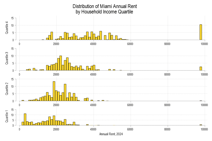
Miami, Florida has some of the highest housing costs in the US. Below is a histogram of annual rental costs in Miami by household income quartile (ACS 2024). I restricted the data to positive incomes and rents and the highest rents are censored down to $98.4k annually. First, we can definitely see that the highest incomes (quartile 4) have the most censored annual rents and that the 1st income quartile (lowest) has the most annual rent payments nearer to zero. So, the histograms make sense in that way. But I was surprised by how much overlap there is. Different income quartiles are consuming many units in the same price range!
We can calculate the overlap with the below equation.* Here’s an example of how it works. Say that 2 of 150 high income people consume housing with a low rental cost. Say also that 5 of 50 low income also consume at the same rental cost. In that case 7 of the 200 total people consume at the same rental price. There would be overlap of 3.5%. We can conduct the same calculation over every rental price bin in order to get the total overlap between income quartiles.

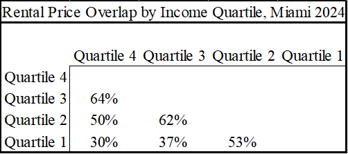
The below table identifies the rental price overlap between income quartiles. It also follows our intuition that there is less overlap between increasingly different incomes. Renters in the 1st income quartile are competing for many of the same rentals as those in quartile 2. And fewer of them compete for the same rentals as those in quartile 3 and 4.
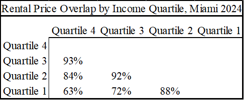
Both the histogram and the table violate my priors. In my mind, the distinct income quartiles rent properties at very different price points, with maybe just a small amount of overlap. But the overlap illustrated here is huge and around 90% for some quartiles. That’s a narrative violation for me.
Yes, more rich people might move to town and snatch up any new rentals. But that occurs in lieu of bidding up the price of an otherwise smaller housing stock. The increase in quantity is the alternative to an increase in price.
I chose Miami because it’s in my backyard and has a decent sample size. But in cities known for housing scarcity like San Francisco and Seattle, the overlap is even greater. In fact, the overlap greater still in cities that are better known as affordable, like Nashville and Indianapolis. Miami had the *least* overlap among the cities that I examined.
What’s the takeaway? The take away is that building high-end rentals will improve rental affordability for lower income quartiles. After all, 63% of people in the 1st and 4th quartile are renting at the same price points – in Miami anyway. So, building high-end rentals also serves plenty of people in the lower income quartiles *directly*, not as part of some theoretical trickle down theory.
Caveat: The same rental prices does not imply the same rental unit quality.
*This is not the typical overlap of relative frequency distributions. Here, I’m measuring the proportion of people among two quartiles who consume rentals in the same price-range bins. The technical name is ‘pooled mass on the common support’. The 1 is an indicator function. The censored bin increases this overlap as an artifact, but only by a small amount and mostly for the two top quartiles.
*What is commonly known as the overlap coefficient, which measures the shared proportion in each bin, still illustrates a great deal of overlap that is prior-violating.