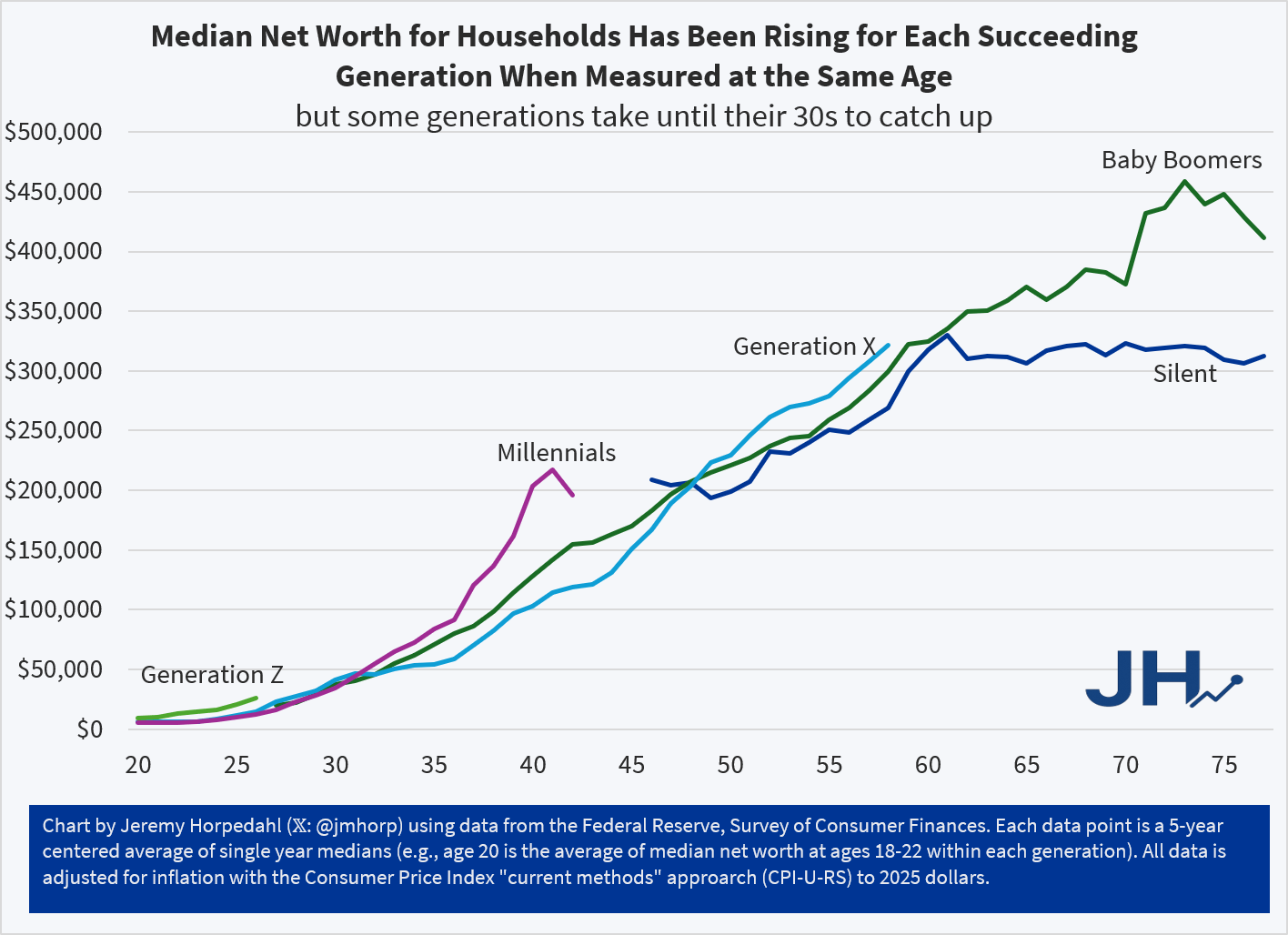
Two weeks ago I provided an update on estimates of wealth for recent generations in the US. But just this week, the Federal Reserve gave us the once-every-three-years complete update to this data, which allows us to calculate medians rather than average, and to more precisely separate age groups.
I will have a lot more to say about this data, both on this blog and a book I am working on, but for now here is the chart you have all been waiting for:


Are you also planning to look at this data broken down by race? Perhaps you can explain why African Americans were such an outlier compared to other racial groups for the three-year period being analyzed. Obviously there’s some COVID-19 fallout to consider, but still…
LikeLike