Voters this November will face a proposed amendment to the Florida state constitution on property tax reform. Currently, Florida has what’s called a ‘homestead’ exemption of $50,000. If a residential property is your primary residence, then your home’s assessed value is $50k less before taxes are calculated. There is no exemption for rental property or 2nd homes or vacation homes. The proposed amendment increases the exemption to $250k by 2028 and then indexes it to inflation.
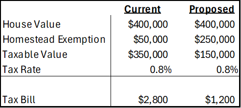
First, let’s get an idea of the magnitudes. The median home in Florida is priced at about $400k and the average property tax rate is around 0.8%. Below compares the current consolidated tax bill against that of the proposed amendment. Given current home prices and local tax rates, the new exemption would have a huge impact on municipal governments who get the bulk of their revenue from property tax. In fact, there is no Florida state property tax, so the proposed amendment would adopt a new rule for municipalities and not the state government.
What Motivates the Amendment?
The current homestead exemption of $50k was established in 2008. A subsequent amendment in 2024 allowed half of that to be indexed to CPI-U. The average home price in Florida has risen 114% since 2008 and 84% since 2020. That’s a lot faster than inflation, but the tax burden is partially offset by a maximum of 3% annual increase in assessed value. Regardless, many individuals face a larger tax bill over time even independent of whether their income or use of public services has changed. Plenty people are feeling the squeeze.
What’s the Purpose of the Homestead Exemption?
The exemption is available for primary residences only. That means that rentals and vacation homes do not qualify. It’s important to keep in mind that, given some total revenue, every tax break for one group or activity implies a higher tax rate for others. So, clearly, the effect is to tax residents less and tax seasonal residents and visitors more. Florida doesn’t have an income tax, but it does have a sales tax, gasoline tax, and others that are disproportionately borne by non-residents. Given that higher income individuals tend to have higher home values, the homestead exemption is a way to lower the tax burden of lower income households. Obviously, the lowest income individuals are renters, but so are non-residents who Florida prefers to tax.
The Economics
Homeowners
The exemption is enjoyed by all primary residences, but helps low income owners the most. And, given a stable amount of municipal tax revenue, a higher homestead exemption requires that municipalities replace that revenue. This might take the form of higher local fees and taxes, making life harder for lower income people to, say, own a car or make purchase if taxes on those activities rise. Revenue stability might also be helped by higher property tax rates. The higher the property value is above $250k, the greater the average tax burden that is borne. So, someone with a very high property value may find themselves with an even higher property tax bill after municipalities adjust to the proposed statewide rule. In this sense, the new amendment would be a step in the direction of tax progressivity (a higher proportion taxed from those with higher income/wealth).
Indexing
Normally, I am in favor of indexing nominal values to CPI. In this case, we need to think about what the goal is. Let’s assume that the goals is to provide relief to lower income homeowners specifically and all primary residence homeowners generally. Does indexing to the CPI help? It depends!
Continue reading