The striking possibility is that increasingly intelligent AI may not make Hayek obsolete. It may give us a new reason to appreciate him. Intelligence does not abolish the economic problem created by dispersed knowledge. A world filled with capable artificial minds may actually contain more decision-makers, more specialization, more private information, and more discoveries that no central intelligence anticipated.
For those minds, as for ours, prices would be a map of a world too complicated for any one mind to know.
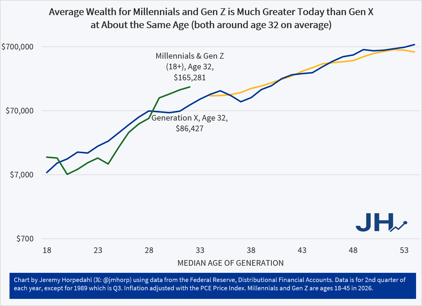
It’s been a while since I updated my generational wealth chart, and we now have estimates through the 2nd quarter of 2026, so here’s the latest chart:
Figure 1
Wealth for younger Americans continues to grow substantially, but let me make two caveats:
Yes, I know median data is better. I’m writing a book that uses median wealth data! But the latest median wealth data from the Fed’s SCF is currently only available through 2022, so it’s not super relevant to current conversations. We should have the 2025 data soon.
Because of the way the data in my chart is produced in the Fed’s DFA, it groups everyone under age 45 together. That’s a mighty big group, and it because it encompasses both Millennials and a lot of Gen Z, it makes it hard to directly compare to earlier generations.
So, until we have 2025 median wealth data, and until the Fed’s DFA starts breaking out Millennials and Gen Z, here is my current best compromise chart:
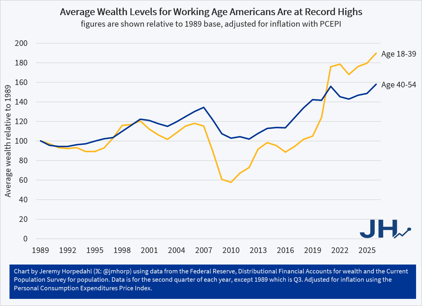
Figure 2
In Figure 2, I have used the Fed DFA data for age groups, which are still pretty large groups, but you can consistently compare them over time. The average wealth level of both the 18-39 group and the 40-54 group have seen substantial gains. In fact, the gains for younger cohorts have been even better than middle-aged Americans, though both saw substantial gains.
And this chart shouldn’t be affected by the lack of household formation among some younger Americans: I am using the full population as the denominator, so if anything, this will understate growth rates. Even so, the growth rate from the depths of Financial Crisis in 2010 have been substantial: 228 percent growth from 2010 to 2026 for ages 18-39. The growth rate for ages 40-54 was less dramatic, though they also didn’t experience as large of a slump from 2007-2010.
While we can always hope and work towards growth rates being better, average wealth for Americans of working age is currently at record highs, having fully recovered from both the Financial Crisis and the inflation slump of 2022.
This, to me, is the principal lesson of the last 10 years from US governance. The story and data in this paper are based in Singapore, but the lessons are universal. Social norms are critical, but if you grow reliant on them absent any formal enforcement, corruption will eventually take root. There are just too many people who figure out that the concept of “being in trouble” isn’t real. If transgressions do not receive instrumental punishments beyond social shaming and reputational damage, then individuals will simply find institutional and social pockets to inhabit where that shame doesn’t reach and a negative reputation might even be viewed as an asset by other would-be corrupt agents.
Read this paper (I mean, at least skim it) and internalize its core observations. This is important.
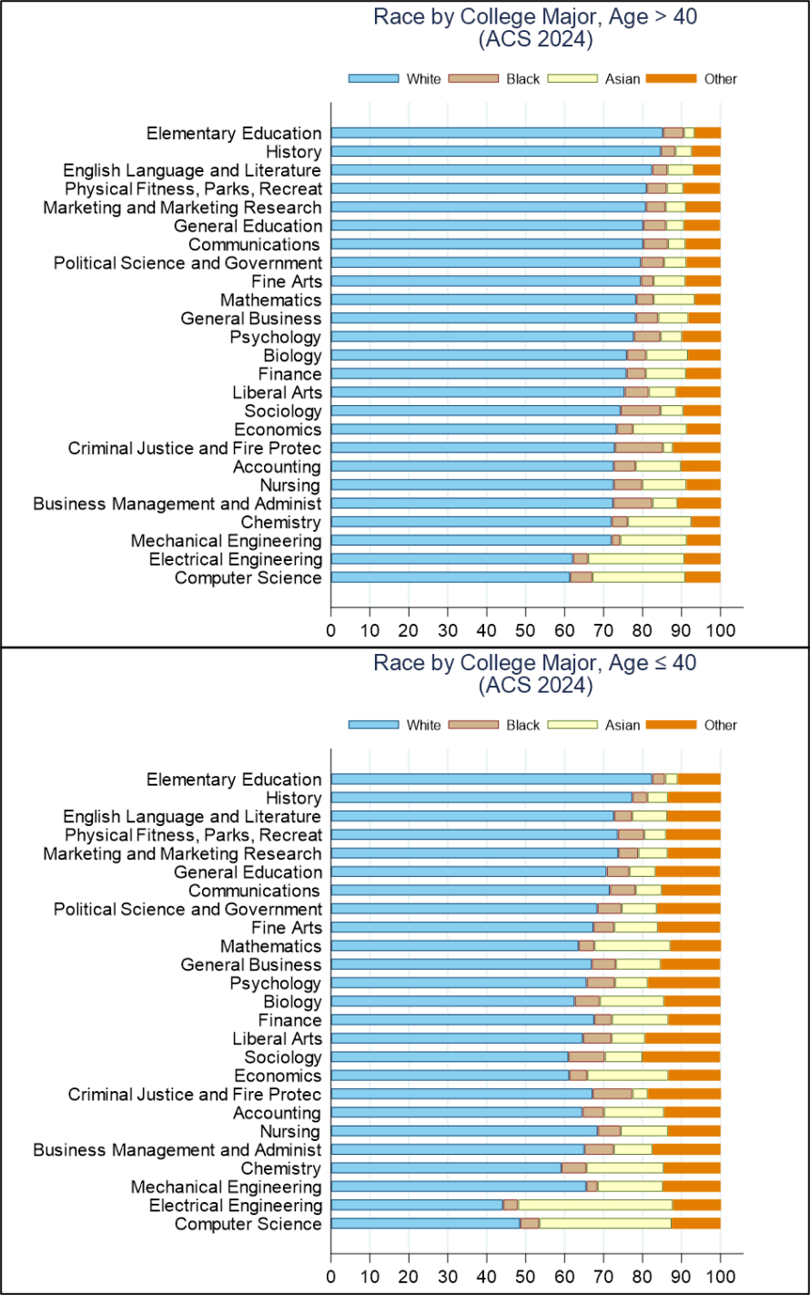
There are some stories that we tell. These include that we have increasing non-white and non-male participation in many college majors. Here I examine the 25 most popular majors in the 2024 ACS data and I split it up into older and younger cohorts, delineated by age 40 (unweighted).
Race
Below-upper is the distribution of race by college major for people older than 40 years of age, or who mostly graduated more than 15 years ago. It largely conforms to my biases. There were a higher proportion of Asian people in the natural sciences and engineering, but also in Economics. I didn’t really have strong priors about the proportions of black people, but they composed the highest proportions in Criminal Justice, Business, and Liberal arts. Contrary to my expectations, Elementary Education had the highest proportion of white people. Below-lower is the cohort that is age 40 and younger. The entire distribution is similar, but less white.
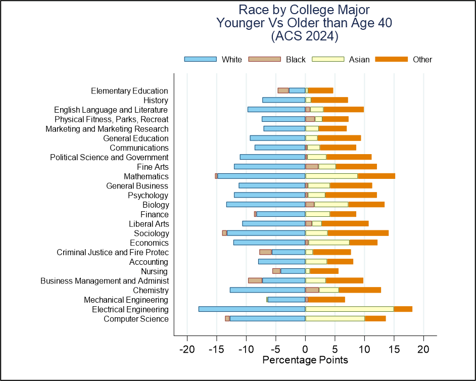
Some of the differences between the two groups are hard to see, so I’ve included those below. What are some general takeaways? 1) There are lower proportions of white people among all degrees. 2) There are higher proportions of Asian people in every field except mechanical engineering, which is unchanged. 3) Whether black people compose a greater proportion depends on the major.
In the younger cohort, black people are now a greater share of bachelor’s in chemistry, Fine Arts, Physical Fitness, Biology, and Liberal Arts. But black people also now compose lower proportions of people with bachelor’s in business management, Criminal Justice, and Nursing.
Interestingly, the whitest college major, Elementary Education, has experienced the least change in racial diversity and has had a decline in the proportion of black degree holders. Economics ties with Sociology with for the 4th lowest proportion of white people among younger graduates at 61%. Most of the criticism in economics has not been due to racial imbalance, but rather due to sex imbalances.
Sex
Because sex has two categories in the census data, I can fit everything into the single graph below. It illustrates the sex split by major among people older than 40 vs the younger cohort. The distribution mostly conforms to my priors. The biggest surprises to me among the older cohort are that Finance and Math were as popular among females as they were. Those are two fields in which I though men would compose a higher proportion, but Math is within a stone’s throw of an even split. Among the younger cohort of majors, the vast majority of degrees are more female now, though Economics is still around 2/3 male.
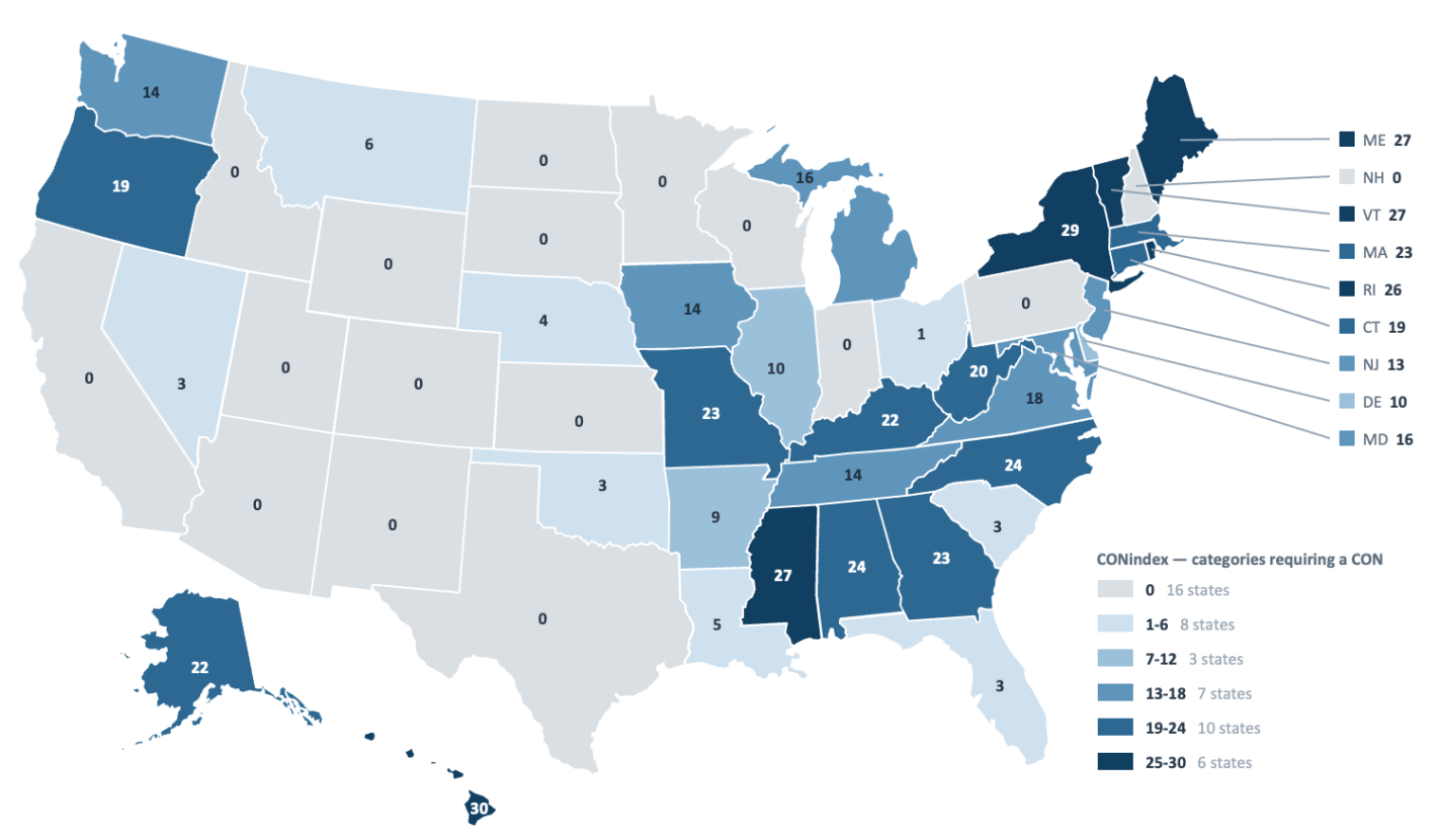
Certificate of Need (CON) laws require healthcare providers to obtain state approval before opening new facilities, expanding existing facilities, or introducing certain healthcare services or equipment. We’ve covered them frequently here, and I’ve written several papers on them.
But my research evaluating the effects of CON on healthcare facilities, spending, and outcomes (along with everyone else’s) always had the drawback that we relied on fairly crude measures of CON- often just a binary measure of whether a state had any CON requirements at all. The problem with this is that different states have wildly different approaches to CON- some states like Vermont require CON for as many as 27 separate types of health facilities, services, or equipment, including major ones like hospitals, while other states like Ohio require CON for only a single type (nursing homes). Previous attempts to catalog this variation tended to produce single-year snapshots (e.g. Institute for Justice, Cicero, Mercatus, NCSL). These are helpful for policymakers wanting to see how their state compares to others, but not so useful to researchers trying to measure the effects of CON, who would typically prefer many years of historical data.
The dataset us CON researchers have always wanted is now here!
It tracks 31 different types of healthcare facilities, services, and equipment that are sometimes regulated by CON, showing which ones required a CON in each state in every year back to 1990 (going even further back for some states). This means our national panel has more than 55,000 data points.
Number of Certificate of Need Requirements Per State, 2025
I’ve spent the last 2+ years working on this with a large team of coauthors (Sriparna Ghosh, Conor Norris, and Justin Leventhal) and research assistants, with support from Providence College and the Knee Regulatory Research Center at WVU. It involved reading decades of old state statutes on HeinOnline and Westlaw. We’ve released a paper, Certificate of Need: A New Comprehensive Panel, explaining the dataset in more detail and sharing ideas for how researchers could use it.
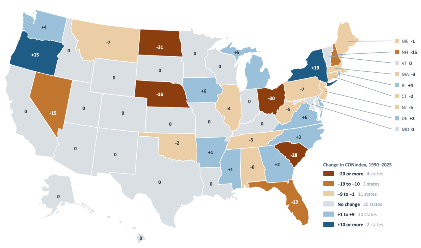
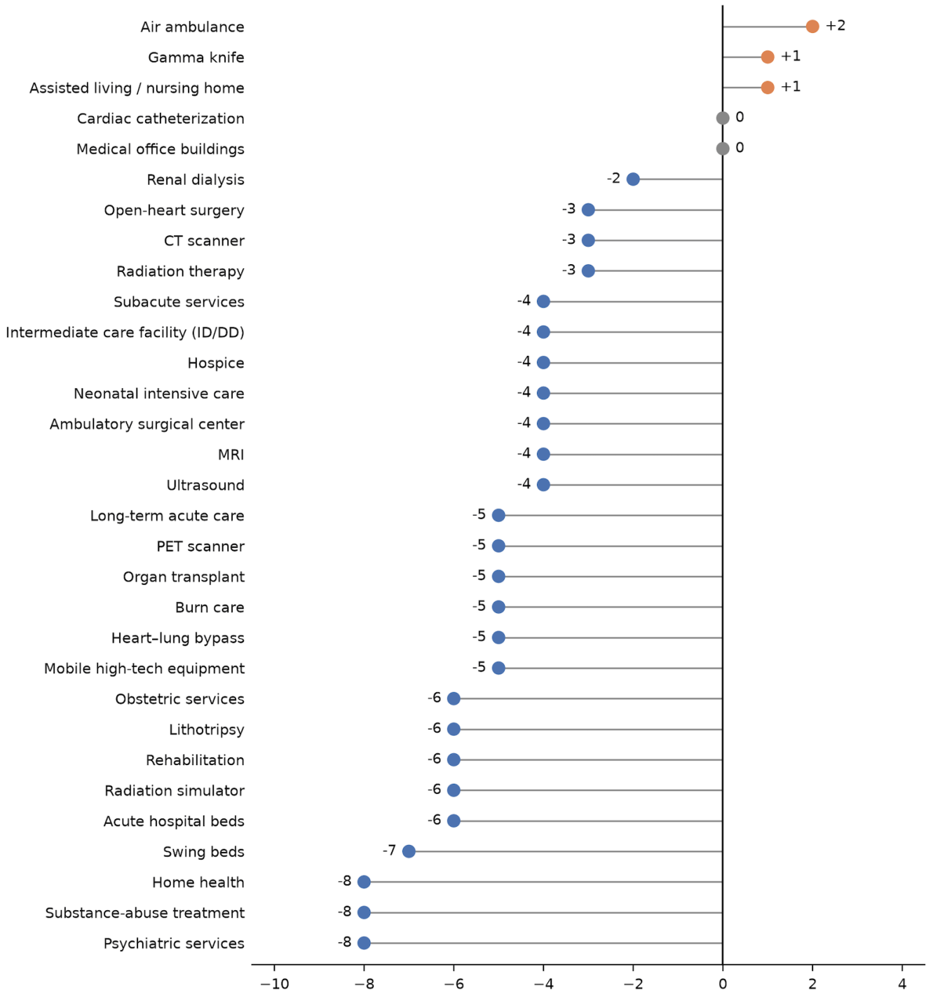
Change In Certificate of Need Requirements Per State, 1990 to 2025Change In Number of States Requiring Each Type of CON From 1990 to 2025
The dataset is public and free for everyone to use- we just ask that people cite us (though feel free to ask any of the dataset’s creators if you do want us as coauthors on your paper using the data). I’d love to hear your ideas for how you might use it, or how we can improve it- this is Version 1.0 but we plan to maintain and improve it going forward so that it can become the standard for the field.
The phrase “are you better off than you were 4 years ago?” seemed to have been a winning campaign slogan for Ronald Reagan in 1980. But when I looked at the data, it didn’t really hold up, if we are looking at real income growth to determine “better off.” Real family income growth was actually positive under Carter, but he lost reelection. Then four years later, Reagan won reelection, despite having negative real income growth. This is a pattern we see often in recent presidential reelection years. Interestingly, it does not appear to be 4-year income growth that matters, but 1-year income growth might.
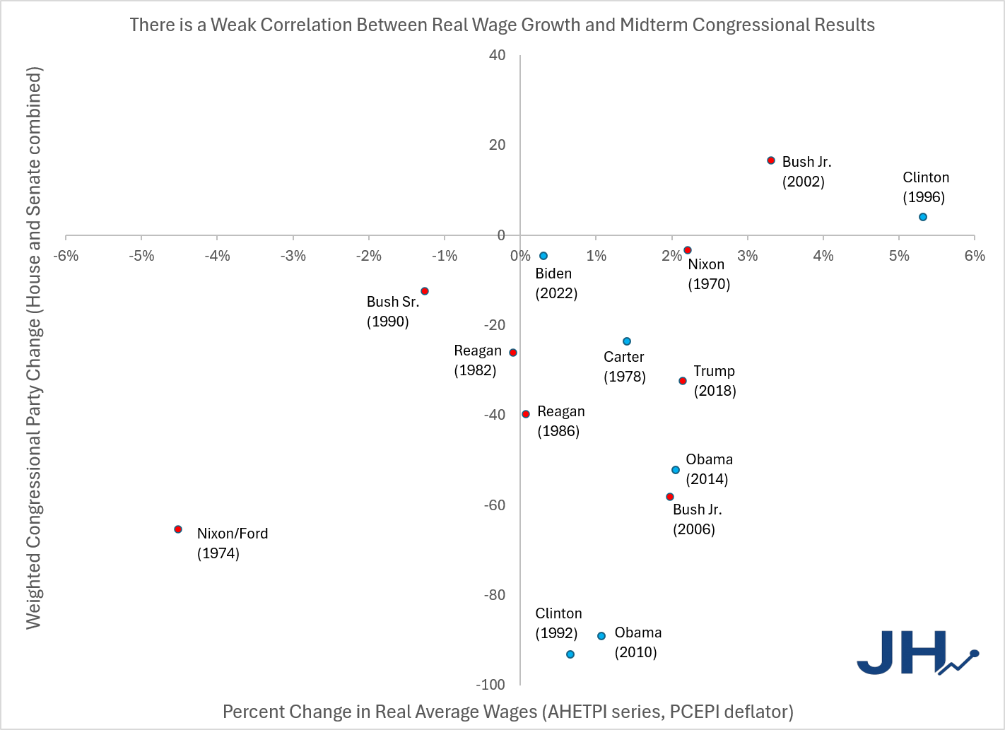
Is there any similar data we can look at for midterm elections? It is well known that Presidents almost always lose seats in a midterm election. But might they lose fewer seats if the economy is performing well? The following scatter plot shows all midterm elections since 1970. On the horizontal axis is the percent change in real wages (AHETPI series, deflated by the PCEPI) from the January a President takes office until November of the midterm election year. The vertical axis shows the net change in Congressional seats for the party of the President, including both the Senate and House (I weight Senate seats at 4.35x House seats, which is somewhat arbitrary).
Figure 1
What can we learn from this scatter plot? I would say there is a weak correlation between the variables: better real wage growth means losing few seats. The sample size is small, so I am reluctant to plot a trendline, but it would be positive. The only two midterm elections since 1970 where the President’s party actually gained Congressional seats had very high wage growth: Bush in 2002 (3.3%) and Clinton in 1996 (a very robust 5.3%). Very negative wage growth shows up just once, for the Nixon/Ford midterm in 1974, and here the Congressional losses were pretty massive.
Now you might object that other factors matter. And surely they do. The Republicans probably would have lost a lot of seats in 1974 anyway, due to Nixon’s resignation. But I’m sure the higher rates of inflation and resulting negative real wage growth didn’t help. And Bush probably got a significant post-9/11 hero bounce in 2002, though the real wage growth might have helped too.
However, Clinton and Obama had the worst midterm losses in this era, in 1992 and 2010, much worse than Nixon/Ford in 1974, and despite positive but weak real wage growth. Does this mean the correlation is useless?
Here’s one way to save it: compare Presidents against themselves. While Clinton and Obama had poor showings in their first midterm elections, their second midterms were much better — and had much better wage growth! Ditto for Nixon, though in reverse: his first midterm was pretty good, and so was real wage growth. Reagan had similarly bland real wage growth rates in both midterms, and had similarly mediocre Congressional losses. Bush did worse in his second midterm — again, you could blame a reverse-9/11 effect, with voters now weary of the global War on Terror, but wage growth was also worse.
What does this all mean for Trump? While we don’t have the full wage growth picture yet, through 18 months it has been pretty mediocre: 0.3%, and falling in recent months due to inflation exceeding wage gains for most of 2026. On social media and among pundits, a lot of people are trying to make comparisons to Biden. “But gas prices were even higher under Biden!”
If Figure 1 is at all useful, it is probably most useful to compare Trump to himself, in his first midterm. Wage growth through November 2018 was about 2.1%: not bad, not great. And he suffered middling Congressional losses. Because wage growth will almost certainly be much worse this time around, we can expect Trump to perform much worse than in his first, 2018 midterm. If Democrats pick up 20 seats in the House and 5 seats in the Senate (current prediction markets suggest about this many), this will put Trump pretty close to the Reagan 1986 point in Figure 1. That feels about right, given recent history, though it wouldn’t be surprising if the Republicans lost even more seats, since that would be a Congressional shift not much different from Trump’s first midterm.
I have heard the term “whinging” at least twice so far in 2026, both times from fairly sophisticated speakers. I don’t recall ever hearing it before this year. Is this a new trend?
“Whinging” is a British/Commonwealth term that means much the same as “whining,” although (surprisingly) they derive from completely different Old English roots. However, it feels a bit sharper and more dismissive than mere complaining. Thus, whinging is a more intellectual-sounding put-down than whining. And goodness knows how much we need more effective put-downs around here.
ChatGPT informs me that in the realm of finance, the word fills a useful niche. Calling someone a whinger often implies not just that they’re wrong, but that they’re engaging in repetitive, unproductive complaining:
In investing discussions, you’ll often see phrases like: “perma-bear whinging”, “shareholder whinging”, “whinging about management”, “stop whinging and buy the index”
where an American 30 years ago would more likely have written: whining, griping, bellyaching, complaining.
In economics, practitioners often want to distinguish between a legitimate complaint or critique, versus repetitive, emotionally-driven complaining. Thus:
Calling an argument “whinging” implies that the speaker is expressing dissatisfaction without offering analysis or solutions. That rhetorical function is useful in debates over inflation, trade, housing, inequality, central banking, or academic economics itself.
I suppose the first one who unleashes the term “whinging” wins; it is tough to dig out from being buried by a term like that. Knowing all this hopefully leaves you better armed for your next testy exchange over trends or policies.
Say that I want to calculate the unemployment rate by college major. That’s easy enough – we just divide the number of unemployed people by the number of people who are in the labor force. Repeat for each major. The 2024 ACS includes all the variables we need, including employment status by week, but here I just calculate the annual average. I’ll calculate unemployment rates using the unweighted observations because I want to make a separate statistical point about simple standard errors.
Sample weights aside, we have some basic data maintenance to consider. The sample sizes for each major differ. Some majors include more than 15k people, while others have less than 100. Which majors should I include? All of them?
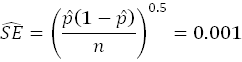
It depends on how precise I want the estimates to be – how small I want the standard errors to be. Below is the basic equation for the standard error (SE). Maybe I want my standard errors to be no more than 0.1%, since unemployment rates are on the order of 1-5%*. Then, it’s just a simple matter of setting the SE equation equal to 0.001 and solving…. Except that there are two variables. Getting a SE of 0.1% depends on both the sample size and the observed proportion. So, a basic rule such as ‘include only majors with at least 100 people won’t quite achieve what we want since the whole point of the exercise is that we suspect that the proportions of unemployed people differ among majors.
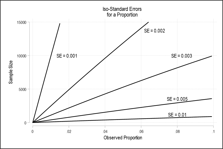
In order to get an idea of how many observations we need conditional on the proportion, we can use a popular tool in economics. Basically, adding the prefix “iso” to any term lets us see how two (or more!) other variables matter for the value of the term. We have iso-costs, iso-quants, iso-Sharpes, iso-retirement payments, etc. Here, we can have an iso-standard error by graphing the sample size on one axis, and the proportion on the other. With the desired SE as a constant, we can rearrange the SE equation so that the sample size and proportion variables remain. They’re isolated below – solving for sample size is much simpler.
The above equations let us see all of the sample size and proportion combinations that yield an arbitrary standard error. We’re basically doing the first steps of what’s known as a power calculation. We’re setting up some guard rails before doing the analysis so that we know ahead of time whether we’d even be able to tell the difference between proportions with the sample sizes that we have. Below is the graph of the iso-SE to illustrate the sample size & proportion combinations that yield some target SEs. Pictured is the left side of parabolas. What does it tell us? It tells us that shrinking the target SE increases the necessary sample size at each proportion REALLY FAST.
Since the most college majors have a sample size that is well below 15k, we basically know ahead of time that we won’t be able to tell the difference between their unemployment rates if they differ by a mere tenth of a percent. Given that the national unemployment rate in 2024 was around 4% and around 2.3% for college majors, there’s not much room for error – literally. Everything looks the same when proportions are similar and sample sizes are small.
So many things are happening that it’s hard to decide which to write about. So I’ll briefly cover several that would each deserve a full post on a normal week:
1. The Fed voted unanimously to raise rates to 4%, showing that the Warsh Fed still has some independence from the President.
2. The 10-year Treasury bond hit 5%. The CBO’s long-term budget forecasts assume 4% rates for the 10-year, and looked unpleasant even with that rosy assumption. The UK dumped Prime Minister Liz Truss over their 10-year hitting 4.5%.
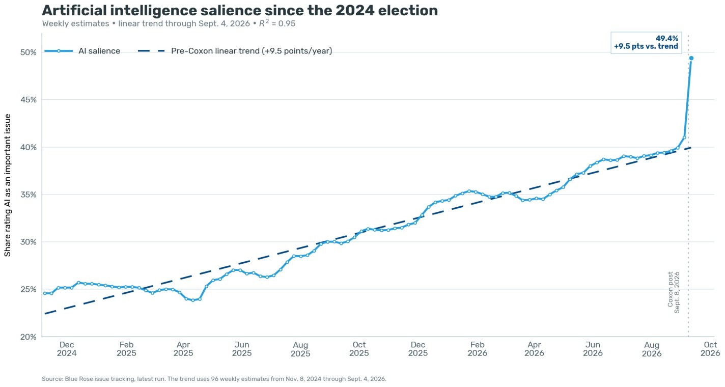
3. Jacob Coxon resigned from Anthropic over AI safety concerns and set off a surprisingly large firestorm over it.
4. The Trump administration reacted by insisting we move forward with AI, with the Department of War blaming Effective Altruists for trying to slow it down:
I suspect this could lead many people to get into Effective Altruism by promoting it from ‘weird thing for nerds‘ to ‘something you can do to oppose Trump’. If that interests you, this is a good place to start.
5. EA hero Michael Kremer (whose work inspired many donations to deworming) was just appointed Chief Economist of the World Bank.
6. But AI progress keeps rolling. Quantum theorist Scott Aaronson declares the Singularity is here:
I recoil from the neverending shell game where you say “oh sure, of course AI can now [escape from its sandbox / solve Millennium Problems / whichever dramatic thing it most recently did], no one ever denied that [I did deny it], wake me up when AI does [thing AI hasn’t yet done but is going to do next year], that’s when I’ll reevaluate my whole worldview [no I won’t].” Where no matter how fast the rollercoaster accelerates, even after your whole familiar world has vanished behind you, you’re still inventing reasons why it doesn’t count.
My position on AI is merely the conservative, skeptical position of 2006, updated with intellectual honesty for the reality of late 2026. And that position, if you need me to spell it out, is as follows:
It seems to me that the Singularity has already started; it’s just wildly unevenly distributed.
I’m honestly surprised we have yet to see an upsurge of millenarianism. Y2K concerns came and went 2000 years after Jesus’ birth. But see how much people worry about AI now, and realize it will only get more powerful as we approach 2000 years after his death- 2033, or if you trust the revisionists, 2030.
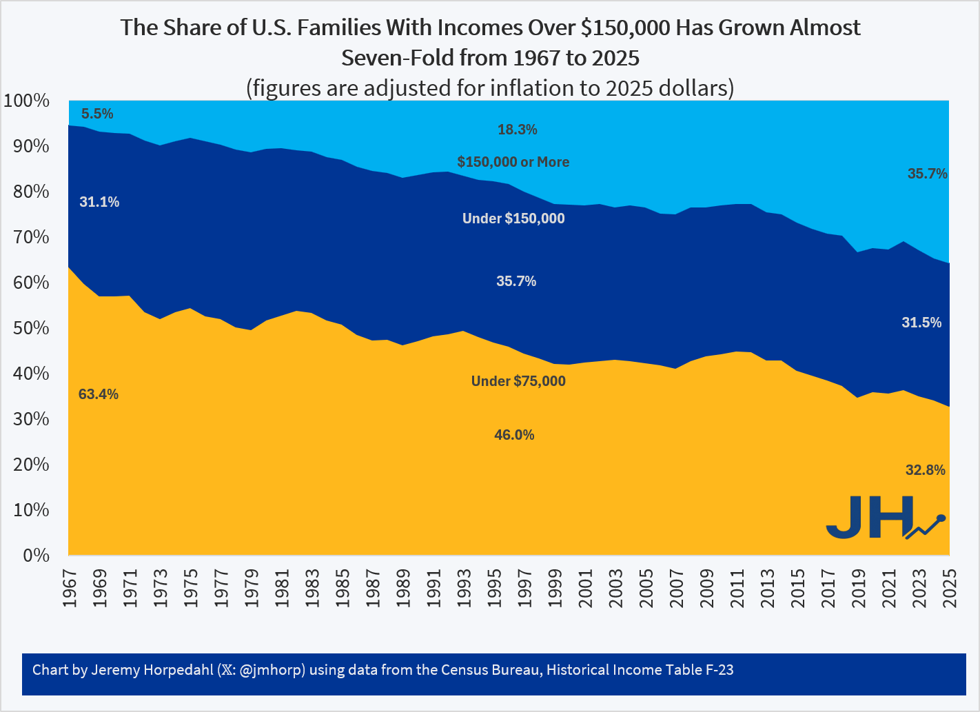
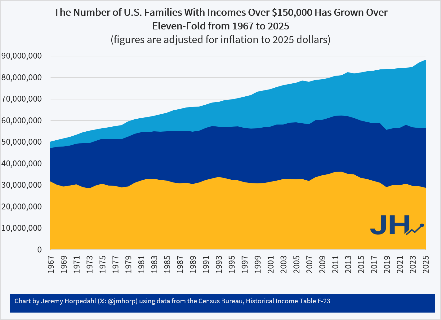
Yesterday the Census Bureau released their annual treasure trove of data from the Current Population Survey, Annual Social and Economic Supplement. Loads of new data are now available for 2025 on income, poverty, and health insurance coverage. This new data allows me to update one of my favorite charts, showing the distribution of family income in the U.S. since 1967. Census releases this data by grouping families into nine different income groups, which I have collapsed into three groups, each being as close to one-third of the total as I can get using the publicly available data.
Figure 1
See also a similar chart from Mark Perry which uses household income (rather than family income) over the same time period.
Figure 1 shows that, adjusted for inflation, the proportion of families with income over $150,000 has grown almost seven-fold since 1967. There has been a roughly constant one-third of the population between $75,000 and $150,000, and the ranks of those under $75,000 has been cut in half since 1967. Again, these dollar figures all adjusted for inflation, using the preferred deflator of the Census Bureau.
What’s even more astonishing is when we look at the number of families at various thresholds, rather than just the share, as seen in Figure 2.
Figure 2
In 1967 there were fewer than 3 million families with incomes over $150,000 (in 2025 inflation-adjusted dollars). By 2025, that had grown to over 31 million families. If we look at the highest income threshold in this Census data — over $200,000 — the number of families has grown from just 1 million in 1967 to over 20 million in 2025. And there are fewer lower-income families too: the number of families under $75,000 shrunk, not just as a proportion of the total as seen in Figure 1, but even in absolute terms by almost 3 million families from 1967 to 2025.
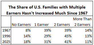
Of course, some of these families do have more earners than in 1967, though we shouldn’t overstate that too much. Using other data from Census, we can see that the share of families with multiple earners hasn’t increased much since 1967, and especially hasn’t since the mid-1990s.
Table 1
As seen in Table 1, as far back as 1967 the majority of families in the U.S. had multiple earners. Now it’s true these were not all married couples with both spouses working full-time, and hours of work in the household have risen over time — but not much since the 1990s. This data is somewhat skewed by the aging of the population, as evidenced by the rising number of families with no earners. But even if we drop those families with no earners, multiple-income families haven’t grown much: from 58% of the total in 1967 to 63% in 2025.