Forecast models, betting markets, and surveys of experts all drastically overstated the actual growth of GDP in the last quarter of 2025. They were off in the initial release, which was just 1.4 percent, but this was even further revised down to 0.5 percent. All four of the sources I track were forecasting over well over 2 percent, with some over 3 percent.
Does that mean we shouldn’t trust the forecasts? Perhaps, but last quarter was largely pulled down by government spending cuts, which the models completed missed. You can see this very clearly in the Atlanta Fed GDPNow model. Perhaps they shouldn’t have been surprised by this drop in government spending, but that is where the major error was.
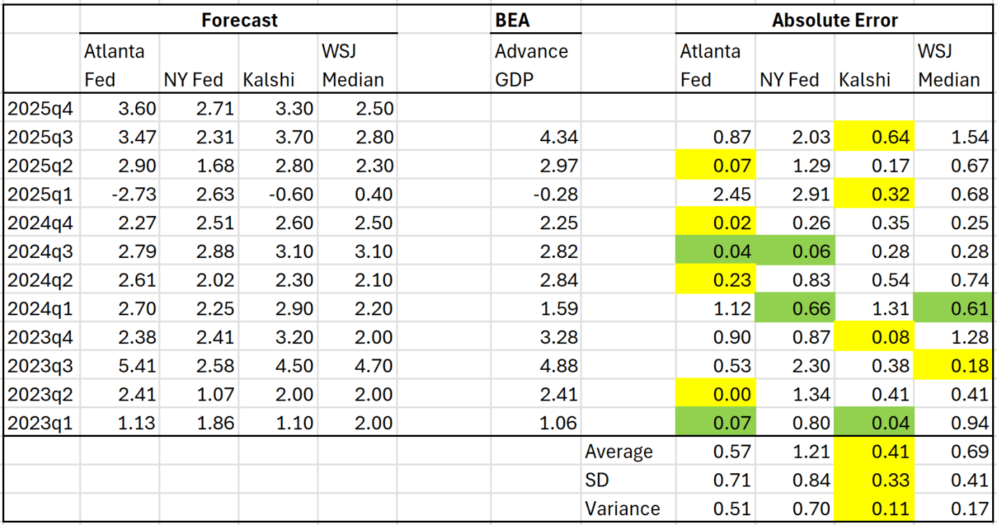
So what do these forecasts think about the first quarter data for 2026, which comes out tomorrow? The two best predictors historically, GDPNow (Atlanta Fed) and Kalshi, are pretty far apart on this one, over a percentage point difference, with GDPNow being the only forecast under 2 percent:
UPDATE 2/19/2026: the last GDPNow estimate from the Atlanta Fed is 3.0% and the Kalshi markets are now predicting 2.8%. I would expect this is a slightly better range than the 3.3-3.6% from my post written on 2/18/2026.
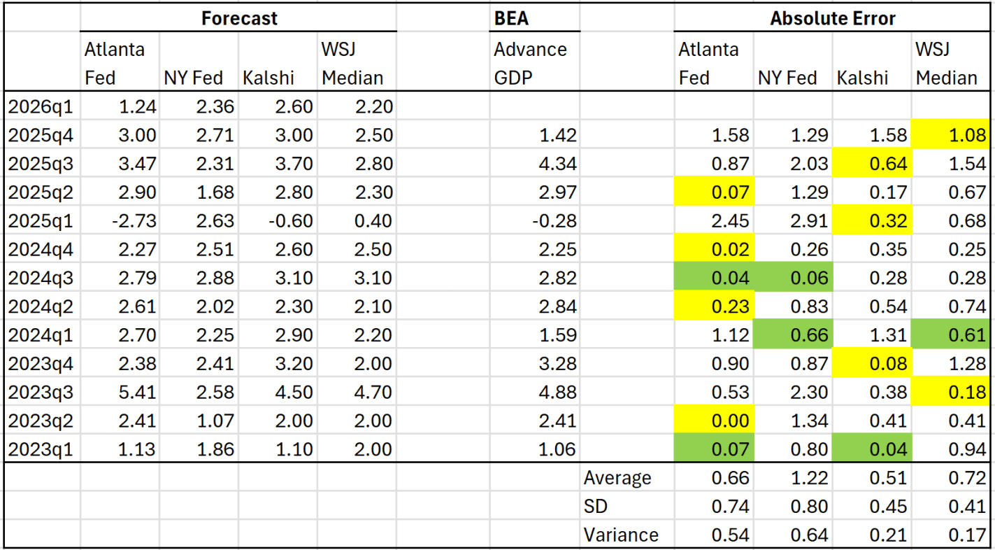
In April 2025 I wrote about several different forecasts for GDP growth. At the time the latest GDP quarter available was 2025Q1. We’ve had two more quarters of data since then, plus a highly anticipated report for Q4 coming out this Friday. How have these different predictions done recently? Here is the updated table from that prior post:
When I wrote the post in April 2025, I said that a simple average of the Atlanta Fed and Kalshi forecasts was the best simple predictor of the actual BEA advance figure. Based on the middle quarters of 2025, I think that continued to be true: each of them was the best estimate in one quarter, and perhaps just as importantly the NY Fed and WSJ survey of economists understated GDP growth pretty significantly.
There is still one more Atlanta Fed GDPNow update coming tomorrow before we get the actual BEA data on Friday, but based on where the numbers are now, we should expect Q4 to be around 3.4-3.5% (annualized) growth rate. This would put the total 2025 calendar year growth at around 2.3% — decent, but still below 2024’s 2.8% growth.
By almost any measure, 2025 was a great year for the United States.
Despite inflation remaining elevated and the damage from new tariffs, the economy did well. Inflation-adjusted median earnings are higher than a year ago, though only by about 1.3%. While most prices are still rising, one bright spot for affordability is that home prices are falling in much of the country (according to Zillow estimates).
The unemployment rate did tick up slightly, from 4.2% last November to 4.6% currently. This is definitely an indicator to watch over the next few months, but it is still well below average.
But even outside of the economy, there is plenty of good news in the data. Crime rates are plummeting. The murder rate fell something like 20%, as well as every major category of crime (violent crime overall is down 10%). This are some of the largest one-year drops in crime the US has ever seen.
Homicides aren’t the only category of deaths that are falling in 2025. For most categories of death as tracked by the CDC, there is a long lag (6 months or more) before all of the deaths are categorized. So we can’t look at complete 2025 data yet. For example, drug overdoses have increased massively in recent years, especially during the pandemic. But after plateauing in 2021-23, drug ODs started falling in 2024 and have continued to fall in early 2025. For the 12 months ending in April 2025, drug OD deaths were 26% lower than the prior 12 months. If we look at just the first 5 months of the year, 2024 was 20% lower than 2023, and 2025 was another 20% lower than 2024. For the first five months of 2025, ODs are basically back down to the same level as 2018 and 2019. Motor vehicle deaths also increased during the pandemic, but they are down 8% in the first half of 2025, essentially back down to 2018-19 levels.
Was it all good news? No, you can certainly find some data to be pessimistic about. For example, despite the efforts of DOGE and other attempts to cut federal government spending, over $2 trillion was added to the national debt in 2025, up 6 percent from the end of 2024 and surpassing $38 trillion. And as I mentioned above with the unemployment rate, there is some evidence the labor market may be weakening.
Not all is rosy as we head into 2026, but 2025 was a year filled with many positive trends on the economic front and in society more generally. May your new year be prosperous and healthy!
A periodically recurring conversation on social media is whether imports are bad for GDP. Everyone thinks they are clearly right, and then they lazily defer to brief dismissal of the opposing view. Some of this might be due to media format. Something just a tiny bit more thorough could help to resolve the painfully unproductive online interactions… And just maybe improve understanding.
It starts with the GDP expenditure identity:
The initial assertion is that imports reduce GDP. After all, M enters the equation negatively. So, all else constant, an increase in M reduces Y. It’s plain and simple.
Many economists reply that the equation is an accounting identity and not a theory about how the world works and that the above logic is simply confusing these two things. This reply 1) allows its employers to feel smart, 2) doesn’t address the assertion, & 3) doesn’t resolve anything. In fact, this reply erects a wall of academic distinction that prevents a resolution. What a missed opportunity to perform the literal job of “public intellectual”.
How are Imports Bad/Good/Irrelevant for GDP?
Let’s add a small but important detail to the above equation to distinguish between consumption of goods produced domestically and those produced elsewhere.
Economist Craig Paulsson has made a simple game free to all.
When you go to MapGDP.com you will find a real picture from Google Maps and a simple question. Guess the GDP/capita in the country where this picture was taken.
Many economics teachers will at some point visit the topic of “what is GDP” or “economic growth.” This web game is great for both topics. I put the website on my classroom projector and called on students to take the guess. We then could do the reveal together. I rate this high value for low effort from a teacher’s perspective. No login or account creation required.
If you are an EWED reader and not an econ teacher, you might have fun playing the game yourself. Almost as satisfying as Wordle…
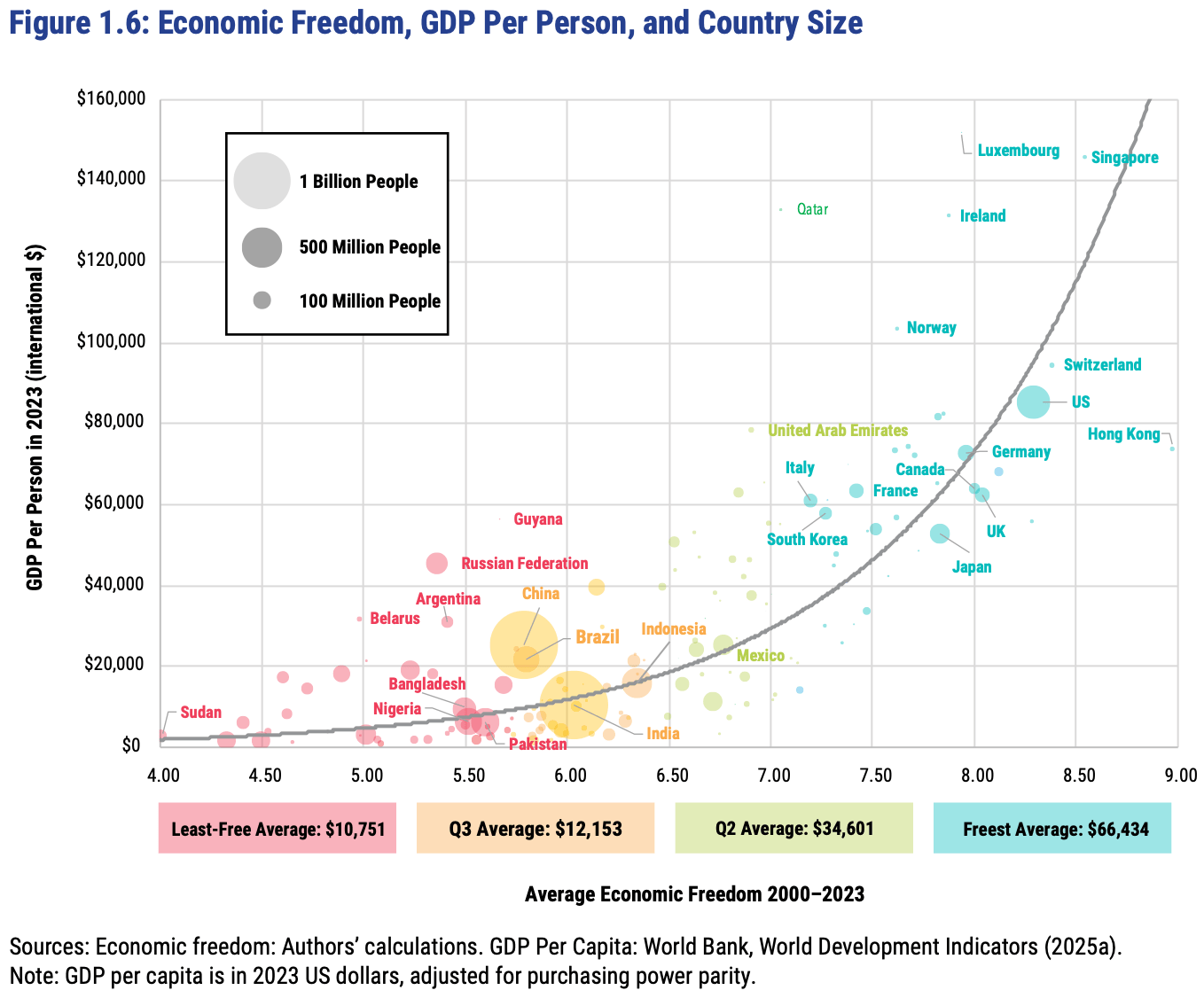
The Fraser Institute released their latest report on the Economic Freedom of the World today, measuring economic policy in all countries as of 2023. They made this excellent Rosling-style graphic that sums up their data along with why it matters:
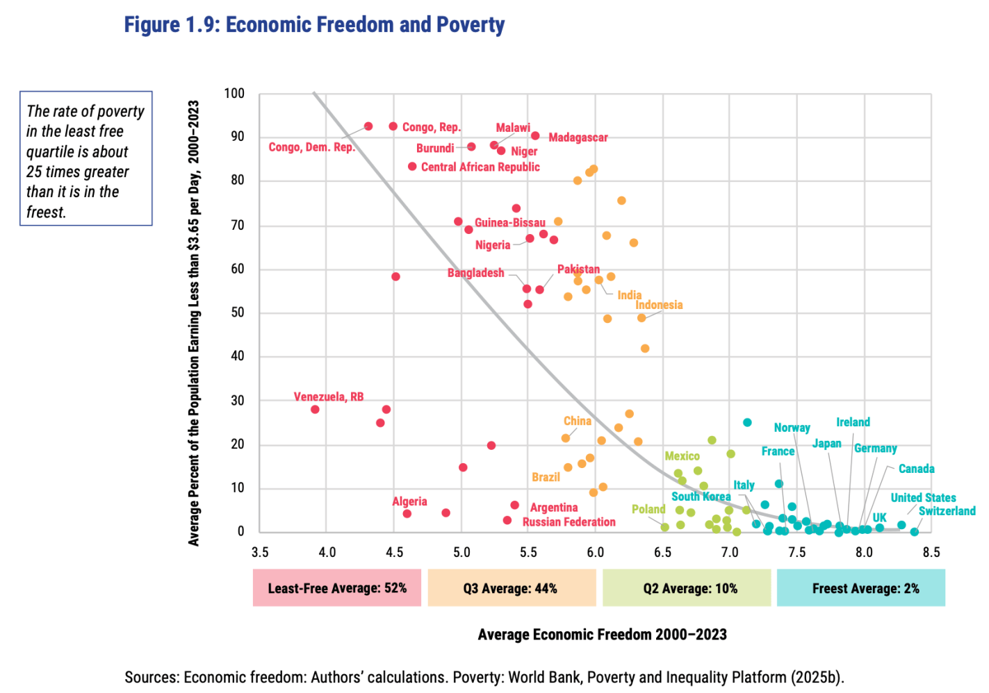
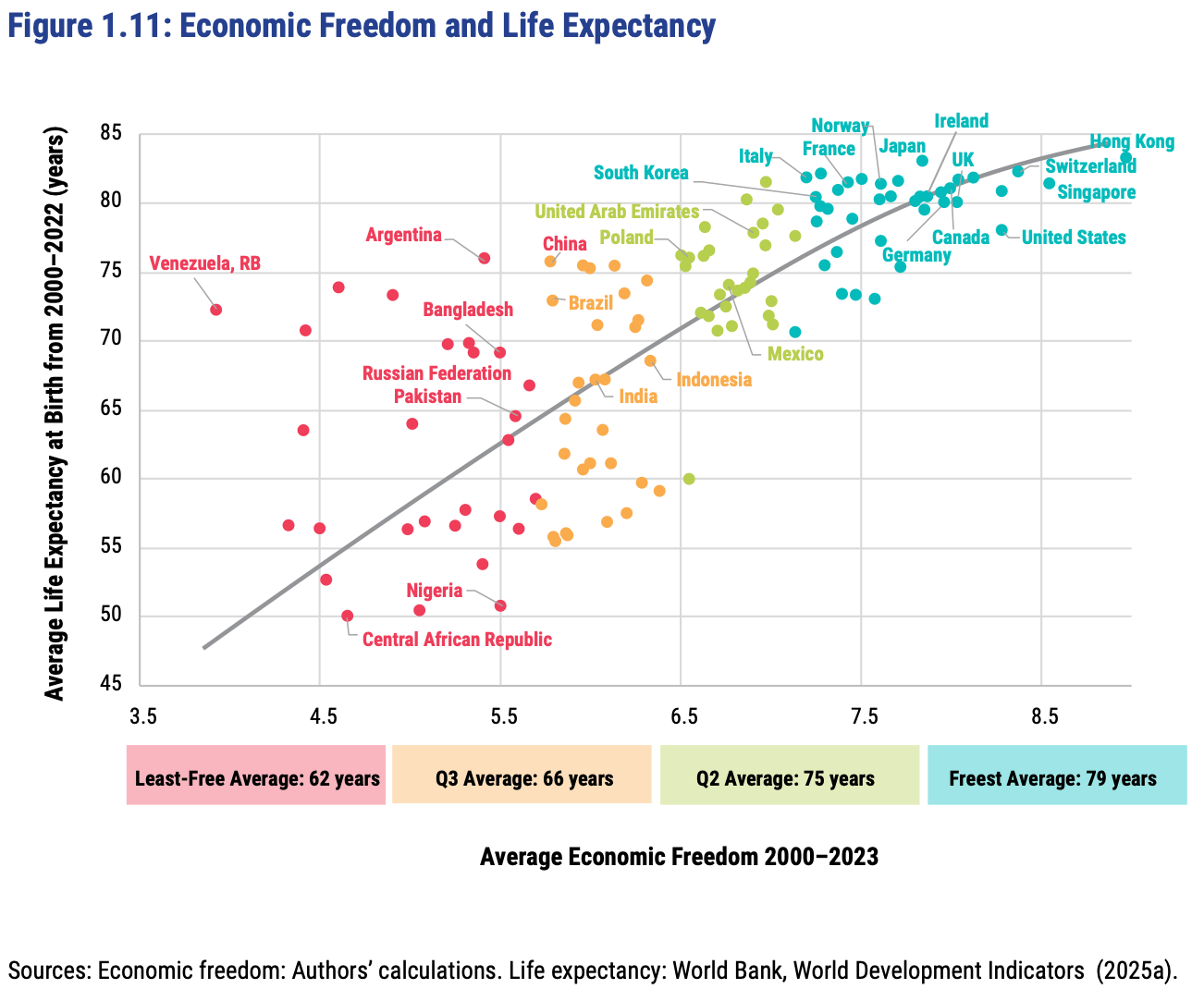
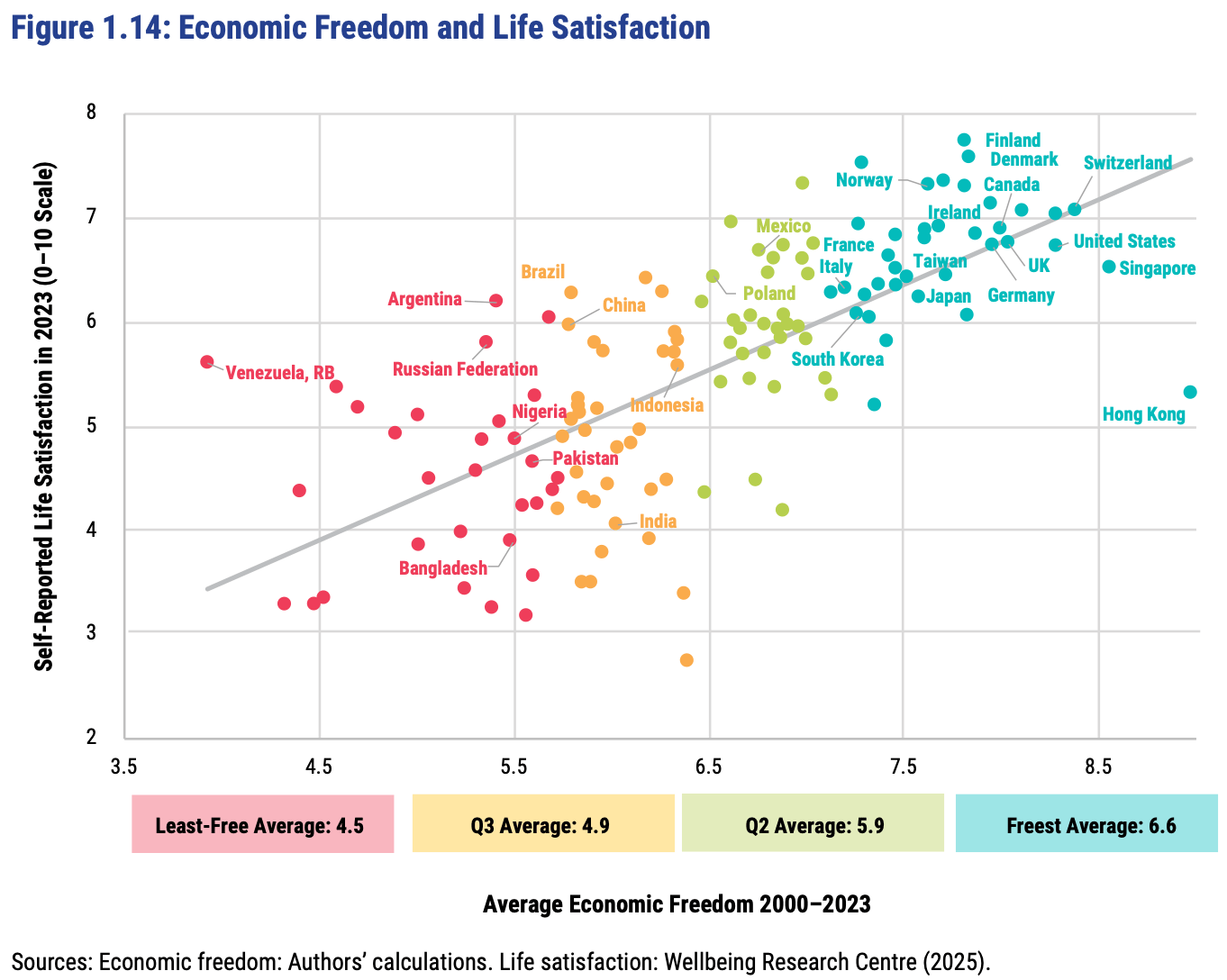
In short: almost every country with high economic freedom gets rich, and every country that gets rich either has high economic freedom or tons of oil. This rising tide of prosperity lifts all boats:
This greater prosperity that comes with economic freedom goes well beyond “just having more stuff”:
The full report, along with the underlying data going back to 1970, is here. The authors are doing great work and releasing it for free, so no complaints, but two additional things I’d like to see from them are a graphic showing which countries had the biggest changes in economic freedom since last year, and links to the underlying program used to create the above graphs so that readers could hover over each dot to identify the country (I suppose an independent blogger could do the first thing as easily as they could…).
FRDM is an ETF that invests in emerging markets with high economic freedom (I hold some), I imagine they will be rebalancing following the new report.
Last week I wrote about the GDP predictions from Kalshi and the GDPNow Model. They were both showing 2.4% for Q2 of 2025 last week. They both changed slightly by yesterday, up to 2.8% and 2.9%. The final result (technically, the “advanced” result, but the final one for purposes of this comparison) was 2.97%. The Atlanta Fed GDPNow model continues to be a top performer, and you can’t do much better than averaging these two estimates. And you can pretty consistently do better than the median result from the WSJ/Dow Jones survey of economists.
Back in April I wrote about 4 different estimates of GDP growth and how well they have performed since 2023. With the 2nd quarter of 2025 GDP data coming out next week, what do the best performing predictors currently say?
In that last post, I showed that the Atlanta Fed GDPNow model and the Kalshi betting market were generally the best performers. And furthermore, averaging these two improves the predictive power a little more. As of today, the GDPNow model is predicting 2.4% growth and Kalshi is… also predicting 2.4%!
There will be a few more updates to GDPNow over the next week, and of course Kalshi is constantly updating as more people bet. But as of right now, 2.4% growth seems like a reasonable prediction. That may surprise some people, especially given all of the pessimism surrounding tariffs and policy uncertainty generally. But despite all of this, the US economy appears to be just continuing to chug along.
The 23 blue-shaded MSAs in this map produce half of US GDP:
You might be tempted to think this map, like so many maps, is just a map of US population. It kind of is, but not completely. These 23 MSAs have 133 million people (as of the 2020 Census), or about 40% of the US population. That’s a lot, but it’s much less than half, which the GDP proportion they account for. In other words, these MSAs also tend to have above-average per capita income.
The three largest MSAs by population (NY, LA, Chicago) are also the three largest by GDP. But after the first three there are some interesting discrepancies. The San Francisco MSA is the 4th largest by GDP, but only the 12th largest by population — San Fran has a population similar to the Phoenix MSA, but almost double the GDP. San Francisco MSA has a very high GDP per capita (the third highest).
The San Jose MSA is also among these 23 largest MSAs for GDP, and also sticks out — it is the 13th largest by total GDP, but only the 36th largest by population. San Jose has a population similar to Cleveland and Nashville, but well over double the GDP of these two MSAs individually. In fact, there are 12 MSAs larger in population than San Jose, but that aren’t among these 23 MSAs that produce half of US GDP: places like St. Louis, Orlando, San Antonio, Pittsburgh, and Columbus. Silicon Valley really pulls up San Jose: it has the 2nd largest GDP per capita among MSAs, only beaten by much smaller Midland, Texas and its oil income.
In macroeconomics we have basic tools to help us talk about economic growth, which is simply the percent change in RGDP per capita. What causes growth? Lot’s of things. All else constant, if more people are employed, then more will be produced. But the productivity of those workers matters too. That’s why we calculate average labor productivity (ALP), which is the GDP per worker. This tells us how much each worker produces. All else constant, more ALP means more GDP.*
What affects ALP? Nearly everything: Technology, demographics, health, culture, and public policy. Most of these have long-term effects. So, it’s better to think in terms of regimes. After all, incurring debt now can result in a lot of investment and production, but there’s no guarantee that it can be sustained year after year. This is why I don’t get terribly excited about individual good or bad policies at any moment. There’s a lot of ruin in a nation. I care more about the long-run policy regime that is fostered over time.
Given the variety of inputs to economic growth, there’s always plenty of room for complaint about policy – even if the economy is doing well. In this post, I’m inspired by a Youtube video that a student shared with me. The OP laments poor policy in Massachusetts. But compared to some other nearby states, MA is doing just fine economically. This is not the same as saying that the OP is wrong about poor policies. Rather, a regime of policy, technology, interests, etc. is built over time and there can be a lot wrong in growing economies.
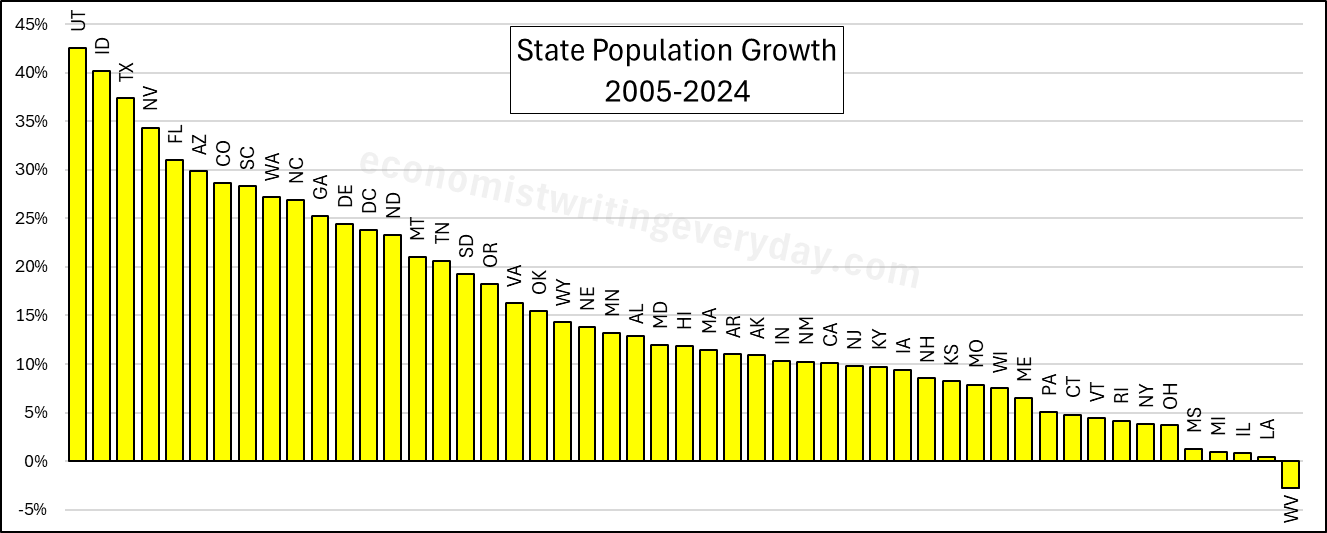
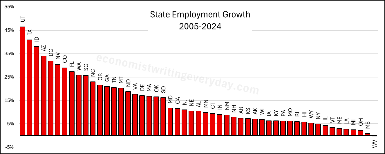
In the interest of being comprehensive, this post includes basic growth stats for all states from 2005 through 2024 (the years of FRED-state GDP).** First, let’s start with the basic building blocks of population, employment, and RGDP. Institutions matter. Policy affects whether people migrate to/from the state, fertility, how many people are employed, and what they can produce.
People like to talk about migration and the flocking to Texas & Florida. But that fails to catch the people who choose to stay in their state. Utah is 43% more populous than it was 20 years ago. But you don’t hear much clamoring for their state policies. Idaho and Nevada also beat Florida in terms of percent change. Where are the calls to be like Idaho? Employment largely tracks population, though not perfectly. The RGDP numbers can change quickly with commodity prices, reflected in the performance of North Dakota. But remember, these numbers cover a 20 year span. So, any one blockbuster or dower year won’t move the rankings much.
Of course, these figures just set the stage. What about the employment-population ratio, ALP, and RGDP per capita? Read on.