WWII Strategic Initiatives 6. Fort Commander’s Lonely Decision Saves Norwegian Government from Capture by Germans

At 4:21 a.m. on April 9, 1940, a 64-year-old Norwegian colonel six months from retirement had about ninety seconds to decide whether to start a war.

Birger Eriksen, who entered Norwegian military service way back in 1893, commanded Oscarsborg, a sleepy coastal fortress on a rocky island in the Oslofjord, armed with three 28cm (11 inch) Krupp guns dating to the 1890s – – plus a secret weapon the Germans didn’t know about: torpedo tubes from 1901. His garrison was mostly reservists conscripted a week earlier. Out of the pre-dawn dark came six unlit, unidentified warships steaming toward Oslo.  Norway had assumed that its diligently neutral stance would avert any foreign attack, and so was lax about maintaining coastal surveillance. The ships could have been British. Firing on the wrong flag meant international catastrophe; not firing, if they were German, meant the capital fell before breakfast.

Colonel Birger Eriksen, the commander of Oscarsborg on 9 April 1940.

Eriksen had no orders from Oslo and no time to ask. He gave the command anyway, reportedly saying: “Either I will be decorated, or I will be court-martialed. Fire!”

The lead ship was the Blücher, a brand-new 16,000-ton heavy cruiser packed with troops, Gestapo officers, and administrators meant to seize the king, the government, and Norway’s gold reserves in one stroke. Two shells from the fort tore into her at point-blank range, followed by torpedoes into her flank. Within ninety minutes she rolled over and sank, taking hundreds of men down with her. The German attack on Oslo was not completely averted, but it was significantly delayed and hampered.

German Heavy Cruiser Blücher (Image by Bundesarchiv)

That single decision to attack the invading fleet bought Norway’s government just enough hours to flee Oslo by train with King Haakon VII — and to load 53 tons of gold bullion onto trucks barely ahead of the advancing German columns. The gold made it out to Britain via a harrowing overland and sea relay; the government reached London and kept functioning as a legitimate exile authority, which gave the Norwegian resistance something to fight for rather than just against. Also, Norway had an enormous (~1000 ships) merchant marine fleet, and the intact, legitimate Norwegian government in exile ordered it into the service of the Allies, right when Britain desperately needed ships and sailors to transport cargo to stay in the war.

The strategic hangover lasted five years. Hitler, rattled by the loss of the king and by ongoing Allied fake Scandinavian invasion plans, garrisoned Norway with somewhere around 300,000–400,000 troops for the rest of the war. This was a staggering commitment, sitting largely idle when they could have made a decisive impact elsewhere. One old colonel, one hunch, one order — which tied down a whole German army guarding a country it barely needed.

This is the sixth in a series of occasional blog posts on individual initiatives that made a strategic (not just tactical) difference in the course of the second world war, an event that gave us the world of the second half of the twentieth century. Here are previous posts:

WW II Key Initiatives 1: FDR Prodded the Navy to Convert Cruisers to Carriers, Just in Time

WW II Key Initiatives 2: “Thatch Weave” Tactic to Counter More-Agile Japanese Fighter Planes

WW II Key Initiatives 3: Kurt Tank Gives Germany a Superior Fighter Plane, the Focke-Wulf 190

WW II Key Initiatives 4: Building Hundreds of Small, Slow, But Cheap Ships to Counter the U-Boat Threat

WWII Key Initiatives 5: General Zhukov Helped Save USSR By Mastering the Pincers Counterattack

Predicting Social Media from 1997

At a rummage sale, I picked up a book by cartoonist Scott Adams called The Dilbert Future: Thriving on Stupidity in the 21st Century published in 1997. I thought I might find a clever prediction about the future, which we can now verify from the standpoint of 2026.

The text of the book is mostly dumb. I get the impression that Scott Adams was making easy money with a guaranteed humor book contract. I don’t recommend the book to anyone.

HOWEVER, with my paper copy I kept skimming ahead to see if any of his predictions about the future were impressive. Finally, on page 200 I found something.

Recall, the internet only became publicly available in the early 90’s. Respectable newspapers might have started to lose out to cable news in the mid-90’s. Blogs did not start until after Adams’ book was published. Social media proper (marked by the launch of Facebook) started in 2004. (Let millennials quietly walk away from Xanga journals and pretend that never happened.)  So, my interest in this passage hinges on the fact that this book has a publication date of 1997.

The following is copied from Adams’ humor book.

I predict that news outlets will try to compensate for the loss of relevant news by focusing on stories that are more shocking and depressing than ever. At least that way they’ll get your attention and sell advertising even if the stories aren’t “news” in the traditional sense.

This will limit the reporting to a few stories per year about famous people who are killing other famous people. And if there are not enough of those stories to sell advertising slots, the media will…

Prediction 51: In the future, the media will k*** famous people to generate news that people will care about.

The end of traditional news outlets will not limit people’s access to information. Thanks to the ubiquity of video cameras and the Internet, every citizen will be a reporter. If something happens in your neighborhood, you’ll tape it, stick it on the Internet with your own commentary and make it available to the world… The weather reports will be computer-generated and constantly available by computer, pager, voice-mail… All news gathering will be disaggregated.

Prediction 52: In the future, everyone will be a news reporter.

People will have access to software that constantly combs the internet for “small” news that is relevant to them.

your software will be able to do a sort of “credibility credit check” on any person who posts information to the Internet… This won’t be foolproof, but nothing is.

This new model depends on people being willing to take the time to put information on the Net without the benefits of payment. Why will people do that? They will do it because that’s our most basic human nature: People like to talk more than they like to listen.

Joy again: Not bad as predictions go. Notice the quaint terminology, such as “tape it” and pagers. (Pagers use radio networks instead of cell towers.) Attention is scarce, and writing is not (even pre-LLM). Adams predicted what I call poastmodernism.

Announcing the Disability Records Project

Did you know that we have access to digital copies of the historical US census rolls? You can also find the digitized data at IPUMS. However, the data for people with disabilities is not great. It depends on the year, but those data have error rates on the order of 20% or higher.  We have the digital census rolls, the data just doesn’t match them.

So, I created a non-install windows computer application that lets people identify disabled people on those digital census rolls. Complemented with machine learning, my goal is to improve the accuracy of historical records about people with disabilities. Historical and quantitative research about disabled populations is relatively thin. We can do better. If you have students who would benefit from this research experience, then do please let me know! I can approve your institution’s email domain and we can get started.

The application is really straightforward with basically two user-facing features.

Continue reading

Seven-Year Grocery Inflation is Running High

A recent poll tells us that 66 percent of Americans think groceries are unaffordable. Is this a reasonable position? Let’s add some context.

Figure 1 is one way to look at the problem. It shows the cumulative 7-year inflation rate for groceries, going back almost 100 years. 7 years is an arbitrary time period, but I think it makes sense: it can reasonably be described as “recent memory”; right now it encapsulates the period going back about 6 months before the pandemic; and it has a few time periods of around 100% grocery inflation and a few with close to 0%.

Figure 1

First things first: grocery price deflation over a 7-year time horizon is highly unusual. The only time it happened was the 1930s, a time when you had general price deflation and groceries followed that pattern. It was also a pretty bad time for the economy and society. I’m not saying you can’t have general food price deflation with a major depression, but it doesn’t show up in the historical record going back over 100 years.

Now to the present: the most recent 7 years look pretty bad. In absolute terms, 33 percent grocery inflation is above the long-run average of 25 percent, and definitely above the average of the last 40 years of 21 percent (for most adults, the past 40 years is as far back as their memory goes in terms of being acutely aware of grocery prices). Yes, there have been a few time periods with higher grocery inflation, notably the two World Wars and the 1970s.

But the really important context is the 7 years prior to the pandemic, when grocery inflation was so low (4-5 percent every 7 years) that it probably felt like 0% to most people. That was the recent experience people had become accustomed to before the pandemic. The only other time since the Great Depression it was that low was the late 1950s through the 1960s — though that 15-year window is bookended by two periods of around 100% grocery inflation!

Continue reading

So Many Prime Ministers

There has been a lot of shade thrown at the United Kingdom recently from economists and political scientists. Economic growth has gone down the tubes and there have been six prime ministers over the past decade. As an American, I didn’t really know if that was a lot. The social media says that we’ve had a lot of turnover recently. Is six prime ministers in ten years a lot in the UK’s parliamentary system? I grew up watching Tony Blair on TV for a ten-year stretch. But I had no context for the historical norm or whether there is any precedent. Here I look at the data.

Right now, there are a record number of former prime ministers still living (PM). Prior to the recent spike, the maximum number of living people who had left office was five. Right now in 2026, there that number is nine! And if the current PM, Andy Burnham, follows the recent trend of short stints in office, then they’ll hit ten. As an American, it’s hard for me to imagine having 10 living former presidents. According to the below charts, the British are probably a bit jarred too!

Why So Many?

In last week’s post I noted that we’re tied for the most living former presidents. But truly, the UK’s numbers are what inspired me to look at this topic in the first place. To recap, the number of living ex-executives can be caused by 1) Longer lifespans, 2) Leaving office at a younger age, and 3) More unique executives. In the US, being currently tied for the record is overwhelmingly driven by longer lifespans. What about the UK?

Continue reading

So Many Living Ex-Presidents

If you count president Trump, the number of living former presidents is at a historic high of five (Clinton, G.W. Bush, Obama, Trump, Biden). The number of living ex-presidents can increase for three reasons. 1) More people becoming president, 2) ex-presidents having longer lifespans, and 3) presidents leaving office earlier in life. Why do we have so many right now?

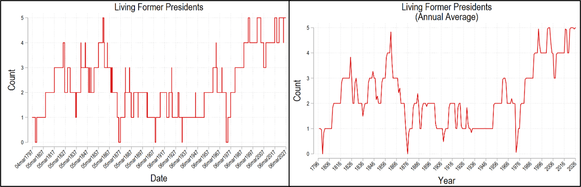
The historical maximum number of people who both 1) leave office and 2) live simultaneously with others is five. It first happened in 1861 when Abraham Lincoln (16th) was president for just under a year before John Tyler (10th) died in 1862. Since then, the number of living ex-presidents has been mostly below four if not below 3.  The figures below graph the number of people living who have been US president. The left graph uses daily data and the right uses the annual average (weighted by day).

In fact, besides Washington, we’ve had four other periods when there were ZERO ex-presidents living. The first was under Grant (18th). This changes my perspective of that period. Living ex-presidents provide a sense of continuity – that something from the past continues today. They give us hope that our country will continue into the future. Grant presided over part of the reconstruction era. For part of this presidency, there was no one else who knew how he felt and no living person who had been in his position. What a tenuous time!*

The other presidents who, at some point, had no living predecessors were Theodore Roosevelt (26th), Herbert Hoover (31st), and Richard Nixon (37th). But since 1981, we’ve had three or more living presidents. So, most of us feel like that’s “normal”. Imagine if there was just Trump, and that’s it. That’d feel jarring.

1) Are More People Becoming President?

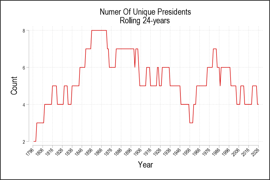
A presidential term is four years and only one president was in office for more than two terms, Franklin Roosevelt (32nd). Let’s take a 24-year trailing average. With 8-year tenures, the least number of presidents is 3. With 4-year tenures, the greatest number of presidents is 6. Assassinations and other deaths of sitting presidents can push the number higher. The graph below is the number of unique people to act as head of state over the prior 24 years (I say ‘unique’ because Cleveland (22nd & 24th) and Trump (45th & 47th) both served two non-consecutive terms).

We can conclude that the number of unique presidents is not exceptionally high at this time. The historical average is about 5.2 unique presidents. We’ve been below that since 1998 owing to a higher proportion of two-term presidents since then. Before Biden (46th), Bush (41st) was the last time that we had a one-term president. So, in terms of executive regimes, the 21st century has been unusually stable. But this stability also places downward pressure on the number of surviving ex-presidents. So, we’ve had many living ex-presidents despite our few regime changes. Reason 1) doesn’t explain why we have so many living ex-presidents now.

2) Are President Lifespans Longer?

Continue reading

Yes, Americans Probably Are About 46 (or Maybe 65) Times Richer Than in 1776

My post and chart from last week showed the phenomenal growth of average income in the US since the Founding. Using GDP per capita historical estimates and adjusting for inflation, this figure is about 46 times greater today than right around the time we declared independence.

It will probably not surprise you that some folks were skeptical. Could this really be true? Two major objections were raised to using GDP per capita. First, wouldn’t it be better to use a median income value rather than a mean (simple average)? Second, wouldn’t a measure of wages be better than GDP per capita?

I really would like to show you an annual series of median income data back to 1776, but unfortunately it just doesn’t exist. Good median income data are hard to find much before the 1950s, much less the 1770s. However, while median values are often better for showing levels, the growth rates of median wages and mean wages aren’t that different for periods when we have comparable data. Consider the following chart, which compares median wages (as calculated by EPI using CPS data) and mean wages (from BLS’s series for non-supervisory workers) since 1973. I have stated these in nominal terms, so don’t take this as real growth rates, but rather it is a raw comparison of two series (we could apply the same inflation adjustment to both, but that won’t change the picture, only the numbers).

Median wages increased by 667% and mean wages increased by 657%, almost identical. Again, these aren’t inflation adjusted, but that’s not the point of this exercise. The point is that whether you use mean or median wages, at least since 1973, the growth rates are the same. Was this true if we went back another 200 years? We can’t say for sure. But many people have this same skepticism about mean wages in recent decades. I think it is better to use median values when you have them, but we shouldn’t throw up our hands and claim we know nothing if all we have is mean wages.

Next, consider the following chart. It begins in 1790, but instead of using GDP per capita, as I did last week, it uses a measure of average wages from economic historian Lawrence Officer. This measure is for “production workers in manufacturing,” and it is a total compensation measure, meaning that it will include the value of fringe benefits as well — though these aren’t noticeable in the data until the 1930s. This is still an average value, but because it is for manufacturing laborers, it won’t be distorted by the wages of managers and owners in that industry, and it won’t be affected by the growth of new industries that might require more years of education (indeed, manufacturing wages are lowering than overall average wages today, so this is taking the hard case). I have also included a second line, which only includes manufacturing wages (not benefits) that I have blended with Officer’s compensation series starting in the 1930s, in case you think including benefits is somehow “cheating.” (Note the log scale again, as in last week’s chart.)

The trends here are very much in the ballpark from the GDP per capita chart I created last week. Using total compensation, wages are 65 times higher than in 1790. Using only wages, they are 49 times higher. Notice that these are both better than the 46 times multiplier using GDP per capita. How is that possible, since I am using the same price deflator in both cases? First, average hours of work have fallen significantly since the 18th century, so incomes haven’t risen quite as much as wages. Second, there was a bit of a decline in GDP per capita during the Revolutionary War, and if we use 1790 as the baseline for GDP per capita, the multiplier is 63. But again, these numbers are all in the ballpark: whether the true figure for a typical American is 46x, 49x, 63x, or 65x, this is a tremendous amount of economic growth.

If you want to look at that chart pessimistically, you will see that there is some reduction in growth rates in the past few decades. That’s true whether we use wages or compensation. This is a well known issue, and has been discussed endlessly in academic papers and on social media. I don’t want to glaze over it here, but I mostly will: the long-run trend of growth in the US is amazing. That’s true whether you use GDP per capita, or wages or compensation for production workers.

So once again, Happy 250th Birthday to the USA and all of you living in the wake of that amazing 250 years of economic growth!

Fiscal Trends: USA’s 250th (And the Government’s 237th)

We celebrate 250 years since the Declaration of Independence was signed on July 4th, 1776. That’s the day that we celebrate our country’s birth. So, it’s very American of us to celebrate the day that we merely declared independence (not the day that the revolutionary war ended). We simply said we were independent from the crown. Regardless, we celebrate 250 years as a people. BUT, our government is only 237 years old.  The current constitution replaced the articles of confederation in 1789.  So there are some caveats to the whole semiquincentennial thing.

An important distinction that is baked into the American pie is that we are not our government. Our government is younger than we are. Our government has a piggy bank called ‘US Treasury’. It can spend and borrow for the US national government. It can also impose tax liabilities on the population in order to service those outlays. Now that it’s the government’s 237th birthday, what’s its basic financial track record?

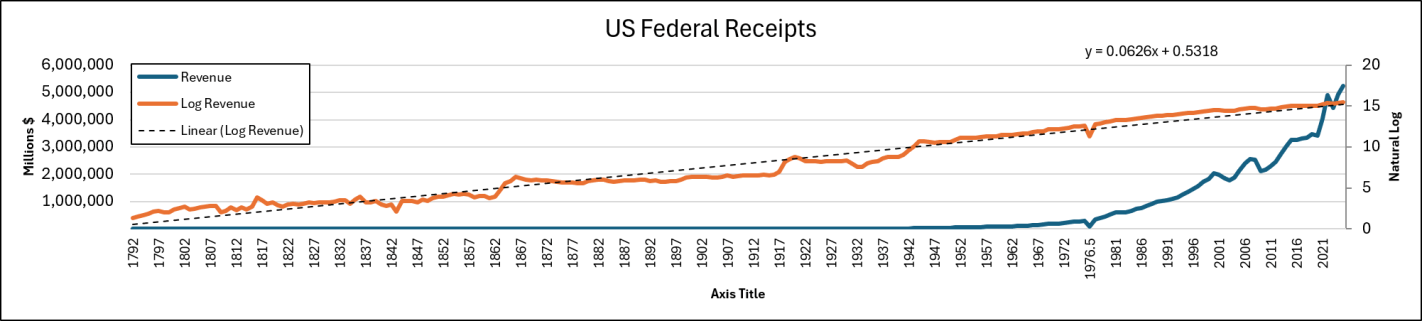
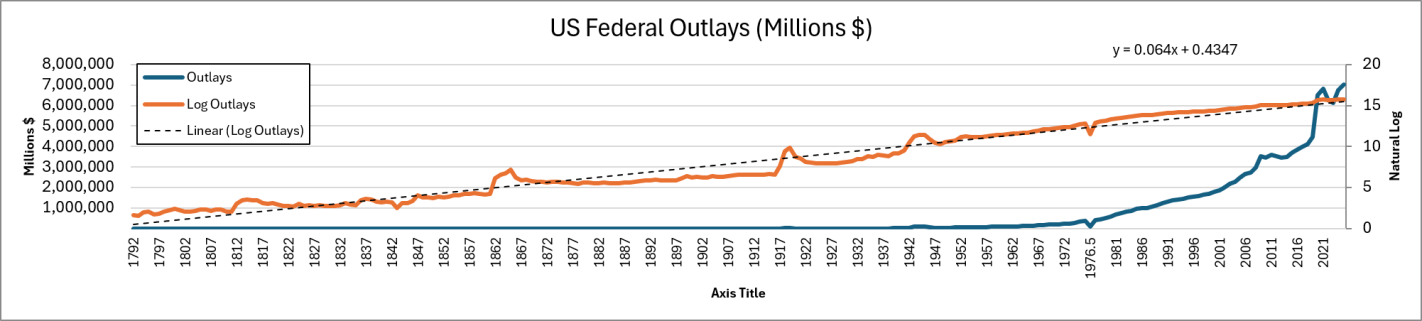
I like to think in the long run, for better or for worse, and I don’t like to get hysterical. So, let’s look at the full span of the 237 years – well – 235 years. The oldest annual data that we have is from Bicentennial Historical Statistics, which goes back to 1792. Below are the series for Federal Receipts and Outlays (revenue and spending).

The blue line is in nominal dollars and the orange line is the natural log so that we can see the changes in growth rates more easily. These aren’t inflation adjusted numbers, so we should expect to see some inflationary patterns. Long-run inflation was pretty stable prior to the 1913 Federal Reserve act and wee can see that reflected in both series. There was some drift upward in terms of revenue and expenditures. But the primary pattern was one of punctuated rises followed by plateaus. That’s a pretty standard ratcheting leviathan pattern. There’s a bump up for the big events in the first half of our history: the War of 1812, Civil War in 1861, and World War I in 1917.

Then, after the great depression and leaving the gold standard (mostly), in about 1933 a new and positive trend in cash flows began. In fact, it’s amazing how consistent the raw nominal series is.  We can see where World War II is in the series, but after that we appear to have traded punctuated increases for steady increases. Even the higher inflation rates of the 1970s look pretty muted and on trend (Btw, the blip in 1976 is a record-keeping artifact. There was a 3 month gap-period when the US government changed its fiscal year start/end). Even the new growth in total cashflows seems to be slightly bending downward and growing a little more slowly.

But rest assured, spending has exceeded revenues. Below is the long run deficit. I don’t take the log for this one since there are negative numbers. It’s hard to tell from the line graph, but the first big and persist swing in the deficit arrived after the Fed was established and the onset of WWI. The deficit hit $9 billion in 1918, which was 10x the prior peak of $0.9 billion at the end of the civil war in 1865. Notice that the above government revenues stayed flat or fell after 1920, but the outlays began trending upward before the revenues. The deficit doesn’t really start its long, steady march until 1932. Of course, for the past quarter century, the national government has been in a deficit mess (even if you measure the proportion of GDP).

Continue reading

Happy Birthday, USA

For America’s 250th birthday, my present to all of you is this chart showing our economic history. Average income in the US has increased dramatically since the country was founded. This chart attempts to provide one, continuous series, using the best available income data and inflation adjustments (well, mostly continuous — before 1790 there are just a few estimates). Sources are listed at the bottom of the chart. The y-axis is a log scale.

Greenspan’s Unknown Ideal

Alan Greenspan died this week at age 100. He was the Federal Reserve chair during my entire childhood.

But since I wasn’t really following markets and macro at the time, I don’t think of him in terms of monthly announcements about interest rates. What I find most interesting now is the winding personal and intellectual path he took to become a long-serving Fed chair.

He studied clarinet at Julliard before later getting economics degrees at NYU. He supposedly attended the famous 1944 Bretton Woods conference that organized the post-war international monetary system- but as part of an orchestra, not as a monetary economist. In 1966 he coauthored “Capitalism: The Unknown Ideal” with Ayn Rand, where he argued against antitrust and consumer protection laws and for the gold standard. This may be why my intro macro professor Bobbie Horn always referred to Greenspan as “Ayn Rand’s boy toy”.

His advocacy for the gold standard is striking given that just two years later he would join the campaign of Richard Nixon, who took the US off the gold standard in 1971. Then Greenspan would go on to chair the Fed in the now-standard discretionary manner while making, as far as I can tell, no attempts to move it back in the direction of a gold standard.

While it’s unclear whether Greenspan’s unusual path improved his ability as a Chair, it was at least possible then to reach the office by his somewhat unusual path. Since his 1987 appointment the path to the highest appointed offices narrowed to include only more conventional candidates. Randy Barnett and Josh Blackman noted this in a 2015 article on the Supreme Court:

earnest, platinum-résumé’d law geeks have their eyes set on “the Big Bench,” so they keep tidy lives because they think they might someday face a confirmation hearing. It is an unfortunate reality today that to be a judge, you cannot hold vehement opinions prior to the nomination and confirmation process.

I see similar forces at work in economics, where the 50 economists who have a shot at being Fed Chair and the 500 who think they do all hold their tongues. But what does that mean for the kind of Fed Chairs we get?

the truth about SCOTUS-wannabes who “trim their sails” and limit their potential based on a fear of a future confirmation hearing: Such persons lack the character a justice needs…. “Courage is a muscle. You develop courage by exercising it. Sitting on the fence is not practice for standing up.” Imagine what it takes to live your whole professional and personal life as a “justice-in waiting.” These SCOTUS-wannabes spend their careers seeking the approval of others, in the hopes that one day they will be nominated because of their friendships across the political spectrum. 

Barnett and Blackman argued that this should change, and I think this is now in the process of changing again:

Such willfully “stealth candidates” should be disqualified from consideration for the Supreme Court…. We need jurists who are fearlessly committed to the rule of law, reputation be damned…. Paper trails are an asset, not a disqualification.