The Washington Post recently ran a fun, data-filled article on berry consumption and parenting. Lots of good tidbits in the article, including that Americans eat a lot more berries than in the recent past, and that a lot of the availability is thanks to foreign trade and imports. But despite being somewhat light-hearted, the article does seem very negative, especially in the title and introduction, about how parents are spending a lot of money on berries.
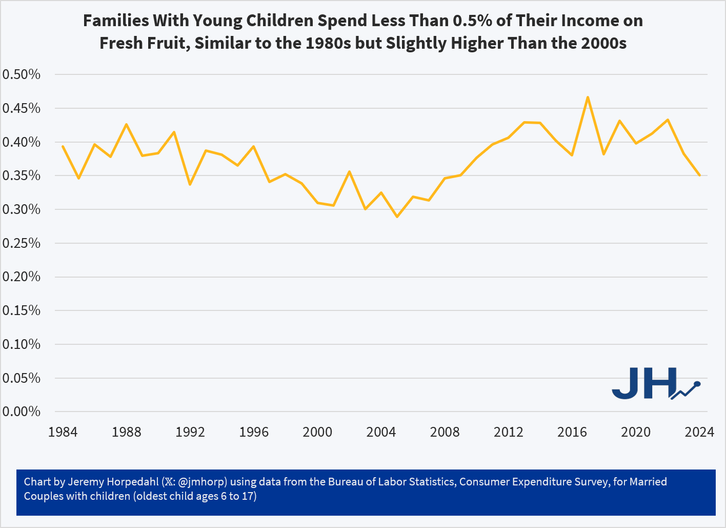
First things first, are berries breaking the budget for parents? Probably not. While the Consumer Expenditure Survey doesn’t give us data on specific types of berry spending, the broader category of Fresh Fruits is a very small share of consumer spending. It has pretty consistently consumed between 0.30% and 0.45% of income for families with children over the past 4 decades. That’s less than $1 out of every $200 of income. True, there has been a slight rise since over the past 20 years or so, but this is still a small share of the budget.
On average, families with children are spending around $600 per year on Fresh Fruit. And that’s all fruit, not just berries! Just a little over $10 per week. But even for an item that families spend a small share of their income on, such as eggs, perhaps the fact that prices have increased so much recently makes families stand up and notice. Berry spending might seem out of control, even if it’s a small share of income.
What does the price data on berries show? My usual source on this the BLS average price data that forms the basis for the CPI, but they only publicly publishes a series for strawberries, not the other famous berries (blueberries, raspberries, etc.). There is one chart on prices in the WaPo article, but it only compares strawberries to bananas over time (they got both of these from BLS). Because banana prices have been very stable in nominal prices over time, it looks like strawberry prices are exploding! But it’s really more notable that banana prices haven’t rise.
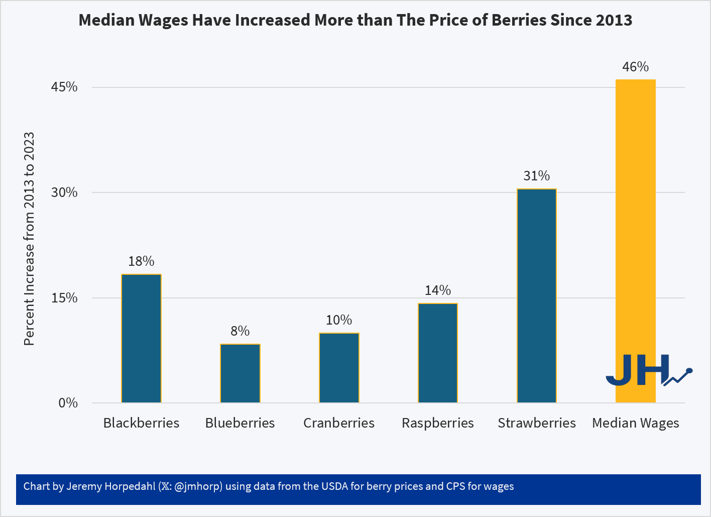
USDA does have some fruit and vegetable specific retail price data, but it only goes from 2013 to 2023. That’s shorter than I would normally like, but it can give us a clue about whether there has been some recent explosion in berry prices. And ending in 2023 isn’t ideal either, but overall inflation has been moderate since 2023, so it’s probably an OK source to use. Here’s what the data shows (prices are for fresh berries, except cranberries which are for dried):
Relative to median wages, berries of all kinds are now more affordable than a decade ago. Parents may still feel squeezed by all the berries their kids are eating, but in terms of affordability and share of the family budget, there is probably no need for a Berry Panic.
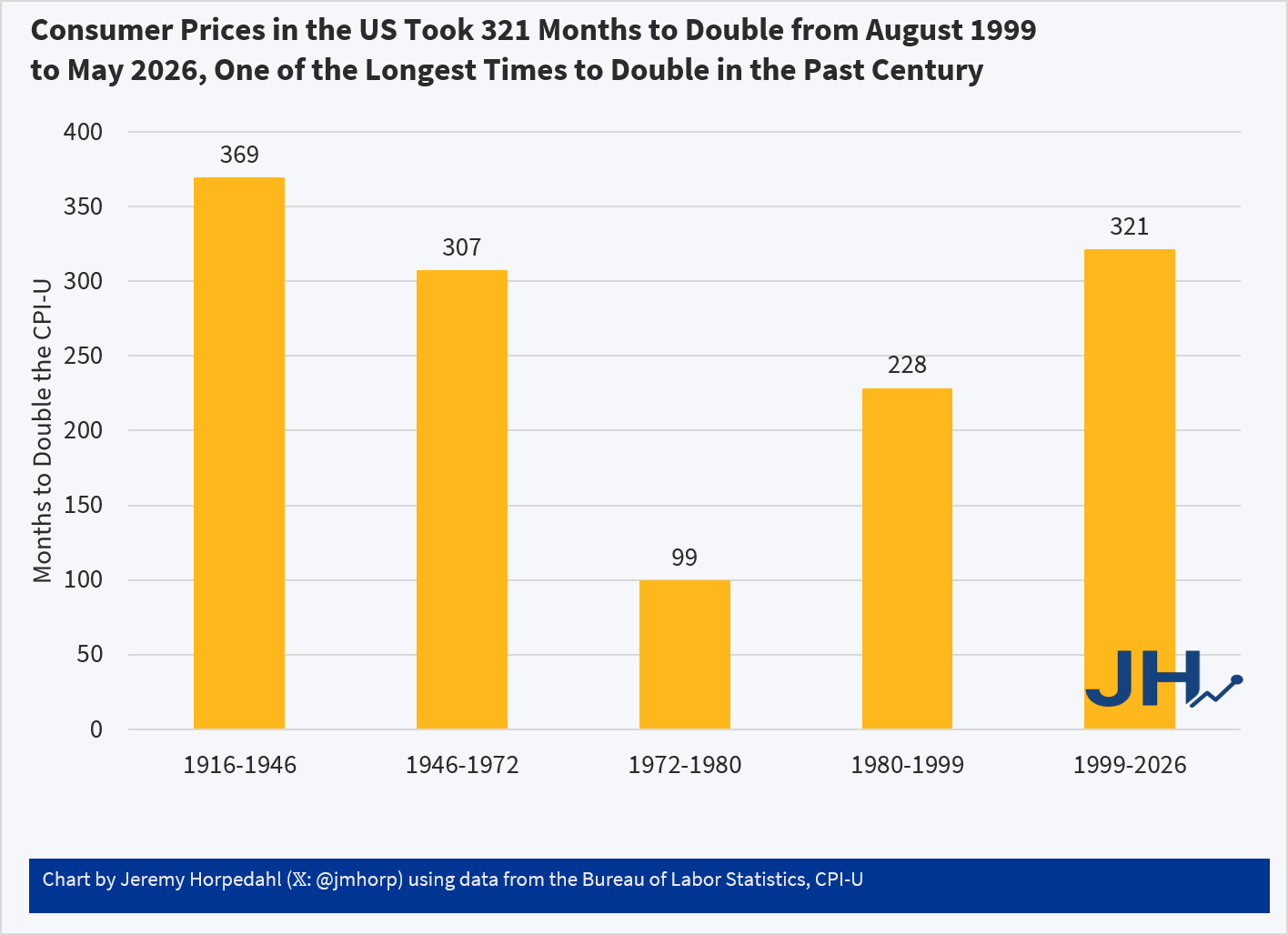
Two years ago I wrote about post about how long it took consumer prices to double in the US. The most recent time period looked pretty good compared to most of the 20th century. But lately I’ve seen a lot of social media posts talking about prices doubling (e.g., “you need twice as much income as the 1990s to match the standard of living back then”), so it’s worth looking at again.
The results aren’t that different:
Using the CPI-U, consumer prices in the US doubled in the most recent 321 months. Not only is that a longer period of time to double than most of the 20th century, in the prior 321 months (November 1972 to August 1999) consumer prices doubled twice: nominal prices were almost 4 times higher in August 1999 than in November 1972!
While the CPI-U does slightly overstate inflation, we don’t get much different results if we used chained indexes. For example, using the PCEPI, it took 390 months for prices to double between October 1993 and April 2026. Either way, prices roughly doubling from some time in the 1990s to today is accurate. But wages have more than doubled since then: you only have to go back to July 2005 for average wages to double (they are up 139% since August 1999 and 190% since October 1993). Or if we use a median wage series (such as EPI’s using CPI data), nominal wages doubled from 2002 to 2025 (I have readjusted that series back to nominal wages). In real terms, median wages are 22 percent since 1999 and 29 percent since 1993.
Of course, it would be better if prices weren’t doubling over any time frame! But the most recent doubling of prices that we lived through is the longest period to double in the lifetime of almost everyone alive in the US today.
Over the years, many people have tried to create alternatives to the CPI for measuring inflation. Probably the most famous is “Shadow Stats,” which Tim Lee has convincingly shown isn’t actually measuring price inflation (it’s just adding a fixed factor to the CPI).
But the CPI critics keep coming. One that was recently released is called the “Reality Index.” This index tries to improve on the CPI-U in two ways. First, it uses fixed weights for the items in the basket, and importantly it uses the 2024 weights and applies them to past years (this is called a Paasche index). Second, it takes out some BLS prices to avoid using hedonically adjusted prices, and other price calculations that the Reality Index author thinks are weird.
Both of these changes are problematic. I will explain why.
1. Fixed Basket of Goods/Services Doesn’t Make Sense
Many critics of the CPI complain about the shifting weights in the CPI. “We just want to measure the cost of a fixed basket over time.” But measuring a fixed basket over time isn’t actually that useful. I will explain why in a moment. But that’s not even what the Reality Index does! Instead, it takes the 2024 CPI weights (which come from the Consumer Expenditure Survey), and then consistently applies those weights to past years. The Index isn’t measuring the cost of a fixed basket of goods from some past year — it is using the 2024 basket, and assuming that’s what people consumed in the past.
The author of the Reality Index, Tom Elliott, is either confused about this or is being deliberately misleading, for example in a recent WSJ essay promoting the Index, he says “That same basket, the one the government says rose 1.87 times since 2000, has actually risen about 2.4 times.” But that’s false. To do that calculation, you would need to use the 2000 CPI weights and follow them forward to 2024 (this is called a Laspeyres index). Instead, he uses the 2024 weights and follows them backwards. He could do the calculation that he references in the WSJ essay, but he does not.
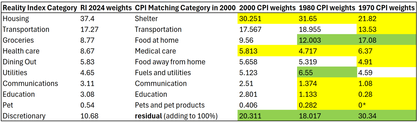
To see why this is a bad approach, let’s compare the weights in the Reality Index with a few past years. I have done my best to translate the weights for the 10 categories listed on this page to actual BLS categories, though I will admit that none of their category weights matched exactly to what I found at BLS. But I’m pretty confident it is correct.
I am also pretty confident that the “discretionary” category is just a residual for everything that wasn’t in the other 9 categories, though I can’t find them explicitly saying this. Yellow highlighting indicates the category in past years was smaller than the 2024 weights. Green highlighting indicates past years were larger weights.
The first thing you might notice is that the CPI weights have changed significantly over time. Relative to 1970, housing/shelter gets almost twice as much weight today. Conversely, groceries/food at home gets about half the weight today as it had in 1970. The “discretionary” category (the residual to make it add to 100%) used to be 30 percent of a household budget, using this approach! That should really give you pause: do we really think a typical household in 1970 considered 30% of their budget to be “discretionary”? I highly doubt it. That discretionary category includes clothing, which was over 10% of household spending in 1970 (it’s around 2% today).
Related to that, you may also notice that categories which have had above average inflation over this time frame — such as housing, healthcare, and education — all have bigger weights today than in the past. Meanwhile, food and clothing have seen less price inflation, but they are weighted much less. This process will tend to overstate inflation of the past, as the CPI in 1970 placed less weight on, say, housing, so when you put more weight on it, of course the inflation rate will go up. And indeed, as the Reality Index’s historical analysis shows, the biggest gaps in inflation between the RI and CPI were in the 1970s (4.9% gap in 1979 and 4.7% gap in 1978). But this is ahistorical: people were not spending 37% of their budget on shelter in the 1970s! In fact, they were spending almost as much on groceries in 1970 as they did on shelter.
The Reality Index is essentially projecting backwards to a fake reality of the past, because it uses the 2024 weights in all past years. But this isn’t capturing anything real about the world, and it is at best an interesting thought experiment. Of course, part of the reason people now spend more of their budget on housing and healthcare is because they have gotten more expensive and to some extent crowded out other spending. But they are also categories we might expect demand to increase as incomes increase (normal goods). And notice this is the opposite of the standard critique of the CPI: as things get more expensive, critics claim the CPI assumes people spend less on those items. Instead, the CPI-U weights are updated each year based on the latest Consumer Expenditure Survey data, and goods/services with higher rates of inflation now consumer more of the weight of the CPI than in the past.
(*Note: the “pet” category is listed as 0% in 1970 because BLS didn’t itemize it separately due to it being so small. That’s of little consequence, since it is such a small share in every year — I’m surprised they didn’t just stuff pets in the discretionary category.)
2. Swapping Quality-Adjusted Measures for Nominal Prices is Often a Bad Idea
Using the 2024 weights for past years is reason enough to not find the Reality Index useful. But let me just say a few words about the substitute prices that the Reality Index uses. The changes are either trying to use something that isn’t hedonically adjusted for quality, or to overcome some of the strange calculations, especially for housing and health care.
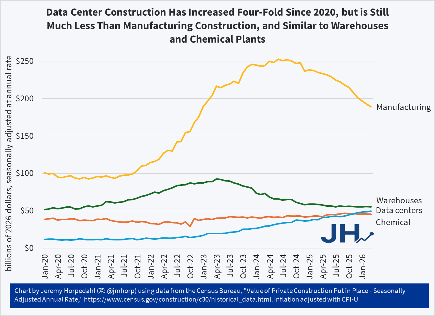
Data centers seem to be popping up everywhere. And based on the value of current construction, the US is indeed building a lot more data centers than we were in 2020 or 2021, about four times as much data center construction (inflation adjusted).
But… did you know that we build a lot more good-old manufacturing than data centers? Almost four times as much in recent months. And that’s even after a decline in manufacturing construction over the past year and a half.
The US also builds about the same amount of warehouses and chemical plants as we do data centers. Data centers may exceed those two categories in a few years, but for now they are pretty similar.
Keep in mind that manufacturing and chemical facilities also use a lot of electricity and water, and have plenty of local negative externalities! Warehouses probably have a lot less resource consumption and external effects, but it’s not zero either.
Are data centers popping up everywhere? Well, people are certainly noticing them. But so are lots of other types of buildings, which rarely register more than a peep from concerned citizens and local media, unless there is some clear and obvious external effect.
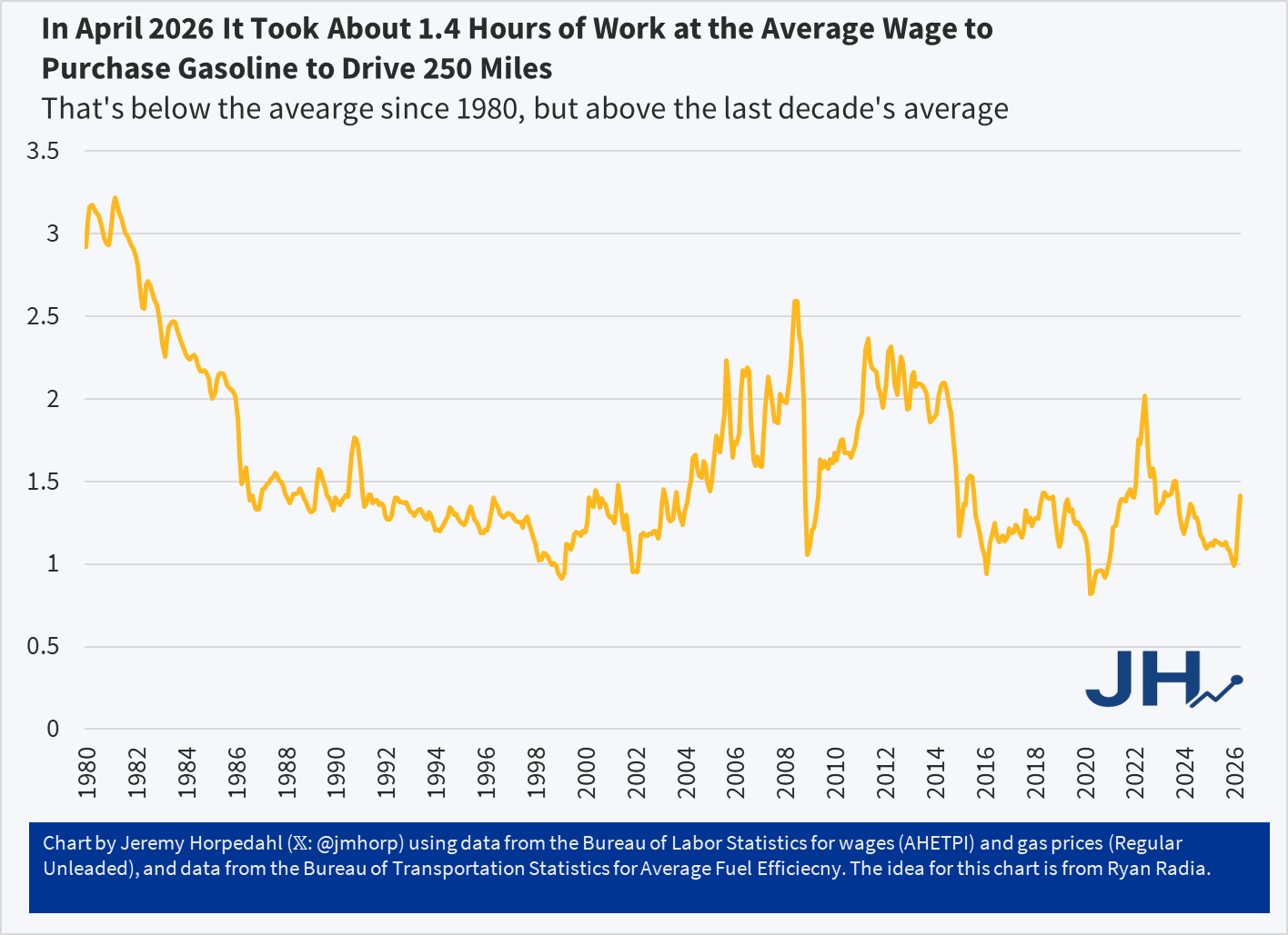
Two months ago I wrote about gasoline prices and tried to give the current prices some historical context. Gas prices have, of course, only continued to increase since then. Here’s a chart I created to give a bit more context, using an idea from Ryan Radia: how much does it cost to drive a car 250 miles? Since fuel efficiency has increased over time, we might be understating how much it costs to drive today relative to the past. And of course, to give the “cost” proper context I have stated in terms of hours worked at the average wage (note: the final data point is from April 2026, as we don’t have wage data for May yet):
In April 2026 it took about 1.4 hours of work at the average wage ($32.23) to purchase enough gasoline to drive 250 miles (10.7 gallons) at the average fuel efficiency (23.4 miles per gallon). That average fuel efficiency figure is from 2024, the latest available, so it could be a bit higher today. Maybe it’s a little easier than 1.4 hours of work to buy it, but even if fuel efficiency had crept up to 25 mpg (that would be a big increase in 2 years, historically speaking), it would still be 1.3 hours of work.
1.4 hours of work is certainly a big jump from earlier in 2026, but you’ll notice it is still on the low end in this chart, and well below the peak we saw in June 2022 of just over 2 hours of work to buy 250 miles worth of gasoline.
But 23.4 miles per gallon is pretty low, as this is includes lots of trucks and SUVs with pretty bad fuel efficiency. What if we looked at some more fuel efficient vehicles?
Here’s a few I checked on (all for 2026 models, with gas and electricity at current national averages):
Toyota Camry: 0.71 hours of work
Chrysler Pacifica Hybrid: 0.61 hours on electric, 1.18 hours on gasoline
Tesla Model Y: 0.37 hours of work
It will probably not surprise you that the all-electric Tesla Model Y is cheaper than the average car to operate at current prices, but you may not have realized that it is almost four times cheaper. But the Toyota Camry, with all models operating as hybrids now, also comes in pretty good at about half the cost of the average vehicle to operate (and the Camry is a very affordable car to purchase). The Chrysler Pacifica hybrid minivan does pretty well too, though even operating only on electricity (30 miles at a time), it’s only slightly more fuel efficient than the Camry.
This is a “guest” blog post that I asked Google Gemini Pro to write. Data centers are increasingly becoming a political issue in communities across America. People are asking questions like: “Why do we need these things? How much water will this use?” Because these are sometimes referred to as “AI Data Centers,” people might assume that data centers are primarily about creating cat memes and fake videos. And it’s true that’s a part of AI, and it’s true that much of the new data center construction is for AI.
But… data centers have been around for a while. People are only now taking notice of them, for the most part. To better understand this issue, I asked — what else? — AI to explain how much data centers are used in our daily lives. AI in this case means Google Gemini Pro.
I’ll paste the full guest post below, but I want to point something out first: this blog post makes no mention of AI. Instead, it talks about: GPS and mapping apps; almost everything you do if you work in an office; credit cards and digital banking; news and social media. All of these things rely on data centers and would cease to function without data centers. That’s not because I asked Gemini to leave out AI from the guest post — when I followed up on this omission, Gemini said “It was a calculated omission—partly to keep the focus on the immediate ‘analog’ shock to daily life.” Most people probably wouldn’t care of they lost the ability to create funny images with AI. They would care if they lost all of their photos, access to their Dropbox account, and the ability to send email.
You could interpret all of this as saying we are “too dependent” on data centers and the modern Internet. You could also say we are “too dependent” on electricity. Or modern plumbing. Or modern supply chains. Or agriculture. Modern life is based on modern technology. I don’t know if it really makes sense to say we are “dependent” on these things, other than that we use them and they are beneficial.
Anyway, on to the guest post from Google Gemini Pro:
The Day the Cloud Evaporated: Life After the Data Center Collapse
Imagine waking up tomorrow morning in your suburban home in Ohio, or your apartment in Seattle. You reach for your smartphone to silence the alarm, but the screen is a stubborn, glowing rectangle of error messages. You try to check the weather, but the app’s spinning wheel never stops. You try to text your partner, but the message stays “Sending…” until it eventually fails.
This isn’t just a bad Wi-Fi connection. Every data center on Earth—those massive, humming warehouses filled with silicon and cooling fans—has vanished. In an instant, the “brain” of the modern world has been lobotomized. For the average person in the United States, life wouldn’t just slow down; it would fundamentally reset to 1950, but without the physical infrastructure of 1950 to catch the fall.
Congressional districts must be redrawn after each US Census. In fact, that is one of the main functions the Census: to determine how many seats of the US House of Representatives that each state is allotted. A related function is to give states information about the distribution of the population in their state. Even if a state doesn’t gain or lose seats after a Census, the population in their state may have grown, shrank, or simply moved around within the state. If each Congressional district is to represent roughly the same number of people, district boundaries will still need to be redrawn even absent a change in the state’s total share of the US House seats.
That much is clear. However, given that historically and still largely today Congressional districts are drawn by state legislatures, there is a temptation and a real possibility that the party in power of a state legislature will draw boundaries in a way that benefits that party. There is nothing illegal about doing this as far as the federal Constitution is concerned (that I am aware of), but it does seem a bit unsporting. But I guess much of politics might be deemed “unsporting.”
Nonetheless, sometimes the shape of districts is so obviously weird and not representing an cohesive group of citizens or communities that it gets the derisive term “Gerrymander,” which derives from a historical example of a very odd looking district. But even if a district doesn’t look weird, it may still give one party an advantage that some deem unfair, such as by diluting one party’s supporters into multiple districts so they get no seats, or alternatively cramming all the supporters into one district so they have a very lopsided victory in just one district, rather than controlling multiple districts. This practice is known as “partisan Gerrymandering,” and it will be my focus in this post today (there are other forms, such as racial Gerrymandering, which are also important but are beyond the scope of this post).
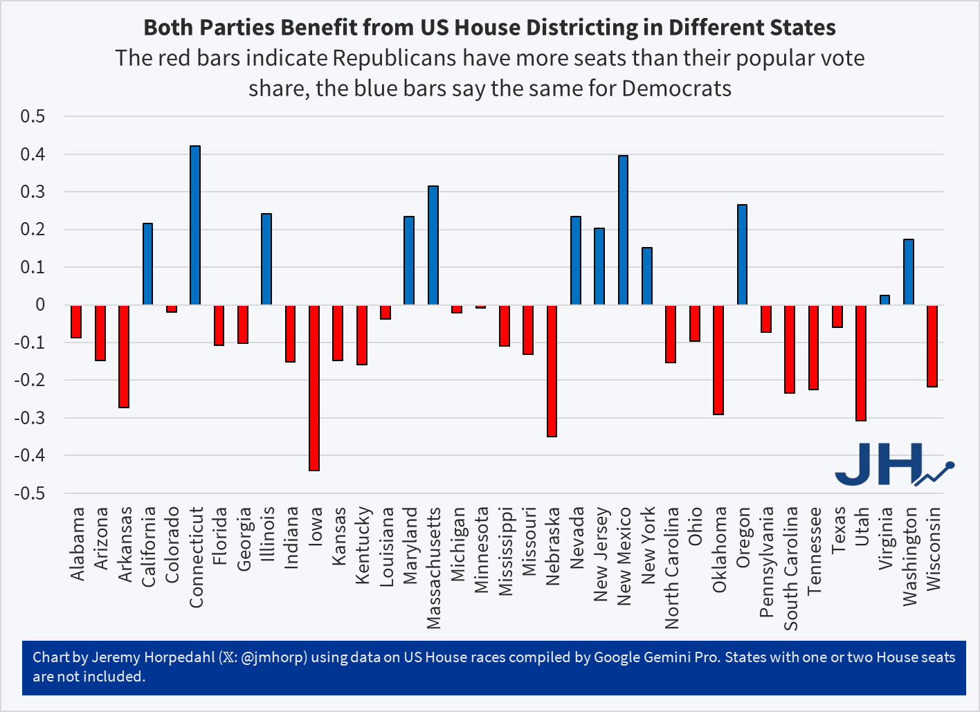
Surely this practice occurs. Some states have tried to avoid it the problem of Gerrymandering by using non-partisan commissions, though this is a minority of states (less than a dozen), and when push-comes-to-shove they don’t actually seem that committed to the idea (both California and Virginia have essentially abandoned these commissions in 2025-26 to attempt to, once again, gain a partisan advantage). But lately a particular question has come up: does partisan Gerrymandering benefit one major party more?
In total for the US House, whatever Gerrymandering at the state level that is happening seems to roughly wash out in national representation: in the 2024 election, Republicans received about 51.7% of the two-party share of votes totaled over all House elections, and Republicans have about 50.6% of the seats in the House. Perhaps you could say that the GOP effectively loses 5 seats to what they “should” have in a truly proportional sense, but this ignores many factors, some of which I will discuss below. But even so, the GOP has a slim majority in the House and they won a slim total of national House votes. It’s about right.
But that “washing out” at the national level ignores some very large disparities at the state level. In some states, one party has all the House seats, even though they got nowhere near 100% of the House vote. Many of these are states with 1 or 2 House seats, which are less interesting because either there is no possibility of Gerrymandering (1 seat) or there is no obviously “fair” division, but it is not only those small states. For examples, Massachusetts gives all 9 seats to the Democrats, even though Republicans received 31.5% of the two-party vote share. Do Republicans deserve 3 of the seats? Is the fact that they don’t have 1/3 of the seats evidence of Gerrymandering? Conversely, in Oklahoma Republicans hold all 5 seats, even though Democrats got 30% of the vote. Should Democrats get a seat or two in Oklahoma?
(Note: for all vote data, I have queried Google Gemini Pro. I found multiple errors along the way, but I am fairly confident the numbers are all correct now. Please let me know if you spot any errors).
Neither Massachusetts nor Oklahoma’s Congressional representation is an obvious case of Gerrymandering on its face. It’s possible that 1/3 opposition party support in both states is perfectly even distributed across the state, such that it would not be possible to draw any “fair” districts that give the opposition roughly 1/3 of the seats. But it could be the result of Gerrymandering, or at least an indication we should look deeper. We can tally up all of the differences across states in the following chart:
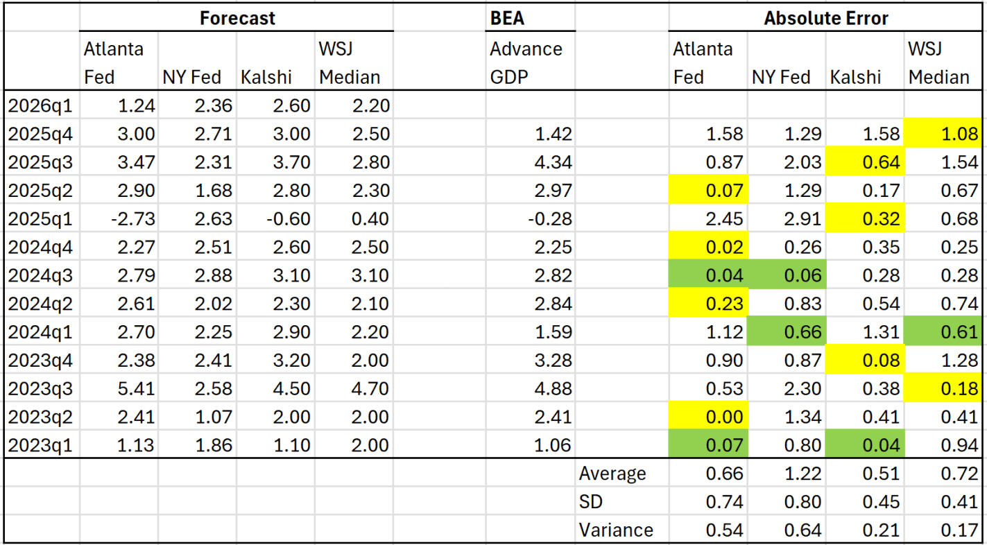
Forecast models, betting markets, and surveys of experts all drastically overstated the actual growth of GDP in the last quarter of 2025. They were off in the initial release, which was just 1.4 percent, but this was even further revised down to 0.5 percent. All four of the sources I track were forecasting over well over 2 percent, with some over 3 percent.
Does that mean we shouldn’t trust the forecasts? Perhaps, but last quarter was largely pulled down by government spending cuts, which the models completed missed. You can see this very clearly in the Atlanta Fed GDPNow model. Perhaps they shouldn’t have been surprised by this drop in government spending, but that is where the major error was.
So what do these forecasts think about the first quarter data for 2026, which comes out tomorrow? The two best predictors historically, GDPNow (Atlanta Fed) and Kalshi, are pretty far apart on this one, over a percentage point difference, with GDPNow being the only forecast under 2 percent:
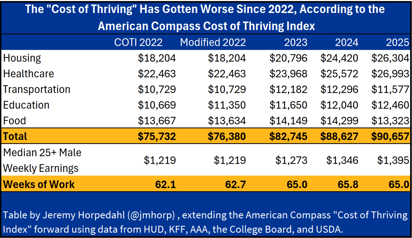
The Cost of Thriving Index from Oren Cass’s American Compass is an attempt to calculate how well US families are doing financially, but without using traditional inflation adjustments to income. Instead, Cass and crew have chosen 5 categories of goods and services, and tracked those over time relative to median earnings for men ages 25 and older (in the baseline model — it can also be applied to different categories of workers).
Scott Winship and I wrote a detailed critique of the COTI, which I summarized in a previous blog post. Our critique comes from several angles, including correcting several major errors in COTI, as well as arguing that standard inflation adjustments to median income are superior to this new approach.
Based on our critique, I don’t think COTI is a very good measure of how well US families are doing financially. But the COT Index still has many fans. And Cass seems to think Trump is in large part pursuing many policies that should help out US workers and families, such as Trump’s tariff policies. Thus, it will be useful to see if Trump’s policies are leading to American workers “thriving” in the first year of Trump’s presidency.
Unfortunately, even using Cass’s preferred approach, Americans don’t appear to be thriving under Trump.
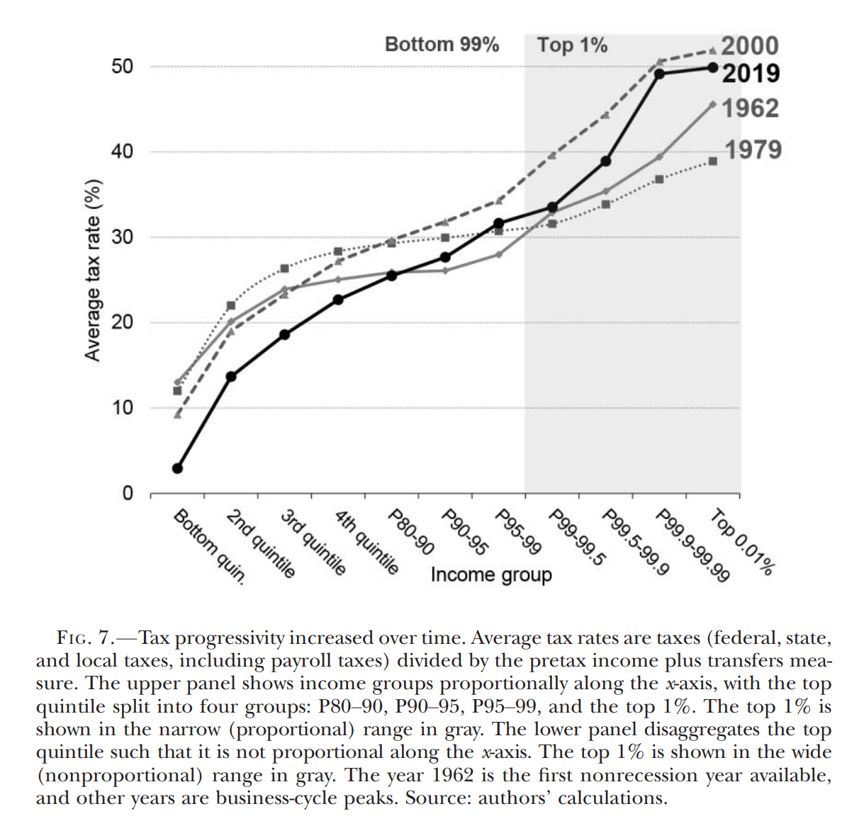
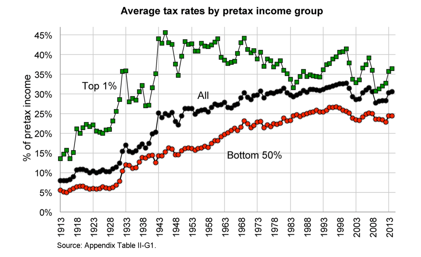
For Tax Day 2026, here are some estimates of how progressive the US tax system is, drawing primarily from published academic work. While there is disagreement about exactly how progressive the tax system is (and should be), these papers all agree that as income rises, average tax rates rise. These estimates attempt to include, as best as possible, all federal, state, and local taxes, and to take account of tax incidence.
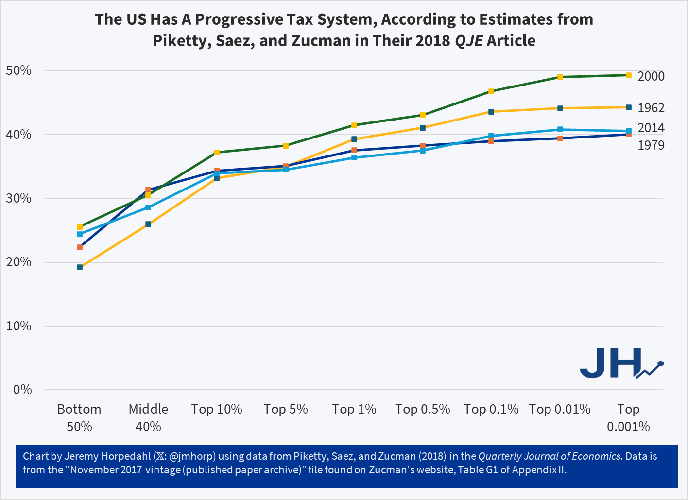
And here is a chart that I created, which comes from the appendix data for PSZ (2018), which is roughly comparable to the Auten-Splinter chart above. Note that it isn’t perfectly comparable: the income groups on the x-axis aren’t exactly the same, and the latest year in PSZ is 2014 rather than 2019 (they do have estimates for later years in updates to the work, but I am trying to stick with the published academic work). But they are roughly comparable:
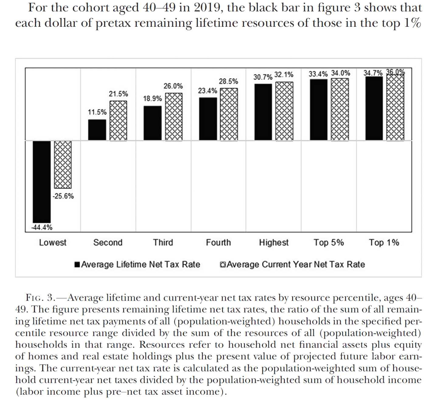
Auerbach, Kotlikoff, and Koehler in the Journal of Political Economy take the additional step of computing lifetime average tax rates, rather than for a single year, showing the US tax system is even more progressive when considered this way. Note: they also include the value of transfers, which makes these results not directly comparable to the papers above:
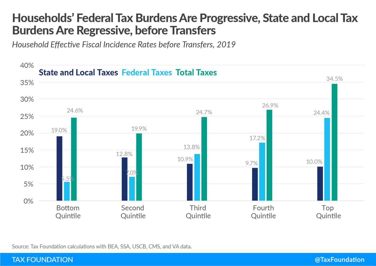
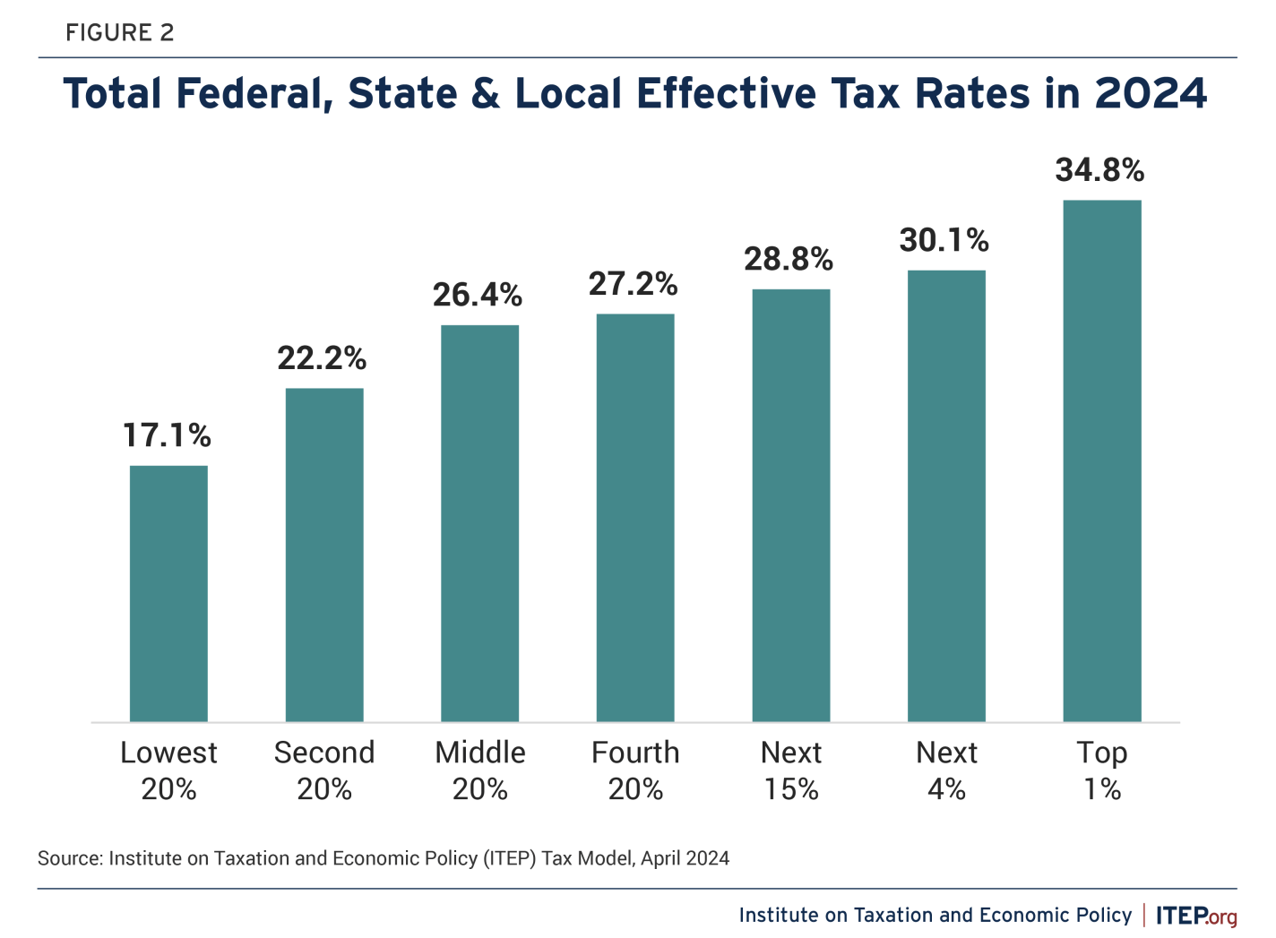
Finally, here are two estimates from think tanks that work on tax policy. Even though the Tax Foundation is considered more right-leaning and ITEP is considered more left-leaning, both agree that the overall US tax code is progressive.