For Tax Day 2026, here are some estimates of how progressive the US tax system is, drawing primarily from published academic work. While there is disagreement about exactly how progressive the tax system is (and should be), these papers all agree that as income rises, average tax rates rise. These estimates attempt to include, as best as possible, all federal, state, and local taxes, and to take account of tax incidence.
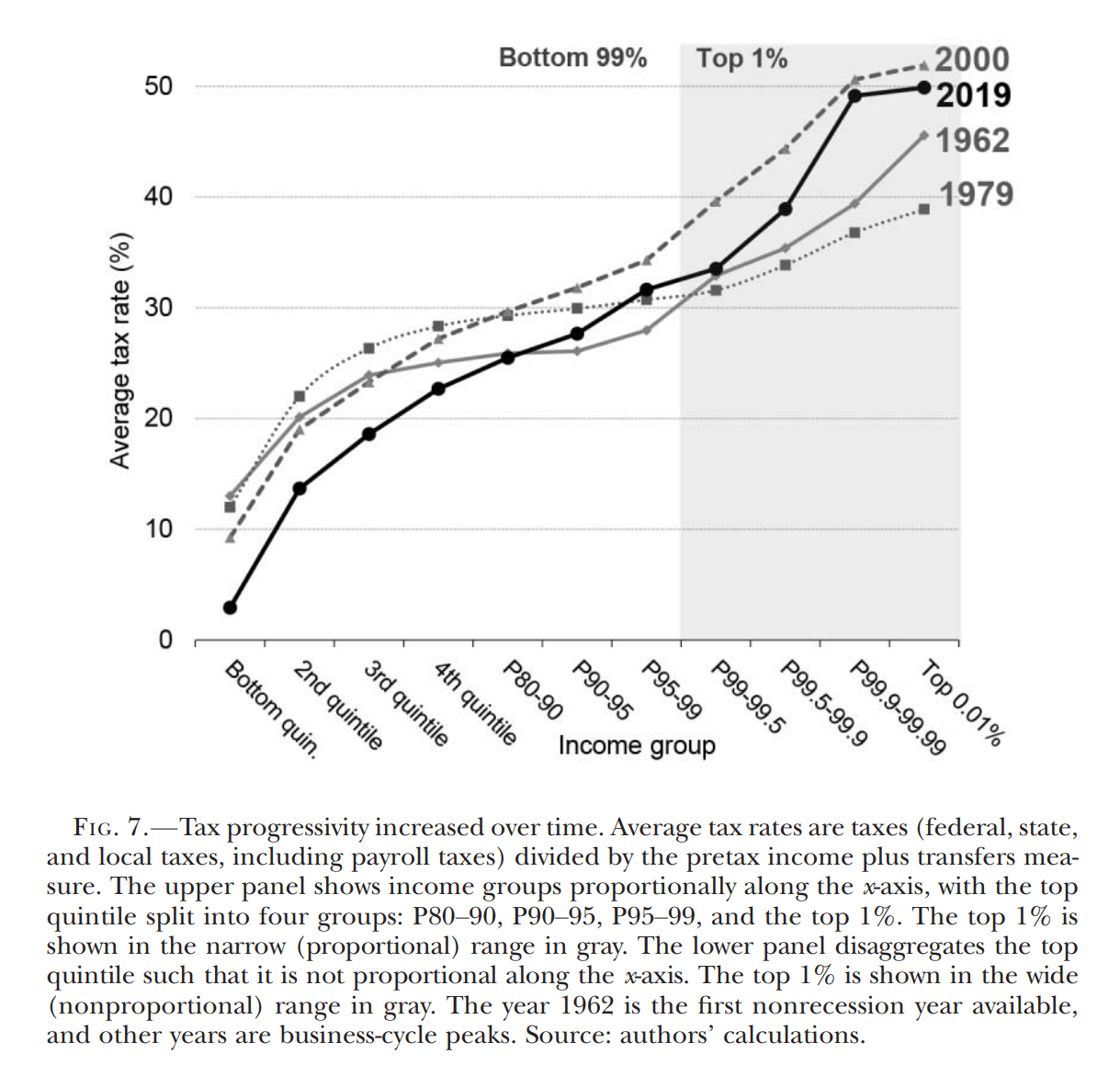
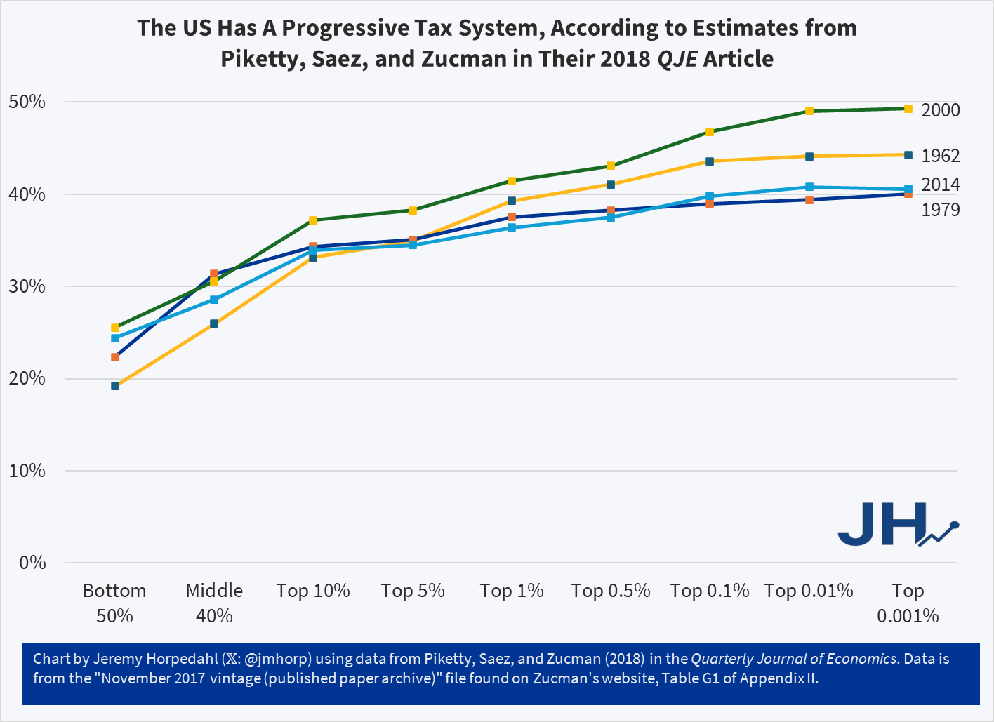
And here is a chart that I created, which comes from the appendix data for PSZ (2018), which is roughly comparable to the Auten-Splinter chart above. Note that it isn’t perfectly comparable: the income groups on the x-axis aren’t exactly the same, and the latest year in PSZ is 2014 rather than 2019 (they do have estimates for later years in updates to the work, but I am trying to stick with the published academic work). But they are roughly comparable:
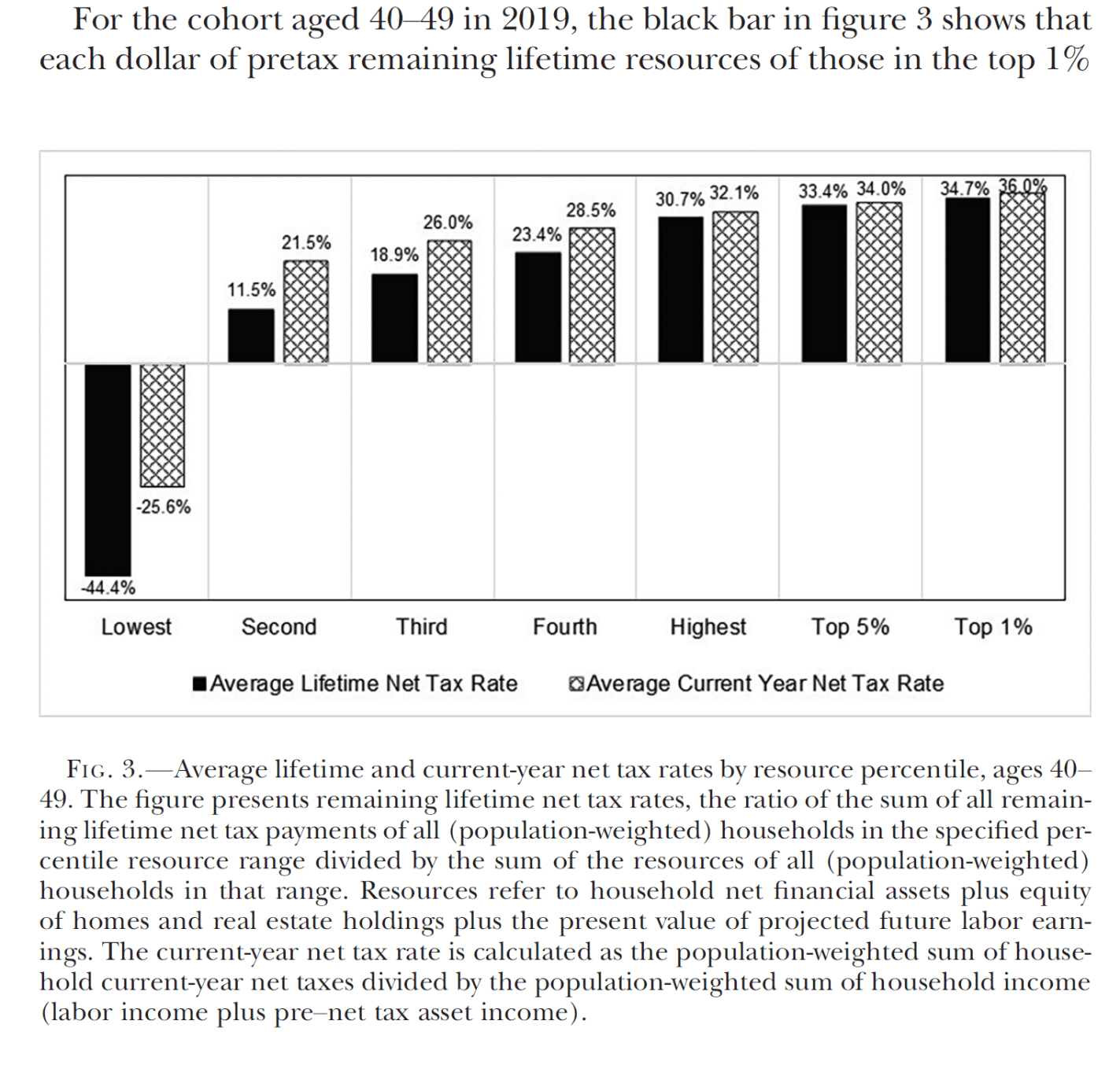
Auerbach, Kotlikoff, and Koehler in the Journal of Political Economy take the additional step of computing lifetime average tax rates, rather than for a single year, showing the US tax system is even more progressive when considered this way. Note: they also include the value of transfers, which makes these results not directly comparable to the papers above:
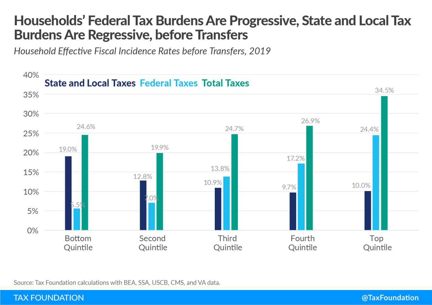
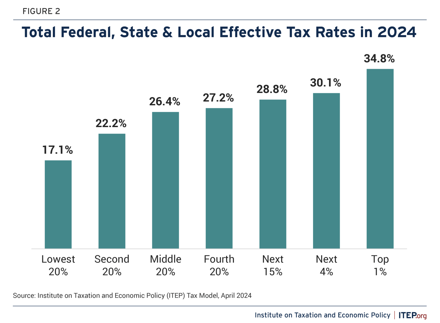
Finally, here are two estimates from think tanks that work on tax policy. Even though the Tax Foundation is considered more right-leaning and ITEP is considered more left-leaning, both agree that the overall US tax code is progressive.
A few weeks ago I wrote a post comparing housing costs in 1971 to today. I noted that while houses had gotten bigger, the major quality improvement for the median new home was the presence of air conditioning: a semi-luxury in 1971 (about 1/3 of new homes), to a standard feature in 2023. Even accounting for the presence of central air-conditioning and more square footage, I concluded that housing was about 17 percent more expensive in 2023 than 1971 (relative to wages).
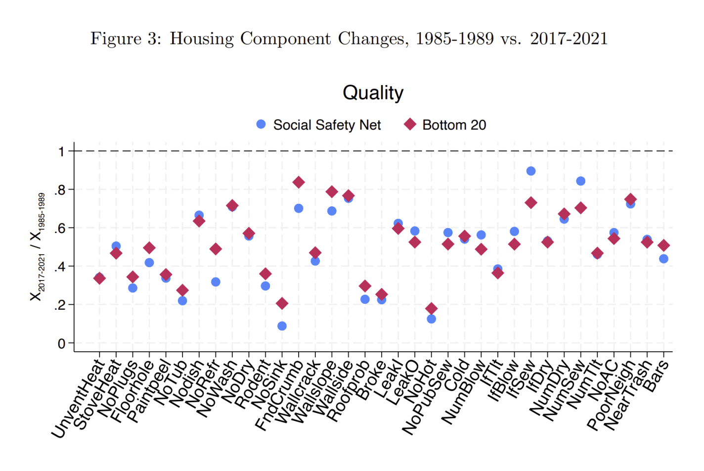
However, if we consider the housing quality of the poorest Americans, the improvements go beyond air-conditioning and more square feet. A recent paper in the Journal of Public Economics titled “A Rising Tide Lifts All Homes? Housing Consumption Trends for Low-Income Households Since the 1980s” has important details on these improvements (ungated WP version). In addition to larger homes, there was “a marked improvement in housing quality, such as fewer sagging roofs, broken appliances, rodents, and peeling paint. The housing quality for low-income households improved across all 35 indicators we can measure.”
Overall, the number of poor American households living in “poor quality” housing was roughly cut in half from 1985 to 2021, from 39% to 16% among social safety net recipients, or from 30% to 12% for the bottom quintile. The 12-16% of poor households that still have poor quality housing is much more than we would like, but these are dramatic improvements over a period when many claim there was stagnation in the standard of living for poor Americans.
This figure from the paper shows the improvements for the different features:
For example, the number of households with no hot water was just 20% of what it was in the late 1980s. Some of the other major improvements are also related to plumbing and water, such as the number having no kitchen sink or no private bathtub/shower, but there was also a big decline in the presence of rodents in the house. All of the 35 indicators they looked at showed improvements, on average a 50% reduction in the number of households with these poor-quality components. This paper only uses data back to 1985, but almost certainly there would be even larger improvements if we used 1971 as the starting point.
While the median new home in 1971 had complete indoor plumbing, this was clearly not true for many poor households even through the 1980s. When we talk about the increasing cost of housing for the poorest Americans, much of that improvement does represent essential quality improvements — and not merely more square feet and air conditioning (though they did get these improvements too).
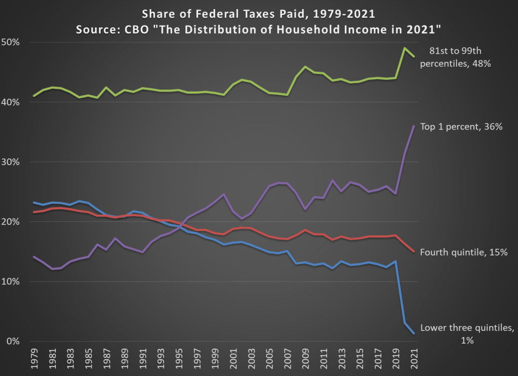
In 2021 the top 1 percent of taxpayers in the United States paid 36 percent of all federal taxes (they have 21.1 percent of income). This figure had been below 20 percent until the mid-1990s, and as recently as 2019 it was just 24.7 percent (they had 15.9 percent of the income that year).
The increase is primarily due to a large number of high-income households realizing capital gains in 2021. With all the talk lately of potentially taxing unrealized capital gains, it’s important to note that we do tax realized gains, and these change a lot from year to year. Another contributing factor is that the share of the bottom 60 percent of households only paid 1 percent of federal taxes in 2021, a big drop from 2019 due to a big increase in temporary refundable tax credits.
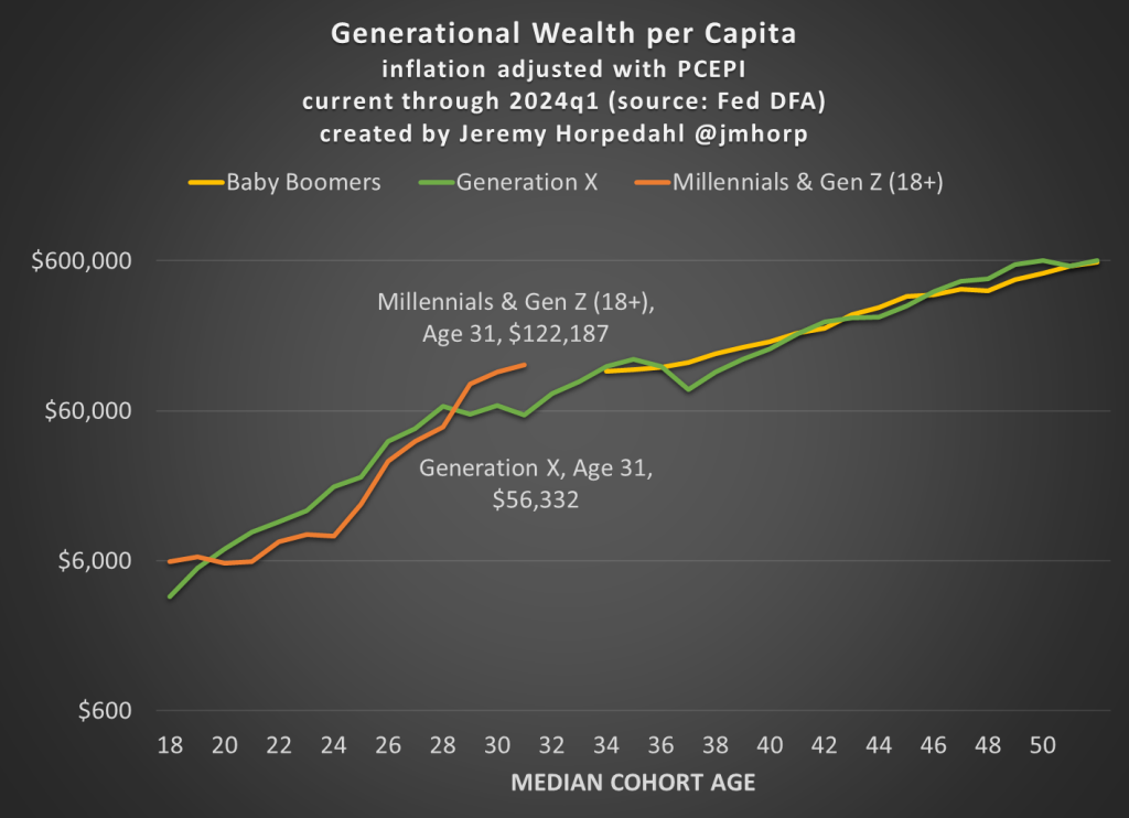
First, here is an updated chart on average wealth by generation, which gives us the first glimpse at 2024 data:
I won’t go into too much detail explaining the chart here, as I have done that in more detail in pastposts. But one brief explanatory note: I’m now labeling the most recent generation “Millennials & Gen Z (18+).” Because of the nature of the data from the Fed’s DFA, I can’t separate these two generations (it can be done with the Fed SCF data, but that is now 2 years old). This combined generation now includes everyone from ages 18 to 43 (which means that technically the median age is 30.5, not quite 31 yet), somewhere around 116 million people, which makes it a bit of a weird “generation,” but you work with the data you have. Note though that this makes the case even harder for young Americans to be doing well, as every year I am adding about 400,000 people to the denominator of the calculation, even though 18-year-olds don’t have much wealth.
What’s notable about the data is just how much the youngest “generation” in the chart has jumped up in recent years. They have now have about double the wealth that Gen X had at roughly the same age. Average wealth is about as much as Gen X and Boomers had 5-6 years later in life — and while there are no guarantees, odds are Millennial/Gen Z wealth will be much, much higher in another 5-6 years. You may notice at the tail end of the chart that Gen X and Boomers now have roughly equal amounts of average wealth at the same age (Gen X’s current age), while 2 years ago they were $100,000 ahead. I suspect this is just temporary, and Gen X will soon be ahead again, but we shall see.
Of course, the most common complaint about my data is that these are just averages, so they don’t tell us a lot about the distribution of wealth and could be impacted by outliers. That’s why I’m really excited to share this new data on wealth by decile from the 2022 Fed SCF survey. This data was put together by Rob J. Gruijters and co-authors, and it allows us to compare the wealth of Boomers, Gen X, and Millennials across the wealth distribution. You should read their analysis of the data, but in this post I’ll give my slightly different (and optimistic) interpretation of it.
For all three generations, wealth in the bottom 10% is negative when that generation is in their 30s. And for Millennials, it is the most negative: -$65,000 compared to -$30,000 for Gen X and -$17,000 for Boomers in the bottom decile (as always, the figures are adjusted for inflation). While I haven’t dug into the data, my suspicion is that student debt is driving a lot of the increase. Since this is households in their 30s, I suspect a lot of the bottom decile is composed of folks that just finished graduate and professional school, and are only now starting to acquire assets and pay down debt — they have very high earning potential, which means over their lifetime they will do great, but they are starting from behind. Again, we’ll have to wait and see, but I suspect many in the bottom will quickly climb up the wealth distribution over their working years.
That being said, in the following chart I have left off the bottom 10% for each generation, since displaying negative wealth would make the chart look a little weird. But this chart shows a very optimistic result: Millennials are doing better than Boomers across the distribution, and Millennials are ahead of almost all deciles for Gen X except a few, where they are essentially equal to Gen X (2nd, 7th, and 8th deciles).
The chart may be a little confusing (give me your suggestions to improve it!), but here’s how to read it. The blue bars show Millennial wealth relative to Gen X, at the same age, for each decile (excluding the bottom 10%). For example, the first bar shows that Millennials in the 2nd wealth decile had 100% of the wealth that Gen Xers in the 2nd wealth decile had at the same age — in other words, they were equal. The orange bars show Millennial wealth relative to Baby Boomer wealth at the same age, in the same decile (to repeat, it’s all adjusted for inflation).
Notice that other than the very first bar (Millennials vs. Gen X in the 2nd wealth decile), all of the other bars are over 100%, indicating that Millennials have more wealth than the two prior generations for almost every decile. For some of these, they are much, much greater than 100%. In the 5th decile (close to the median), Millennials have over 50% more wealth than Gen X and almost 200% (double the wealth) of the wealth of Boomers. That’s a massive increase!
A pessimistic read of the chart is that the biggest gains went to the top 10%. Though notice that’s only true relative to Baby Boomers. When compared with Gen X, the 4th and 5th deciles did better than the top 10% in terms of relative improvement. To relate this to the earlier chart in this post, it suggests that relative to Boomers, outliers at the top end might be skewing the average a bit, but that’s probably not the case relative to Gen X. And again, the broad-based gains are visible throughout the distribution from the 2nd decile on up.
Finally, on social media I’ve got several objections about the chart, such as folks not liking the log scale y-axis, and preferring the CPI-U for inflation adjustments instead of the PCEPI that I use. For those objectors, here is a different version of the chart:
While there are many factors to consider, ultimately whether living standards are rising is a race between prices and income. What does that race look like if we start the clock in December 2019, just before the pandemic?
Whether we use median weekly earnings (the purple line) or average hourly earnings for non-management workers (the blue line), they have clearly won the race with two commonly used price indexes (the CPI-U and the PCEPI). That’s good news, and probably not something you hear very often in the discourse about the economy (unless you spend a lot of time reading this blog).
The Federal Reserve has released the latest update to their Distributional Financial Accounts data, which the data underlying several of my past posts on generational wealth. With that recent data, I have updated the chart of wealth for Baby Boomers, Generation X, and Millennials.
The data is shown on a log scale to better show growth rates and allow for easier visual comparisons. But if you are interested in the more precise numbers, in the most recent quarter (2023q2) Generation X has, on average about $620,000 in net wealth, which compares favorably with Baby Boomers at about the same age (in 2006) with about $539,000 in net wealth per person. That’s about 20 percent more.
Millennials have about $115,000 in net wealth on average, which also compares favorably with Baby Boomers, who had slightly more at about the same age (in 1990) with $121,000 in net wealth on average. Given the uncertainties of all the data that goes into this, I’d say those are roughly equal. Gen X had a bit more around the same age (in 2007) with $149,000, but that fell significantly the next two years during the Great Recession.
(For more detail on my approach to creating the chart, see the linked post above, but in short I’m using the Fed DFA data for wealth, Census Bureau data by single year of age for population, and the Personal Consumption Expenditures price index for inflation adjustments (I also have a chart with the CPI-U — it’s not much different). Wealth data is for the 2nd quarter in each year (to match 2023), except for 1989 since the 3rd quarter is the first available.)
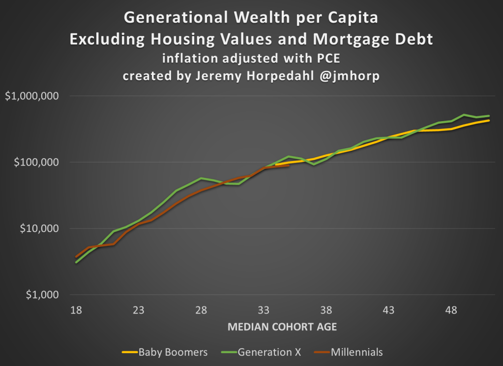
Given how much wealth can fluctuate based on housing values (see above for Gen X from 2007-2009), it might be useful to look at the data with housing. Housing is also a weird kind of wealth — for the most part, you can’t access it without selling (other than certain home equity loans), and when you do sell, unless your home appreciated more than average, you just have to move to another home that also appreciated.
Here’s the chart excluding housing value and mortgage debt:
The chart… doesn’t change much. The values are all lower, of course, but the comparisons across generations look pretty similar. Gen X right now is 17 percent wealthier than Boomers at the same age. And if we look at all three generations around the median age of 35, they are pretty close: Gen X with $123,000 (but slipping over the next few years), Boomers with $99,000, and Millennials with $90,000.
There is a narrative about US history that goes like this: “Historical racism was really bad and limited opportunities for blacks. Blacks were not allowed to participate in a set of occupations and other civic life. The absence of blacks from typically higher income occupations reduced the number of competitors in those sectors. Not only did blacks have fewereconomic opportunities, the whites who were insulated from competition earned monopoly rents. Therefore, if blacks were excluded, the whites who were in exclusive sectors earned profits at the expense of blacks.”
The logic is neat. Are there any holes in it?Let’s see.
Last week I wrote about wealth growth during the pandemic, but my favorite way to look at wealth data is comparing different generations. Last September I wrote a post comparing Boomers, Gen Xers, and Millennials in wealth per capita at roughly the same age. At the time, Millennials were basically equal to Gen X at the same age, and we were a year short of having comparable data with Boomers.
What does it look like if we update the chart through the second quarter of this year?
I won’t explain all of the data in detail — for that see my post from last September. I’ll just note a few changes. We now have single-year population estimates for 2020 and 2021, so I’ve updated those to the most recent Census estimates for each cohort. Inflation adjustments are to June 2022, to match the end of the most recent quarter of data from the Fed DFA. We still have to use average wealth rather than median wealth for now, but the Fed SCF is currently in progress so at some point we’ll have 2022 median data (most recent currently is 2019, and there’s been a lot of wealth growth since then).
What do we notice in the chart? First, we now have one year of overlap between Boomers and Millennials. And it turns out… they are pretty much at the same level per capita! Millennials have also now fallen slightly behind Gen X at the same time, since they’ve had no wealth growth (in real, per capita terms) since the end of 2021 to the present.
But Millennials have fared much better in 2022 with the massive drop in wealth: about $6.6 trillion in total wealth in the US was lost (in nominal terms) from the first to the second quarter of 2022. None of that wealth loss was among Millennials, instead it was roughly evenly shared among the three older generations (Boomers hid hardest). This difference is largely because Millennials hold more assets in real estate (which went up) than in equities (which went way down). The other generations have much more exposure to the stock market at this point in their life.
You can clearly see that affect of the 2022 wealth decline if you look at the end of the line for Gen X. You can’t see the effect on Boomers, since I cut off the chart after the last Gen X comparable data, but they saw a big decline since 2021 as well: about 6% per capita, along with 7% for Gen X. Even so, Gen X is still about 18% wealthier on average than Boomers were at the same age.
Of course, even since the end of the second quarter of 2022, we’ve seen further declines in the stock market, with the S&P 500 down about 4%. And who knows what the next few months and quarters will bring. But as of right now, Millennials don’t seem to be doing much worse than their counterparts in other generations at the same age.
In the US wealth distribution, which group has seen the largest increase in wealth during the pandemic? A recent working paper by Blanchet, Saez, and Zucman attempts to answer that question with very up-to-date data, which they also regularly update at RealTimeInequality.org. As they say on TV, the answer may shock you: it’s the bottom 50%. At least if we are looking at the change in percentage terms, the bottom 50% are clearly the winners of the wealth race during the pandemic.
Average wealth of the bottom 50% increased by over 200 percent since January 2020, while for the entire distribution it was only 20 percent, with all the other groups somewhere between 15% and 20%. That result is jaw-dropping on its own. Of course, it needs some context.
Part of what’s going on here is that average wealth at the bottom was only about $4,000 pre-pandemic (inflation adjusted), while today it’s somewhere around $12,000. In percentage terms, that’s a huge increase. In dollar terms? Not so much. Contrast this with the Top 0.01%. In percentage terms, their growth was the lowest among these slices of the distribution: only 15.8%. But that amounts to an additional $64 million of wealth per adult in the Top 0.01%. Keeping percentage changes and level changes separate in your mind is always useful.
Still, I think it’s useful to drill down into the wealth gains of the bottom 50% to see where all this new wealth is coming from. In total, there was about $2 trillion of nominal wealth gains for the bottom 50% from the first quarter of 2020 to the first quarter of 2022. Where did it come from?
A few weeks ago, my friend James Dean (see his website here, he will soon be a job market candidate and James is good) and I received news that the Journal of Institutional Economics had accepted our paper tying economic freedom to income mobility. I think its worth spending a few lines explaining that paper.
In the last two decades, there has been a flurry of papers testing the relationship between economic freedom (i.e. property rights, regulation, free trade, government size, monetary stability) and income inequality. The results are mixed. Some papers find that economic freedom reduces inequality. Some find that it reduces it up to a point (the relationship is not linear but quadratic). Some find that there are reverse causality problems (places that are unequal are less economically free but that economic freedom does not cause inequality). Making heads or tails of this is further complicated by the fact that some studies look at cross-country evidence whereas others use sub-national (e.g. US states, Canadian provinces, Indian states, Mexican states) evidence.
But probably the thing that causes the most confusion in attempts to measure inequality and economic freedom is the reason why inequality is picked as the variable of interest. Inequality is often (but not always) used as a proxy for social mobility. If inequality rises, it is argued, the rich are enjoying greater gains than the poor. Sometimes, researchers will try to track the income growth of the different income deciles to go at this differently. The idea, in all cases, is to see whether economic freedom helps the poor more than the rich. The reason why this is a problem is that inequality measures suffer from well-known composition biases (some people enter the dataset and some people leave). If the biases are non-constant (they drift), you can make incorrect inferences.
Consider the following example: a population of 10 people with incomes ranging from 100$ to 1000$ (going up in increments of 100$). Now, imagine that each of these 10 people enjoy a 10% increase in income but that a person with an income of 20$ migrates to (i.e. enters) that society (and that he earned 10$ in his previous group). The result will be that this population of now 11 people will be more unequal. However, there is no change in inequality for the original 10 people. The entry of the 11th person causes a composition bias and gives us the impression of rising inequality (which is then made synonymous with falling income mobility — the rich get more of the gains). Composition biases are the biggest problem.
Yet, they are easy to circumvent and that is what James Dean and I did. We used data from the Longitudinal Administrative Database (LAD) in Canada which produces measures of income mobility for a panel of people. This means that the same people are tracked over time (a five-year period). This totally eliminates the composition bias and we can assess how people within that panel evolve over time. This includes the evolution of income and relative income status (which decile of overall Canadian society they were in).
Using the evolution of income and relative income status by province and income decile, we tested whether economic freedom allowed the poor to gain more than the rich from high levels of economic freedom. The dataset was essentially the level of economic freedom in each five-year window matching the LAD panels for income mobility. The period covered is 1982-87 to 2013-18.
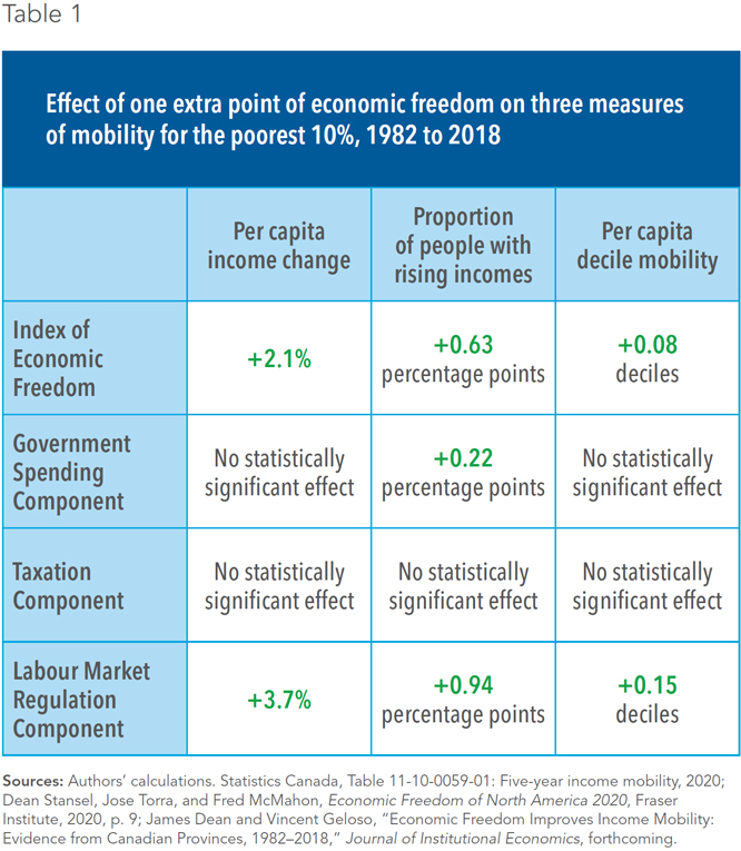
What we found is in the table below which illustrates only our results for the bottom 10% of the population. What we find is that economic freedom in each province heavily affects income mobility.
More importantly, the results we find for the bottom decile are greater than the results “on average” (for all the panel) or than for the top deciles. In other words, economic freedom matters more for the poor than the rich. I hope you will this summary here to be enticing enough to consult the paper or the public policy summary we did for the Montreal Economic Institute (here)