“The central values of civilization are in danger”

The Mont Pelerin Society was founded 75 years ago. The title of this post was the opening sentence of the Statement of Aims the new Society agreed upon. They had many concerns about what they considered “central values,” but primary among those concerns were the dangers related to market economies: “a decline of belief in private property and the competitive market” and “the growth of theories which question the desirability of the rule of law.”

How has the world done since 1947? It’s easy to point to the decline of communism and socialism, both in practice and as a dominant theory, as a victory for the goals of the Mont Pelerin Society. However, we might be concerned that in the non-communist world, economic freedom has declined even as communism has failed. Let’s dig a little deeper.

One source we can use is an extension of the Fraser Institute’s Economic Freedom of the World index. The primary index only extends back to 1970, but recently Lawson and Murphy have constructed a version of the index which goes all the way back to 1950 for some countries. As far as I’m aware, they haven’t yet perfectly mapped the pre-1970 index with the primary index that extends to the present, but I’ll make a quick comparison using the available data. The 1950 data brings us very close to the date of the first MPS meeting.

Here’s a list of countries relevant to the discussion at MPS in 1947. The list includes countries where attendees came from, as well as other countries of interest to the discussion, such as China and Russia (I’m using the list from Caldwell’s recent edited transcripts of the 1947 meeting). Caveat: this isn’t a chain-linked index, so the 1950 and 2020 numbers are perfectly comparable. Also, the 2020 number only includes Areas 1-4 of the index, since that’s what the pre-1970 data contains.

The table above should give us some optimism about the state of market economies in the world from the perspective of 1947. Not only have China and Russia, clearly improved their economic freedom scores, but all of the Western market economies have as well. Again, exercise caution in interpreting these, since it’s not a chain-linked index, and it excludes one area of economic freedom (regulation, which surely has grown substantially since 1947). Despite those cautions, the picture in 2020 looks pretty good compared with 1950.

But what of other liberal institutions? While the MPS statement of aims doesn’t specifically mention democratic institutions, the threat to democracy seems to clearly be a concern in 1947 (“extensions of arbitrary power” and “freedom of thought and expression”).

Continue reading

The Transition to a Market Economy: Did Former Soviet Republics Fail?

This semester I am participating in a reading group with undergraduate students that focuses on the history and prospects for capitalism and socialism. Lately we have been reading Joseph Stiglitz, who has long argued that China’s transition to a market economy has gone much better than the former Soviet Union. Gradual transition is superior to “shock therapy,” according to Stiglitz.

There’s an extent to which this is true. If we just look at economic growth rates since, say, 1995, China has clearly outpaced Russia.

Source: Our World in Data

It’s hard to know exactly what year to start, since GDP figures for former planned economies immediately after transition aren’t reliable, but the start date is mostly irrelevant for everything I’ll say here (please play around with the start year in the charts to see if I’m cherry-picking years). 1995 seems a reasonable enough year to start for reliable post-transition starting point.

As we see above, while Russia has had a rough doubling of GDP per capita since 1995 (respectable, and yes, it’s all adjusted for inflation!), China has soared almost 600%. Wow! But this is something of a cheat. Despite all that growth, average income in China is still lower than Russia: only about 60% of Russia in 2020. China started from a much lower level, meaning that faster growth, while not guaranteed, is at least easier to achieve. In fact, if we go back to 1978, when China’s first reforms began, GDP per capita in the Former USSR was about 6 times as high as China (that’s according to the latest Maddison Project estimates, which will always be speculative for non-market economies, but are the best we have).

Furthermore, Russia hasn’t really transitioned to a democracy either. China clearly hasn’t, but no one doubts that. But despite having the outward symbols of democracy (elections, a legislature, etc.), Russia still scores low on most indexes of democracy and civil liberties. For example, Freedom House scores them at 19/100, a little better than China (9/100), but nothing like Western Europe.

So, did the quick transition to market economies fail? Not so fast. While it did fail in Russia, in most of Eastern Europe and the eastern part of the former USSR it seems to have been a major success. Take a look at this chart, which shows the former Soviet Republics in and near Europe (I exclude Central Asian FSRs).

Source: Our World in Data
Continue reading

Economics of the Russia-Ukraine Conflict

Russia launched a full invasion of Ukraine last night. Most of the discussion I’ve seen has naturally focused on the fighting itself- what is happening, what is likely to happen, how did it come to this.

Since there are plenty of better sources to follow about that, I’ll simply offer a few observations on the economics of the conflict:

  1. Russia is not only more than 3 times as populous as Ukraine, it also more than twice as well off on a per-capita basis. This means its overall economy is more than 6 times the size of Ukraine’s. This gap has been growing since the fall of the Soviet Union, as Russia’s per-capita GDP growth has been much stronger, while its population has shrunk much less than Ukraine’s. Putting this together, Ukraine’s measured real GDP is actually smaller than it was in 1990, while Russia’s is larger.

2. Russia’s much larger economy allows it to spend much more on its military. Russia spends $60 billion per year, the 4th most of any country (after the US, China and India). Ukraine spends only $6 billion per year on its military. So Russia is starting with a big economic advantage here, though Ukraine has some of its own advantages, like fighting on their own ground and receiving more foreign support.

3. War is bad for business. Russian stocks are down 33% in a day, their biggest-ever loss; Ukraine shut down trading entirely, and their bonds are being hit even worse than Russia’s. Regardless of which side “wins” the fight for territory, both countries will be economically worse off for years as a result of the war.

4. Russia, though, expected that the war would lead to sanctions from the West that would harm their economy, and prepared for this by building up hundreds of billions of dollars worth of foreign reserves over many years.

5. US markets are down only slightly, much less than they would be if traders thought the US would get involved directly in the fighting. But this slight overall decline conceals huge swings. Companies that do business in Ukraine or Russia are big losers. But those that compete with Russian exports see their value rising given the expected sanctions. Because Russia’s biggest exports are oil and natural gas, the value of US-based oil & gas companies is rising, while alternatives like solar are also up substantially.

6. There is still some hope for Ukraine to expel Russian troops, but its not looking good, and even a victory would involve huge costs. This leaves people all over the world wondering, how did it come to this? How might future conflicts like this be avoided? There is of course a lot to say about military preparedness, nuclear umbrellas, and ways the West can impose costs on Russia as a deterrent. But what stands out to me is that a stagnant economy and shrinking population make a country weak and vulnerable. Ukraine has a worse economic freedom score than Russia; this combined with its relative lack of natural resources explains much of the stagnation. Political elites often focus on grabbing a large share of the pie, rather than growing the pie and risk empowering domestic opponents. But we’re now seeing how stagnation carries its own risks. A growing economy, and especially growing energy sources that don’t depend on hostile nations, is the path to independence and survival.

Economics, Economic Freedom and the Olympics

The Olympics have begun. Is there anything economists can say about what determines a country’s medal count? You might not think so, but the answer is a clear yes! In fact, I am going to say that both the average economist and the average political economist (in the sense of studying political economy) have something of value to say.

Why could they not? After all, investing efforts and resources in winning medals is a production decision just like using labor and capital to produce cars, computers or baby diapers. Indeed, many sports cost thousand of dollars in equipment alone each year – a cost to which we must add the training time, foregone wages, and coaching. Athletes also gain something from these efforts – higher incomes in after-career, prestige, monetary rewards per medal offered by the government. As such, we can set up a production function of a Cobb-Douglas shape

Where N is population, Y is total income (i.e., GDP), A is institutional quality and T is the number of medals being won. The subscript i and t depict the medals won at any country at any Olympic-event. This specification above is a twist (because I change the term A’s meaning as we will see below) on a paper in the Review of Economics and Statistics published in 2004 by Andrew Bernard and Meghan Busse.

The intuition is simple. First, we can assume that Olympic-level performance abilities requires a certain innate skill (e.g. height, leg length). The level required is an absolute level. To see this, think of a normal distribution for these innate skills and draw a line near the far-right tail of the distribution. Now, a country’s size is directly related to that right-tail. Indeed, a small country like Norway is unlikely to have many people who are above this absolute threshold. In contrast, a large country like Germany or the United States is more likely to have a great number of people competing. That is the logic for N being included.

What about Y? That’s because innate skill is not all that determines Olympic performance. Indeed, innate skills have to be developed. In fact, if you think about it, athletes are less artists who spend years perfecting their art. The only difference is that this art is immensely physical. The problem is that many of the costs of training for many activities (not all) are pretty even across all income levels. Indeed, many of the goods used to train (e.g., skis, hockey sticks and pucks, golfing equipment) are traded internationally so that their prices converge across countries. This tends to give an edge to countries with higher income levels as they can more easily afford to spend resources to training. This is why Norway, in spite of being quite small, is able to be so competitive – its quite-high level of income per capita make it easier to invest in developing sporting abilities and innate talent.

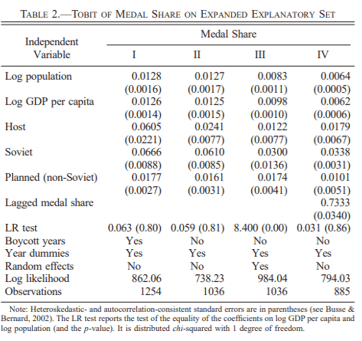
Bernard and Busse confirm this intuition and show that, yes, population and development levels are strong determinants of medal counts. The table below, taken from their article, shows this.

What about A? Normally, A is a scalar we use in a Cobb-Douglas function to illustrate the effect of technological progress. However, it is also frequently used in the economic growth literature as the stand-in for the quality of institutions. And if you look at Bernard and Musse’s article, you can see institutions. Do you notice the row for Soviet? Why would being a soviet country matter? The answer is that we know that the USSR and other communist countries invested considerable resources in winning medals as a propaganda tool for the regimes. The variable Soviet represents the role of institution.

And this is where the political economist has lots to say. Consider the decision to invest in developing your skills. It is an investment with a long maturity period. Athletes train for at least 5-10 years in order to even enter the Olympics. Some athletes have been training since they were young teenagers. Not only is it an investment with a long maturity period, but it pays little if you do not win a medal. I know a few former Olympic athletes from Canada who occupy positions whose prestige-level and income-level that are not statistically different from those of the average Canadian. It is only the athletes who won medals who get the advertising contracts, the sponsorships, the talking gigs, the conference tours, and the free gift bags (people tend to dismiss them, but they are often worth thousands of dollars). This long-maturity and high-variance in returns is a deterrent from investing in Olympics.

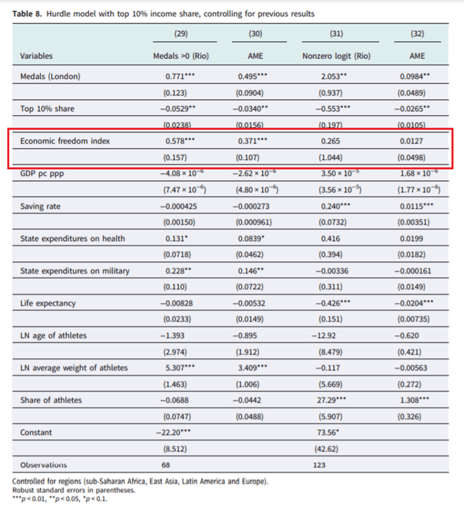
At the margin, insecurity in property rights heighten the deterrent effect. Indeed, why invest when your property rights are not secured? Why invest if a ruler can take the revenues of your investment or if he can tax it to level punitive enough to deter you? In a paper published in Journal of Institutional Economics with my friend Vadim Kufenko, I found that economic freedom was a strong determinant of medal count. Vadim and I argued that secure property rights – one of the components of economic freedom indexes – made it easier for athletes to secure the gains of their efforts (see table below).

Two other papers, one by Christian Pierdzioch and Eike Emrich and the other by Lindsay Campbell, Franklin Mixon Jr. and Charles Sawyer, also find that institutional quality has a large effect on medal counts won by countries. Another article, this time by Franklin Mixon and Richard Cebula in the Journal of Sports Economics, also argues that the effective property rights regime in place for athletes creates incentives that essentially increase the supply of investment in developing athletic skills. The overall conclusion is the same: Olympics medal counts depends in large part in the quality of institutions in an athlete’s country of origin.

Phrased differently, the country that is most likely to win a ton of medals is the economically free, rich and populous one. That’s it!

Economic freedom and income mobility

A few weeks ago, my friend James Dean (see his website here, he will soon be a job market candidate and James is good) and I received news that the Journal of Institutional Economics had accepted our paper tying economic freedom to income mobility. I think its worth spending a few lines explaining that paper.

In the last two decades, there has been a flurry of papers testing the relationship between economic freedom (i.e. property rights, regulation, free trade, government size, monetary stability) and income inequality. The results are mixed. Some papers find that economic freedom reduces inequality. Some find that it reduces it up to a point (the relationship is not linear but quadratic). Some find that there are reverse causality problems (places that are unequal are less economically free but that economic freedom does not cause inequality). Making heads or tails of this is further complicated by the fact that some studies look at cross-country evidence whereas others use sub-national (e.g. US states, Canadian provinces, Indian states, Mexican states) evidence.

But probably the thing that causes the most confusion in attempts to measure inequality and economic freedom is the reason why inequality is picked as the variable of interest. Inequality is often (but not always) used as a proxy for social mobility. If inequality rises, it is argued, the rich are enjoying greater gains than the poor. Sometimes, researchers will try to track the income growth of the different income deciles to go at this differently. The idea, in all cases, is to see whether economic freedom helps the poor more than the rich. The reason why this is a problem is that inequality measures suffer from well-known composition biases (some people enter the dataset and some people leave). If the biases are non-constant (they drift), you can make incorrect inferences.

Consider the following example: a population of 10 people with incomes ranging from 100$ to 1000$ (going up in increments of 100$). Now, imagine that each of these 10 people enjoy a 10% increase in income but that a person with an income of 20$ migrates to (i.e. enters) that society (and that he earned 10$ in his previous group). The result will be that this population of now 11 people will be more unequal. However, there is no change in inequality for the original 10 people. The entry of the 11th person causes a composition bias and gives us the impression of rising inequality (which is then made synonymous with falling income mobility — the rich get more of the gains). Composition biases are the biggest problem.

Yet, they are easy to circumvent and that is what James Dean and I did. We used data from the Longitudinal Administrative Database (LAD) in Canada which produces measures of income mobility for a panel of people. This means that the same people are tracked over time (a five-year period). This totally eliminates the composition bias and we can assess how people within that panel evolve over time. This includes the evolution of income and relative income status (which decile of overall Canadian society they were in).

Using the evolution of income and relative income status by province and income decile, we tested whether economic freedom allowed the poor to gain more than the rich from high levels of economic freedom. The dataset was essentially the level of economic freedom in each five-year window matching the LAD panels for income mobility. The period covered is 1982-87 to 2013-18.

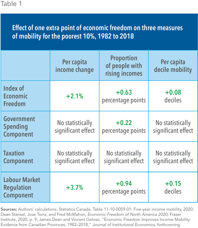
What we found is in the table below which illustrates only our results for the bottom 10% of the population. What we find is that economic freedom in each province heavily affects income mobility.

Image

More importantly, the results we find for the bottom decile are greater than the results “on average” (for all the panel) or than for the top deciles. In other words, economic freedom matters more for the poor than the rich. I hope you will this summary here to be enticing enough to consult the paper or the public policy summary we did for the Montreal Economic Institute (here)

The Luck (?) of the Irish

Poor Ireland. Long oppressed by the Brits. Losing 25% of their population in the Great Famine due to both deaths and emigration. Today, there are possibly 10 times as many Irish Americans as there are residents of Ireland. There are as many Irish Canadians as there are residents of Ireland.

Poor Ireland.

And indeed, Ireland used to be literally very poor, at least in an economic sense. In 1960, their GDP per capita was about half of the United Kingdom. As recently as 1990, they were still only at about 70% of the United Kingdom and the rest of Western Europe. That’s all according to the latest Maddison database figures, which are probably as close to accurate as we can find. But after 1990, we probably shouldn’t use those figures, for reasons peculiar to Ireland.

Today? Ireland is much wealthier. But how much wealthier? It’s tricky. Ireland’s GDP is inflated significantly due to a lot of foreign investment. And possibly some tax evasion/avoidance. You see, Ireland is a tax haven. It has one of the lowest corporate tax rates in the world. That means we have to interpret the data with care, but only because it is such a great place to invest.

Continue reading