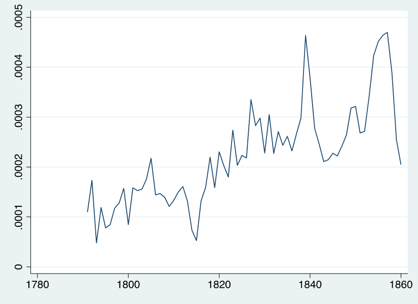
I have been working the last two weeks on a revise and resubmit for a journal article regarding the provision of lighthouses in antebellum America (1790-1860). This is in relation with other works I am doing or have already done (see here, here, here, and here) with respect to the provision of public goods by states or markets (i.e., remember that lighthouses were/are a frequent textbook example of public goods). In the process of doing the revisions, I assembled data on all expenditures by the Lighthouse Establishment and Lighthouse Board to 1860. This includes appropriations for new constructions, salaries of keepers, provisions for operation and maintenance expenditures. I divided these expenditures by GDP to yield the graph below.
There is not a ton to say about this here on this blog except the following three interrelated comments. First notice that the scale means that lighthouse spending to GDP is always less than 0.05% of GDP. That is small. Second, notice that the trend is up over time. It goes from 0.01% to a bit than 0.05% in peak years. These first two comments matter because you would expect the small share to grow smaller over time. Why? Remember the definition of public goods — non-rivalrous and non-excludable. The first part of that definition implies that you take the sum of marginal benefits at any quantity for everyone in a society to arrive at the societal benefit of an extra unit of public goods. If the marginal cost of providing the public good is zero, is constant or is only increasing at a slow pace, this means that adding an extra person would add more to the benefits than the cost. Phrased differently, this means that we should expect lighthouse spending to fall or stay constant as a share of GDP. This is because GDP goes up when more people are added (and the benefits of the public good scale up with extra people) while costs do not increase as much. Ergo, the trend in the graph below should fall.
Figure 1: Lighthouse Spending in America Divided by GDP, 1791 to 1860
I am a big fan of Bjørn Lomborg but not for the reasons you think. Most Lomborg fans highlight the Skeptical Environmentalistas their preferred work. I admire How to Spend $50 Billion to Make the World a Better Place. The logic in that book is elegantly simple for an economist as it argues for dealing with the world’s problems using cost-benefit analysis. After all, you cannot deal with every problem and priorities must be set according to which priority is most likely to generate massive benefits.
Obviously, some nuances can be made. For example, I am inclined to think that a sizable share (but not the majority) of the cost of climate change can be dealt with by encouraging economic development. As Richard Tol argued in thisReview of Environmental Economics and Policy article, “poverty reduction complements greenhouse gas emissions reductions”. However, this criticism is one that alters the ranking of priorities only.
There is a deeper criticism that has been lurking in my mind since 2010. I never formulated it directly in link with Lomborg’s work even though I did include elements of this criticism in this published article of mine (see here in the Review of Austrian Economics). The criticism amounts to a simple point: can governments actually achieve the proposals in the book. Do they have the ability to intelligently invest $50 billion to fight communicable diseases? Would they be able to invest $50 billion to improve educational access? The answer may very well be “yes”, but no one has considered the risk of government failure in trying to organize the ranking of priorities to deal with. Essentially, this is the “public choice” criticism of Lomborg’s work (which does not require a stand on the climate change portion which has been the object of so many debates). This is not a trivial criticism as it could be that the ranking is all wrong or that the solutions are simply not politically accessible.
Since 2010, I have not seen any “public choice” criticism of Lomborg. Today, while writing this blog post, I spent a good hour trying to find a criticism in either peer-reviewed journals such as Public Choice, Journal of Public Finance and Public Choice and Constitutional Political Economy. None had such criticisms. Similarly, I tried looking at think tanks and newspaper. Again, I came up empty-handed.
If someone knows a piece that makes this case, send it my way. If you are a graduate student looking for an article to write, this might be a good idea!
Next week, I am teaching collusive agreements in my price theory class. I decided to take a different approach to the discussion than the one usually found in textbook. The approach consists in showing how economic thought on a topic has evolved over time. For collusion, I decided to discuss George Stigler’s 1964 article on the theory of oligopoly published in the Journal of Political Economy.
Simply put, Stigler proposes a simple approach for stating how collusive agreements can break apart by asking how much extra sales a firm can obtain by cutting its prices without being detected by other firms. Stigler argued that detection got easier as the number of buyers increased or as concentration increased. He also argued that detection became harder if buyers do not repeat purchases and if there is growth in the market through the addition of new customers as firms are not able to detect whether the growth of other firms is due to new customers or because old customers are purchasing its wares. Detection also became harder with a greater number of sellers but he also argued that this was of equal (or maybe lesser) importance than low repeat-sales rates or the arrival of new customers into the market.
This is pretty standard price theory and it is well executed. After postulating the theory, Stigler throws the empirical kitchen sink to see if, broadly speaking, his point is confirmed. One interesting regression is from table 5 in the article (which is illustrated below). That regression estimated rates for a line of advertising in newspapers market (i.e., cities) conditional on circulation in 1939 (its a cross-section of 53 markets). The regression itself is uninteresting to Stigler as he wants to consider the residuals. Why? Because he could classify the residuals by the structure of the market (with only one newspapers or with two newspapers. The idea is that more newspapers should be marked with lower rates as collusive agreements tend to be harder to enforce. Stigler thought this confirmed his idea that “that the number of buyers, the proportion of new buyers, and the relative sizes of firms are as important as the number of rivals” (p. 56).
While looking at Stigler’s regression, I thought that there might an interesting economic history paper to write. Notice that the source of the data used is cited below the table. Retracing that source and checking if (because there are clearly volumes of the Market and Newspaper Statistics) a panel can be constructed could allow for something interesting to be done. Indeed, a panel allows to directly test for the new customers’ hypothesis by adding a population growth variable. This advantage compounds that of increasing the number of observations. Both of those advantages could allow to test the relative importance of the mechanisms highlighted by Stigler.
A paper of this kind, I believe, would be immensely interesting. It is always worth engaging with important theoretical articles ontheir own terms. As Stigler set this test as one of his illustration, a paper that extends his test would engage Stigler on his own term and could provide a usefully contained discussion of the evolution of the theory of oligopoly. I honestly could see this published in journals like History of Political Economy or Journal of the History of Economic Thought or journals of economic history such as Cliometrica, European Review of Economic History or Explorations in Economic History.
There is a new paper available at Cliometrica. It is co-authored by Mathieu Lefebvre, Pierre Pestieau and Gregory Ponthiere and it deals with how the poor were counted in the past. More precisely, if the poor had “a survival disadvantage” they would die. As the authors make clear “poor individuals, facing worse survival conditions than non-poor ones, are under-represented in the studied populations, which pushes poverty measures downwards.” However, any good economist would agree that people who died in a year X (say 1688) ought to have their living standards considered before they died in that same year (Amartya Sen made the same point about missing women). If not, you will undercount the poor and misestimate their actual material misery.
So what do Lefebvre et al. do deal with this? They adapt what looks like a population transition matrix (which is generally used to study in-,out-migration alongside natural changes in population — see example 10.15 in this favorite mathematical economics textbook of mine) to correctly estimate what the poor population would have been in a given years. Obviously, some assumptions have to be used regarding fertility and mortality differentials with the rich — but ranges can allow for differing estimates to get a “rough idea” of the problem’s size. What is particularly neat — and something I had never thought of — is that the author recognize that “it is not necessarily the case that a higher evolutionary advantage for the non-poor over the poor pushes measured poverty down”. Indeed, they point out that “when downward social mobility is high”, poverty measures can be artificially increased upward by “a stronger evolutionary advantage for the non-poor”. Indeed, if the rich can become poor, then the bias could work in the opposite direction (overstating rather than understating poverty). This is further added to their “transition matrix” (I do not have a better term and I am using the term I use in classes).
What is their results? Under assumptions of low downward mobility, pre-industrial poverty in England is understated by 10 to 50 percentage points (that is huge — as it means that 75% of England at worse was poor circa 1688 — I am very skeptical about this proportion at the high-end but I can buy a 35-40% figure without a sweat). What is interesting though is that they find that higher downward mobility would bring down the proportion by 5 percentage points. The authors do not speculate much as to how likely was downward mobility but I am going to assume that it was low and their results would be more relevant if the methodology was applied to 19th century America (which was highly mobile up and down — a fact that many fail to appreciate).
There is a new paper in Journal of Economic Perspectives. Its author, Dan Sichel, studies the price of nails since 1695 (image below). Most of you have already tuned off your attention by now. Please don’t do that: the price of nails is full of lessons about economic growth.
Indeed, Sichel is clear in the title in the subtitle about why we should care — nail prices offer “a window into economic change”. Why? Because we can use them to track the evolution of productivity over centuries.
Take a profit-maximizing firm and set up a constrained optimization problem like the one below. For simplicity, assume that there is only one input, labor. Assume also that a firm is in a relatively competitive market so as to remove the firm’s ability to affect prices so that, when you try to do your solutions, all the quantity-related variables will be subsumed into a n term that represent’s the firm share of the market which inches close to zero.
If you take your first order conditions and solve for A (the technological scalar). You will find this this identity
What does this mean? Ignore the n and consider only w and p. If wages go up, marginal costs also increase. From a profit-maximizing firm’s standpoint trying to produce a given quantity, if prices (i.e. marginal revenue) remained the same, there must have been an increase in total factor productivity (A). Express in log-form, this means that changes in total factor productivity are equal to αW – αP. This means that, if you have estimates of output and input prices, you can estimate total factor productivity with minimal data. This is what Sichel essentially does (and Douglas North did the same in 1968 when estimating shipping productivity). All that Sichel needs to do is rearrange the identity above to explain price changes. This is how he gets the table below.
The table above showcases the strength of Sichel’s application of a relatively simple tool. Consider for example the period from 1791 to 1820. Real nail prices declined about 0.4 percent a year even though the cost of all inputs increased noticeably. This means that total factor productivity played a powerful role in pushing prices down (he estimates that advances in multifactor productivity pulled down nail prices by an average of 1.5 percentage points per year). This is massive and suggestive of great efficiency gains in America’s nail industry! In fact, this efficiency increases continued and accelerated to 1860 (reinforcing the thesis of economic historians like Lindert and Williamson in Unequal Gainsthat American had caught up to Britain by the Civil War).
I know you probably think that the price of nails is boring, but this is a great paper to teach how profit-maximizing (and constrained optimization) logic can be used to deal with problems of data paucity to speak to important economic changes in the past.
Generally, when you do your microeconomics class you get to see isoquants. I mean, I hope you get to see them (some principles class dont introduce them and are left to intermediate classes). But when you do, they look like this:
Its a pretty conventional approach. However, there is a neat article in History of Political Economy by Peter Lloyd (2012) titled “the discovery of the isoquant“. The paper assigns the original idea, rather than to the usual suspect of Abba Lerner in 1933, to W.E. Johnson in 1913 as A.L. Bowley was referring to his “isoquant” in a work dated from 1924 (from which the image is drawn). But what is more interesting that the originator of the idea is how the idea has morphed from another of its early formulations. In the 1920s and 1930s, Ragnar Frisch was teaching his price theory classes in Norway and depicted isoquants in the following manner in his lectures notes.
Do you notice something different about Frisch’s 1929 (or 1930) lectures relative to the usual isoquants we know and love today? Watch the end of each isoquant. They seem to “arc” do they not? How could an isoquant have such a bent? Most economists are probably so used to using isoquants that do not bend (except for perfect complements) that it will take a minute to answer. Well, here is the answer: its because Frisch was assuming that the production function from which the isoquant is derived had a maximum which means that the marginal product of an input could become negative. This is in stark contrast with our usual way to assume production functions as smoothly declining (but never negative) marginal products. This is why Frisch includes an arc to this shape (a backward bend).
Why did we move away from Frisch’s depiction? Well think about the economic meaning of a negative meaning marginal product. It means that a firm would be better offscaling down production regardless of anything else. Its a straightforward proposition to understand why in all settings, a firm would automatically from such an “uneconomic” zone. In other words, we should never expect firms to continually operate in a zone of negative marginal product. Ergo, the “bend”/”arc” is economically trivial or irrelevant. Removing it simplifies the discussion and formulation but also does something subtle — it sneaks in a claim rationality of behavior from firmowners and operators.
This is a good setup for a question to ask your students in an advanced microeconomics class that isnt just about the mathematics but about what the mathematical formulations mean economically!
This is the title to a paper in Historical Methodsthat I believe should convince you of two things. The first, and this applies to scholars in economic history, is that the journal Historical Methods is a highly interesting one. It tends to publish new and original work by economists, historians, sociologists and anthropologists who are well-versed in statistical analysis and data construction. The articles that get published there often offer a chance to discover solutions to longstanding problems through both interactions of different fields and the creation of new data.
The second is that it is becoming increasingly harder to hold the view that the industrial revolution was “a wash”. I described elsewhere this view of the industrial revolution as a wash as believing one or more of the following claims: “living standards did not increase for the poor; only the rich got richer; the cities were dirty and the poor suffered from ill-health; the artisans were crowded out; the infernal machines of the Revolution dumbed down workers”. Since the 1960s, many articles and books have confirmed that the industrial revolution was marked by rising wages and incomes as well as long-run improvements in terms of nutrition, mortality and education. The debates that persist focus on the pace of these improvements and the timing of the sustained rise that is commonly observed (i.e. when did it start)
The new paper in Historical Methods that I am mentioning here suggests that these many articles and books are correct. The author, Pierre Lack, takes all the 19th century pamphlets published in Britain and available online to analyze the vocabulary contained within them. Lack’s idea is to use the fact that books became immensely cheap (books were becoming more affordable through both falling prices and rising incomes — see table above) to evaluate emotional well-being by the words contained in them. What Lack finds is that there were no improvements in emotional well-being as proxied by the types of words in those pamphlets.
But how could this be positively tied to the industrial revolution as not being a wash? This is because, if you believe that there is such a thing as a hedonic treadmill (i.e. more income only allows us to actualize upward our preferences so that the income has no impact on happiness), you cannot hold many of the beliefs associated with the industrial revolution being a wash. For example, if you think that living standards for the poor did not rise while other dimensions of their well-being (e.g., health, environment of the city, working conditions) fell, then there the graph produced by Lack should have exhibited a downward trend!
This is not the only belief associated with the “industrial revolution was a wash” view that cannot withstand Lack’s new paper. One frequently advanced factor that purportedly affects emotional wellbeing is inequality. Because we care about our relative position (e.g., I am happier if my neighbor have a worse car than me), rising inequality should be associated with falling emotional well-being (that was for example the case that the Spirit Level of Wilkinson and Pickett tried to advance). However, if you believe that Britain enjoyed rising inequality (it did at first and it then fell according to Jeffrey Williamson who shows that inequality rose to 1860 and fell to 1913), then Lack’s data should show falling emotional well-being. It does not which means that it is quite hard to hold the view that the revolution was a wash.
This is probably my favorite paper at Historical Methods and I hope you will like it too. I also hope that you will add it to your list of articles to inform your own research.
Canadians are blocking a bridge. For Americans who like to engage in stereotypes about Canadians, this is inexplicable (even though the practice of blocking things in Canada is not new by any means). However, for me as an economist, it is entirely explicable.
Consider what vaccine mandates/passports (which is what initiated the current mayhem) do in pure economics terms: they raise costs for the unvaccinated. They do not alter the benefit of being vaccinated. All they do is raise costs. People could be more or less inelastic to this cost, but the fact that many are willing to spend time and resources (fuel, wear and tear of trucks etc.) to prevent such policies from continuing suggest that their behavior is not perfectly inelastic.
How elastic is it then? Well, we can see that by looking at what happens when we alter the benefit of being vaccinated. This is the case with vaccine lotteries. The “extra” benefits associated with a lottery is that the unvaccinated obtains the value of the vaccine plus the expected value (i.e. the probability) of winning a particular prize. One recent paper in Economics Lettersfinds that for $55, you can convince an extra person to be vaccinated. That is basically the cost of administering a lottery plus the prizes themselves. That is a relatively cheap way to increase the benefit for the unvaccinated in order to have them change their mind. Another paper, in the American Journal of Health Economics, finds a similar results by concentrating on the Ohio vaccine lottery. The difference is that the amount is $75 instead of $55. Still, pretty cheap for an extra vaccinated person and the generally high social benefit of a vaccine in terms of avoided costs of infections/hospitalizations/deaths.
Thus, we can say that behavior is quite elastic. But this is where the rub comes. When you raise the benefits in this case, the story is over. There is nothing else that happens after that. When you raise the costs, people might resist and adopt other measures to avoid the costs. This includes blocking bridges on the US-Canada border. And what is the social cost of that attempt at avoiding the cost of the coercive private-cost-increasing policy? Pretty high. Probably higher than the cost of a lottery system or other voluntary programs that play with the marginal private benefit of being vaccinated.
The point I am trying to get across to you is quite simple: persuasion works because it essentially increases the perception of benefits from doing X or Y activity. Coercion is impose a private cost of not doing X or Y with the potential downside that people respond in ways that create socially detrimental outcomes. Yup, coercion isn’t cheap.
The Olympics have begun. Is there anything economists can say about what determines a country’s medal count? You might not think so, but the answer is a clear yes! In fact, I am going to say that both the average economist and the average political economist (in the sense of studying political economy) have something of value to say.
Why could they not? After all, investing efforts and resources in winning medals is a production decision just like using labor and capital to produce cars, computers or baby diapers. Indeed, many sports cost thousand of dollars in equipment alone each year – a cost to which we must add the training time, foregone wages, and coaching. Athletes also gain something from these efforts – higher incomes in after-career, prestige, monetary rewards per medal offered by the government. As such, we can set up a production function of a Cobb-Douglas shape
Where N is population, Y is total income (i.e., GDP), A is institutional quality and T is the number of medals being won. The subscript i and t depict the medals won at any country at any Olympic-event. This specification above is a twist (because I change the term A’s meaning as we will see below) on a paper in the Review of Economics and Statistics published in 2004 by Andrew Bernard and Meghan Busse.
The intuition is simple. First, we can assume that Olympic-level performance abilities requires a certain innate skill (e.g. height, leg length). The level required is an absolute level. To see this, think of a normal distribution for these innate skills and draw a line near the far-right tail of the distribution. Now, a country’s size is directly related to that right-tail. Indeed, a small country like Norway is unlikely to have many people who are above this absolute threshold. In contrast, a large country like Germany or the United States is more likely to have a great number of people competing. That is the logic for N being included.
What about Y? That’s because innate skill is not all that determines Olympic performance. Indeed, innate skills have to be developed. In fact, if you think about it, athletes are less artists who spend years perfecting their art. The only difference is that this art is immensely physical. The problem is that many of the costs of training for many activities (not all) are pretty even across all income levels. Indeed, many of the goods used to train (e.g., skis, hockey sticks and pucks, golfing equipment) are traded internationally so that their prices converge across countries. This tends to give an edge to countries with higher income levels as they can more easily afford to spend resources to training. This is why Norway, in spite of being quite small, is able to be so competitive – its quite-high level of income per capita make it easier to invest in developing sporting abilities and innate talent.
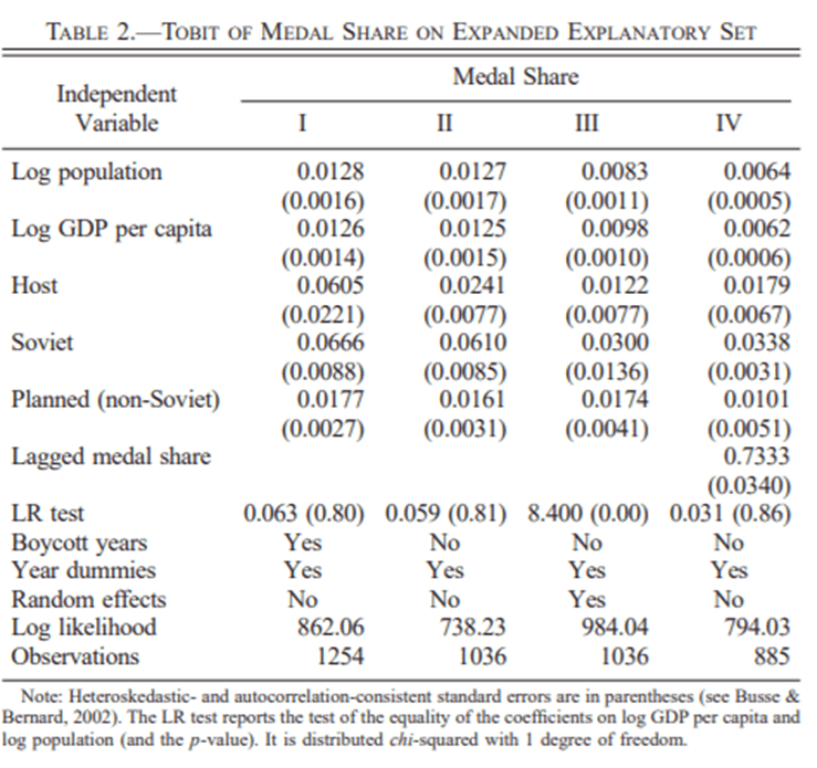
Bernard and Busse confirm this intuition and show that, yes, population and development levels are strong determinants of medal counts. The table below, taken from their article, shows this.
What about A? Normally, A is a scalar we use in a Cobb-Douglas function to illustrate the effect of technological progress. However, it is also frequently used in the economic growth literature as the stand-in for the quality of institutions. And if you look at Bernard and Musse’s article, you can see institutions. Do you notice the row for Soviet? Why would being a soviet country matter? The answer is that we know that the USSR and other communist countries invested considerable resources in winning medals as a propaganda tool for the regimes. The variable Soviet represents the role of institution.
And this is where the political economist has lots to say. Consider the decision to invest in developing your skills. It is an investment with a long maturity period. Athletes train for at least 5-10 years in order to even enter the Olympics. Some athletes have been training since they were young teenagers. Not only is it an investment with a long maturity period, but it pays little if you do not win a medal. I know a few former Olympic athletes from Canada who occupy positions whose prestige-level and income-level that are not statistically different from those of the average Canadian. It is only the athletes who won medals who get the advertising contracts, the sponsorships, the talking gigs, the conference tours, and the free gift bags (people tend to dismiss them, but they are often worth thousands of dollars). This long-maturity and high-variance in returns is a deterrent from investing in Olympics.
My home province of Quebec in Canada has been under lockdown since the Holidays (again). At 393 days of lockdown since March 11th 2020, Quebec has been in lockdown longer than Italy, Australia and California (areas that come as examples of strong lockdown measures). Public health scientists admit that the Omicron variant is less dangerous. But the issue is not the health danger, but rather the concern that rising hospitalizations will cause an overwhelming of an exhausted health sector.
And to be sure, when one looks at the data on hospital bed capacity and use-rates, you find that the intensity of lockdowns is well-related to hospital capacity. Indeed, Quebec is a strong illustration of this as its public health care system has one of the lowest levels of hospital capacity in the group of countries with similar income-levels. The question then that pops to my mind is “how elastic is the supply of hospital/medical services?”.
In places like my native Quebec, where health care services are largely operated and financed by the government, the answer is “not much”. This is not surprising given that the capacity is determined bureaucratically by the provincial government according to its constraints. And with bureaucratic control comes well-known rigidities and difficulties in responding to changes in demand. But that does not go very far in answering the question. Indeed, the private sector supply could also be quite inelastic.
A few months ago, I came across this working paper by Ghosh, Choudhury and Plemmons on the topic of certificate-of-needs (CON) laws. CON-laws essentially restrict entry into the market for hospital beds by allowing incumbent firms to have a say in determining who has a right to enter a given geographical segment of the market. The object of interest of Ghosh et al. was to determine the effect of CON-laws on early COVID outbreak outcomes. They found that states without such laws performed better than states with such laws (on both non-COVID and COVID mortalities). That is interesting because it tells us the effect of a small variation in the legal ability of private firms to respond to changes in market conditions. Eliminating legal inability to respond to changes leaves us with normal difficulties firms face (e.g. scarce skilled workers such as nurses, time-to-build delays etc.).
But what is more telling in the paper is that Ghosh et al. studied the effect of states with CON-laws that eased those laws because of COVID. This is particularly interesting because it unveils how fast previously regulated firms can start acting like deregulated firms. They find similar results (i.e. fewer deaths from COVID and non-COVID sources).
All of these, taken together, suggest to me that hospital capacity is not as fixed as we think of. Hospitals are capable of adjusting on a great number of margins to increase capacity in the face of adverse exogenous shocks. That is if there are profit-motives tied behind it — which is not the case in my home country of Quebec.