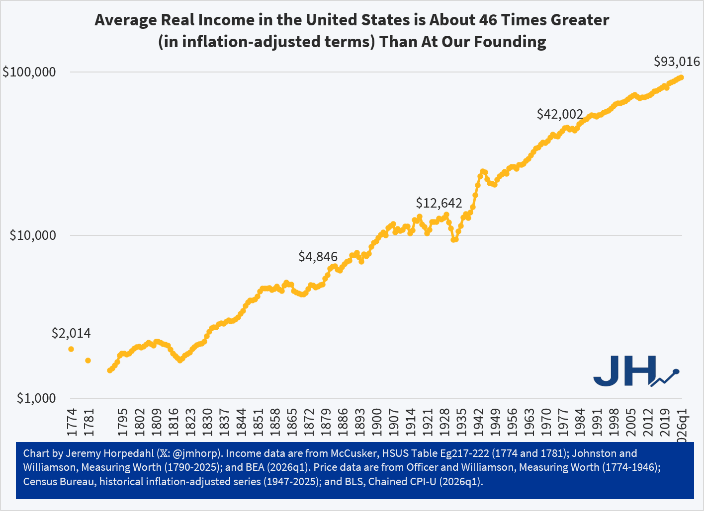
My post and chart from last week showed the phenomenal growth of average income in the US since the Founding. Using GDP per capita historical estimates and adjusting for inflation, this figure is about 46 times greater today than right around the time we declared independence.
It will probably not surprise you that some folks were skeptical. Could this really be true? Two major objections were raised to using GDP per capita. First, wouldn’t it be better to use a median income value rather than a mean (simple average)? Second, wouldn’t a measure of wages be better than GDP per capita?
I really would like to show you an annual series of median income data back to 1776, but unfortunately it just doesn’t exist. Good median income data are hard to find much before the 1950s, much less the 1770s. However, while median values are often better for showing levels, the growth rates of median wages and mean wages aren’t that different for periods when we have comparable data. Consider the following chart, which compares median wages (as calculated by EPI using CPS data) and mean wages (from BLS’s series for non-supervisory workers) since 1973. I have stated these in nominal terms, so don’t take this as real growth rates, but rather it is a raw comparison of two series (we could apply the same inflation adjustment to both, but that won’t change the picture, only the numbers).

Median wages increased by 667% and mean wages increased by 657%, almost identical. Again, these aren’t inflation adjusted, but that’s not the point of this exercise. The point is that whether you use mean or median wages, at least since 1973, the growth rates are the same. Was this true if we went back another 200 years? We can’t say for sure. But many people have this same skepticism about mean wages in recent decades. I think it is better to use median values when you have them, but we shouldn’t throw up our hands and claim we know nothing if all we have is mean wages.
Next, consider the following chart. It begins in 1790, but instead of using GDP per capita, as I did last week, it uses a measure of average wages from economic historian Lawrence Officer. This measure is for “production workers in manufacturing,” and it is a total compensation measure, meaning that it will include the value of fringe benefits as well — though these aren’t noticeable in the data until the 1930s. This is still an average value, but because it is for manufacturing laborers, it won’t be distorted by the wages of managers and owners in that industry, and it won’t be affected by the growth of new industries that might require more years of education (indeed, manufacturing wages are lowering than overall average wages today, so this is taking the hard case). I have also included a second line, which only includes manufacturing wages (not benefits) that I have blended with Officer’s compensation series starting in the 1930s, in case you think including benefits is somehow “cheating.” (Note the log scale again, as in last week’s chart.)

The trends here are very much in the ballpark from the GDP per capita chart I created last week. Using total compensation, wages are 65 times higher than in 1790. Using only wages, they are 49 times higher. Notice that these are both better than the 46 times multiplier using GDP per capita. How is that possible, since I am using the same price deflator in both cases? First, average hours of work have fallen significantly since the 18th century, so incomes haven’t risen quite as much as wages. Second, there was a bit of a decline in GDP per capita during the Revolutionary War, and if we use 1790 as the baseline for GDP per capita, the multiplier is 63. But again, these numbers are all in the ballpark: whether the true figure for a typical American is 46x, 49x, 63x, or 65x, this is a tremendous amount of economic growth.
If you want to look at that chart pessimistically, you will see that there is some reduction in growth rates in the past few decades. That’s true whether we use wages or compensation. This is a well known issue, and has been discussed endlessly in academic papers and on social media. I don’t want to glaze over it here, but I mostly will: the long-run trend of growth in the US is amazing. That’s true whether you use GDP per capita, or wages or compensation for production workers.
So once again, Happy 250th Birthday to the USA and all of you living in the wake of that amazing 250 years of economic growth!