Gifs are really cool. They’re like the animated photos on loop from Harry Potter. They’re also great for teaching. You can show students exactly what you want them to see over, and over, and over. They don’t need to navigate to the right part of the video, wait for ads, or worry about whether the particular grammar of a book is opaque. They can just look and think.
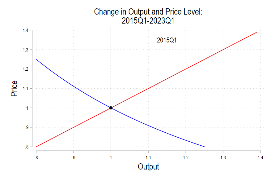
For example: Why are prices higher than 3 years ago? We can use the Aggregate Supply- Aggregate Demand model (AS-AD) to help us think about it. Prices have increased because demand has grown faster than long-run aggregate supply (LRAS).
At first, the SRAS, which does the work of finding the long run equilibrium, increased rightward. This is because we’ve had a decade of low, stable inflation and inflation expectations were anchored at a low level. Greater demand was met with greater output. But, as AD continued to grow and people began to confront the unavoidable reality of scarcity, SRAS began moving upward, increasing the price to ration the quantity demanded.*
See the below gif. I made it in Stata and ezgif.com. It’s pretty cool.
*Yes, I know that this is one of many interpretations. It’s not exactly how I teach it in class. But, it’s still pretty cool.

3 thoughts on “Animated AS AD Model”