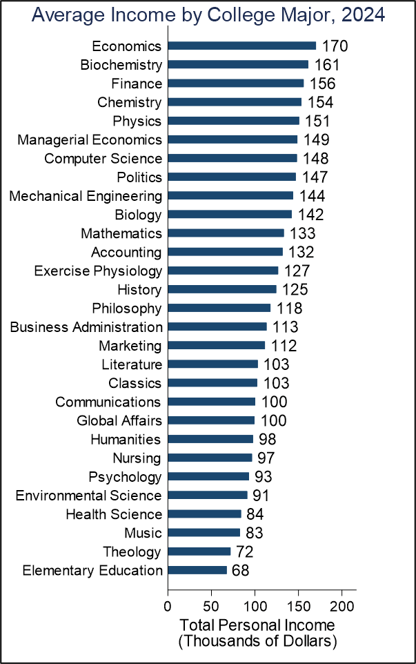
I’ve discussed multiple times now how economics degrees are associated with higher income. One reason may be that it’s not the bachelor’s degree that’s doing the legwork, but rather the graduate degree. I examine that hypothesis here for the 25 most popular degrees in the 2024 American Community Survey.
The data identifies who has a bachelor’s degree and in what field. We also know whether an individual has a master’s or professional degree, or a doctorate. Unfortunately, we don’t know the field for the higher degrees. So, while we can say that 45% of Economics majors have a graduate degree, we can’t say that the graduate degree is in Economics. After all, plenty of people major in one thing and pursue a graduate degree in another thing.
Degree Types by College Major
Below is a chart that ranks the 25 most popular college majors and whether those graduates also hold a graduate degree. There are several patterns. First, the tier near the top of the chart shows more business majors tend to be terminal. Students majoring in communications, business, and marketing tend not to proceed to get higher degrees.
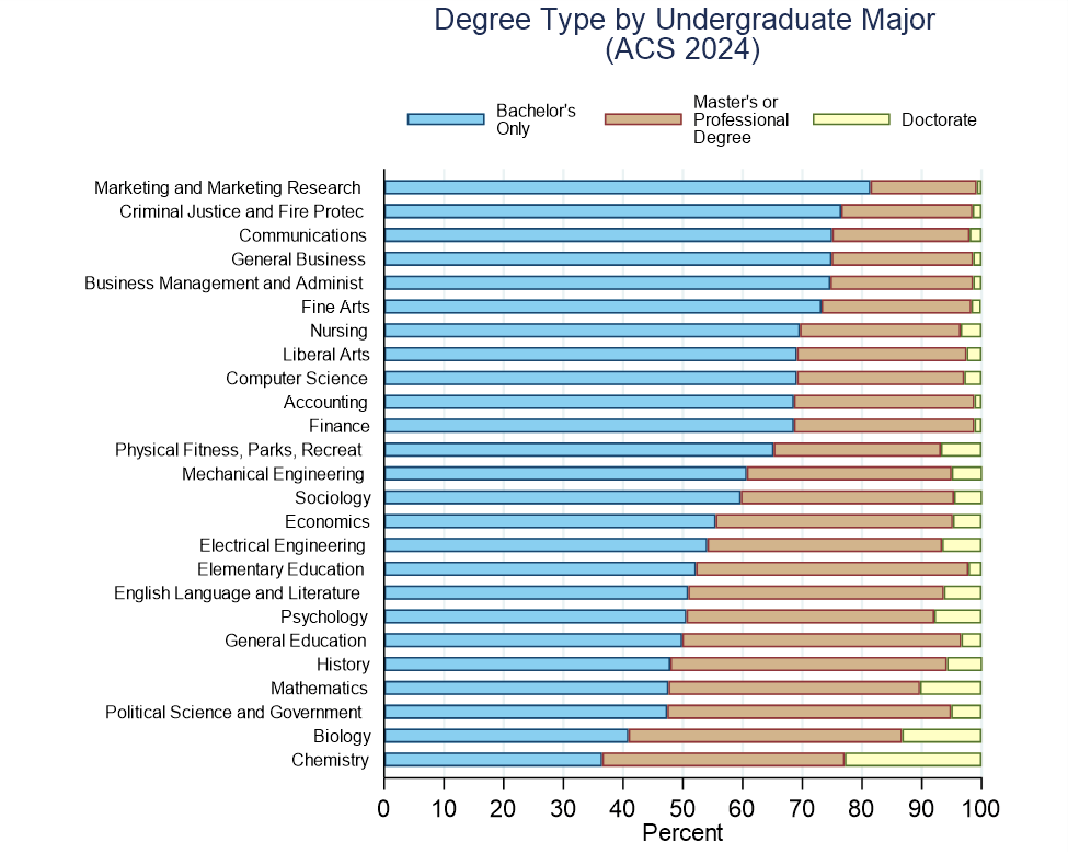
That contrasts starkly with the bottom tier of the graph where majors like Chemistry, Biology, Political Science, Math, and History all tend to have high rates of graduate degrees. I’m not sure why this is. Maybe it’s because the skills are more research-oriented in nature and prepare those students well for graduate school. Other alternatives may be that the bachelor’s degree alone doesn’t provide much income or that a graduate degree results in a large proportional increase in income for those majors.
Economics majors are on the lower end in terms of the proportion with only a bachelor’s degree (55.5%), near the middle of the pack for proportion with a master’s or professional degree (39.7%), and have an average proportion holding doctorates (5.1%).
Because the numbers make it easy, I’ll pick on education majors a little. Given the high proportion of education and elementary education majors who have graduate degrees, there are relatively few of them who have doctorates. Other majors that have a lot of graduate degree holders tend to have more doctorates, but education majors in higher education are overwhelmingly people with master’s degrees. Given that many of them work for governments, I suspect that they often get procedural pay raises merely for holding a higher degree.
Income by Degree Type and College Major
Below is a chart that shows the average income among employed people by college major and higher degree. The highest-paying terminal bachelor’s and master’s degrees are both among Economics majors ($144k & $203k). A previous post showed that Economics majors had the highest overall income and here we can see that it comes primarily from the bachelor’s and master’s degree holders, while economics majors with doctorates earn the 3rd highest income ($208k) behind computer science ($247k) and electrical engineering ($238k).
Continue reading