That extra $4 trillion or so that the feds dumped into our collective checking accounts in 2020-2021 – -where did it come from? Certainly not from taxes. It was created out of thin air, via a multi-step alchemy. The government does not have the authority to simply run the printing presses and crank out benjamins. The U.S. Treasury sells bonds to Somebody(ies), and that Somebody in turn gives the Treasury cash, which the Treasury then uses to fund government operations and giveaways. In 2020-2021, the Somebody who bought all those bonds was mainly the Federal Reserve, which does have the power to create unlimited amounts of cash, in exchange for government bonds or certain other investment-grade fixed income securities.
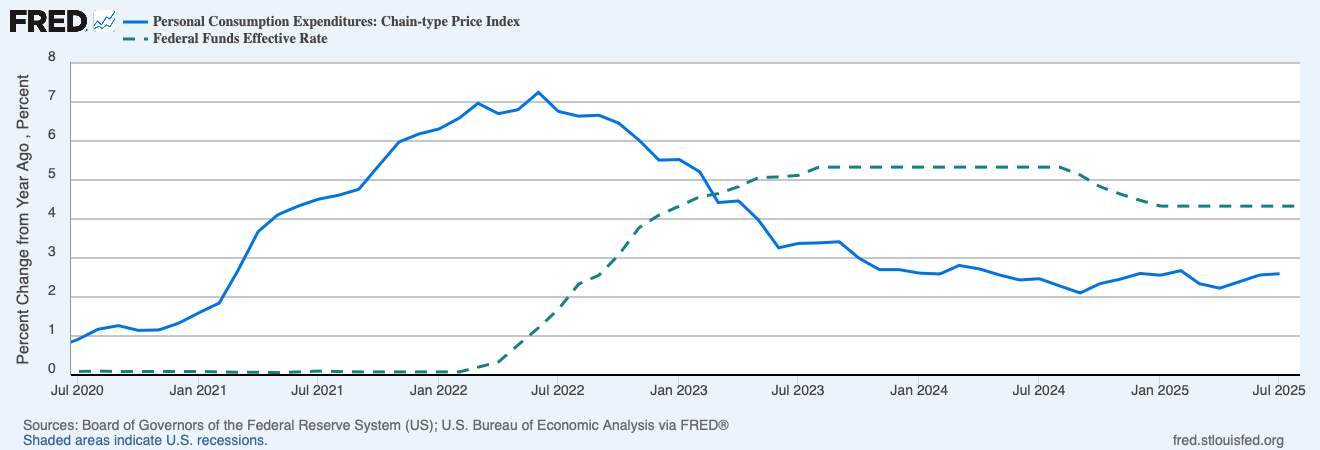
What is causing a bit of a kerfuffle recently is public assessment of what sorts of bonds that Janet Yellen’s Treasury issued back then. Interest rates were driven down to historic lows in that period, thanks to the Fed’s monster “quantitative easing” (QE) operations. The Fed was buying up fixed income hand over fist: government bonds, mortgage securities, even corporate junk bonds (which was probably illegal under the Fed’s charter, but desperate times…). This buying frenzy drove bond prices up and rates down.
All corporate CFOs with functioning neurons and with BB+ credit ratings refinanced their company debt in that timeframe: they called in as much of their old bonds as they could, and re-issued long-term debt at near-zero interest rates. Or they just issued 5, 10, 20 year low-interest bonds for the heck of it, raising big war-chests of essentially free cash to tide them through any potential hard times ahead. And of course, millions of American homeowners likewise refinanced their mortgages to take advantage of low rates.
What about the federal government? Was the Treasury, under Secretary Yellen, similarly clever? No, not really. Because there is little serious doubt that the U.S. government will be able to pay its debts (grandstanding government shutdowns aside), the government can always find takers for 20- and 30-year bonds, as well as shorter maturity securities. A mainstay of government financing is the 10-year bond. And in 2020-2021, the Fed would have consumed whatever kinds of bonds the Treasury wanted to sell, so the Treasury could have issued a boatload of long-term bonds.
It seems that the Treasury issued a lot of 2-year bonds, rather than longer-term bonds. If they had issued say ten-year bonds, the government would have had a decade of enjoying very low interest payments on that huge slug of pandemic-related debt. But now, all those 2-year bonds are being rolled over at much higher rates and thus much greater expense to the government. (Since the federal debt only grows, almost never shrinks, maturing earlier bonds are not simply paid down, but are paid by issuing yet more bonds).
Veteran hedge fund manager Stanley Druckenmiller (reported net worth: $6 billion) commented in an interview:
When rates were practically zero, every Tom, Dick and Harry in the U.S. refinanced their mortgage… corporations extended [their debt],” he said. “Unfortunately, we had one entity that did not: the U.S. Treasury….
Janet Yellen, I guess because political myopia or whatever, was issuing 2-years at 15 basis points[0.15%] when she could have issued 10-years at 70 basis points [0.70 %] or 30-years at 180 basis points [1.80%],” he said. “I literally think if you go back to Alexander Hamilton, it is the biggest blunder in the history of the Treasury. I have no idea why she has not been called out on this. She has no right to still be in that job.
Ouch.
Druckenmiller went on:
When the debt rolls over by 2033, interest expense is going to be 4.5% of GDP if rates are where they are now,” he warned. “By 2043—it sounds like a long time, but it is really not—interest expense as a percentage of GDP will be 7%. That is 144% of all current discretionary spending.
Unsurprisingly, Yellen demurs:
“Well, I disagree with that assessment,” Yellen said when asked to respond to the accusation during an interview on CNN Thursday night. She said the agency has been lengthening the average maturity of its bond portfolio and “in fact, at present, the duration of the portfolio is about the longest it has been in decades.”
According to Druckenmiller, this is not quite true. It does seem that of the federal bonds held by the public (including banks), the average maturity (recently as long as 74 months) has indeed been a bit longer than usual in the past several years. However, this ignores the huge amount of government bonds held at the Fed:
“The only debt that is relevant to the US taxpayer is consolidated US government debt,” Druckenmiller said. “I am surprised that the Treasury secretary has chosen to exclude $8 trillion on the Fed balance sheet that is paying overnight rates in the repo market. In determining policy, it makes no sense for Treasury to exclude it from their calculations.”
Druckenmiller makes an important point. However, how this plays out depends on how the Fed treats these bonds going forward. If the Fed keeps these bonds on its balance sheet, and buys the replacement bonds, there will be actually very little interest expense to the government going forward. The reason is that the Fed is required to remit 90% of its profits back to the Treasury, so the gazillions of interest payments on those bonds and their replacements will largely flow right back to Treasury. However, if the Fed continues with reducing its balance sheet, forcing the Treasury to go the open market to roll these bonds over, Druckenmiller’s dire warnings will prove correct.
Because of this enormous debt overhang and the ongoing need for the government to sell bonds, I do not expect interest rates to go down as low as 2021 or even 2019 levels, unless there is a financial catastrophe requiring the Fed to become a gigantic net buyer of bonds once again.