A month ago (red arrow in 5-year chart below), I noticed that the price of silver was starting into a parabolic rise pattern. That is typical of speculative bubbles. Those bubbles usually end in a bust. Also, the rise in silver price seemed to be mainly driven by retail speculators, fueled by half-baked narratives rather than physical reality.
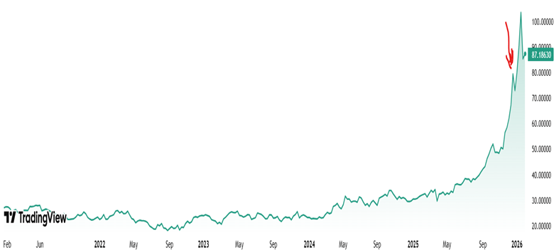
Five-year chart of silver prices $/oz, per Trading View
So I wrote a blog post here last month warning of a bubble, and sold about a quarter of my silver holdings. (I also initiated some protective options but that’s another story for another time.) I then felt pretty foolish for the next four weeks, as silver prices went up and up and up, a good 40% percent over the point I initially thought it was a bubble. Maybe I was wrong, or maybe the market can stay irrational longer than you can stay solvent, per J. M. Keynes.
When the crash finally came, it was truly epic. Below is a one-month chart of silver price. The two red lines show silver price at the close of regular trading on Thursday, January 29 (115.5 $/oz), and at the close of trading on Friday, January 30 (84.6 $/oz):
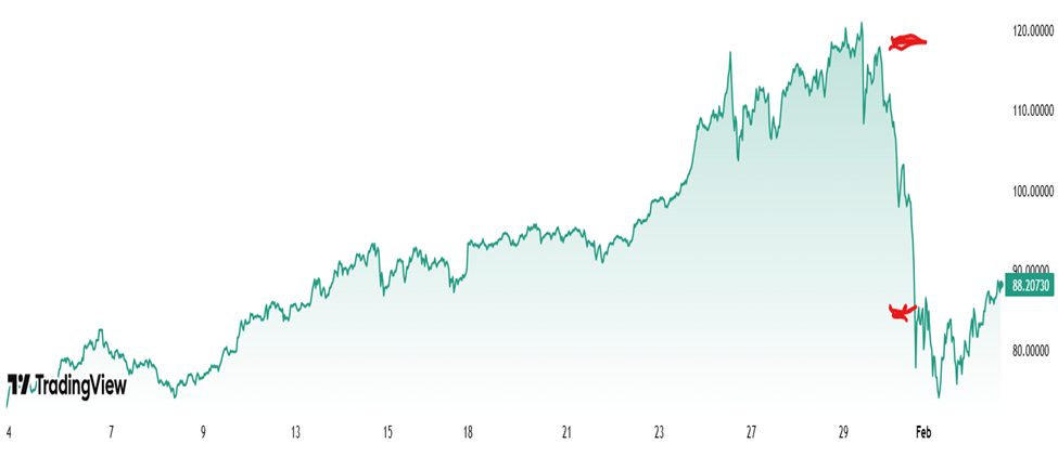
This is a drop of nearly 30% in one day, which is a mind-boggling move for a major commodity. Gold got dragged down, too:
These aren’t normal moves. Over roughly the past 25+ years (through 2025), gold’s price has changed by about 0.8% per day on average (in absolute percentage terms). Silver, being more volatile, has averaged around 1.4–1.5% per day. If you’re scoring at home, that’s about a 13 Sigma move for Gold and 22 Sigma move for Silver! You’re witnessing something that shouldn’t happen more than once in several lifetimes…statistically speaking. Yet here we are.
After the fact, a number of causes for the crash were proposed:
- The nomination of Kevin Warsh as the next Federal Reserve Chair. Warsh is perceived as a hawkish policymaker, leading investors to expect tighter monetary policy, higher interest rates, and a stronger U.S. dollar—all of which reduce the appeal of non-yielding assets like silver.
- Aggressive profit-taking after silver surged over 40% year-to-date and hit record highs near $121 per ounce.
- Leveraged positions in silver futures were rapidly unwound as prices broke key technical levels, triggering stop-loss orders and margin calls.
- CME margin hikes (up to 36% for silver futures) increased trading costs, forcing traders to cut exposure and accelerating the sell-off.
- Extreme speculation among Chinese investors, leading the Chinese government to clamp down on speculative trading. (And presumably Chinese solar panel manufacturers have been complaining to the government about high costs for silver components).
What happens next?
Silver kept falling to a low of 72.9 $/oz in the wee hours of February 2, a drop of 40% percent from the high of 120.8 on Jan 26. However, it looks to my amateur eyes like the silver bubble is not really tamed yet. For all the drama of a 22-sigma crash one day crash, about all that did was erase one months’ worth of speculative gains. The charts above are showing that silver is clawing its way right back up again. It is very roughly on the trend line of the past six months, if one excludes the monster surge in the month of January.
There is a saying among commodities traders, that the cure for high prices is high prices. This means that over time, there will be adjustments that will bring down prices. In the case of silver, that will include figuring out ways to use less of it, including recycling and substitution of other metals like copper and aluminum. However, my guess is that the silver bulls feel vindicated by the price action so far, and will keep on buying at least for now.
Disclaimer: As usual, nothing here should be regarded as advice to buy or sell any security.


