Is it the best of times or the worst of times? This question I asked myself as I saw the following three headlines juxtaposed last week:

“US consumers are in the best shape ever” is sandwiched between two downers. The American consumer’s ongoing spending has staved off the long-predicted recession, quarter after quarter after quarter. Can we keep those plates spinning?
We noted earlier that the huge windfall of pandemic benefits (direct stimulus plus enhanced unemployment benefits) put trillions of dollars into our bank accounts, and the spending down of that surplus seems to have powered the overall economy and hence employment (and inflation). How the economy does going forward is still largely determined by that ongoing spend-down. Thus, the size of the remaining hoard is critically important.
Unfortunately, it seems to be difficult to come up with an agreed-on answer here. The San Francisco Fed maintains a web page dedicated to tracking “Pandemic-Era Excess Savings.” Here is a key chart, tracking the ups and downs of “Aggregate Personal Savings”:

This is compared to a linear projection of pre-pandemic savings, which is the dotted line. (Which dotted line you choose is crucial, see below) . The next chart plots the cumulative savings relative to that line, showing a steady spend-down, and that this excess savings is just about exhausted:

If this represents reality, then we might expect an imminent slowdown in consumer spending and in GDP growth, and presumably a lessening in inflationary pressures, which may in turn justify more rate cuts by the Fed.
But the Boston Fed says, “Maybe not.” A study by Omar Barbiero and Dhiren Patki published in November titled Have US Households Depleted All the Excess Savings They Accumulated during the Pandemic? showed that it makes a huge difference which savings rate trend you choose for a baseline.
The following chart shows two versions of the first plot shown above, with (on the left) a linear, increasing projection of 2018-2019 savings trends, versus a flat savings rate baseline:
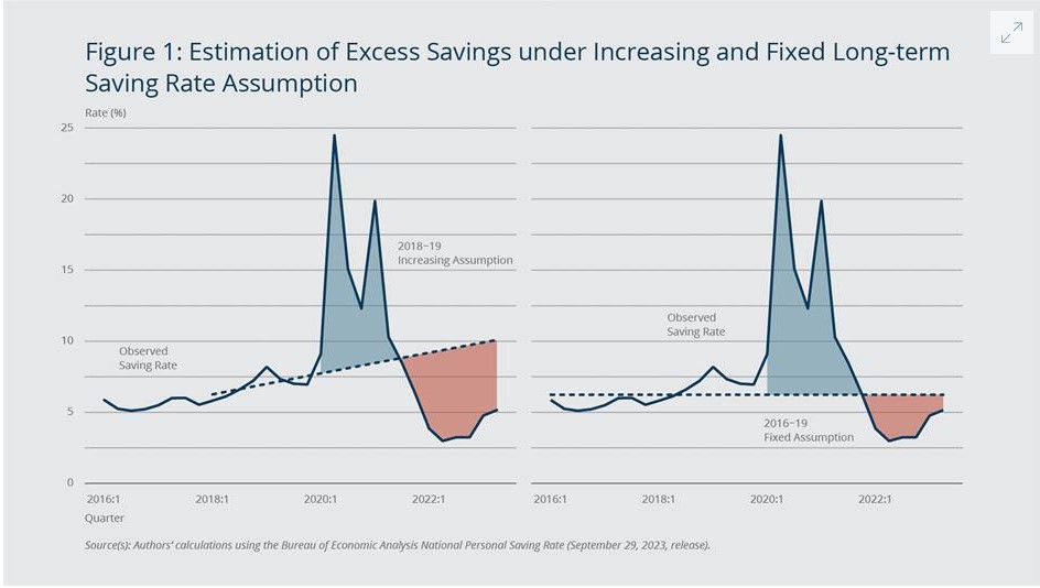
Two significant differences between these plots and the San Francisco Fed plot shown above are that these plots only run through the end of 2022, and that they display per cent savings rate rather than dollar amounts. However, they demonstrate the difference that the baseline makes. Using an increasing savings rate baseline (2018-2019 trend projection), the surplus was nearly exhausted at the end of 2022. Using a flat rate average of 2016-2019 for the baseline, the surplus was barely dented.
We will see how this plays out. My guess is that at the first whiff of actual recession and job losses, the administration will gush out the maximum amount of largesse; while we may have ongoing inflation and high interest rates due to the deficit spending, we will not have a hard landing. I think.