xtbreak (STATA)
I found a new time series and panel data tool that I want to share. What does it do? It’s called xtbreak and it finds what are known as ‘structural breaks’ in the data. What does that mean? It means that the determinants of a dependent variable matter differently at different periods of time. In statistics we’d say that the regression coefficients are different during different periods of time. To elaborate, I’ll walk through the same example that the authors of the command use.
You can download the time series data from here: https://github.com/JanDitzen/xtbreak/blob/main/data/US.dta
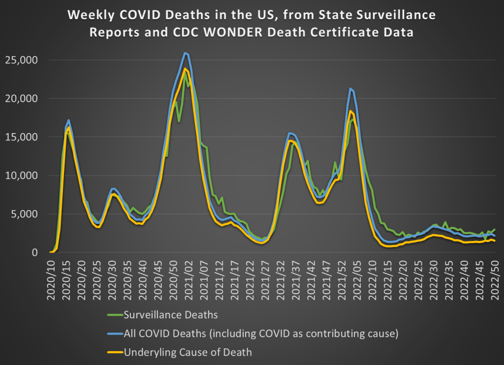
The data contains weekly US covid cases and deaths for 2020-2021. Here’s what it looks like:

So, what’s the data generating process? It stands to reason that the number of deaths is related to the number of cases one week prior. So, we can adopt the following model:

That seems reasonable. However, we suspect that δ is not the same across the entire sample period. Why not? Medical professionals learned how to better treat covid, and the public changed their behavior so that different types of people contracted covid. Further, once they contracted it, the public’s criteria for visiting the doctor changed. So, while the lagged number of cases is a reasonable determinant of deaths across the entire sample, we would expect it to predict a different number deaths at different times. In the model above, we are saying that δ changes over time and maybe at discrete points.
First, xtbreak allows us to test whether there are any structural breaks. Specifically, it can test whether there are S breaks rather than S-1 breaks. If the test statistic is greater than the critical statistics, then we can conclude that there are some number of breaks. Note that there being 5 breaks given that there are 4 depends on there also be at least 4 breaks. And since we can’t say that there are certainly 4 breaks rather than 3, it would be inappropriate to say that there are 4 or 5 breaks.

Great, so if there are three structural breaks, then when do they occur? xbtreak can answer that too (below). The three structural breaks are noted as the 20th week of 2020, the 51st week of 2020, and the 11th week of 2021. Conveniently, there is also a confidence interval. Note that the confidence intervals for 2020w11 and 2021w11 breaks are nice and precise with a 1-week confidence interval. The 2nd break, however, has a big 30-week confidence interval (nearly 7 months). So, while we suspect that there is a 3rd structural break, we don’t know as precisely where it is.

Regardless, if there are three structural breaks, then that means that there are four time periods with different relationships between lagged covid cases and covid deaths. We can create a scatter plot of the raw data and run a regression to see the different slopes. Below we can see the different slopes that describe the impact of lagged covid cases on deaths. Sensibly, covid cases resulted in more deaths earlier during the pandemic. As time passed, the proportion of cases which resulted in death declined (as seen in the falling slope of the dots). It’s no wonder that people were freaking out at the start of the pandemic.


What’s nice about this method for finding breaks is that it is statistically determined. Of course, it’s important to have a theoretical motivation for why any breaks would occur in the first place. This method is more rigorous than eye-balling the data and provides opportunities to hypothesis test the number of breaks and their location. If you read the documentation, then there are other tests, such as breaks in the constant, that are also possible.
See this ppt by the authors for more: https://www.stata.com/meeting/germany21/slides/Germany21_Ditzen.pdf
See this Stata Journal article for more still: https://repec.cal.bham.ac.uk/pdf/21-14.pdf