Much ink has been spilled making cross-country comparisons since the start of the COVID-19 pandemic. I have made a few of these, such as a comparison of GDP declines and COVID death rates among about three dozen countries in late 2021. I also made a similar comparison of G-7 countries in early 2022. But all such comparisons are tricky to interpret if we want to know why these differences exist between countries, which surely ultimately we would like to know. I tried to stress in those blog posts that I was just trying to visualize the effects, not make any claims about causation.
Here’s one more chart which I think is a very useful visualization, and it may give us some hint at causation. The following scatterplot shows COVID vaccination rates and excess mortality for a selection of European countries (more detail below on these measures and the countries selected):
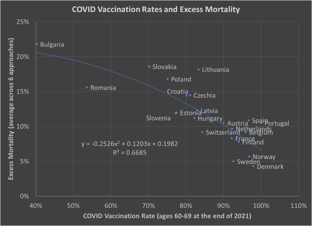
The selection of countries is based on data availability. For vaccination rates, I chose to use the rate for ages 60-69 at the end of 2021. Ages 60-69 is somewhat arbitrary, but I wanted a rate for an elderly age group that was somewhat widely available. There is no standard source for an international organization that published these age-specific vaccine rates (that I’m aware of), but Our World in Data has done an excellent job of compiling comparable data that is available.
Note: I’m using the data on at least one dose of the vaccine. OWID also has it available by full vaccine series, and by booster, but first dose seemed like a reasonable approach to me. Also, I could have used different age groups, such as 70-79 or 80+, but once you get to those age groups the data gets weird because you have a lot of countries over 100%, probably due to both challenging denominator calculations and just general challenges with collecting data on vaccination rates. By using 60-69, only one country in my sample (Portugal) is over 100%, and I just code them as 100%. Using the end of 2021, rather than the most current data, is a bit arbitrary too, but I wanted to capture how well early vaccination efforts went, though ultimately it probably wouldn’t have mattered much.
Also: dropping the outliers of Bulgaria and Romania doesn’t change things much. The second-degree best fit polynomial still has an R2 over 0.60 (for those unfamiliar with these statistics, that means about 60% of the variation is “explained” in a correlational sense).
The excess mortality measure I use comes from the following chart. In fact, this entire post is inspired by the fact that this chart and others similar to it have been shared frequently on social media.
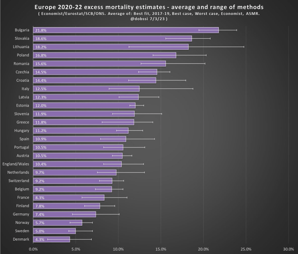
The chart comes from a Tweet thread by Paul Collyer. The whole thread is worth reading, but this chart is the key and summary of the thread. What he has done is shown the average and range of a variety of ways of calculating excess mortality. Read his thread for all the details, but the basic issues are what baseline to use (2015-2019 or 2017-2019? A case can be made for both), how to do the age-standardized mortality, and other issues. I won’t make a claim as to which method is best, but averaging across them seems like a fine approach to me.
For the y-axis in my chart, I just used the average for each country from Collyer’s chart. There are 34 countries in his chart, but in the OWID age-specific vaccination rates, only 22 countries were available the overlapped with his group. Unfortunately, this means we drop major countries like Italy, Spain, the UK, and Germany, but you work with the data you have.
For many sharing this and similar chart (such as charts with just one of those methods), the surprising (or not surprising) result to them is that Sweden comes out with almost the lowest excess mortality rate. Some approaches even put Sweden as the very lowest. Sweden!
Why is Sweden so important? Sweden has been probably the most debated country (especially by people not living in the country in question) in the COVID pandemic conversation. In short, Sweden took a less restrictive (some might say much less restrictive) approach to the pandemic. This debate was probably the most fevered in mid-to-late 2020, when some were even claiming that the pandemic was over in Sweden (it wasn’t). The extent to which Sweden took a radically different approach is somewhat overstated, especially in relation to other Nordic countries. And as is clear in both charts above, the Nordic countries all did relatively very well on excess mortality.
The bottom line from my first chart is that what really matters for a country’s overall excess mortality during the pandemic is how well they vaccinated their population. There seems to be a lot of interest on social media to rehash the debates about whether lockdowns (and lighter restrictions) or masks worked in 2020. But what really mattered was 2021, and vaccines were key. A scatterplot isn’t the last word on this (we should control for lots of other things), but it does suggest that a big part of the picture is vaccines (you can see this in scatterplots of US states too). It’s frustrating that many of those wanting to rehash the 2020 debates to “prove” masks don’t work, or whatever, either ignore vaccines or have bought into varying degrees of anti-vaccination theories. It’s completely possible that lockdowns don’t pass a cost/benefit test, but that vaccines also work very well (this has always been my position).
Why did Sweden have such great relative performance on excess mortality? Vaccines are almost certainly the most important factor among many that matter to a much smaller degree.
What About the US?
Note: for those wondering about the US, we don’t have the vaccination rate for ages 60-69 that I can find. Collyer also didn’t include the US in his analysis, it was only Europe. So, for both reasons, I didn’t include them in this post. The CDC does report first-dose vaccinations for ages 65+ in the US, though they top-code states at 95%. As of the end of 2021, here are the states that were below 95%: Mississippi, Louisiana, Tennessee, West Virginia, Indiana, Ohio, Wyoming, Georgia, Arkansas, Idaho, Alabama, Montana, Alaska, Missouri, Texas, Michigan, and Kentucky. These states generally have very high age-adjusted COVID death rates. Ideally we would use age-adjusted excess mortality for US states, but in the US that is horribly confounded by the rise in overdoses, homicides, car accidents, and other causes that are independent of vaccination rates (though they may be related to 2020 COVID policies — this is still a matter of huge debate).