The flu and covid-19 vaccines don’t work super well. Both vaccines permit infection and transmission at quite high rates. The benefit from these vaccines come largely from reductions in mortality or severe symptoms conditional on infection. The covid-19 vaccine is itself especially risky or ineffective depending on the age and health of the individual. Plenty of people eschew vaccines.
I live in Collier County, Florida where there have been 61 confirmed cases of measles so far this year. I have since learned that Measles is EXTREMELY contagious. It floats around the air and on items and just sort of hangs out and waits for a place to replicate. I’ve also learned that symptoms include a fever, eye irritation, possible brain swelling, severe dehydration, and a characteristic rash. The severe dehydration easily puts people in the hospital, the eye irritation can lead to permanent vision loss, and the brain swelling can be acute, or a symptom delayed by 5-6 years, which can also be fatal. I’ve also learned that having the vaccine, which is usually administered in two doses, provides about 97% immunity. The vaccine works so well, that the department of health recommends no behavioral change among the vaccinated population when there is a measles outbreak. Barring unique circumstances, measles immunity can persist for a lifetime.
Unfortunately, a large segment of the anti-vaccine mood affiliation retains the salience of the covid-19 vaccine characteristics. Other vaccines and diseases in the typical pediatric schedule are not similar. Most of these prevent infection >90% of the time (TDAP is low at 73%), prevent transmission, reduce mortality when there are breakthrough infections, are effective for years or decades, and are extremely safe for all age groups.
The risks of disease versus the corresponding vaccine are orders of magnitude away from each other. The tables below summarize the data (with sources). I did not double check the source on every single figure. If you glance below, then you’ll see why: Even if the numbers are closer by 10 or 100 times, vaccines still look really good.
First, mortality: The data is divided by disease and age group, and provides mortality rates for both the disease and for the vaccine. The numbers are proportions, conditional on infection or vaccination. There are a lot of zeros in the vaccine mortality rates and certainly more than for the diseases. For example, a measles infection is 10,000 more lethal than the MMR vaccine which prevents it. In fact, all of those zeros in the vaccine rates reflect mortality that is so uncommon, that the estimated one out of every 10 million is just rounded up because researchers don’t think that the risk is zero.
By almost any measure, 2025 was a great year for the United States.
Despite inflation remaining elevated and the damage from new tariffs, the economy did well. Inflation-adjusted median earnings are higher than a year ago, though only by about 1.3%. While most prices are still rising, one bright spot for affordability is that home prices are falling in much of the country (according to Zillow estimates).
The unemployment rate did tick up slightly, from 4.2% last November to 4.6% currently. This is definitely an indicator to watch over the next few months, but it is still well below average.
But even outside of the economy, there is plenty of good news in the data. Crime rates are plummeting. The murder rate fell something like 20%, as well as every major category of crime (violent crime overall is down 10%). This are some of the largest one-year drops in crime the US has ever seen.
Homicides aren’t the only category of deaths that are falling in 2025. For most categories of death as tracked by the CDC, there is a long lag (6 months or more) before all of the deaths are categorized. So we can’t look at complete 2025 data yet. For example, drug overdoses have increased massively in recent years, especially during the pandemic. But after plateauing in 2021-23, drug ODs started falling in 2024 and have continued to fall in early 2025. For the 12 months ending in April 2025, drug OD deaths were 26% lower than the prior 12 months. If we look at just the first 5 months of the year, 2024 was 20% lower than 2023, and 2025 was another 20% lower than 2024. For the first five months of 2025, ODs are basically back down to the same level as 2018 and 2019. Motor vehicle deaths also increased during the pandemic, but they are down 8% in the first half of 2025, essentially back down to 2018-19 levels.
Was it all good news? No, you can certainly find some data to be pessimistic about. For example, despite the efforts of DOGE and other attempts to cut federal government spending, over $2 trillion was added to the national debt in 2025, up 6 percent from the end of 2024 and surpassing $38 trillion. And as I mentioned above with the unemployment rate, there is some evidence the labor market may be weakening.
Not all is rosy as we head into 2026, but 2025 was a year filled with many positive trends on the economic front and in society more generally. May your new year be prosperous and healthy!
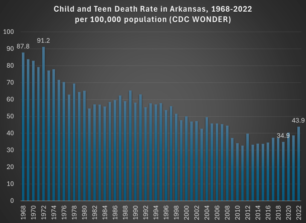
In my Inbox I read the following sentence, summarizing an article on child health in Arkansas: “The latest Annie E. Casey Foundation KIDS COUNT Data Book shows 2022 was the deadliest year on record for child deaths in Arkansas.”
Deadliest on record! That certainly grabbed my attention. I clicked the link and read the article. Indeed, they emphasize three times that 2022 was the “deadliest year” for kids in Arkansas, including with a chart! And the chart does seem to support the claim: in 2022 there were 44 child and teen deaths per 100,000 in Arkansas, higher than any year on the chart.
But wait a minute, this chart only goes back to 2010. Surely the record goes back further than that? Indeed it does. It took me three minutes (yes, I timed myself, and you have to use 4 different databases) to complete the necessary queries from CDC WONDER to extract the data to replicate their 2010-2022 chart, and to extend the data back a lot further: all the way to 1968 (though in 30 seconds I could have extended it back to 1999).
And what do we find in 1968? The death rate for children and teens in Arkansas was twice as high as it was in 2022. Not just a little higher, but double. With some more digging, I might be able to go back further than 1968, but from the easily accessible CDC data, that’s as far back as “the record” goes. Of course, I knew where to look, but I would hope that a group producing a data book on child health also knows where to look. And you don’t need to extend this very far past the arbitrary 2010 cutoff in the article quoted: 2008 and every year before it was more deadly than 2022 for children in Arkansas. Here’s a chart showing the good long-run trend:
Now there is a notable flattening of the long-run trend in the past 15 years or so, and a big reversal since 2019. What could be causing this? The article I read doesn’t get specific, but here’s what they say: “The state data isn’t broken out into cause of death, but firearm-related deaths have become the leading cause of death among U.S. teens in recent years. Deaths from accidents such as car crashes account for most child deaths.”
But using CDC WONDER, we can easily check on what is causing the increase since 2019. “Firearm-related deaths” is an interesting phrase, since it lumps together three very different kinds of deaths: homicides, suicides, and accidents. And while it is true that “deaths from accidents” are the leading category of deaths for children, this also lumps together many different kinds of deaths: not only car crashes, but also poisonings, drownings, or accidental firearm deaths.
For Arkansas in 2022, here are the leading categories of deaths for children and teens (ages 1-19) if we break down the categories a bit:
Homicides: 66
Non-transport accidents: 58 (largest subcategories: poisonings/ODs and drowning)
Transport accidents: 52 (almost all car crashes)
Suicides: 24
Birth defects: 16
Cancers: 14
Cardiovascular diseases: 13
And no other categories are reported, because CDC WONDER won’t show you anything smaller than 10 deaths.
We might also ask what caused the increase since 2019, especially since this a report on child health and possible solutions. The death rate increased by 9 deaths per 100,000, and over 80% of the increase is accounted for by just two categories: homicides and non-transport accidents. Car crashes actually fell slightly (though the rate increased a bit, since the denominator was also smaller). Deaths from suicides, cancer, and heart diseases also declined from 2019 to 2022 among children in Arkansas, and these are the three on the list above that we would probably consider the “health” categories. Things actually got better!
But the really big increase, and very bad social trend, is the category of homicides. Among children and teens in Arkansas, it rose from 35 deaths in 2019 to 66 deaths in 2022. It almost doubled. That’s bad! But homicides are not mentioned anywhere in the article on this topic that I read (“firearm-related deaths” is the closest they get). And while car accidents are definitely a major problem, they didn’t really increase from 2019 to 2022 (among kids in Arkansas).
One more thing we can do with CDC WONDER is break down the homicides by age. The numbers so far are looking at a very broad range of children and teens, from ages 1-19. As I’ve written about before, the is a huge difference between homicide rates for older teens versus all of the kids. Indeed for Arkansas we see the same pattern, such as when I run a CDC WONDER query for single-years of age: only the ages 17, 18, and 19 show up (remember, anything less than 10 deaths won’t register in the query).
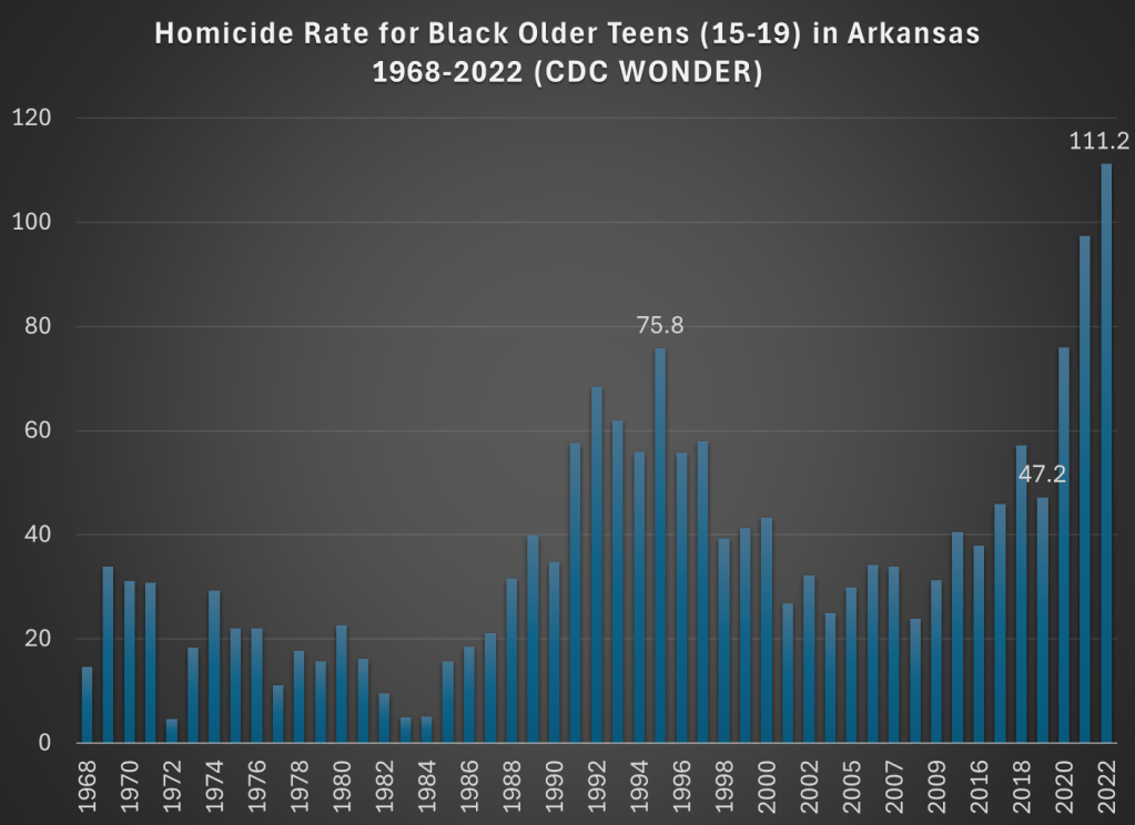
Breaking it down by five-year age groups, we see that 53 of the 66 homicides (in Arkansas among kids and teens) were for ages 15-19, that is 80% of the total. And further if we run the query by race, we see that 40 of the 66 homicides were for African Americans age 15-19. This is clearly a social problem, but it’s an extremely concentrated social problem. And the increase for older teen Blacks has been large too: it was just 17 deaths in 2019, more than doubling to 40 homicides in 2022.
Now, small numbers can jump around a bit, so just looking at 2019 and 2022 might be deceptive. What if we had a longer annual series to look at? Again, CDC WONDER allows us to do this. Here is the chart for homicides among older Black teens in Arkansas:
This is a dramatic chart. The steady rise in homicides among this demographic since 2019 is staggering. Not only the dramatic increase, but notice that 2021 and 2022 are much worse than the crime wave of the early 1990s, which also jump out in this chart. The homicide rate for older Black teens in 2022 was almost 50 percent higher than 1995, the prior worst year on record.
So is there a problem with child and teen deaths in Arkansas? Yes! But with just a few minutes of searching on CDC WONDER, I think we can get a much better picture of what is causing it than the article I read summarizing the report. Indeed, if we read the full national report, the word “homicide” is only mentioned once in a laundry list of many causes of death.
The most important part of addressing a social problem, such as “deadliest year on record for child deaths in Arkansas” is to know some basic details about what is causing a bad social indicator to worsen. Hopefully after reading this blog post you know a little bit more. If you want to read my summary of the research on how to reduce deaths from firearms, see this June 2022 post.
I’m in the process of writing a review of Jon Haidt’s book The Anxious Generation. I wrote some preliminary thoughts a few weeks ago, but I’m diving a lot deeper now, so watch for that review soon. But one of the main startling pieces of data in the book is the dramatic rise in suicides among young girls. Haidt isn’t the first to point this out, but in large part his book is an attempt to explain this rise (as well as the rise among boys and slightly older girls).
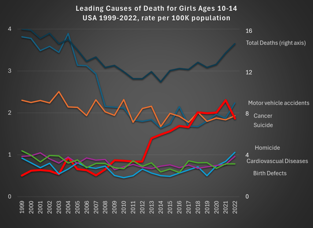
This got me thinking a bit more broadly about not just suicides, but all causes of mortality among young Americans. So in the style of my 2022 post about the leading causes of death among men ages 18-39, let’s look at the historical trends for deaths among girls 10-14 in the US.
Data comes from CDC WONDER. The top dark line shows total deaths, and the scale for total deaths is the right-axis. Notice that for total deaths, there is a U-shaped pattern. From 1999 to about 2012, deaths for girls aged 10-14 are falling. Then, the bottom out and start to rise again. While the end point in 2022 is lower than 1999 (by about 9 percent), there is a 22 percent increase from 2010 to 2022.
What’s driving those trends? A fall in motor vehicle accidents (blue line, the leading cause of death in both 1999 and 2022) is driving the decline. This category fell 41 percent over the entire time period: a big drop for the leading cause of death!
But the rise in suicides (thick red line) starting in 2013 is the clear driver of the reversal of the overall trend. Suicides for this demographic in 2022 were 268 percent higher than 1999, and 116 percent higher than 2010. Haidt and others are right to investigate the causes of this trend (I’m not convinced they have the complete answer, but more on that in my forthcoming book review).
There has been no clear trend in cancer deaths over this time period, and the combination of all the three of these trends means that roughly equal number of girls ages 10-14 die from car accidents, suicide, and cancer.
What can we learn from this data? First, we should acknowledge just how rare death is for girls ages 10-14. At 14.8 deaths per 100,000 population, it is the lowest 5-year age-gender cohort, other than the ages just below it (ages 5-9, for both boys and girls). But just because it is small doesn’t mean we should ignore it. The big increase, especially in suicides, in the past decade is worrying and could be indicative of broader worrying social trends (and suicides have risen for almost every age group too, see my linked post above).
If a concern, though, is that we are over-protecting our kids and this is leading them to retreat into a world of social media, we might want to see if there are any benefits of this overprotection in addition to the costs. The decline in motor vehicle accidents is one candidate. Is this decline just a result of the overall increase in car safety? Or is there something specific going on that is leading to fewer deaths among young teens and pre-teens?
As we know from other data, a lot fewer young people are getting driver’s licenses these days, especially compared to 1999 (and engaging in fewer risky behaviors across the board). Of course, 10-14 year-olds themselves usually weren’t the ones getting licenses — they are too young in most states — but their 15 and 16 year-old siblings might be the ones driving them around. Is fewer teens driving around their pre-teen siblings a cause of the decline in motor vehicle deaths? We can’t tell from this data, but it is worth investigating further (note: best I can tell, only about 23 percent of the decline is from fewer pedestrian deaths, though in the long-run this is a bigger factor).
Social tradeoffs are hard. If there really is a tradeoff between fewer car accident deaths and more suicides, how should we think about that tradeoff? Or is the tradeoff illusory, and we could actually have fewer deaths of both kinds? I don’t think I know the answer, but I do think that many others are being way too confident that they have the answer based on what data we have so far.
One final note on suicides. For all suicides in the US, the most common method is suicide by firearm: about 55% of suicides in the US were committed with guns in 2022, with suffocations a distant second at about 25%. For girls ages 10-14, this is not the case, with suffocation being by far the leading method: 62% versus just 17% with firearms. I only mention this because some might think the increasing availability of firearms is the reason for the rise in suicides. It could be true overall, but it’s not the case for young girls.
On X.com Matt Yglesias posted a chart that sparked some conversation about child safety:
One thing about the much-lamented rise of more intensively supervised childhood activities is that kids have in fact become a lot less likely to die. pic.twitter.com/MTjR7spLM8
Of course, it was probably more his comment about the “rise of more intensively supervised childhood activities” that generated the feedback and pushback. And I assume his comment was partially tongue-in-cheek, as often happens on Twitter, and designed to generate that very discussion. Still, it is worth thinking about. Exactly why did that decline happen?
I’ve posted on this topic before. In my March 2023 post, I looked at very broad categories of child death. While all death categories have declined, about half of the decrease (depending on the age group, but half is about right) is from a decline in deaths from diseases, as opposed to external causes. And fewer disease death can largely be attributed to improvements in healthcare, broadly defined. Good news!
Of course, that means that about half of the decline is from things other than diseases. What caused those declines? Let’s look into the data. Specifically, let’s look into the data on deaths from car accidents.
Two recent essays push back against the concept of “disinformation” in thoughtful but, I believe, ultimately incorrect ways.
Martin Gurri is primarily concerned with government trying to stamp out what it views as disinformation. I am concerned about that too, but there are ways for private actors to correct bad information too.
Dan Klein (my friend and professor in grad school) argues that most labeling of “disinformation” or “misinformation” is not really about information, but instead about knowledge. I agree that sometimes this is true. But sometimes it is not true. Sometimes we really are talking about information. And sometimes the information is about extremely important topics.
As I search through my own Twitter history for these terms, I see that there is overwhelmingly one period of time and one piece of information that I used them for: the total number of deaths in the United States in 2020. If you can think way back to the fall and winter of 2020/early 2021, you might recall that we were just finishing up the first year of the pandemic, and we were also going through one of the worst periods in the pandemic. Vaccines were now starting to become widely available as we got into 2021, and people were starting to make person decisions about whether to “get the jab.”
The number of total deaths in 2020 was an important number. There was still a lot of uncertainty about exactly how bad the pandemic was, or (to a small but vocal minority) whether the pandemic was even “real.” The data was crucial to this debate. Of course, once we have the data, we must interpret it. This is one of Klein’s main points, and a good one. But if we aren’t starting from a common baseline of true information, there is really no point in discussions based on interpretations of those different apparent realities. We will, by definition, be “talking past each other.”
So what were people saying about total deaths in 2020 during this moment of importance in late 2020/early 2021?
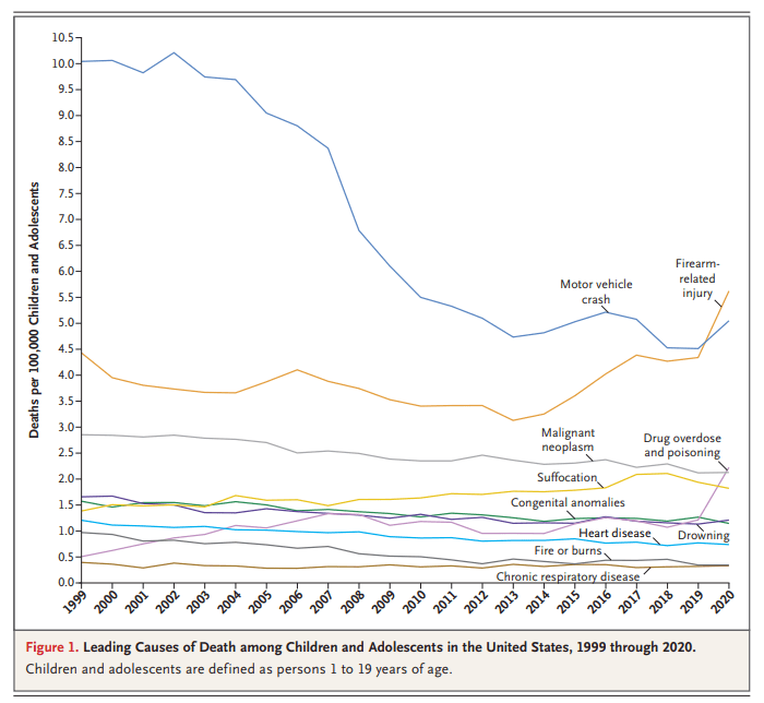
You might have seen this chart recently. It comes from a letter published in the New England Journal of Medicine in April 2022. The data comes directly from the CDC. It shows the leading causes of death for children in the US. You will notice that firearm-related deaths have been rising for much of the past decade, and in 2020 eclipsed car accidents as the leading cause.
Many are sharing this chart in response to the recent elementary school shooting in Nashville. It’s natural to want to study these problems more in the wake of tragedies. After the Uvalde shooting last year, I tried to read as much as I could about the history of homicide and gun violence in the US, and to look at the research on what might work to reduce gun violence, which is summarized in a post I wrote last June.
That being said, I don’t think the chart above accurately characterizes the problem of elementary school shootings. It might accurately describe some broader problem, but it’s misleading with respect to the shooting we all just witnessed. The most important reason is that the definition of “children” here extends to 18- and 19-year-olds. Much of the gun-related homicides for “children” shown here are gang-related violence, not random school shootings at elementary schools. It’s not that we shouldn’t care about these deaths too — we very much should care — but the causes and solutions are entirely different from elementary school mass shootings.
Much ink has been spilled making cross-country comparisons since the start of the COVID-19 pandemic. I have made a few of these, such as a comparison of GDP declines and COVID death rates among about three dozen countries in late 2021. I also made a similar comparison of G-7 countries in early 2022. But all such comparisons are tricky to interpret if we want to know why these differences exist between countries, which surely ultimately we would like to know. I tried to stress in those blog posts that I was just trying to visualize the effects, not make any claims about causation.
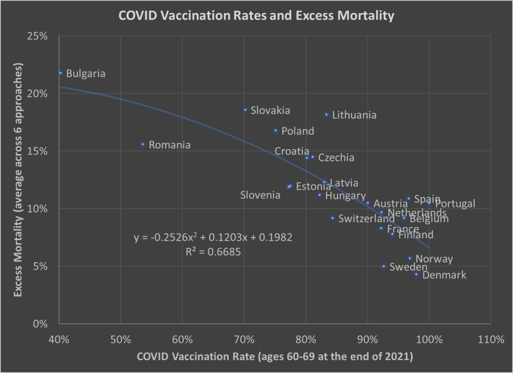
Here’s one more chart which I think is a very useful visualization, and it may give us some hint at causation. The following scatterplot shows COVID vaccination rates and excess mortality for a selection of European countries (more detail below on these measures and the countries selected):
The selection of countries is based on data availability. For vaccination rates, I chose to use the rate for ages 60-69 at the end of 2021. Ages 60-69 is somewhat arbitrary, but I wanted a rate for an elderly age group that was somewhat widely available. There is no standard source for an international organization that published these age-specific vaccine rates (that I’m aware of), but Our World in Data has done an excellent job of compiling comparable data that is available.
Note: I’m using the data on at least one dose of the vaccine. OWID also has it available by full vaccine series, and by booster, but first dose seemed like a reasonable approach to me. Also, I could have used different age groups, such as 70-79 or 80+, but once you get to those age groups the data gets weird because you have a lot of countries over 100%, probably due to both challenging denominator calculations and just general challenges with collecting data on vaccination rates. By using 60-69, only one country in my sample (Portugal) is over 100%, and I just code them as 100%. Using the end of 2021, rather than the most current data, is a bit arbitrary too, but I wanted to capture how well early vaccination efforts went, though ultimately it probably wouldn’t have mattered much.
Also: dropping the outliers of Bulgaria and Romania doesn’t change things much. The second-degree best fit polynomial still has an R2 over 0.60 (for those unfamiliar with these statistics, that means about 60% of the variation is “explained” in a correlational sense).
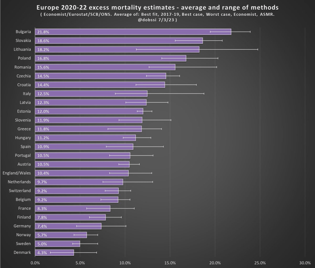
The excess mortality measure I use comes from the following chart. In fact, this entire post is inspired by the fact that this chart and others similar to it have been shared frequently on social media.
The chart comes from a Tweet thread by Paul Collyer. The whole thread is worth reading, but this chart is the key and summary of the thread. What he has done is shown the average and range of a variety of ways of calculating excess mortality. Read his thread for all the details, but the basic issues are what baseline to use (2015-2019 or 2017-2019? A case can be made for both), how to do the age-standardized mortality, and other issues. I won’t make a claim as to which method is best, but averaging across them seems like a fine approach to me.
For the y-axis in my chart, I just used the average for each country from Collyer’s chart. There are 34 countries in his chart, but in the OWID age-specific vaccination rates, only 22 countries were available the overlapped with his group. Unfortunately, this means we drop major countries like Italy, Spain, the UK, and Germany, but you work with the data you have.
For many sharing this and similar chart (such as charts with just one of those methods), the surprising (or not surprising) result to them is that Sweden comes out with almost the lowest excess mortality rate. Some approaches even put Sweden as the very lowest. Sweden!
Why is Sweden so important? Sweden has been probably the most debated country (especially by people not living in the country in question) in the COVID pandemic conversation. In short, Sweden took a less restrictive (some might say much less restrictive) approach to the pandemic. This debate was probably the most fevered in mid-to-late 2020, when some were even claiming that the pandemic was over in Sweden (it wasn’t). The extent to which Sweden took a radically different approach is somewhat overstated, especially in relation to other Nordic countries. And as is clear in both charts above, the Nordic countries all did relatively very well on excess mortality.
The bottom line from my first chart is that what really matters for a country’s overall excess mortality during the pandemic is how well they vaccinated their population. There seems to be a lot of interest on social media to rehash the debates about whether lockdowns (and lighter restrictions) or masks worked in 2020. But what really mattered was 2021, and vaccines were key. A scatterplot isn’t the last word on this (we should control for lots of other things), but it does suggest that a big part of the picture is vaccines (you can see this in scatterplots of US states too). It’s frustrating that many of those wanting to rehash the 2020 debates to “prove” masks don’t work, or whatever, either ignore vaccines or have bought into varying degrees of anti-vaccination theories. It’s completely possible that lockdowns don’t pass a cost/benefit test, but that vaccines also work very well (this has always been my position).
Why did Sweden have such great relative performance on excess mortality? Vaccines are almost certainly the most important factor among many that matter to a much smaller degree.
What About the US?
Note: for those wondering about the US, we don’t have the vaccination rate for ages 60-69 that I can find. Collyer also didn’t include the US in his analysis, it was only Europe. So, for both reasons, I didn’t include them in this post. The CDC does report first-dose vaccinations for ages 65+ in the US, though they top-code states at 95%. As of the end of 2021, here are the states that were below 95%: Mississippi, Louisiana, Tennessee, West Virginia, Indiana, Ohio, Wyoming, Georgia, Arkansas, Idaho, Alabama, Montana, Alaska, Missouri, Texas, Michigan, and Kentucky. These states generally have very high age-adjusted COVID death rates. Ideally we would use age-adjusted excess mortality for US states, but in the US that is horribly confounded by the rise in overdoses, homicides, car accidents, and other causes that are independent of vaccination rates (though they may be related to 2020 COVID policies — this is still a matter of huge debate).
How many people died in the US from heart diseases in 2019? The answer is harder than it might seem to pin down. Using a broad definition, such as “major cardiovascular diseases,” and including any deaths where this was listed on the death certificate, the number for 2019 is an astonishing 1.56 million deaths, according to the CDC. That number is astonishing because there were 2.85 million deaths in total in the US, so over half of deaths involved the heart or circulatory system, at least in some way that was important enough for a doctor to list it on the death certificate.
However, if you Google “heart disease deaths US 2019,” you get only 659,041 deaths. The source? Once again, the CDC! So, what’s going on here? To get to the smaller number, the CDC narrows the definition in two ways. First, instead of all “major cardiovascular diseases,” they limit it to diseases that are specifically about the heart. For example, cerebrovascular deaths (deaths involving blood flow in the brain) are not including in the lower CDC total. This first limitation gets us down to 1.28 million.
But the bigger reduction is when they limit the count to the underlying cause of death, “the disease or injury that initiated the train of morbid events leading directly to death, or the circumstances of the accident or violence which produced the fatal injury,” as opposed to other contributing causes. That’s how we cut the total in half from 1.28 million to 659,041 deaths.
We could further limit this to “Atherosclerotic heart disease,” a subset of heart disease deaths, but the largest single cause of deaths in the coding system that the CDC uses. There were 163,502 deaths of this kind in 2019, if you use the underlying cause of death only. But if we expand it to any listing of this disease on the death certificate, it doubles to 321,812 deaths. And now three categories of death are slightly larger in this “multiple cause of death” query, including a catch-all “Cardiac arrest, unspecified” category with 352,010 deaths in 2019.
So, what’s the right number? What’s the point of all this discussion? Here’s my question to you: did you ever hear of a debate about whether we were “overcounting” heart disease deaths in 2019? I don’t think I’ve ever heard of it. Probably there were occasional debates among the experts in this area, but never among the general public.
COVID-19 is different. The allegation of “overcounting” COVID deaths began almost right away in 2020, with prominent people claiming that the numbers being reported are basically useless because, for example, a fatal motorcycle death was briefly included in COVID death totals in Florida (people are still using this example!).
A more serious critique of COVID death counting was in a recent op-ed in the Washington Post. The argument here is serious and sober, and not trying to push a particular viewpoint as far as I can tell (contrast this with people pushing the motorcycle death story). Yet still the op-ed is almost totally lacking in data, especially on COVID deaths (there is some data on COVID hospitalizations).
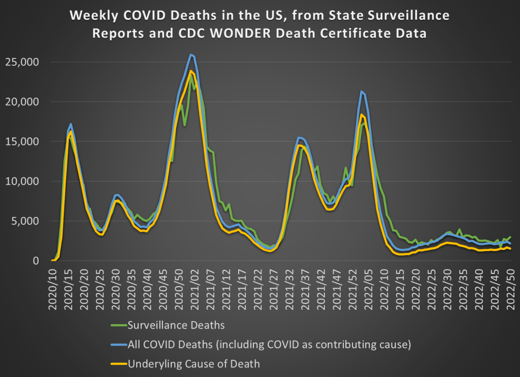
But most of the data she is asking for in the op-ed is readily available. While we don’t have death totals for all individuals that tested positive for COVID-19 at some point, we do have the following data available on a weekly basis. First, we have the “surveillance data” on deaths that was released by states and aggregated by the CDC. These were “the numbers” that you probably saw constantly discussed, sometimes daily, in the media during the height of the pandemic waves. The second and third sources of COVID death data are similar to the heart disease data I discussed above, from the CDC WONDER database, separated by whether COVID was the underlying cause or whether it was one among several contributing causes (whether it was underlying or not).
Those three measures of COVID deaths are displayed in this chart:
The all-cause mortality rate in 2021 for men in the US ages 18-39 was about 40% higher than the average of 2018 and 2019. That’s a huge increase, especially for a group that is not in the high-risk category for COVID-19. What’s causing it?
Some have suggested that heart disease deaths, perhaps induced by the COVID vaccines, is the cause. This is not just a fringe internet theory by anonymous Twitter accounts. The Surgeon General of Florida has said this is true.
What do the data say? The first thing we can look at is heart disease deaths for men ages 18-39.
The data I’m using is from the CDC WONDER database. This database aggregates data from US states, using a standardized system of reporting deaths. The most important thing to know is that in this database, each death can one have one underlying cause, and this is indicated on the death certificate. Deaths can also have multiple contributing causes (and most deaths do), and the database allows you to search for those too. But for this analysis, I’m only looking at the underlying cause.
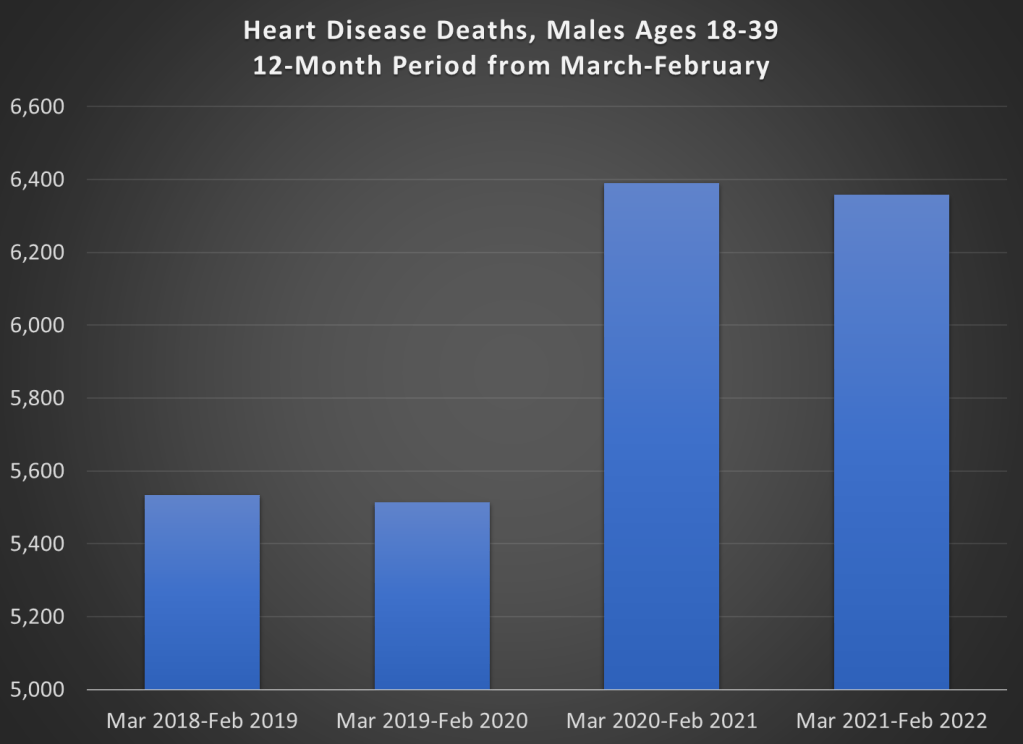
Here’s the heart disease death data for men ages 18-39, presented two different ways. First the trailing 12-month average. Don’t focus too much on that dip at the end, since the most recent data is incomplete. Instead, notice three things. First, there was a clear increase in heart disease deaths. Second, that rise began in mid-2020, well before the introduction of vaccines. Third, once vaccines started being administered to this age group in Spring 2021, the number of deaths leveled off (though it didn’t return to pre-pandemic levels).
Here’s another way of looking at the data: 12-month time periods, rather than a trailing average. I created 12-month time periods starting in March and ending in February of the following year. I’ve also truncated the y-axis to show more detail, not to trick you. But don’t be tricked! The deaths are up 2-3%, not a more than doubling as the chart appears to show.
We can see in the chart above that the rise in heart disease deaths for young males completely preceded the vaccination period. Something changed, for sure, but the change wasn’t the introduction of vaccines. Heart disease deaths (by underlying cause) are only up 2-3%, while overall deaths are up around 40%.
So, to repeat the title question, what is killing these young men?