Remember that one time, back when we had a global pandemic, when interest rates fell really low and everyone was borrowing and refinancing? Good times. But they were also times of surging demand for durable goods, supply chain disruptions, and shortages. Specifically, the price of lumber surged by 54% between 2019 and 2022. There were stories of contractors who were unable to do their jobs at their typical prices. Some of them went without work. Others did much less work. Theft of precious lumber was in the news.
As we know, sudden price spikes often make the front pages and the social media rounds. But they peter out and the subsequent decline in prices hardly ever gets coverage in the same way. People used to talk about higher gasoline prices all the time, but never discussed with the same enthusiasm when prices fell. The same is true for lumber. We heard hysterical stories of record high prices, alleged shortages, and the sawmills that lacked adequate capacity to keep up with demand.
I found a new time series and panel data tool that I want to share. What does it do? It’s called xtbreak and it finds what are known as ‘structural breaks’ in the data. What does that mean? It means that the determinants of a dependent variable matter differently at different periods of time. In statistics we’d say that the regression coefficients are different during different periods of time. To elaborate, I’ll walk through the same example that the authors of the command use.
The data contains weekly US covid cases and deaths for 2020-2021. Here’s what it looks like:
So, what’s the data generating process? It stands to reason that the number of deaths is related to the number of cases one week prior. So, we can adopt the following model:
That seems reasonable. However, we suspect that δ is not the same across the entire sample period. Why not? Medical professionals learned how to better treat covid, and the public changed their behavior so that different types of people contracted covid. Further, once they contracted it, the public’s criteria for visiting the doctor changed. So, while the lagged number of cases is a reasonable determinant of deaths across the entire sample, we would expect it to predict a different number deaths at different times. In the model above, we are saying that δ changes over time and maybe at discrete points.
First, xtbreak allows us to test whether there are any structural breaks. Specifically, it can test whether there are S breaks rather than S-1 breaks. If the test statistic is greater than the critical statistics, then we can conclude that there are some number of breaks. Note that there being 5 breaks given that there are 4 depends on there also be at least 4 breaks. And since we can’t say that there are certainly 4 breaks rather than 3, it would be inappropriate to say that there are 4 or 5 breaks.
Great, so if there are three structural breaks, then when do they occur? xbtreak can answer that too (below). The three structural breaks are noted as the 20th week of 2020, the 51st week of 2020, and the 11th week of 2021. Conveniently, there is also a confidence interval. Note that the confidence intervals for 2020w11 and 2021w11 breaks are nice and precise with a 1-week confidence interval. The 2nd break, however, has a big 30-week confidence interval (nearly 7 months). So, while we suspect that there is a 3rdstructural break, we don’t know as precisely where it is.
Regardless, if there are three structural breaks, then that means that there are four time periods with different relationships between lagged covid cases and covid deaths. We can create a scatter plot of the raw data and run a regression to see the different slopes. Below we can see the different slopes that describe the impact of lagged covid cases on deaths. Sensibly, covid cases resulted in more deaths earlier during the pandemic. As time passed, the proportion of cases which resulted in death declined (as seen in the falling slope of the dots). It’s no wonder that people were freaking out at the start of the pandemic.
What’s nice about this method for finding breaks is that it is statistically determined. Of course, it’s important to have a theoretical motivation for why any breaks would occur in the first place. This method is more rigorous than eye-balling the data and provides opportunities to hypothesis test the number of breaks and their location. If you read the documentation, then there are other tests, such as breaks in the constant, that are also possible.
Well, the great “Recession Starting Next Quarter” that has been predicted for nearly two years is nowhere in sight. In fact, the Bureau of Labor Statistics just last week posted an absolute blowout jobs number:
The U.S. economy churned out a blockbuster 336,000 jobs in September, smashing economists’ expectations and heightening the risk that policymakers will have to push even harder to slow down the economy. The data released Friday by the Bureau of Labor Statistics offered yet another snapshot of the job market’s remarkable strength, with the unemployment rate holding at 3.8 percent and wage growth outpacing inflation in a boost to workers. But it was also the latest example of an economy that simply refuses to slow down, despite the Federal Reserve’s aggressive attempts to get prices and hiring closer to normal levels…The September report, which showed the largest number of gains since January, had been expected to indicate continued moderation in the labor market, with forecasts of around 170,000 jobs created. Instead, it came in at nearly twice that amount. (Lauren Kaori Gurley and Rachel Siegel , Washington Post)
Before we get too excited, let’s note that the BLS numbers have a strong component of BS: nearly every jobs number they put out is quickly, quietly revised downward by 20% or so. Also, much of the jobs creation this year has been in the part-time category (so employers don’t have to pay health benefits). That said, it is indisputable that despite ferocious interest rate hikes, the economy continues to hum along, much more robustly that nearly anyone predicted six or twelve months ago. Why?
I suggest that we follow the time-tested approach of investigative reporters, which is to follow the money. We have noted earlier that since 2020 a key factor in consumer spending, which constitutes about 70% of the economy, has been the ginormous windfall of free money, over $4 trillion, that was put into the economy via various pandemic-related programs (enhanced unemployment benefits, direct stimmie payments, etc.). The story of the recent strong jobs market is largely the story of spending down that windfall.
When we were locked down in late 2020-early 2021, we consoled ourselves with ordering tons of goods on Amazon. While this generated some jobs for longshoremen and UPS and Amazon drivers, it was mainly Chinese workers who benefited from this phase. But for the past year and a half, we are out there in planes, trains, automobiles, and cruise ships, spending for services and restaurant food at a brisk pace. This has buoyed up the domestic economy, which in turn is keeping inflation far above the Fed’s 2% target.
Part of the incoming-recession story has been that the COVID windfall money is about to run out. For instance, here is a June, 2023 chart from Fed authors de Soyres, et al. showing that in the U.S. (black curve below) this money has already been exhausted:
A different set of Fed authors (Abdelrahman and Oliveira of the San Francisco Fed) wrote, also in June, that there remained a smidge of excess savings, but that “would likely be depleted in the third quarter of 2023.”
However, the Bureau of Economic Analysis (BEA) recently completed an update of national economic data that lowered the savings rate prior to the pandemic and increased it in 2020 and 2021. This basically reflected a change in the way the BEA accounts for income from mutual funds and REITS. The bottom line is that it has forced Wall Street economists to increase their excess savings projections to date by as much as $600 billion to $1 trillion, depending on the economics team. This in turn leads them to delay forecasts of recession by yet another 6-12 months.
For instance, James Knightley of ING Global Markets Research writes that there are still plenty of excess savings around; recent revisions in their numbers show the remaining hoard is even larger than they originally thought:
They did not break down this excess saving by income group, so it is possible that much of it remains with the upper 10-20% who may hoard/invest it, versus the bottom quartiles who have been spending it all into economy and now may be tapped out. We shall see how this continues to play out.
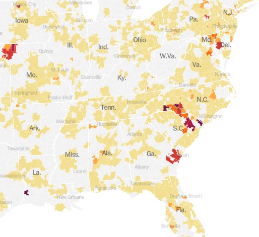
We reported last month on yet another COVID surge beginning, driven by yet another new, highly transmissible variant. When I checked in on the state of affairs this week, I found two different narratives.
With the demise of widespread public testing, it has become more difficult to track the progress of the disease. One means to do so now is to monitor hospital admissions for COVID. The New York Times provides this service, and it shows a continued uptrend in cases, at least through September 8:
The chart above is for the whole country. It turns out that these cases are highly localized in certain hot spots, especially along the Atlantic seaboard (Delaware through South Carolina), plus the region of St. Joseph, Missouri:
An alternate means of monitoring the progress of COVID is to do ongoing testing of municipal wastewater. The virus is “shed” (to put it delicately) in sewage, and can be detected there some days before a person reports any symptoms. Most recent wastewater analyses indicate that incidence of the disease is plateauing for now, according to an NBC News article by Erika Edwards:
Biobot Analytics, a company that tracks wastewater samplesat 257 sites nationwide, said that the current average Covid levels across the United States are approximately 5% lower than they were last week.
“All fingers crossed,” Cristin Young, a Biobot epidemiologist said, “this wave is plateauing and may be declining.”
After a mid- to late-summer rise, the CDC’s Covid wastewater surveillance now shows declines in mid-Atlantic states, such as Virginia and Maryland.
The findings are backed up from surveillance in North Carolina, said Jessica Schlueter, an associate professor in the department of bioinformatics and genomics at the University of North Carolina Charlotte. Her lab is responsible for testing 12 sites across the state.
The increase in Covid wastewater samples during the last six months “seems to be peaking and starting to taper off,” she said. …Wastewater collection sites in the Midwest and the Northeast, however, show a steady uptick in Covid spread.
Hospitalizations and deaths are lagging indicators, whereas wastewater analysis provides something of a leading indicator. Putting it all together, it may be that what we are seeing now is the usual late summer COVID increase, which may come down in the next two months, to be followed by another winter surge. Do get your latest booster shots.
We seem to be somewhat exhausted by all the dire predictions around Covid, now that life has largely gotten back to the normal. Shops and theaters are open, and people are once more crowding aboard those floating petri dishes called cruise ships. The most vulnerable segments of the population have mainly been vaccinated, and each new strain of the disease seems less harmful. All the anti-vaxxers I know have had Covid at least once and hence have some level of immunity, or else they caved and got vaccinated after seeing a close friend or relative die back in the winter of 2021-22. One enduring benefit of Covid is much more availability to work from home.
One of the direst prognostications was that the world would suffer a more or less permanent step down in standards of living due to “long Covid.” According to this narrative, untold numbers of healthy young or middle-aged people would remain debilitated indefinitely due to the ongoing after-effects of a Covid infection: struck down in their prime, never to rise again.
A recent review of the field in Nature concluded, “The oncoming burden of long COVID faced by patients, health-care providers, governments and economies is so large as to be unfathomable”. Ouch. The federal government has provided $1.15 billion for research into the problem of long COVID and its mitigation.
Just the Facts
A couple of facts stand out: First, in many cases, scans of internal organs have shown changes in victims’ hearts and lungs and brains, following a severe Covid infection. Second, many people have reported symptoms such as weakness, fatigue and general malaise, impaired concentration and breathlessness, weeks after the primary symptoms of the disease have resolved.
How big a problem is this? I cannot, in the scope of a short blog post, adequately canvass all the data and literature. I will just cite a few numbers and charts, and let the professional data analysts dig into the fine points.
One meta-analysis found that a full “41.7% of COVID-19 survivors experienced at least one unresolved symptom and 14.1% were unable to return to work at 2-year after SARS-CoV-2 infection.” [That number seems much higher than my personal observations would suggest]. A CDC survey found that as of July 26-Aug 7, 2023, about 5.8 % of all Americans (which is 10.4% of Americans who ever had Covid) report experiencing some effects of long Covid, with 1.5% of all American adults experiencing significant activity limitations as result of long Covid. These numbers show a modest downward trend with time.
The chart below depicts the incidence of long Covid in England, again showing a modest downward trend in the latest year:
Weekly estimates of prevalence of COVID-19 and long COVID in England. Source.
Correlation versus Causation
So: we have many people experience severe symptoms from Covid, but most resolve within a few months at most. That leaves a small but nontrivial minority of Covid victims reporting problems long after that window. A significant question is whether Covid of itself caused those long-term symptoms, or just precipitated some problem that was bound to show up anyway.
I have read poignant anecdotes of perfectly healthy young people who suffer from brain fog two years later. But I have lived long enough to be wary of generalizing from poignant anecdotes. After all, the whole anti-vaccination movement has been fueled by poignant anecdotes of, say, perfectly normal two-year-olds going autistic shortly after getting their vaccine shots.
The 2023 metastudy referred to earlier found that long Covid sufferers tended to be older, and had pre-existing medical comorbidities. Similarly, we have known since 2020 that the cohorts most likely to die from Covid were older folks (such as me!), many of whom were bound to die anyway.
In this light, the data brought forth by James Baily in his recent article on this blog, Long Covid is Real in the Claims Data… But so is “Early Covid”?, is most interesting. He noted that on average people use more health care for at least 6 months post-Covid compared to their pre-Covid baseline, which is consistent with some measure of long Covid. However, those same individuals also spent significantly more on healthcare 1-2 months before their Covid diagnosis. This seems consistent with the notion that some of what gets blamed on Covid would have occurred sooner or later anyway.
A Nuanced View of Long Covid
An article in Slate by Jeff Wise has dug deeper into the data. He noted that the survey-based datasets that have been largely used to estimate the effects of long Covid tend to be biased: those who feel ongoing symptoms are more likely to complete the surveys, giving rise to some of the largish numbers I have shared above. Newer, better-controlled retrospective cohort studies tend to show much lower ongoing incidence of symptoms, especially compared to control groups who had not had Covid. The feared tidal wave of mass disabilities never arrived:
“The best available figures, then, suggest two things: first, that a significant number of patients do experience significant and potentially burdensome symptoms for several months after a SARS-CoV-2 infection, most of which resolve in less than a year; and second, that a very small percentage experience symptoms that last longer. ”
Further, “Another insight that emerges from the cohort studies into long COVID is that it is not so easy to prove causality between a particular infection and a symptom. Almost all the symptoms associated with long COVID can also be triggered by all sorts of things, from other viruses to even the basic reality of living through a pandemic.”
Finally:
It looks more as if people who complain of long COVID are suffering from a collection of different effects. “I think there’s quite a heterogeneous group of people all sailing under the one flag,” said Alan Carson, a neuropsychiatrist at the University of Edinburgh in Scotland. Some patients may be experiencing the lingering aftereffects that occur in the wake of many diseases; some patients with chronic comorbidities might be experiencing the onset of new symptoms or the continuation of old ones; others might be affected by the sorts of mood disorders and psychiatric symptoms you’d expect to find in a population undergoing the stress of a global pandemic.
Another Slate article from last month gently debunks alarmism stemming from a Nature Medicine study of U.S. veterans who showed increased susceptibility to disease even two years after contracting Covid.
There is often great difficulty in discerning the actual organic, biochemical basis for the reported symptoms. This makes it hard to come up with a pill or a shot that might adjust the body’s metabolic pathways in order to cure them. Thus, simply treating the symptoms as such may offer the best near-term relief. To that end, a team of French researchers had the audacity to propose that much of the fatigue and brain fog associated with long Covid may be largely in our heads. In an article in the Journal of Psychosomatic Research Why the hypothesis of psychological mechanisms in long COVID is worth considering , Lemogne, et al. noted strong links between a patient’s prior expectations of symptom severity and the actual reported outcomes. The intent of the researchers is not to belittle the reported distress of long Covid sufferers, but to point towards established therapeutic methods to help treat disorders with at least a partial psychosomatic basis:
Many potential psychological mechanisms of long COVID are modifiable factors that could thus be targeted by already validated therapeutic interventions. Beside the treatment of a comorbid psychiatric condition, which may be associated with fatigue, cognitive impairment or aberrant activation of the autonomous nervous system, therapeutic interventions may build on those used in the treatment of ‘functional somatic disorders’, defined as the presence of debilitating and persistent symptoms that are not fully explained by damage of the organs they point. These disorders are common after an acute medical event, particularly in women, and include psychological risk factors, such as anxiety, depression, and dysfunctional beliefs that can lead to deleterious, yet modifiable health behaviors. Addressing these factors in the management of long COVID may provide an opportunity for patient empowerment.
In sum: A significant number of those who contract COVID suffer ongoing symptoms for a number of months afterward. Over a billion dollars of research has been directed at the problem. The severity of these symptoms tends to decline with time, in the vast majority of cases resolving by twelve months. This leaves some individuals still suffering fatigue and brain fog over a year later. Studies are ongoing to discern the organic basis of these complaints, and the exact role that COVID may have played, in the light of the fact that complaints of enduring fatigue and brain fog were not uncommon before the pandemic. We hope that following the science will bring more relief here.
Circling back to our original interest in the economic impact of long COIVD, early studies indicated that a large fraction of the population might continue to be debilitated, to the point of being unable to work, with significant effects on the workforce and GDP. Actual data (e.g., on disability claims) indicate that these problems have not actually materialized.
The spread of highly-contagious and sometimes fatal Covid-19, and the responses to it (lockdowns and then trillions of dollars of federal giveaway money to mitigate the effects of the lockdowns and now huge interest rate hikes to counter the inflation caused by that giveaway money) have been arguably the most economically momentous events of this decade so far. Thus, it behooves us to keep an ongoing eye on this beast, since it seems to keep coming back in waves.
We all know that Covid is spread by little “aerosol” droplets coming out the infected people’s mouths and noses. Those aerosols are mainly generated by speaking and singing. So being in a room full of talking or singing people (e.g., a happy convention or bar, or a hymn-singing church) can be a super-spreader situation.
I have reasons to try to avoid respiratory diseases, and so I attended church on-line or outdoors for most of the past three years. The Covid numbers finally got low enough this spring that I started attending inside, and even going unmasked the past two months.
Alas, Covid cases and hospitalizations are back on the rise, it seems due to the new Eris or EG.5 subvariant. Like the infamous omicron variant of a year ago, it is very transmissible and resistant to existing vaccines, but is not as deadly as the original strain. Much of the population has some immunity due to vaccines and/or prior exposure. Also, antivirals like Paxlovid are widely available to help mitigate symptoms. Still, a case of Covid often makes for an uncomfortable and disruptive week or two, and can still be fatal or debilitating.
So, I have done a quick amateur scan of the internet, trying to get a fix on what to expect. One thing that stands out is that actual case numbers are far higher than officially reported, for a couple of reasons. One is that the rigorous, systematic reporting of cases has fallen off, since Covid was deemed no longer an emergency. Also, with the end of free test kits and the generally more lax public attitude (we just want to be done with this), there is far less testing done than in 2022. (In communities with systematic testing, it turns out that the best way to track Covid is by analyzing wastewater).
Will the Latest Vaccines Save Us?
The vaccine story seems somewhat mixed. The latest booster vaccine, to be available around October, will target the XBB.1.5 subvariant, which is what was mainly circulating earlier this year. However, it is expected that since EB.5 is closely related to XBB.1.5 (both of these are of the general omicron family), the booster will confer some immunity to EB.5. That is the good news.
The bad news is that the public’s uptake of boosters in general is well under 50%, so we may expect EB.5 or whatever the next subvariant is to continue to circulate, and probably surge during the colder months when respiratory diseases tend to spread. Also, vaccines do not really stop you from getting Covid, they mainly act to mitigate the symptoms by helping your body’s defenses to react faster.
Starting next week, I will resume wearing an effective KN-95 or my preferred KF-94 mask at church and other venues where a lot of people are talking or singing.
Two recent essays push back against the concept of “disinformation” in thoughtful but, I believe, ultimately incorrect ways.
Martin Gurri is primarily concerned with government trying to stamp out what it views as disinformation. I am concerned about that too, but there are ways for private actors to correct bad information too.
Dan Klein (my friend and professor in grad school) argues that most labeling of “disinformation” or “misinformation” is not really about information, but instead about knowledge. I agree that sometimes this is true. But sometimes it is not true. Sometimes we really are talking about information. And sometimes the information is about extremely important topics.
As I search through my own Twitter history for these terms, I see that there is overwhelmingly one period of time and one piece of information that I used them for: the total number of deaths in the United States in 2020. If you can think way back to the fall and winter of 2020/early 2021, you might recall that we were just finishing up the first year of the pandemic, and we were also going through one of the worst periods in the pandemic. Vaccines were now starting to become widely available as we got into 2021, and people were starting to make person decisions about whether to “get the jab.”
The number of total deaths in 2020 was an important number. There was still a lot of uncertainty about exactly how bad the pandemic was, or (to a small but vocal minority) whether the pandemic was even “real.” The data was crucial to this debate. Of course, once we have the data, we must interpret it. This is one of Klein’s main points, and a good one. But if we aren’t starting from a common baseline of true information, there is really no point in discussions based on interpretations of those different apparent realities. We will, by definition, be “talking past each other.”
So what were people saying about total deaths in 2020 during this moment of importance in late 2020/early 2021?
As you drive through cities and many suburbs near cities, you see lot and lots and lots of office buildings. Employees by the tens of millions used to get dressed and fight their way through traffic to get to these building every weekday, park, and go up to their desks to do their white-collar jobs.
The demand for new office space seemed endless, and so developers borrowed money to build more office buildings, and firms like real estate investment trusts (REITs) also borrowed money to buy such buildings in order to rent them out.
Covid changed all that. Suddenly, in early/mid 2020, nearly all office buildings went dark, and people started working from home. With affordable computers and internet access, and with Zoom and other conferencing tools, it was found that workers could get their jobs done remotely. Even after vaccines rolled out in early/mid 2021, concerns over contagious Covid variants kept offices closed. 2022 was when things started opening up again big time, and by end 2022/early 2023 there were stories in the news about companies ordering employees back to their desks.
By January, 2023 Bloomberg could report “More than half of workers in major US cities went to the office last week, the first time that return-to-office rates crossed 50% of their pre-pandemic levels.” However, that movement seems to have stalled, and has even reversed in some cases, as workers have pushed back strongly against being forced back to the cubes. Notably, Elon Musk initially banned remote work at Twitter after taking it over in November, but after rethinking the costs of maintaining offices, has shut down Twitter’s offices in Seattle and Singapore, telling employees to work from home
Per the Morning Consult, “The pandemic lockdown triggered one of the swiftest, most significant behavior changes in human history. People’s habits changed overnight, and through the successive lockdowns, shutdowns and new standards, these new habits became ingrained. The experience triggered new, positive associations with working from home, working out with virtual trainers, cooking, gardening and more. A vast web of neural pathways formed to hold these new associations – and that web runs deep.”
And thus, many office buildings remain largely empty, which in turn is resulting in rising defaults on the loans for these buildings. A number of high profile corporate owners in recent months have deliberately (in their own pecuniary interest) defaulted on their loans, forfeited their equity interest in a building , and handed the keys back to the mortgage lenders, who are now stuck with big losses on their loans and with holding a building that nobody much wants.
There are many ramifications of these trends. The one I will focus on is how this extended underutilization of offices affects the parties that lent money to build or buy these buildings. In many cases, those lenders were smaller (regional) banks. They have much greater exposure to commercial real estate loans than the larger banks, which may cause serious problems in the coming months.
Eric Basmajian calls out some key differences between large and small banks in the U.S.:
At large US banks, loans make up 51% of total assets. Small banks have 65% loans as a percentage of total assets. So small banks have a lot of loans, and large banks have a lot of cash, Treasury bonds, and MBS.
…At small US banks, loans make up 65% of assets. Of that loan portfolio, real estate is 65%, meaning a lot of real estate exposure….Within that real estate loan portfolio, almost 70% was commercial real estate lending. So small banks have a high concentration of commercial real estate loans…. Within the commercial real estate category, the highest concentration is “non-residential property,” which can include office buildings, retail stores, and data centers.
….So small banks have a potentially large problem. Deposits are starting to leave after the SVB crisis in search of more safety, but also in search of higher yields on safe assets like Treasury bills. Deposit outflows will make it hard for small banks to grow lending and may cause a deleveraging. If deposit outflows are severe, deleveraging will cause banks to sell securities or loans.
Securities can be pledged at the Fed for a relatively high-interest rate. This keeps a bank solvent but at a material hit to earnings. The loan portfolio is a much bigger problem because the value of these potentially permanently impaired assets will be called into question.
Basmajian summarizes:
There are major differences between large and small US banks.
Large banks hold a lot of reserves, Treasuries, MBS, and residential real estate loans. The asset mix at large banks is very conservative.
Small banks have most of their assets in loans, with commercial real estate holding the highest weight. Small banks appear to have outsized exposure to highly impaired office buildings which could generate significant losses.
It will be critical to monitor lending standards and availability at small banks because, in the post-2008 cycle, small banks are the lifeblood of credit to the private economy.
I noted a month ago that President Xi and the CCP have taken credit for relatively low (reported) deaths from COVID, due to strict lockdown protocols. By “strict” we mean locking down whole cities and blockading residents in their apartment buildings for months at a stretch. However, public protests rose to an unprecedented level, and so the Chinese government has done a surprising full 180 policy change, towards almost no restrictions.
According to Dr. Ezekiel Emanuel in the Wall Street Journal, the way this policy is being carried out has the makings of a mass human tragedy:
Zero Covid was always untenable and had to be ended. But it could have been done responsibly.
Among other things, that would involve buying Pfizer and Moderna bivalent vaccines and administering them to the elderly and other high-risk people, and purchasing Paxlovid and molnupiravir to treat those who test positive. Supplies of these products are ample. Authorities could continue mask mandates to reduce transmission. And China could institute a rigorous wastewater testing program to identify potential SARS-CoV-2 variants as soon as possible – and commit to sharing the data with the world.
Due to nationalistic pride, China has spurned the purchase of effective mRNA vaccines from Pfizer and Moderna, pushing instead the less-effective in-house vaccine.
Readers may recall in the early days of COVID spread in the West, masking and social distancing were promoted, not because they would prevent everyone from ultimately becoming infected, but because these measures would “flatten the curve” (i.e. reduce the peak load on hospitals at any one time, but instead spread it out over time). China is headed into a very un-flattened infection curve; some 800 million people (10% of the world’s population) may get COVID in the next 3 months, overwhelming hospitals and leading to over a million deaths. Besides the near-term human costs, this concentration of active COVID cases is likely to lead to a slew of new, even more virulent variants which will affect the rest of the world, along with China. What should help mitigate the situation is that the newer, most virulent variants of COVID may be somewhat less fatal than the original strain.
Why is the Chinese government doing it this way? Well, the sooner the country gets through mass exposure to the virus, the sooner everyone can get back to their factories and start producing stuff again. If in the process a bunch of (mainly older) people die, well, that’s just the price of progress. Let ‘er rip…
[U.S.]Epidemiologist and health economist Dr Eric Feigl-Ding estimate that 60 per cent of China’s population is likely to be infected over the next 90 days. “Deaths likely in the millions—plural,” he added.
According to Eric, bodies were seen piled up in hospitals in Northeast China. “Let whoever needs to be infected infected, let whoever needs to die die. Early infections, early deaths, early peak, early resumption of production,” the epidemiologist said terming it to be summary of Chinese Communist Party’s (CCP) current goal.
But don’t expect any acknowledgement of mass death from the official Chinese media. Just as the initial COVID outbreak was denied and censored by the Chinese propaganda machine, so the current surge is being minimized. From Barrons:
On Friday, a party-run newspaper cited an official estimate of half a million daily new cases in the eastern city of Qingdao. By Saturday, the story had been amended to remove the figure, an AFP review of the article showed….
Several posts on the popular Weibo platform purporting to describe Covid-related deaths appeared to have been censored by Friday afternoon, according to a review by AFP journalists.
They included several blanked-out photos ostensibly taken at crematoriums, and a post from an account claiming to belong to the mother of a two-year-old girl who died after contracting the virus.
Posts about medicine shortages and instances of price gouging were also taken down, according to censorship monitor GreatFire.org.
And social media users have posted angry or sardonic comments in response to the perceived taboo around Covid deaths.
Many rounded on a state-linked local news outlet after it reported Wu Guanying — designer of the mascots for the 2008 Beijing Olympics — had died of a “severe cold” at the age of 67.
Perhaps we should not be surprised that the Chinese Center for Disease Control and Prevention just reported zero COVID deaths for December 25 and 26.
Today as I gave my last final and took my kids to a huge school party, it struck me that things are finally back to something like 2019 levels of normality.
2020 was a lost cause, of course. I had high hopes for 2021 that vaccines would immediately get us back to normal. They did get my school back to fully in-person by Fall 2021, but not really back to normal, partly thanks to the variants. My students were out sick more than normal, and I was out watching my sick kids more than normal, as every cold meant they would be home until the school was sure it wasn’t Covid. Toward the end of the Spring 2022 semester worries were subsiding, and my state was pretty much fully re-opened, but things still weren’t really back to normal. Student attendance and effort were still way below normal, partly from the lingering effects of Covid, and partly from celebrating its end- partying to make up for lost time (and cheering on a great basketball team).
Fall 2022 finally felt like a basically normal semester. I still see the occasional mask, still hear from the occasional student out with Covid, and still have one kid missing 2 school days with every cough (policies stricter than 2019, but much relaxed from the days when both kids were at schools that could have them miss 5+ days with every non-Covid cough). Overall though student attendance and effort are back to what seem like normal levels. Up to Spring 22 I’d have students just disappear for a few weeks, not in class, not answering e-mails about why they weren’t showing up or completing work, needing lots of help to get on track once they finally reappeared. This Fall that didn’t happen; in my Senior Capstone everyone turned in a quality paper basically on-time and without me having to chase anyone down for it. Also, everyone just seemed happier now that their stress levels are back down to the baseline for college students.
This semester was nothing special- and that was beautiful.