Two years ago I wrote about post about how long it took consumer prices to double in the US. The most recent time period looked pretty good compared to most of the 20th century. But lately I’ve seen a lot of social media posts talking about prices doubling (e.g., “you need twice as much income as the 1990s to match the standard of living back then”), so it’s worth looking at again.
The results aren’t that different:
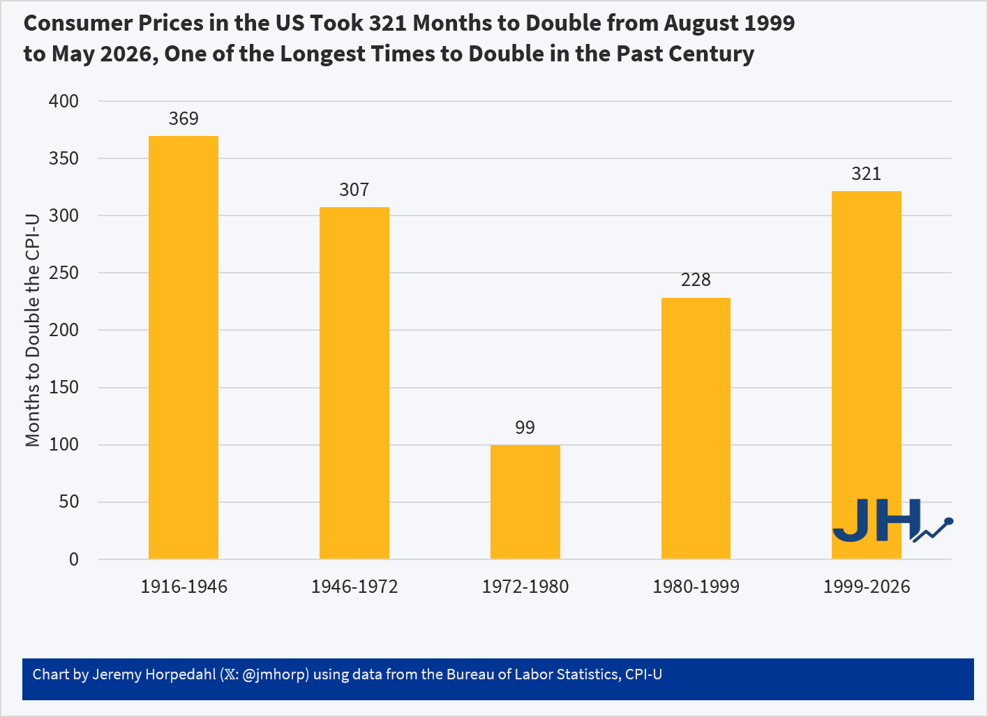
Using the CPI-U, consumer prices in the US doubled in the most recent 321 months. Not only is that a longer period of time to double than most of the 20th century, in the prior 321 months (November 1972 to August 1999) consumer prices doubled twice: nominal prices were almost 4 times higher in August 1999 than in November 1972!
While the CPI-U does slightly overstate inflation, we don’t get much different results if we used chained indexes. For example, using the PCEPI, it took 390 months for prices to double between October 1993 and April 2026. Either way, prices roughly doubling from some time in the 1990s to today is accurate. But wages have more than doubled since then: you only have to go back to July 2005 for average wages to double (they are up 139% since August 1999 and 190% since October 1993). Or if we use a median wage series (such as EPI’s using CPI data), nominal wages doubled from 2002 to 2025 (I have readjusted that series back to nominal wages). In real terms, median wages are 22 percent since 1999 and 29 percent since 1993.
Of course, it would be better if prices weren’t doubling over any time frame! But the most recent doubling of prices that we lived through is the longest period to double in the lifetime of almost everyone alive in the US today.
Over the years, many people have tried to create alternatives to the CPI for measuring inflation. Probably the most famous is “Shadow Stats,” which Tim Lee has convincingly shown isn’t actually measuring price inflation (it’s just adding a fixed factor to the CPI).
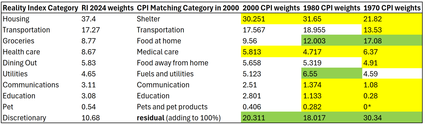
But the CPI critics keep coming. One that was recently released is called the “Reality Index.” This index tries to improve on the CPI-U in two ways. First, it uses fixed weights for the items in the basket, and importantly it uses the 2024 weights and applies them to past years (this is called a Paasche index). Second, it takes out some BLS prices to avoid using hedonically adjusted prices, and other price calculations that the Reality Index author thinks are weird.
Both of these changes are problematic. I will explain why.
1. Fixed Basket of Goods/Services Doesn’t Make Sense
Many critics of the CPI complain about the shifting weights in the CPI. “We just want to measure the cost of a fixed basket over time.” But measuring a fixed basket over time isn’t actually that useful. I will explain why in a moment. But that’s not even what the Reality Index does! Instead, it takes the 2024 CPI weights (which come from the Consumer Expenditure Survey), and then consistently applies those weights to past years. The Index isn’t measuring the cost of a fixed basket of goods from some past year — it is using the 2024 basket, and assuming that’s what people consumed in the past.
The author of the Reality Index, Tom Elliott, is either confused about this or is being deliberately misleading, for example in a recent WSJ essay promoting the Index, he says “That same basket, the one the government says rose 1.87 times since 2000, has actually risen about 2.4 times.” But that’s false. To do that calculation, you would need to use the 2000 CPI weights and follow them forward to 2024 (this is called a Laspeyres index). Instead, he uses the 2024 weights and follows them backwards. He could do the calculation that he references in the WSJ essay, but he does not.
To see why this is a bad approach, let’s compare the weights in the Reality Index with a few past years. I have done my best to translate the weights for the 10 categories listed on this page to actual BLS categories, though I will admit that none of their category weights matched exactly to what I found at BLS. But I’m pretty confident it is correct.
I am also pretty confident that the “discretionary” category is just a residual for everything that wasn’t in the other 9 categories, though I can’t find them explicitly saying this. Yellow highlighting indicates the category in past years was smaller than the 2024 weights. Green highlighting indicates past years were larger weights.
The first thing you might notice is that the CPI weights have changed significantly over time. Relative to 1970, housing/shelter gets almost twice as much weight today. Conversely, groceries/food at home gets about half the weight today as it had in 1970. The “discretionary” category (the residual to make it add to 100%) used to be 30 percent of a household budget, using this approach! That should really give you pause: do we really think a typical household in 1970 considered 30% of their budget to be “discretionary”? I highly doubt it. That discretionary category includes clothing, which was over 10% of household spending in 1970 (it’s around 2% today).
Related to that, you may also notice that categories which have had above average inflation over this time frame — such as housing, healthcare, and education — all have bigger weights today than in the past. Meanwhile, food and clothing have seen less price inflation, but they are weighted much less. This process will tend to overstate inflation of the past, as the CPI in 1970 placed less weight on, say, housing, so when you put more weight on it, of course the inflation rate will go up. And indeed, as the Reality Index’s historical analysis shows, the biggest gaps in inflation between the RI and CPI were in the 1970s (4.9% gap in 1979 and 4.7% gap in 1978). But this is ahistorical: people were not spending 37% of their budget on shelter in the 1970s! In fact, they were spending almost as much on groceries in 1970 as they did on shelter.
The Reality Index is essentially projecting backwards to a fake reality of the past, because it uses the 2024 weights in all past years. But this isn’t capturing anything real about the world, and it is at best an interesting thought experiment. Of course, part of the reason people now spend more of their budget on housing and healthcare is because they have gotten more expensive and to some extent crowded out other spending. But they are also categories we might expect demand to increase as incomes increase (normal goods). And notice this is the opposite of the standard critique of the CPI: as things get more expensive, critics claim the CPI assumes people spend less on those items. Instead, the CPI-U weights are updated each year based on the latest Consumer Expenditure Survey data, and goods/services with higher rates of inflation now consumer more of the weight of the CPI than in the past.
(*Note: the “pet” category is listed as 0% in 1970 because BLS didn’t itemize it separately due to it being so small. That’s of little consequence, since it is such a small share in every year — I’m surprised they didn’t just stuff pets in the discretionary category.)
2. Swapping Quality-Adjusted Measures for Nominal Prices is Often a Bad Idea
Using the 2024 weights for past years is reason enough to not find the Reality Index useful. But let me just say a few words about the substitute prices that the Reality Index uses. The changes are either trying to use something that isn’t hedonically adjusted for quality, or to overcome some of the strange calculations, especially for housing and health care.
My university recently hosted a guest speaker. Among their content, they included some nominal macroeconomic values from pre-2020, back in the era when inflation was very low. That roughly includes the years 2012-2019. Truly, inflation stayed below 2% through February of 2021, but I think that we can all agree that the economy was different in a few ways beginning in 2020.
I asked the speaker why not express the nominal values in real terms. They were emphatic that the low rates of inflation at the time implied that the signal-to-noise ratio was too low. Therefore, the ‘real’ inflation adjusted values would not be more precise because excessive noise would be introduced into the series during a period when not much deflating was necessary in the first place.
1) It may be information is incomplete and becomes more complete as time passes. This sort of noise only exists in the short-run and is resolved as more information becomes available later in time. Revisions tend to happen each month for prior months, as well as each year for prior years. There are also big revisions after methodological, consumption weight, and data source changes.
2) Another type of noise is due to incomplete information that is never resolved. After all, the government statisticians can’t see literally all of the transactions. Those unobserved transactions will never make it into the official inflation measures and we’ll never get a perfect picture.
3) Methodological artifacts may also include known biases. This type of noise doesn’t get corrected except after major changes to the series. If those changes never happen, then we just sort of live with imprecision. Luckily, so long as the bias is consistent, then percent change in the price indices will approximate the underlying true levels. However, if there are non-random biases in the percent change, then it can cause some trouble.
One way to get an idea for the amount of noise in the data is to observe the magnitude of revisions. Of course, this only helps us with the first type of noise above that eventually gets resolved with more information. It’s much harder to get a handle on the imprecision that is not identifiable. The Philadelphia Federal Reserve Bank provides an easy-to-use database that puts all of the archival and revised numbers for many macro series in a single place: the Real-Time Data Set (RTDS). It includes every historical PCE price index value for each publication month. Let’s limit our sample to the 21st century.
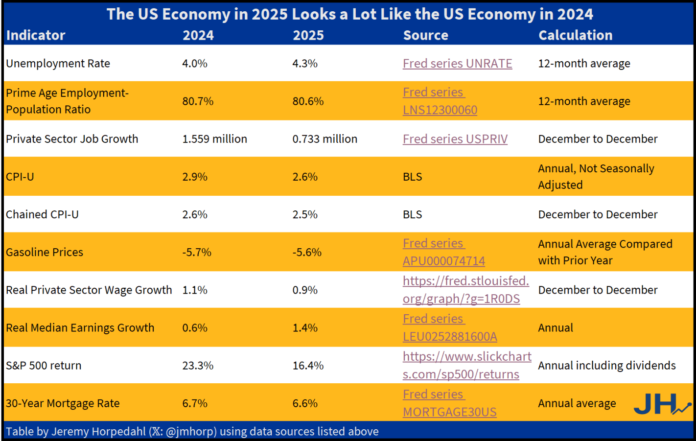
So what is the truth? I have put together what I think are the best economic indicators to judge how the economy is doing. And what does it tell us? I think the fairest read is that 2025 was a pretty good year, but based on most economic data it was almost identical to 2024.
The only indicator that is clearly better is private-sector job growth in 2024. We might add S&P 500 in 2024 growth too, although some other assets such as gold have performed better in 2025. Inflation in 2025 is a tad lower, but not the massive improvement Trump suggests. This is especially the case for one of his favorite prices, gasoline. Yes, 2025 is a little lower than 2024… just like 2024 was a little lower than 2023.
And what of that greatest of all macroeconomic indicators, GDP? We don’t yet have Q4 data for GDP, which means we don’t have full-year 2025 data yet. But the growth rate of real GDP in 2024 was 2.8%, and betting markets are currently predicting 2.3% for 2025. Betting markets could be wrong! But it seems unlikely it would be much above 2.8% (those same betting markets only think there is a 4% chance it will be over 3.0%).
None of this is to say that the 2024 and 2025 economies are exactly the same. Certainly there is more uncertainty due to the shifting tariff policy, but on the other hand even with that uncertainty the economy is still performing fairly well. And my table above only includes economic outcomes, not any changes to government budgets, nor important social indicators such as crime. These are important too, but my focus in this post is only on the economic data.
It seems that in those surveys about whether the economy is better now or under Biden, it would be useful to offer an “about the same” option. Of course, in 2021-2022 inflation was much worse under Biden — but job growth was much better. A lot of this was baked in from the pandemic, 2020 monetary and fiscal stimulus, etc. Once we were back to a semi-normal economy in 2024, it was a decent year. Not blockbuster, but decent. So was 2025.
By almost any measure, 2025 was a great year for the United States.
Despite inflation remaining elevated and the damage from new tariffs, the economy did well. Inflation-adjusted median earnings are higher than a year ago, though only by about 1.3%. While most prices are still rising, one bright spot for affordability is that home prices are falling in much of the country (according to Zillow estimates).
The unemployment rate did tick up slightly, from 4.2% last November to 4.6% currently. This is definitely an indicator to watch over the next few months, but it is still well below average.
But even outside of the economy, there is plenty of good news in the data. Crime rates are plummeting. The murder rate fell something like 20%, as well as every major category of crime (violent crime overall is down 10%). This are some of the largest one-year drops in crime the US has ever seen.
Homicides aren’t the only category of deaths that are falling in 2025. For most categories of death as tracked by the CDC, there is a long lag (6 months or more) before all of the deaths are categorized. So we can’t look at complete 2025 data yet. For example, drug overdoses have increased massively in recent years, especially during the pandemic. But after plateauing in 2021-23, drug ODs started falling in 2024 and have continued to fall in early 2025. For the 12 months ending in April 2025, drug OD deaths were 26% lower than the prior 12 months. If we look at just the first 5 months of the year, 2024 was 20% lower than 2023, and 2025 was another 20% lower than 2024. For the first five months of 2025, ODs are basically back down to the same level as 2018 and 2019. Motor vehicle deaths also increased during the pandemic, but they are down 8% in the first half of 2025, essentially back down to 2018-19 levels.
Was it all good news? No, you can certainly find some data to be pessimistic about. For example, despite the efforts of DOGE and other attempts to cut federal government spending, over $2 trillion was added to the national debt in 2025, up 6 percent from the end of 2024 and surpassing $38 trillion. And as I mentioned above with the unemployment rate, there is some evidence the labor market may be weakening.
Not all is rosy as we head into 2026, but 2025 was a year filled with many positive trends on the economic front and in society more generally. May your new year be prosperous and healthy!
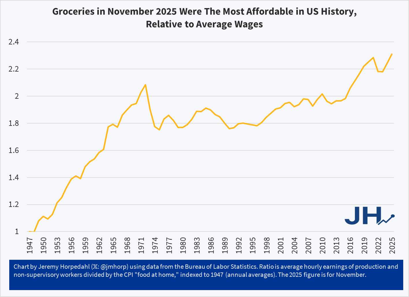
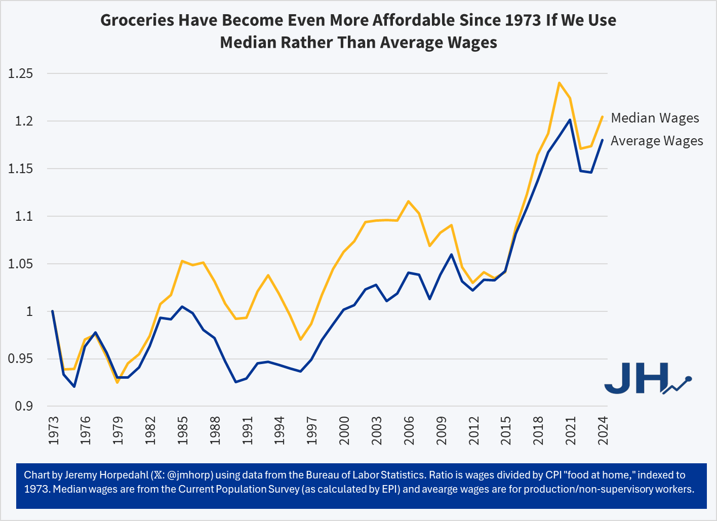
The chart shows a simple measure of relative grocery affordability. Starting with the levels of wages and grocery prices in 1947, if in any year wages increase more than prices, the line goes up (it can also go down, as it does in some years). Cumulatively, you can see that today groceries are over twice as affordable as in 1947.
You could reasonably complain that there hasn’t been much progress since the early 1970s. Fair enough. But there has been significant progress since the 1990s. Even if the progress is less than we would have liked, groceries are still, right now, the most affordable they have ever been in the US relative to average wages. And since US consumers spend by far the lowest share of their income on groceries in the world, we might be tempted to say that right now groceries in the US are the most affordable they have ever been in human history. Period.
This is not just a trick of using average wages, which can be distorted by outliers. First, we are already using an average wage series that strips out the highest earners (supervisors, managers, etc.). But we can show this more clearly by using a median-wage series, such as the CPS series (calculated by EPI) starting in 1973. Notice this affordability trend gets slightly better if we use median wages from 1973-2024:
It’s true that using the median wage series, 2020 and 2021 look more affordable than 2024 — but that’s because the compositional effects of the job losses in the pandemic really throw off the median wage. But the growth rate since 1973 is slightly better for median rather than average wages — it’s not a trick! And when we have the median wage data for 2025, it will also likely be the most affordable measure on this chart.
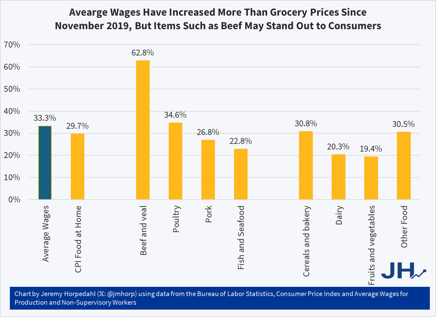
So why are people so pessimistic if wages have been rising faster than grocery prices? One theory: availability bias. People focus on the prices where they notice goods becoming less affordable, but ignore the ones that are more affordable. Many consumers could probably tell you that a dozen eggs increased from $1.40 per dozen in November 2019 to $2.86 today, and at times was much higher, topping $6 briefly in early 2025. Likewise they could tell you that a pound of ground beef soared from $3.81 in late 2019 to $6.54 today. Both of these prices increases vastly exceed wage increases over the same timeframe (about 33 percent for wages), but most consumers probably couldn’t tell you that these were outliers and most major categories of food increased by less than average wages since late 2019:
While the “beef and veal” category has clearly outpaced wages — by almost twice as much! — nearly every other category of meat and as well as other food product prices increased less than wages. Poultry is the one exception, though here it is almost equal to wage increases. But if we are talking about pork or fish, or the non-meat categories, most food is more affordable than in late 2019 relative to wages. Consumers won’t as easily identify these more affordable categories, and they probably have no idea how much average wages increased.
Much of what economics has to say about tariffs comes from microeconomic theory. But it’s mostly sectoral in nature. Trade theory has some insights. But the effects on the whole of an economy are either small, specific to undiversified economies, or make representative agent assumptions that avoid much detail. Given that the economics profession has repeatedly said that the Trump tariffs would contribute to inflation, it seems like we should look at the historical evidence.
Lay of the Land
Economists say things like ‘competition drives prices closer to marginal cost’. Whether the competitor lives abroad is irrelevant. More foreign competition means lower prices at home. But that’s a partial equilibrium story. It’s true for a particular type of good or sector. What happens to prices in the larger economy in seemingly unrelated industries? The vanilla thinking that it depends on various elasticities.
I think that the typical economist has a fuzzy idea that the general price level will be higher relative to personal incomes in some sort of real-wages and economic growth mental model. I don’t think that they’re wrong. But that model is a long-run model. As we’ve discovered, people want to know about inflation this month and this year, not the impact on real wages over a five-year period.
Part of the answer is technical. If domestic import prices go up, then we’ll sensibly see lower quantities purchased. The magnitude depends on the availability of substitutes. But what should happen to total import spending? Rarely do we talk about the expenditure elasticity of prices. Rarely do we get a simple ‘price shock’ in a subsector. It’s unclear that total spending on imports, such as on coffee, would rise or fall – not to mention the explicit tax increase. It’s possible that consumers spend more on imports due to higher prices, or less due to newly attractive substitutes. The reason that spending matters is that it drives prices in other parts of the economy.
For example, I argued previously that tariffs reduce dollars sent abroad (regardless of domestic consumer spending inclusive of tariffs) and that fewer dollars will return as asset purchases. I further argued that uncertainty makes our assets less attractive. That puts downward pressure on our asset prices. However, assets don’t show up in the CPI.
According to the above discussion, it’s unclear whether tariffs have a supply or demand impact on the economy. The microeconomics says that it’s a supply-side shock. But the domestic spending implications are a big question mark.
What is a Tariff Shock?
That’s the title of a recent working paper from the Federal Reserve Bank of San Francisco. It’s a fun paper and I won’t review the entirety. They start by summarizing historical documents and interpreting the motivation of tariffs going back to 1870. They argue that tariffs are generally not endogenous to good or bad moments in a business cycle and they’re usually perceived as permanent. The authors create an index to measure tariff rates.
Here’s the fun part. They run an annual VAR of unemployment, inflation, and their measure of tariffs. Unemployment in negatively correlated with output and reflects the real side of the economy. Along with inflation, we have the axes of the Aggregate Supply & Aggregate Demand model. Tariffs provide the shock – but to supply or demand?. Below are the IRF results:
What I’m telling my Intro Macro students on the last day of class, since we weren’t able to get through every chapter in the textbook:
A few of you might end up working in economic policy, or in highly macro-sensitive businesses like finance. For you, I recommend taking followup classes like Intermediate Macroeconomics or Money and Banking so you can understand the details. For everyone else, here are the very basics:
In the long run, economic growth is what matters most. The difference between 2% and 3% real GDP growth per capita sounds small in a given year, but over your lifetime it is the difference between your country becoming 5 times better off vs 10 times better off.
How to increase long-run economic growth? This is complicated and mostly not driven by traditional macroeconomic policy, but rather by having good culture, institutions, microeconomic policy, and luck.
In the shorter run, you want to avoid recessions and bursts of inflation.
High inflation means too many dollars chasing too few goods. To fix it, the federal government and the central bank need to stop printing so much money (the details can get very complicated here, but if we’re talking moderately high inflation like 5% the solution is probably the central bank raising interest rates, and if we’re talking very high inflation like 50% the solution is probably a big cut to government spending).
If there is a recession (which will look to you like a big sudden increase in layoffs and bankruptcies), the solution is probably to reverse everything in the previous point. The government should make money ‘easier’ via the central bank lowering interest rates while the federal government spends more and taxes less.
If you don’t take more economics classes, you will likely hear about macro issues mainly through the news media and social media. You should be aware of their two main biases: negativity bias and political bias.
Negativity Bias: If It Bleeds, It Leads on the news. Partly this is because bad news tends to happen suddenly while good news happens slowly, so it doesn’t seem like news; partly it just seems to be what people want from the news and from social media.
Political Bias: People tend to seek out news and social media sources that match their current preferences. These sources can be misleading in consistent ways for ideological reasons, or in varying ways based on whether the political party they like is currently in power.
There are different ways to measure each key macroeconomic variable. Think through them now and make a principled decision about which ones you think are the best measures, and track those. Otherwise, your media ecosystem will cherry-pick for you whichever measures currently make the economy look either the best or the worst, depending on what their biases or incentives dictate.
There are good ways to keep learning about economics outside of formal courses and textbooks, I list a few here.
One of the likely effects of the federal government shutdown is that recipients of SNAP benefits (what used to be officially called “food stamps,” a term still used by the general public, especially those that dislike the program) may lose their benefits next month. This would obviously be a hardship for those that depend on this program, but it has also led to bad claims being made about the program, from both supporters and opponents of the program.
Let’s start from the political right: Matt Walsh makes the claim that by subsidizing food consumption “obviously drives up the cost” of groceries.
The number one thing that artificially inflates the price of groceries is the food stamp program. The federal government is subsidizing groceries for 40 million people which obviously drives up the cost. That's why the increase in the cost of groceries tracks exactly with the…
As with all bad claims, there is a nugget of truth baked into them. If the government subsidizes anything, we would expect demand to increase, and thus unless supply is perfectly elastic, there will be some effect on prices. However, we need to think more carefully about the nature of the subsidy.
The way SNAP works is that beneficiaries receive an electronic voucher to spend at the grocery store, which is about $300 per month on average for a household. That $300 must be spent on groceries. However, if that household had already planned to spend $300 or more on groceries, it is unlikely they will spend all of the additional $300 on food. In the limit, it’s entirely possible they will spend no additional money on groceries, merely reducing their out-of-pocket spending on groceries by $300. They will then effectively have $300 more to spend on other goods. More likely is that they will spend some of the additional $300 on groceries, and some of it on other goods.
Many studies have tried to look at the extent to which SNAP benefits affect household spending, but these were mostly observational studies. There was no treatment and control group. But a 2009 paper titled “Consumption Responses to In-Kind Transfers: Evidence from the Introduction of the Food Stamp Program” has a better approach to studying the question. Since the original Food Stamp program was slowly rolled out across the country over more than a decade, you can compare counties that entered the program first to counties that entered it later. By doing so, Hilary Hoynes and Diane Schanzenbach find out some first interesting things about the causal effects of SNAP benefits.
For the claim by Walsh in his Tweet, the most relevant result from the paper is that food stamps impact household spending similarly to a cash transfer. Yes, the program increases household spending on groceries, but it also increases spending on other goods and services. And it does so almost identically to how cash transfers impact household spending. In other words, while pitching the program as assistance for buying groceries may make it more politically palatable, SNAP benefits are no different from a similarly-sized cash transfer for the average recipient. If they do cause any inflation, they do so in the same way as a cash transfer would, and thus there is no specific impact on food inflation.
A second bad claim about SNAP comes from the political left, in this case Minnesota Governor Tim Walz:
Here is a chart of the Core Personal Consumer Index for inflation (Core PCE), which is the Fed’s favorite measure on inflation, from 1970 through early 2024:
This chart is from an article by the Richmond Fed, The Origins of the 2 Percent Inflation Target. That article has a long discussion of how and why the Fed decided to name an explicit inflation target of 2% in 2012. Although controlling inflation has been formally part of the Fed’s “dual mandate” since the Federal Reserve Reform Act of 1977, it had traditionally not set a single numerical target. After years of discussions within the Fed, it was decided that the benefits of a clear single target outweighed the potential downsides. 2% was though to be about the lowest you could run, while still giving the Fed some room to cut short term rates in a recession without running up against the dreaded zero lower bound. It was understood that 2% was a loose target, with some years a little over or under to be allowed to balance each other out.
That Richmond Fed article was published in early 2024. At that point, inflation was falling quickly and steadily from its post-Covid high, as consumers finished spending down their gigantic stimulus package windfalls.
Unsurprisingly, this article concludes that “Even during this period, long-run inflation expectations have remained anchored, rising no higher than 2.5 percent, according to the Cleveland Fed.”
That was about 18 months ago. The actual path of inflation since then has not be a descent to 2-2.5%. Between gigantic peacetime deficits by two administrations, and the results of tariffs, inflation seems to have leveled out at around 3%:
The sub-2% inflation that was normal for twenty years (2000-2020) may now be a lost world. This puts the Fed in an awkward spot. Even ignoring the irresponsible squawking from some quarters of the government, it will not be an easy decision to keep cutting rates (to address soft employment) if inflation stays this high. The Fed’s mantra this time around is that the current inflation is just a transient response to tariffs and so can be largely discounted. But I recall similar verbiage in 2021, as the Fed dismissed the ramping inflation back then as merely a transitory effect of pandemic supply chain restrictions. They were wrong then, and I suspect it would be wrong now to be too complacent. The 1970s-80’s showed that once the inflation genie gets out of the bottle, it can be very costly to subdue it. Whether 2.0 % is still the right target, however, may be open to debate.