The Washington Post recently ran a fun, data-filled article on berry consumption and parenting. Lots of good tidbits in the article, including that Americans eat a lot more berries than in the recent past, and that a lot of the availability is thanks to foreign trade and imports. But despite being somewhat light-hearted, the article does seem very negative, especially in the title and introduction, about how parents are spending a lot of money on berries.
First things first, are berries breaking the budget for parents? Probably not. While the Consumer Expenditure Survey doesn’t give us data on specific types of berry spending, the broader category of Fresh Fruits is a very small share of consumer spending. It has pretty consistently consumed between 0.30% and 0.45% of income for families with children over the past 4 decades. That’s less than $1 out of every $200 of income. True, there has been a slight rise since over the past 20 years or so, but this is still a small share of the budget.
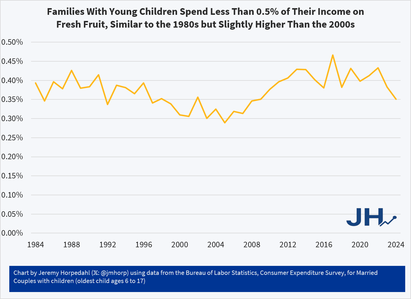
On average, families with children are spending around $600 per year on Fresh Fruit. And that’s all fruit, not just berries! Just a little over $10 per week. But even for an item that families spend a small share of their income on, such as eggs, perhaps the fact that prices have increased so much recently makes families stand up and notice. Berry spending might seem out of control, even if it’s a small share of income.
What does the price data on berries show? My usual source on this the BLS average price data that forms the basis for the CPI, but they only publicly publishes a series for strawberries, not the other famous berries (blueberries, raspberries, etc.). There is one chart on prices in the WaPo article, but it only compares strawberries to bananas over time (they got both of these from BLS). Because banana prices have been very stable in nominal prices over time, it looks like strawberry prices are exploding! But it’s really more notable that banana prices haven’t rise.
USDA does have some fruit and vegetable specific retail price data, but it only goes from 2013 to 2023. That’s shorter than I would normally like, but it can give us a clue about whether there has been some recent explosion in berry prices. And ending in 2023 isn’t ideal either, but overall inflation has been moderate since 2023, so it’s probably an OK source to use. Here’s what the data shows (prices are for fresh berries, except cranberries which are for dried):
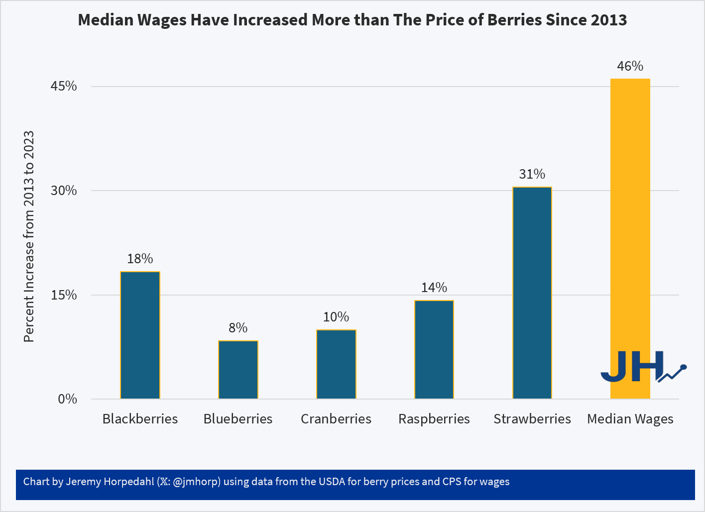
Relative to median wages, berries of all kinds are now more affordable than a decade ago. Parents may still feel squeezed by all the berries their kids are eating, but in terms of affordability and share of the family budget, there is probably no need for a Berry Panic.