Real and Nominal Rigidities Research

This week, I’m doing some review for a macro-related project. In economics, the concepts of real and nominal rigidities help explain why prices and wages do not always adjust quickly in response to shocks. These rigidities create frictions that affect how markets function. A well-known rigidity is downward nominal wage rigidity (I have an experimental paper on that).

“Nominal rigidities” refer to the stickiness of prices and wages in their nominal (monetary) terms. These rigidities prevent immediate adjustment of prices and wages to changes in the overall economic environment.

Examples of Nominal Rigidities

  • Menu Costs: The costs associated with changing prices, such as reprinting menus or reprogramming point-of-sale systems. For instance, a restaurant might avoid changing its menu prices frequently because of the costs involved in printing new menus and the risk of confusing or losing customers.
  • Nominal Wage Contracts: Many workers are employed under contracts that fix their wages for a certain period, such as a year. This means that even if the demand for labor changes, wages cannot adjust immediately. For example, a factory might have a one-year wage contract with its workers, preventing it from lowering wages even during a downturn.
  • Price Stickiness Due to Psychological Factors: Prices may remain rigid because businesses fear that frequent changes might upset customers or erode their trust. A classic example is a retail store keeping prices stable to maintain a reputation for reliability, even when costs fluctuate.

Side note: Lars Christensen predicts less nominal rigidity in our future. Menu costs are getting smaller and customers could become accustomed to, for example, watching the price of milk fluctuate in real time in response to statements by the Fed. Click here for related Twitter joke.

Continue reading
Future Consumption Has Never Been Cheaper

Economics as a discipline really likes to boil things down to their essentials. There are plenty of examples. How many goods can one consume? Just two, bread and not bread. How can you spend your time? You can labor or leisure. How do you spend your money? Consume or save. It’s this last one that I want to emphasize here.

First, all income ultimately ends up being spent on consumption. Saving today is just the decision to consume in the future. And if not by you, then by your heirs. One determinant of inter-temporal consumption decisions is the real rate of return. That is, how many apples can you eat in the future by forgoing an apple eaten today? The bigger that number is, the more attractive the decision to save.

Further, since most saving is not in the form of cash and is instead invested in productive assets, we can also characterize the intertemporal consumption problem as the current budget allocation decision to consume or invest. The more attractive capital becomes, the more one is willing to invest rather than consume. The relative attractiveness between consumption and investment informs the consumption decision.

How attractive is investment? I’ll illustrate in two graphs. First, if the price of investment goods falls relative to consumption goods, then individuals will invest more. The graph below charts the price ratio of investment goods to consumption goods. Relative to consumption, the price of investment has fallen since 1980. Saving for the future has never been cheaper!

Of course, as in a price taker story, I am assuming that individuals don’t affect this price ratio. Truly, prices are endogenous to consumption/investment decisions. For all we know, it may be that the prices of investment goods are falling because demand for investment goods has fallen. But that doesn’t appear to be the case.

Continue reading

Where’s the Deflation?

Inflation continues to remain stubbornly high in the US. While Core CPI is down to 3.6%, the lowest it has been in 3 years, this is still well above the Fed’s 2% target (the Fed’s preferred Core PCE is a bit lower at 2.8%). But consumers are tired of the cumulative inflation, which, depending on your preferred gauge of inflation, is somewhere around 20% in the past 4 years. Consumers want to know: will prices ever go down again?

The answer is: Yes, and some prices already have declined!

For example, you can look at broad categories of consumer purchases, such as durable goods, which are down almost 5 percent since the peak in August 2022. Durable goods include items such as used cars (down 17.3 percent since February 2022), furniture (down 6 percent since August 2022), and appliances (down 7.2 percent since March 2023).

We can even jump into the nondurables category and look at specific items, such as groceries which seem to be on everyone’s mind. Here’s a list of items and the price decrease since their peak (I ignore a few items where it is only a purely seasonal cycle that made them cheaper in April 2024):

  • Spaghetti and macaroni: -4.3% (Feb 2023)
  • Bacon: -12.8% (Oct 2022)
  • Chicken legs: -10.6% (Aug 2023)
  • Chicken breasts: -14.4% (Sept 2022)
  • Eggs: -40.6% (Jan 2023)
  • Milk: -8.3% (Nov 2022)
  • Cheddar cheese: -9.4% (Sep 2022)
  • Bananas: -2.6% (Sept 2022)
  • Oranges: -14.7% (Sept 2022)
  • Lemons: -12.3% (May 2022)
  • Strawberries: -12.9% in the past year (and down 34.6% since seasonal peak in Dec 2022)
  • Ground coffee: -6.2% (Dec 2022)

It’s true that this is a cherry-picked list: lots of items are at all-time highs! My goal here is to show that, Yes!, some prices will fall. Others may too in the near future. And while it’s also true that most prices are still well above 2019 levels, that’s not universally true. The April 2024 prices of lemons, strawberries, and tomatoes are roughly equal to their April 2019 prices.

And it’s not just food. Natural gas this January was 20% cheaper than January 2023. Regular unleaded gasoline is down 11.6% from 2 years ago (and down 25% from the peak in Summer 2022, but we’ll wait to see what this summer looks like). Even some services, such as airline fares, are down 6.7% from 2 years ago (and down 16% from June 2022).

Some of these price decreases could be due to factors specific to the production and supply of those goods, but another factor is monetary policy. Broad measures of the money supply such as M2 show a decline of about 4 percent in the past 2 years. That hasn’t yet produced overall deflation, but it has probably contributed to the decline in the goods and services mentioned.

Looking at price changes can only tell us so much though, especially focusing on individual item prices. The big picture is that over the past 4 years, wages have increased more than prices overall across most of the income distribution (only the highest quintile lost out on the race between wages and prices). Falling prices would certainly help this trend continue, but most consumers have more buying power than they did in 2019, even if they don’t feel like they do.

The Time it Took for Price to Rise

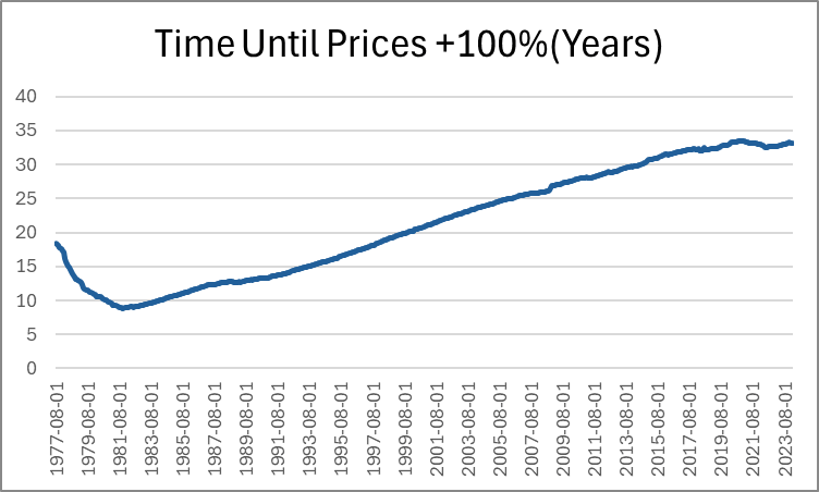
Last month, Jeremy wrote about how long it takes for prices to double. He identified a few intervals of time that are sensible. But I want to pick up the ball and move it further down the field. Not only can we identify how long it took for prices to double in particular eras, we can also do it for *every month*. Below, is a graph that shows us how many years had passed since prices were half as high (PCE Chained Prices).

Expectedly, the minimum time to double consumer prices was in the early 80s, taking just under 9 years for price to double. The prior decade included the highest inflation rates in the past 70 years.  Since that time, the number of years needed in order for prices to double steadily rose as the average inflation rate fell. That is, until after the pandemic stimuli which caused the time to plateau. But to be clear, that must mean that prices aren’t doubling any fast that they used to, despite what we’ve heard on the news.

Except… prices are in fact rising faster by 21st century standards. Indeed, measuring the time that it took prices to double covers up a lot of variation. After all, The PCEPI was 15.19 in 1959 and is 122.3 now. That’s only enough difference for three doublings. But as we lower the threshold for price changes, we can see more of the price level patterns. Below-left is the time that was necessary for prices to increase by 50% and below-right is the time that was necessary for prices to rise by 25%.

In these graphs we can see more of the action that happened post-Covid. The time needed for prices to rise by 50% has fallen by about five years since 2020. That’s a 20% shorter time necessary for a 50% increase in prices. The time needed for a 25% increase in prices is even more drastic. As of 2020, people were accustomed to experiencing upwards of 14 years before overall prices rose by 25%. That number fell below 8 years by 2024.

And finally, the most unnerving graph of all is below: the time that was needed for prices to rise by 10%.

Continue reading

Let’s Be Thankful for Food Abundance

Despite recent increases in prices of food, we should still all be very thankful this Thanksgiving for the abundance of affordable food available in the modern world. Looking back at my past few blog posts, I notice that I have been very food-centric in my choice of topics! And last week I also showed how the Thanksgiving meal this year will be the second cheapest ever (only behind 2019). While it’s absolutely true that food prices are up a lot in the past 2 and 4 years, they probably aren’t up as much as you have heard.

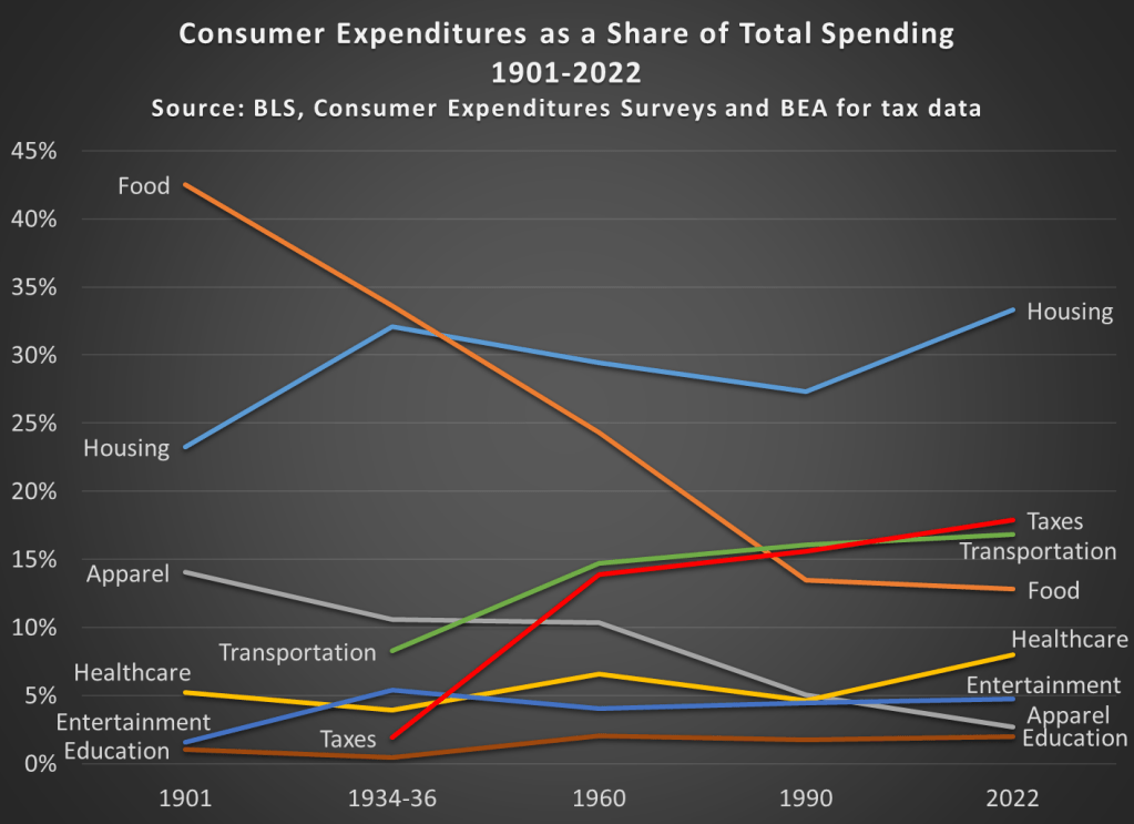
It’s always my preference to take as long-term perspective as possible when thinking about economic progress. So here’s the best way I’ve come up with to show how cheap and abundant food is today: food as a share of household spending fell dramatically in the 20th century.

Most of the data in this chart comes from the BLS Consumer Expenditure Surveys. This survey was done occasionally since 1901, and then annually since 1984. I also use BEA data to estimate personal taxes paid as a percent of spending (the CEX Surveys have some tax data, but it’s not reliable nor consistent). I picked as close to 30-year intervals as I could (with a preference for showing the earliest and latest years available), and I chose spending categories that are 90-100% of total expenditures in most of these years. Keep in mind also that these are consumer expenditures. As a nation, we spend a lot more on healthcare and education than this chart suggests, but most of that spending is not directly from households (of course, it is indirectly). Think of this chart as an average household budget.

I hope the thing that jumps out at you is that the amount money households spend on food has fallen dramatically since 1901, from over 42 percent to under 13 percent of household expenditures. To be clear, this data includes both spending on food at home and at restaurants (after 1984 we can track them separately, and groceries are pretty consistently about 60 percent of food spending). And you may be wondering about very recent trends too, such as before the pandemic. In 2022, household spent slightly less on food than they did in 2019, falling from 13.5 to 12.8%.

You may also notice that taxes have increased, though not much since 1960. Housing cost have been consistently high, and also a bit higher than 1990, going from 27 percent to 33 percent in 2022. And housing is now the single largest budget expenditure category, but for most of the first half of the 20th century, it was food that was the largest. And since people aren’t changing their housing situation more than once a year (if that), it would also have been food that dominated weekly and monthly budget decisions and worry about price fluctuations.

This year there will be lots of complaining about prices around the Thanksgiving table. And much of that is warranted! But let’s also be thankful on this food-intensive holiday for how cheap the food is.

And if some smart-aleck youngster tries to tell you that they learned on TikTok that things were better during the Great Depression (yes, people are really saying this!), have them watch this video by Christopher Clarke. Or show them that in the mid-1930s an average family spent one-third of their budget on food in my chart above, or how much labor it would have taken to buy that turkey in the 1930s (about 40 times as much time spent working as today).

Thanksgiving 2023 is the Second Cheapest Ever (Relative to Earnings)

Continuing my tradition of Thanksgiving posts, Farm Bureau released today the latest data on the cost of a traditional Thanksgiving meal. There is welcome news for consumers, as the nominal price of the dinner is slightly lower than last year: $61.17 vs. $64.05 in 2022. The big factor in this decline was the fall in the price of turkeys, though eight of the 12 items in this meal are lower than 2022. As they note in the press release, this is still significantly higher than 2019: about 25% higher.

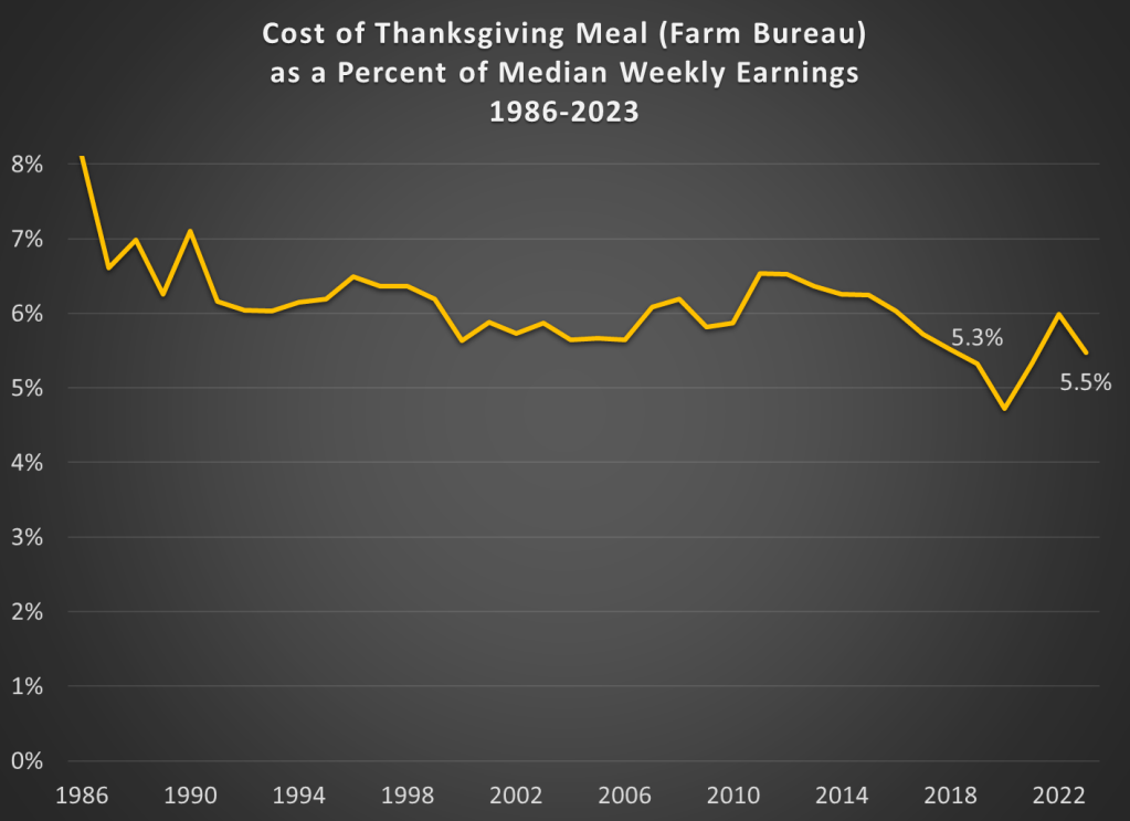
Regular readers will know what’s coming. Let’s compare those prices (and some historical prices) to earnings:

The Farm Bureau turkey dinner stands at about 5.5 percent of median weekly earnings from the third quarter of this year. That’s a touch higher than 2019, when it was 5.3 percent of weekly earnings. But notice that other than 2019, the figure for 2023 is the lowest ever! (Ignoring the weird years of the pandemic, when wage data is hard to interpret.) So we haven’t quite gotten back to 2019 levels, but we are at the same level as 2018. And lower than 2017. And all prior years too.

The last few Thanksgivings have been tough for Americans. This year, we can all be thankful for falling prices and rising wages.

Food Prices Are Up, But Let’s not Overstate How Much

Last week I gave some advice on how to save money on food. Food prices are up a lot in the past 4 years, but especially since the beginning of 2021. Over the 32 months since January 2021, grocery prices (according to the CPI) are up 20 percent (keep that number in mind). To give you an idea of how unusual that is, in the 32 months before the pandemic (up to January 2020), grocery prices only rose 2 percent. Perhaps even more astonishingly, if we look at October 2019 grocery prices, they were slightly lower on average than 4 years earlier in October 2015. From a flat 4 years to a 25 percent increase over the next 4 years. That’s a huge change for consumers.

But we also shouldn’t overstate the price increases. As you might guess, the best place for overstatements is social media. You can find plenty of them. For example, this very viral video claims that her family’s grocery prices doubled (in fact, almost exactly doubled, to the penny, which is suspicious) in just one single year, from August 2021 to August 2022. According to the CPI data, grocery prices were up 13.5 percent over that period — which, don’t get me wrong, is a lot! But it’s not 100 percent. I’ll focus on this one example, but I’m sure you will believe me that you can find dozens of examples like this on social media every single day (for example, yesterday someone claimed bread prices had tripled since 2019).

Let’s leave aside for a moment that in that viral video she claims to spend $1,500 per month on groceries. This would be a massive outlier for 2022. A family in the middle income quintile spent $460 per month on groceries in 2022, and $713 on all food including restaurants. So even if this family eats every single meal at home, they are still spending twice as much as a middle income family. Even a family with 5 or more people (the largest bucket BLS uses in that report) spent $755 per month on groceries ($1,232 on all food). According to the Consumer Expenditure survey, the middle quintile grocery spending went up 16%, and the five-person household went up 19% from 2021 to 2022. Big increases, no doubt! But not 100%.

So who are we to believe? Have prices roughly doubled since 2021? Or are they up about 20 percent? People are sometimes skeptical of the consumer price index, so let’s look at the actual price data that goes into the index. BLS has data on hundreds of individual food items, but here’s a summary chart with eight common food items. Here’s the change in the prices of those items since January 2021:

Continue reading

Self-Conception, Relative Prices, & Confabulation

We all like to think that we are individuals. We like to think that we grow and that our tastes develop and mature. We begin to appreciate different things in life, and among other behaviors, our spending habits change.

But what would you say if I told you that your maturing tastes didn’t cause your maturing consumption patterns? Indeed, what if it’s the other way around? Maybe, you’re just a bumbling ball bearing bouncing about and pinging off of various stimuli in a very predictable fashion. What if the prices that you face changed over the course of the past two decades, adjusting your optimal bundle of consumption, and then you contrived reasons for your new behavior in an elegant post-hoc fashion.

Have you *really* taken a liking to whole wheat bread and pasta over the past decade because your tastes have developed? Or maybe it’s because you found that scrumptious New York Times recipe that turned you away from potatoes and toward rice. Whether it’s a personal experience, a personal influence, or a personal development, we like to think about ourselves as complex organisms with a narrative that makes sense of the way in which we interact with the world.

On the other hand, we have price theory. Price theory still accepts that you are special and that you have preferences. Then, it asserts that your preferences remain fixed and that your changes in behavior are merely responses to changing costs and benefits that you perceive in the world. Maybe you’re not any more inclined to eat healthily than you were previously, but the price ratio of whole wheat bread to white bread is 10% less than it use to be. Maybe your east-Asian inspired recipe didn’t cause you to spurn potatoes, but instead the price ratio of rice to potatoes fell by 20%.   

Continue reading

Concentrating on Housing

Housing has become more expensive. Below is a figure that illustrates the change in housing prices since 1975 by state. By far the leaders in housing price appreciation are the District of Columbia, California, and Washington. The price of housing in those states has increased about 2,000% – about double the national average. That’s an annualized rate of about 6.7% per year. That’s pretty rapid seeing as the PCE rate of inflation was 3.3% over the same period. It’s more like an investment grade return considering that the S&P has yielded about 10% over the same time period.

Continue reading

Air Travel Prices Have Not “Soared” Since 1980 — They’ve Been Cut in Half

Winter holiday travel is notoriously frustrating. This year was especially bad if you were flying on Southwest. But that frustration about delayed and cancelled flights seems to have caused a big increase in pundits criticizing the airline industry generally. Here’s one claim I’ve seen a few times lately, that airline prices have “soared” as airlines consolidated.

Reich’s claim that there are 4 airlines today is strange — yes, there are the “Big Four” (AA, United, Delta, and Southwest), but today there are 14 mainline carriers in the US. There have been many mergers, but there has also been growth in the industry (Allegiant, Frontier, JetBlue, and Spirit are all large, low-cost airlines founded since 1980).

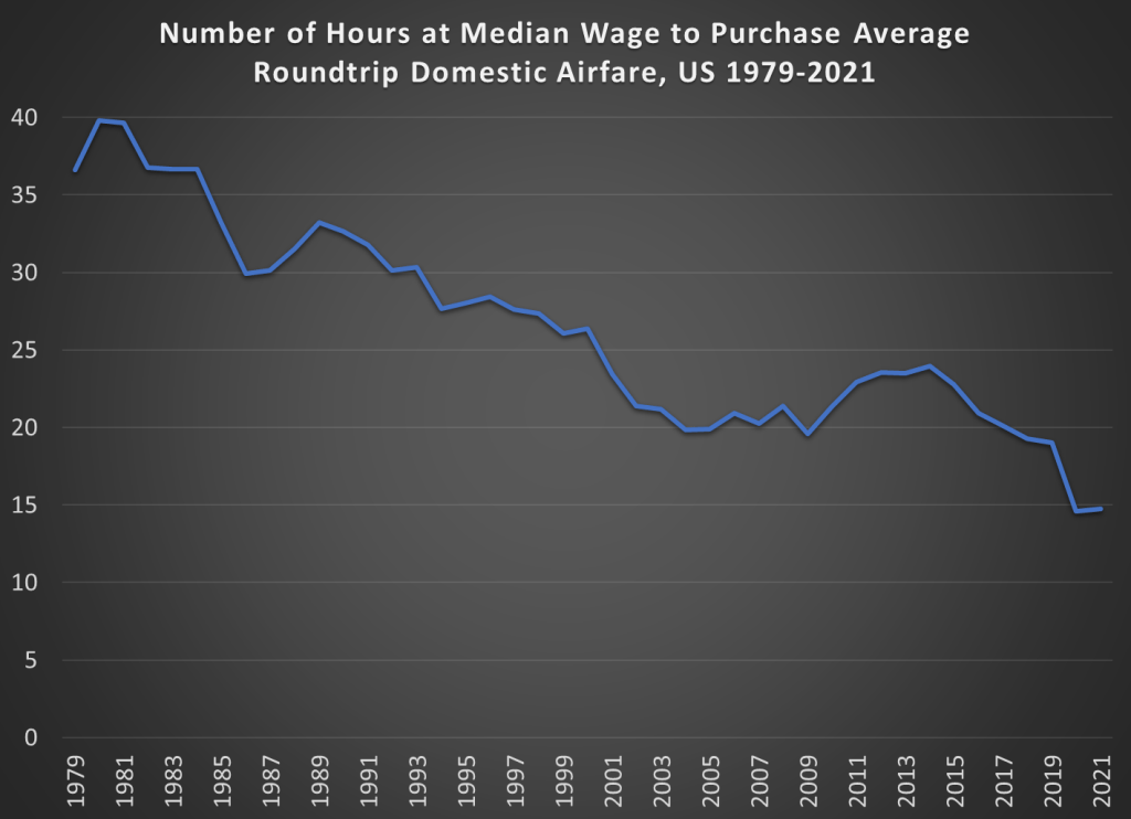
But is he right that prices have increased since 1980? Using data from the Department of Transportation (older data archived here), we can look at average fare data going back to 1979 (the data includes any baggage or change fees). In the chart below, I compare that average fare data (for round-trip, domestic flights) to median wages. The chart shows the number of hours you would have to work at the median wage to purchase the average ticket.

The dip at the end is due to weird pandemic effects in 2020 and 2021, so we can ignore that for the moment (early analysis of the same data for 2022 indicates prices are roughly back to pre-pandemic levels, consistent with the CPI data for airfare).

The main thing we see in the chart is that between 1980 and 2019, the wage-adjusted cost of airfare was cut in half. Almost all of that effect happened between 1980 and 2000, after which it’s become flat. That might be a reason to worry, but it’s certainly not “soaring.”

Of course, my chart doesn’t show the counterfactual. Perhaps without several major mergers in the past 20 years, price would be even lower. Perhaps. But research which tries to establish a counterfactual isn’t promising for that theory. Here’s a paper on the Delta/Northwest merger, suggesting prices rose perhaps 2% on connecting routes (and not at all on non-stop routes). Here’s another paper on the USAir/Piedmont merger, which shows prices being 5-6% higher.

There are probably other papers on other mergers that I’m not aware of. And maybe all of these small effects from particular mergers add up to a large effect in the aggregate. But, as my chart indicates, even if the consolidation has led to some price increases, they weren’t enough to overcome the trend of wages rising faster than airline prices.

One last note: the average flight today is longer than in 1979. I couldn’t find perfectly comparable data for the entire time period, but between 1979 and 2013, the average length of a domestic flight increased by 20%. So, if I measured the cost per mile flown, the decline would be even more dramatic.