Winter holiday travel is notoriously frustrating. This year was especially bad if you were flying on Southwest. But that frustration about delayed and cancelled flights seems to have caused a big increase in pundits criticizing the airline industry generally. Here’s one claim I’ve seen a few times lately, that airline prices have “soared” as airlines consolidated.
Reich’s claim that there are 4 airlines today is strange — yes, there are the “Big Four” (AA, United, Delta, and Southwest), but today there are 14 mainline carriers in the US. There have been many mergers, but there has also been growth in the industry (Allegiant, Frontier, JetBlue, and Spirit are all large, low-cost airlines founded since 1980).
But is he right that prices have increased since 1980? Using data from the Department of Transportation (older data archived here), we can look at average fare data going back to 1979 (the data includes any baggage or change fees). In the chart below, I compare that average fare data (for round-trip, domestic flights) to median wages. The chart shows the number of hours you would have to work at the median wage to purchase the average ticket.
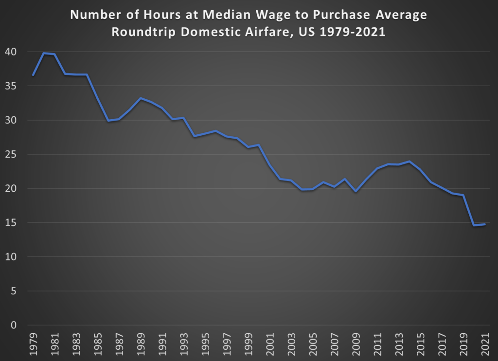
The dip at the end is due to weird pandemic effects in 2020 and 2021, so we can ignore that for the moment (early analysis of the same data for 2022 indicates prices are roughly back to pre-pandemic levels, consistent with the CPI data for airfare).
The main thing we see in the chart is that between 1980 and 2019, the wage-adjusted cost of airfare was cut in half. Almost all of that effect happened between 1980 and 2000, after which it’s become flat. That might be a reason to worry, but it’s certainly not “soaring.”
Of course, my chart doesn’t show the counterfactual. Perhaps without several major mergers in the past 20 years, price would be even lower. Perhaps. But research which tries to establish a counterfactual isn’t promising for that theory. Here’s a paper on the Delta/Northwest merger, suggesting prices rose perhaps 2% on connecting routes (and not at all on non-stop routes). Here’s another paper on the USAir/Piedmont merger, which shows prices being 5-6% higher.
There are probably other papers on other mergers that I’m not aware of. And maybe all of these small effects from particular mergers add up to a large effect in the aggregate. But, as my chart indicates, even if the consolidation has led to some price increases, they weren’t enough to overcome the trend of wages rising faster than airline prices.
One last note: the average flight today is longer than in 1979. I couldn’t find perfectly comparable data for the entire time period, but between 1979 and 2013, the average length of a domestic flight increased by 20%. So, if I measured the cost per mile flown, the decline would be even more dramatic.

Neat plot!
Can one argue, though, that 1980 flight was just a better experience overall. How do average seat widths, leg room, and flight delays or cancellations stack up?
LikeLike
Reblogged this on Utopia, you are standing in it!.
LikeLike