Why No Recession (Yet)

Where is that recession that pundits have been predicting for over a year now? The suspense is killing me. Despite savage hikes in interest rates that have led to a collapse in regional banks and in home buying, the economy just keeps chugging along, and inflation continues to run way above the targeted 2% level. What’s going on?

An article I just read on the Seeking Alpha applied finance website points to three interrelated factors. I will cite and credit the author (whose moniker is “Long-Short Manager”; he runs a couple of investment funds) for the content here, while noting that I agree with his points based on other reading. These points all relate to ongoing strong financial position of the (average) American consumer, who mainly drives the spending in our economy.

( 1 )  Reduced Debt Service

The article notes:

The graph above shows household debt payments as a percent of disposable personal income going back to 2000. Since peaking at 13% right before the financial crisis, it steadily improved to 2020, with a subsequent large drop due primarily to lowered mortgage rates (usually the largest debt obligation of a household). It is the lowest it has been this century.

(Although mortgage rates have jumped in the past year, most existing mortgages were taken out pre-2023, when interest rates had been pushed to near zero by the Fed.)

( 2 )  Robust Wage Growth

The next graph from the Atlanta Fed’s wage tracker (note that the methodology used by this tracker is fundamentally different from the Fed’s employment cost index …) shows that job hoppers on average are making about 3% more than core inflation (call that 5%) whereas the average stayer is making a half percent over core inflation. This is allowing people to catch up for the year that they got behind on inflation.

Likewise, the author notes that although job quits have come down in the past year, they remain well above re-COVID levels.

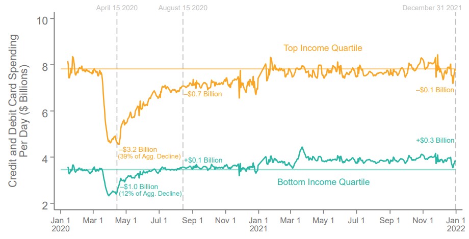
( 3 ) We Are Still Spending Down Gigantic Pandemic Stimulus Windfall

As we have noted earlier, the government/Fed combination dumped some $4 trillion into our collective pockets in 2020-2021. This includes enhanced unemployment benefits as well as direct stimulus payments, at a time when much of our normal spending (e.g., on travel, sports, commuting, etc.) was curtailed. We are still spending down these excess savings at a good clip, which seems to be a fundamental driver of the currently robust economy:

The last figure on the consumer shows how excess savings (defined as the extra savings consumers accumulated during the pandemic due to fiscal transfers and reduced spending due to lockdowns) has evolved – it should now be around 700 billion and ought to be fully depleted by the end of the year – leaving the consumer still with the lowest debt service ratios of the century and wages caught up with inflation. If you are wondering why we haven’t had a recession despite economists saying we will have it within 6 months for about 12 months now, these charts should tell you why. The tailwind from consumers has exceeded any headwinds from reduced investment due to higher rates. 

And there you have it.

Is the Bottom Quartile Already in Recession?

I heard on a radio interview that spending by the bottom quartile is way down in 2022, while it is holding up merrily for the upper two quartiles. My mind jumped to the thesis:

“Hmm, the bottom quartile probably (proportionately) felt the benefit of the three COVID stimulus packages more, plus they would have benefited more, proportionately, from the enhanced 2020-2021 unemployment benefits, which (I gathered from anecdotal observations) often paid them more for staying home than they used to receive for working. But…by 2022, all that extra money may be running out.”

I spent some time poking around the internet, trying to find some pre-made figures or tables to support or disprove this thesis. What I found tended to support it, but this is not rigorous data-mining. So, for what it is worth, here are some  charts.

First, about the spending in 2022. This chart indicates that discretionary service spending by the bottom 40% income cohort is indeed down sharply in  2022, and now sits a little lower than a  year ago, while the upper 20% cohort is spending actually more than a year ago.  Spending by the middle 40% trended up in 2H 2021, then back down in 1H 2022, to end about even over the past 12 months:

Discretionary service consumption by income cohort. (I don’t what the units are for the y-axis, but presumably they show the trends). Source: Earnest Research, as of June 30, 2022, as reproduced by Blackrock.

And what about 2020-2021? The next two charts indicate (a) that consumer spending was HIGHER in 2021 that it was pre-COVID for the bottom income quartile, even though (b) their employment in 2021 remained some 20% LOWER than pre-COVID. Looks to me like a lot of spending of stimmie checks was going on in 2021, but (see above) that money has run out in 2022.

Some reader here may have access to a more consistent data set, so I am happy to see this thesis tested further.

Consumer Spending by Income Quartile (Showing higher spending by bottom quartile following stimulus checks and enhanced unemployment payments in 2020-2021)  Source: The Economic Impacts of COVID-19: Evidence from a New Public Database Built Using Private Sector Data, Stepner et al. (2022).

Employment Changes by Wage Quartile ( Showing employment for the bottom quartile in most of 2021 was some 20% lower that pre-COVID)  Source: The Economic Impacts of COVID-19: Evidence from a New Public Database Built Using Private Sector Data, Stepner et al. (2022)   

Covid Evidence: Supply Vs Demand Shock

By the time most students exit undergrad, they get acquainted with the Aggregate Supply – Aggregate Demand model. I think that this model is so important that my Principles of Macro class spends twice the amount of time on it as on any other topic. The model is nice because it uses the familiar tools of Supply & Demand and throws a macro twist on them. Below is a graph of the short-run AS-AD model.

Quick primer: The AD curve increases to the right and decreases to the left. The Federal Reserve and Federal government can both affect AD by increasing or decreasing total spending in the economy. Economists differ on the circumstances in which one authority is more relevant than another.

The AS curve reflects inflation expectations, short-run productivity (intercept), and nominal rigidity (slope). If inflation expectations rise, then the AS curve shifts up vertically. If there is transitory decline in productivity, then it shifts up vertically and left horizontally.

Nominal rigidity refers to the total spending elasticity of the quantity produced. In laymen’s terms, nominal rigidity describes how production changes when there is a short-run increase in total spending. The figure above displays 3 possible SR-AS’s. AS0 reflects that firms will simply produce more when there is greater spending and they will not raise their prices. AS2 reflects that producers mostly raise prices and increase output only somewhat. AS1 is an intermediate case. One of the things that determines nominal rigidity is how accurate the inflation expectations are. The more accurate the inflation expectations, the more vertical the SR-AS curve appears.*

The AS-AD model has many of the typical S&D features. The initial equilibrium is the intersection between the original AS and AD curves. There is a price and quantity implication when one of the curves move. An increase in AD results in some combination of higher prices and greater output – depending on nominal rigidities. An increase in the SR-AS curve results in some combination of lower prices and higher output – depending on the slope of aggregate demand.

Of course, the real world is complicated – sometimes multiple shocks occur and multiple curves move simultaneously. If that is the case, then we can simply say which curve ‘moved more’. We should also expect that the long-run productive capacity of the economy increased over the past two years, say due to technological improvements, such that the new equilibrium output is several percentage points to the right. We can’t observe the AD and AS curves directly, but we can observe their results.

The big questions are:

  1. What happened during and after the 2020 recession?
  2. Was there more than one shock?
  3. When did any shocks occur?

Below is a graph of real consumption and consumption prices as a percent of the business cycle peak in February prior to the recession (See this post that I did last week exploring the real side only). What can we tell from this figure?

Continue reading

Primary Driver for This Inflation Is Surging Demand (Fueled by COVID Payments), Not Supply Chain Constraints

Inflation is colloquially defined as, “Too much money chasing too few goods (and services)”. Supply chain constraints get talked about, and these are widely blamed for the inflation we are seeing.  Of course, supply limitations play into inflation, but to focus on them is to miss the elephant in room. The primary driver of this inflation is not “too few goods”, but “too much money.”

Such is the thesis of a widely circulated article by Ray Dalio’s investing firm Bridgewater Associates, “It’s Mostly a Demand Shock, Not a Supply Shock, and It’s Everywhere.” The point is summarized:

While the headlines tend to focus on the micro elements of the supply shock (the LA port, coal in China, natural gas in Europe, semiconductors globally, truckers in the UK, etc.), this perspective largely misses the macro cause that is likely to persist and for which there is no idiosyncratic solution. This is not, by and large, a pandemic-related supply problem: as we’ll show, supply of almost everything is at all-time highs. Rather, this is mostly an MP3-driven upward demand shock. [emphases in the original]

In Bridgewater’s terminology, “MP3” is “Monetary Policy #3”, and refers to massive deficit spending combined with central bank quantitative easing. We saw this implemented in 2020-2021 when the federal government pumped out trillions of dollars of stimulus payments and enhanced unemployment benefits, and the Fed instantly soaked up the bonds that were issued to pay for these trillions. This fed/Fed combo amounts to simply printing money on an enormous scale.

Those trillions of dollars funded a huge surge in durable goods purchases. By late 2021 the supply of these goods was well above 2019 (pre-COVID) levels, and even above normal growth trendlines. However, the supply and transport systems simply could not grow fast enough to accommodate this insatiable demand. Charts below substantiate this. To focus on supply chain bottlenecks of themselves is misleading. The primary driver for this inflation has been the trillions of dollars of federal largesse. The Fed knows all this, obviously, but Jay Powell (the Chief Enabler of this deficit spending) would likely not have been reappointed if he spoke too directly about the cause of this inflation. Hence the endless prattle about supply chains.

Continue reading