By the time most students exit undergrad, they get acquainted with the Aggregate Supply – Aggregate Demand model. I think that this model is so important that my Principles of Macro class spends twice the amount of time on it as on any other topic. The model is nice because it uses the familiar tools of Supply & Demand and throws a macro twist on them. Below is a graph of the short-run AS-AD model.

Quick primer: The AD curve increases to the right and decreases to the left. The Federal Reserve and Federal government can both affect AD by increasing or decreasing total spending in the economy. Economists differ on the circumstances in which one authority is more relevant than another.
The AS curve reflects inflation expectations, short-run productivity (intercept), and nominal rigidity (slope). If inflation expectations rise, then the AS curve shifts up vertically. If there is transitory decline in productivity, then it shifts up vertically and left horizontally.
Nominal rigidity refers to the total spending elasticity of the quantity produced. In laymen’s terms, nominal rigidity describes how production changes when there is a short-run increase in total spending. The figure above displays 3 possible SR-AS’s. AS0 reflects that firms will simply produce more when there is greater spending and they will not raise their prices. AS2 reflects that producers mostly raise prices and increase output only somewhat. AS1 is an intermediate case. One of the things that determines nominal rigidity is how accurate the inflation expectations are. The more accurate the inflation expectations, the more vertical the SR-AS curve appears.*
The AS-AD model has many of the typical S&D features. The initial equilibrium is the intersection between the original AS and AD curves. There is a price and quantity implication when one of the curves move. An increase in AD results in some combination of higher prices and greater output – depending on nominal rigidities. An increase in the SR-AS curve results in some combination of lower prices and higher output – depending on the slope of aggregate demand.
Of course, the real world is complicated – sometimes multiple shocks occur and multiple curves move simultaneously. If that is the case, then we can simply say which curve ‘moved more’. We should also expect that the long-run productive capacity of the economy increased over the past two years, say due to technological improvements, such that the new equilibrium output is several percentage points to the right. We can’t observe the AD and AS curves directly, but we can observe their results.
The big questions are:
- What happened during and after the 2020 recession?
- Was there more than one shock?
- When did any shocks occur?
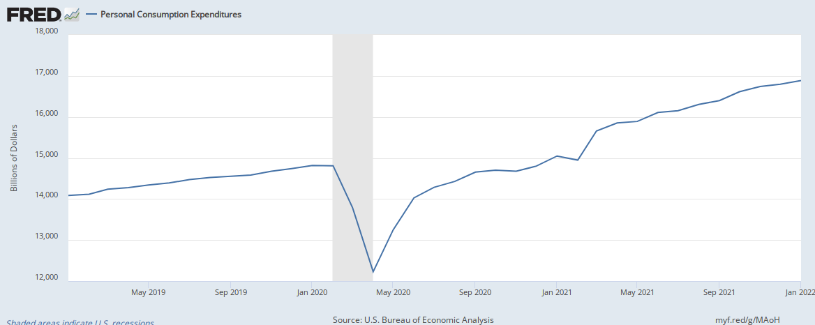
Below is a graph of real consumption and consumption prices as a percent of the business cycle peak in February prior to the recession (See this post that I did last week exploring the real side only). What can we tell from this figure?

We can tell that in the 12 months prior to the peak, both output and prices were steadily increasing, consistent with an accommodating monetary policy. The peak occurs at the origin. After that, we see a sharp and immediate decline in both price and real consumption. This is consistent with a mostly flat SR-AS curve and a sharp decline in AD. By 12 months after the peak, consumption spending had almost fully recovered. Lower output and higher prices imply that there was a negative supply shock (less output indespite recovered consumption spending). Fourteen months after the pre-recession peak, real consumption rose at about its pre-recession rate. BUT, the prices began rising MUCH FASTER. In fact, the past few months have indicated that consumption expenditures are rising much faster than our productivity. The implication is that people – including those in firms – are getting quite good at forecasting inflation. As a result, they are adjusting prices in the face of greater spending rather than increasing output.
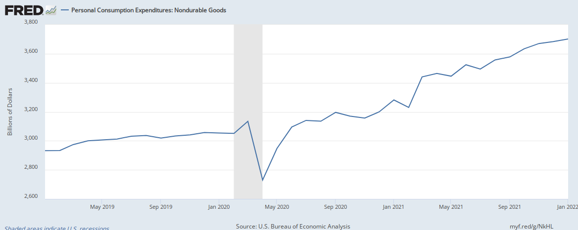
We can also split up consumption expenditures into several parts: Durables, Non-durables, Services, & Food. The below graphs repeat the above exercise in order to reveal the heterogeneous supply shocks and the composition of AD changes. What can we see?

Demand for Durables fell, but then rebounded within four months. You can almost see the SR-AS up until about 15 months after the peak. Then, we begin to see prices rise and output falter – the tell-tale sign of greater inflation expectations.
Non-durables experienced substantially different pressures. Immediately after the peak, quantities rose while prices fell. It seems that there was an initial expansion of supply as firms attempted to unload their inventory. Again, we can see the slightly upward sloping SR-AS curve. Indeed, spending on non-durables spiked just before the declines in April (were you one of those people stockpiling toilet paper?).
Total Food spending was practically flat in March of 2020 and then never looked back. It spiked immediately by 23% then settled down to about 15% higher than the pre-recession peak for the next 10 months. Thirteen months after the pre-recession peak, almost all of the increasing AD has been complemented by increasing inflation expectations and no change in output.
The outlier amongst all of these is spending on services, which didn’t recover to the previous peak until 16 months later. It’s not that spending on services fell so much – that was typical. It’s more that the real purchases never recovered to the prior peak. It looks as if there was a one-time increase in the cost of service production and the increasing demand seems to reveal that there was even a decrease in the long-run productivity. After all, what else could account for growing prices and more than a full recovery in the other real consumption categories?
In summation, it is clear to me that the recent ‘Covid recession’ was largely an aggregate demand shock. Yes, food experienced greater real output, but that can be explained by diminishing inventories and consumer substitution and stockpiling. Otherwise, we see a story characterized by a sharp decline in AD, followed by a sharp recovery. Overall, there was no negative supply shock for goods. After about a year, we see AD continuing to grow, but SR-AS comparably falling (leftward shift, rising inflation expectations) such that there’s been little growth in real consumption compared to the substantial growth in prices. Services are the only consumption component to experience a long-run decline in productivity.
*Note that perfectly anticipating inflation implies a vertical SR-AS curve. It can also be construed as any sloped SR-AS curve that moves instantaneously and perfectly such that it intersects the AD curve at the initial level of output.

Reblogged this on Utopia, you are standing in it!.
LikeLike