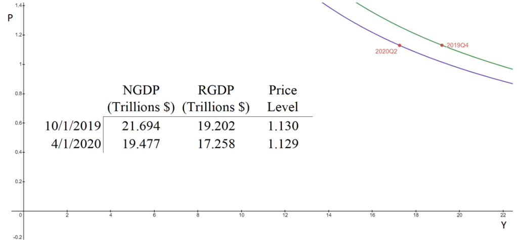
The aggregate supply & aggregate demand model (AS-AD) is nice because it’s flexible and clear. Often professors will teach it in levels. That is, they teach it with the level of output on one axis, and the price level on the other axis. This presentation is convenient for the equation of exchange, which can be arranged to reflect that aggregate demand (AD) is a hyperbola in (Y, P) space. Graphed below is the AD curve in 2019Q4 and in 2020Q2 using real GDP, NGDP, and the GDP price deflator.

The textbook that I use for Principles of Macroeconomics, instead places inflation (π) on the vertical axis while keeping the level of output on the horizontal axis. The authors motivate the downward slope by asserting that there is a policy reaction function for the Federal Reserve. When people observe high rates of inflation, state the authors, they know that the Fed will increase interest rates and reduce output. Personally, I find this reasoning to be inadequate because it makes a fundamental feature of the AS-AD model – downward sloping demand – contingent on policy context.
At the same time, I do think that it can be useful to put inflation on the vertical axis. Afterall, individuals are forward looking. We expect positive inflation because that’s what has happened previously, and we tend to be correct. So, I tell my students that “for our purposes”, placing inflation on the vertical axis is fine. I tell them that, when they take intermediate macro, they’ll want to express both axes as rates of change. I usually say this, and then go about my business of teaching principles.
But, what does it look like when we do graph in percent-change space?
First, some clear notation.

Because,

It follows that:

Therefore, the percent change in AD is:

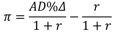
Solving for π allows us to easily plot the AD curve in (r,π) space.
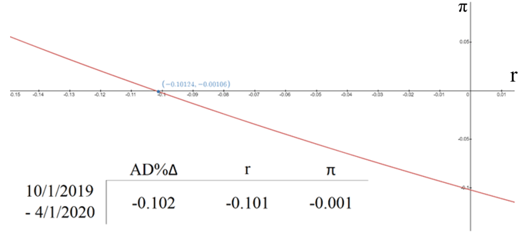
The distance between the two time periods is irrelevant for the math or the graph. If they are more than one period apart from one another, then the percent change variables can be subscripted with a ‘c’ in order to denote cumulative percent change. Graphed below is the same information for 2019Q4 and 2020Q2 as above, but in terms of percent.
What does this exercise do for us? It’s important to first acknowledge what it doesn’t do for us. Namely, we don’t know the steepness of the SRAS curve. The above evidence is consistent with a relatively flat SRAS that doesn’t move at all. Unfortunately, it is also consistent with a Vertical SRAS that declines dramatically. Of course, the above only reflects an average for the entire economy. We know that service and non-durable consumption were composed by a variety of supply-side responses to the covid-19 recession. Regardless, we can see that from peak to trough, the Covid recession was overwhelmingly an AD shock.
More importantly for students, we can see that the AS-AD model still works in growth-rate space. Demand still slopes down even when we take into account that people expect percent changes in prices, output, and total spending. Neatly, the AS & AD curves and their intersections all still make sense in this space. Yes, the graph space is more conceptually complicated and the math is harder, but the same fundamental message is communicated.
Therefore, we don’t need to fret about price level being on the vertical axis. It does the same job for us pedagogically as does the more complicated percent-change model. For me, the fact that the level and percent-change versions are so consistent makes the mixed model of inflation and output level in (Y, π) space untenable. It introduces unnecessary hand-waiving and assumptions about a policy response function that only serve to confuse and mislead students.

“The authors motivate the downward slope by asserting that there is a policy reaction function for the Federal Reserve. When people observe high rates of inflation, state the authors, they know that the Fed will increase interest rates and reduce output. Personally, I find this reasoning to be inadequate because it makes a fundamental feature of the AS-AD model – downward sloping demand – contingent on policy context.”
But AD is contingent on monetary policy in a fiat money system. The Central Bank is able to set the monetary base at any level they desire, so they can target any single nominal variable they desire. The market knows this and therefore focuses intently on the CB’s intentions, goals, and targets. AD is then a downward sloping rectangular hyperbola as productivity shocks (AS shifts) can be offset by monetary policy. Long run AS is a vertical line (neutrality of money) but short run AS is upward sloping due to nominal rigidity.
LikeLiked by 1 person
That AD slopes downs has *nothing* to do with policies of the central bank. Yes, the CB affects the placement of the AD within the graph, but not whether it is downward sloped. Whether there is fiat is irrelevant. Whether there is a central bank is irrelevant. The data generating process that determines the split between M & V is irrelevant. My point is that there is no reason to include any of these in order to motivate AD sloping down. They’re orthogonal.
Price flexibility affects the slope of SRAS – yes.
Expectations affect the responsiveness or intercept of SRAS – yes.
Expectations affect the demand for money and V – yes.
But neither of these affects whether demand slopes down.
LikeLiked by 1 person
Just to make sure we’re on the same page, how exactly are you defining Aggregate Demand?
LikeLike
The standard definition of AD is :
AD=NGDP=MV=PY.
Unlike the conventional microeconomics demand, AD is not the quantity of goods demanded given certain determinants. Price theorists like to define demand as holding every variable constant except for price.
AD is the product of price/quantity combinations.
LikeLike
Great. And since NGDP is a nominal variable, the central bank determines it due to their full control over the supply of money and indirect control over the demand for money. Therefore it’s a downward sloping rectangular hyperbola. Any shift in AS can be offset by the central bank, so P*Y is the same at any point along AD (or for rates, P+Y).
So yes, the covid recession was an AD shock (NGDP fell), but it was also a massive supply shock (RGDP fell even more). AD and AS are poorly named. We’re really talking about nominal shocks and real shocks, and covid was the biggest real shock since RGDP has been measured.
LikeLike
Absolutely.
None of that contradicts the post nor my comments.
I think that we are talking past one another.
My claim that you highlighted is that The federal reserve has nothing to do with AD sloping downward.
Maybe I misunderstood your initial comment. (You began with “but”. )
LikeLike
You say:
“So yes, the covid recession was an AD shock (NGDP fell), but it was also a massive supply shock (RGDP fell even more). AD and AS are poorly named. We’re really talking about nominal shocks and real shocks, and covid was the biggest real shock since RGDP has been measured.”
Might Covid have been a supply shock? – Yes.
But the fact that RGDP fell is not evidence of that.
Keynesians often assert a horizontal SRAS. (It barely moved in the graph above)
Neoclassicals assert vertical SRAS. (It moved a lot in the graph above)
A fixed upward sloping SRAS is consistent with the graph above.
SRAS may have moved, but the above graphs don’t tell us one way or another.
AND, we *know* that AD declined a lot.
LikeLike
If covid wasn’t a supply shock, could you give a real-world example of one?
LikeLike
1) My point is not that Covid isn’t a supply shock. My point is that the graphs above don’t tell us whether it was without additional information.
2)
Whether something is a supply shock is specific to the production function. Economists get to armchair spitball about what they reasonably think might be a supply shock. But that’s not what constitutes truth. We know that some industries experienced lowered output and higher prices 8 quarters after the pre-recession peak. That’s very tight case for a supply shock – in those industries.
The only quarter in which the the price level rose and output fell for the entire economy was from 2019Q4 to 2020Q1, (0.3% and -1.3% respectively). That’s definitely a supply shock. But it’s nothing in the realm of catastrophe.
To me, the more I look at the data, the more that the Covid-19 recession is looking way more like a demand shock, with a great big change in the mix of goods produced and consumed. A change in production & consumption composition might be a supply shock, yes. But it doesn’t have all of the hallmarks of a big negative supply shock that implies a rightward/upward shift in the SRAS curve.
A very flexible US economy permits a quick substitution from in-person services and toward remote services, durables, and non-durables. A big resource re-allocation occurred in the US (see my links in the post). Below is supplemental data that’s informing this comment:
date AD% r pi
10/1/2018 -0.04061558 -0.02505058 -0.015964931
1/1/2019 -0.031937511 -0.019222427 -0.01296429
4/1/2019 -0.01867712 -0.011445602 -0.007315245
7/1/2019 -0.008732461 -0.004669074 -0.004082448
10/1/2019 0 0 0
1/1/2020 -0.00982237 -0.013035827 0.003255901
4/1/2020 -0.102192643 -0.101243288 -0.001056298
7/1/2020 -0.025623318 -0.033409314 0.008055111
10/1/2020 -0.009996147 -0.022629152 0.012925498
1/1/2021 0.01584589 -0.007637362 0.023663983
4/1/2021 0.048238172 0.008644793 0.039254036
7/1/2021 0.069505585 0.014403632 0.054319555
10/1/2021 0.106403073 0.031453507 0.072664027
1/1/2022 0.123912983 0.027787542 0.093526567
LikeLike