Say that the Federal Reserve Prints a boatload of money. We can use the AS-AD model (aggregate supply & aggregate demand) to evaluate the effect on prices and output.
Printing money results in more total spending in the economy. How much of that initial greater total spending is composed of higher prices versus higher output depends on business marginal costs and whether firms know or expected the greater demand to be due to a broad inflationary event (rather than just greater demand for their particular products).
If there is broad inflation, then the price level that is observed in the economy, including inputs, will deviate from what firms expected. Naturally, firms update their expectations. In so doing, they increase the price that they would require in order to produce every quantity of output. The vertically rising SRAS reflects both of these. The rising itself reflects the higher required prices, and the intersection with the LRAS reflects the expected price level. Notice that updating the expectations places upward pressure on prices, resulting in still higher than anticipated prices. This occurs repeatedly and each time that expectations are updated, the difference between the actual and the expected inflation gets smaller.
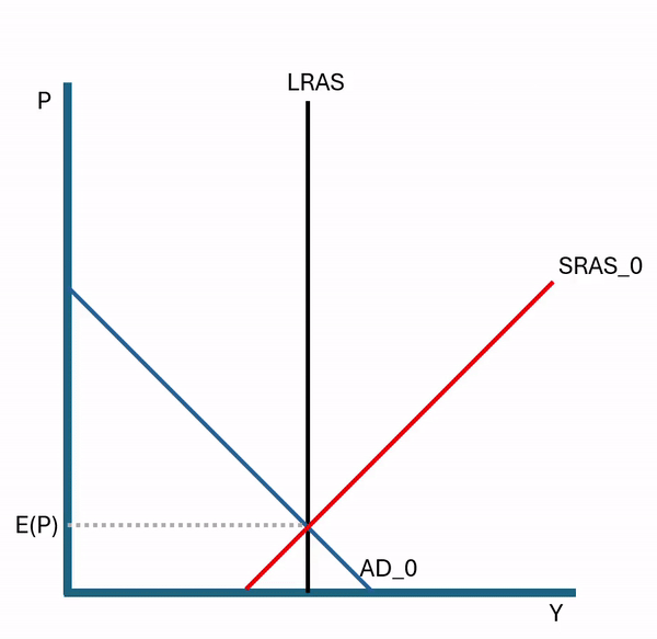
This is what macroeconomists call the “self-correcting property’. The economy will adjust to an AD shock ‘automatically’. Of course, automatic isn’t quite the right word. It’s automatic from the perspective of a policy maker. But the self-correction is the result of an economy’s worth of people bidding for scarce goods and changing their price expectations. It’s automatic in the sense that people don’t need to be told to make the effort. The same results won’t occur if buyers and sellers do nothing, which sounds less automatic.

Since the fundamental productivity of the economy hasn’t changed, we eventually return to the original level of output. If monetary policy doesn’t change in the meantime, then prices will simply rise until the long-run price change composes 100% of the change in total spending. Indeed, given the AS-AD model above, half of the price difference between the current price and the long run price is eliminated each period. Similarly, half of the output gap is eliminated each period. This is why monetary and fiscal stimulus that just focuses on total spending only has short-run output and employment effects. The self-correcting property asserts itself and prices rise in the long run.
*In the figures above, I’ve illustrated an initial sharp price change, though sticky prices and very surprising inflationary stimulus can cause a delay in the initial price adjustment.
**Of course, all of this can be expressed in percent change rather than levels.