America has withdrawn aid from Ukraine. Contra the Vice-President, we could easily afford to reverse this, and I hope we will. I know we could afford it because even the much poorer Europeans can, and I think they might finally be ready to try.
Until now, Europe has been fighting with both hands tied behind their back- letting their economic growth fall far behind America’s due to poor policy, and committing only a tiny share of that economy to defense. Here’s how Polish Prime Minister Donald Tusk put it:

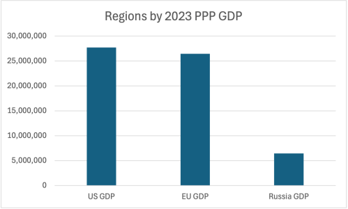
Europe may be significantly poorer than the US on a per-capita basis, but it has significantly more people, so the total size of their economy is almost as large as the US and over 4 times larger than Russia:
But Europe has put only a small fraction of their economy toward defense for a long time. Russia alone spends more on their military than the rest of Europe combined despite their much smaller economy, by putting a much larger fraction of their GDP toward the military:

When European countries spend so little on their own defense, they have little to share with Ukraine. Many leaders complaining about the end of US support have contributed much less themselves, even as a share of their smaller economies:

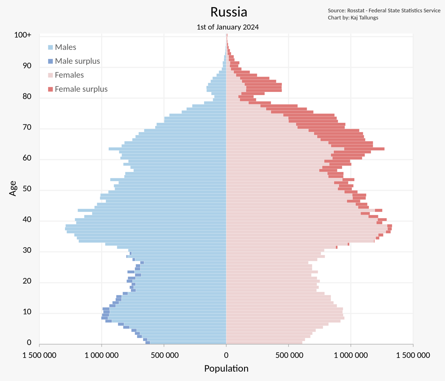
Europe can be much stronger than Russia, but only if they start trying at least half as hard as Russia. Yes, Europe has poor demographics, but Russia’s are worse; Europe has many more military-age men:

Yes, Russia has nukes, but so do Britain and France, and France might actually take advantage of this.
Economically speaking, is this a good time for Europe to rearm? To me it looks fine. The best time would have been the late 2000s to early 2010s, both because it could have been in time to dissuade Russia from starting this war, and because their economic problems then were much more about a lack of aggregate demand. But right now inflation is fine at 2.4%, NGDP growth is fine at 4.3%, and 10-year bond yields the major countries are around 3-4%. Overall this looks like AD is currently about right, but markets expected that economic growth could turn negative this year, and a burst of defense spending could head that off:

This would be especially valuable if it can be paired with the supply-side reforms that European leaders know they should to do anyway, and that would allow for more growth without pushing up inflation. Europe has fallen far behind the US in productivity, to the point that it is now a bigger issue than their higher unemployment and lower hours worked in explaining why the US is much richer:

The silver lining here is that the further behind the US they fall, the faster they could potentially grow- catchup growth is easier than frontier growth, you just need to copy the technologies and implement the strategies already figured out by the frontier economies. Europe easily has the human capital to do this, they just haven’t had the will- have preferred to regulate new technologies like fracking and AI into oblivion, along with older technologies like nuclear power. They won’t drill for oil and gas themselves in the name of decarbonization but have spent hundreds of billions on Russian oil and gas just since the war began. But if they ever decided to change their policy, their economy could rapidly improve- like letting go of the rubber band you’ve been pulling back.
European leaders appear to finally be realizing this. The European Commission just proposed a 150 billion Euro joint defense fund. This week Germany proposed spending half a trillion on infrastructure and defense, sending European stocks above their previous all-time high set in the year 2000 (!).
The EU always used to be able to excuse their economic failings by saying “at least we brought peace to a continent formerly full of war.” But this is no longer the case. If they cannot settle the war on good terms, they have no excuse. The good news is that European decline has been a choice, and it is a choice they could decide to change at any moment. Victory awaits those who will it.