Myron Scholes was on top of the world in 1997, having won the Nobel Prize in economics that year for his work in financial economics, work that he had applied in the real world in a wildly successful hedge fund, Long Term Capital Management. But just one year later, LTCM was saved from collapse only by a last-minute bailout that wiped out his equity (along with that of the other partners of the fund) and cast doubt on the value of his academic work.
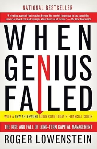
Roger Lowenstein told the story of LTCM in his 2001 book “When Genius Failed“. I finally got around to reading this classic of the genre this year, and I’d say it is still well worth picking up. The story is well-told, and the lessons are timeless-
- Beware hubris
- Beware leverage
- Bigger positions are harder to get out of (especially once everyone knows you are in trouble)
- In a crisis, all correlations go to one
- Past results don’t necessarily predict future performance
- Sometimes things happen that are very different from anything that happened in your backtest window.
The book came out in 2001 but it presages the 07 financial crisis well- not about mortgage derivatives specifically, but the dangers of derivatives, leverage, using derivatives to avoid regulations restricting leverage, and over-relying on mathematical models of risk based on past behavior. If Fed had let LTCM fail, could we have avoided the next crisis? Perhaps so, as their counterparties (most major Wall Street banks) who got burned would have been more careful about the leverage and derivatives used by themselves and their counterparties, and regulators may have taken stronger stances on the same issues.
Perhaps some more recent well-contained blowups foreshadow the next big crisis in the same way, like FTX or SVB?

Some more specific highlights about LTCM:
Continue reading