Two weeks ago I provided an update on estimates of wealth for recent generations in the US. But just this week, the Federal Reserve gave us the once-every-three-years complete update to this data, which allows us to calculate medians rather than average, and to more precisely separate age groups.
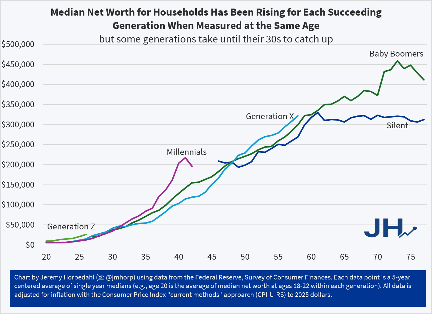
I will have a lot more to say about this data, both on this blog and a book I am working on, but for now here is the chart you have all been waiting for:
It’s been a while since I updated my generational wealth chart, and we now have estimates through the 2nd quarter of 2026, so here’s the latest chart:
Figure 1
Wealth for younger Americans continues to grow substantially, but let me make two caveats:
Yes, I know median data is better. I’m writing a book that uses median wealth data! But the latest median wealth data from the Fed’s SCF is currently only available through 2022, so it’s not super relevant to current conversations. We should have the 2025 data soon.
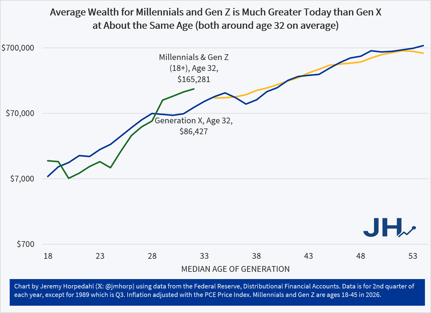
Because of the way the data in my chart is produced in the Fed’s DFA, it groups everyone under age 45 together. That’s a mighty big group, and it because it encompasses both Millennials and a lot of Gen Z, it makes it hard to directly compare to earlier generations.
So, until we have 2025 median wealth data, and until the Fed’s DFA starts breaking out Millennials and Gen Z, here is my current best compromise chart:
Figure 2
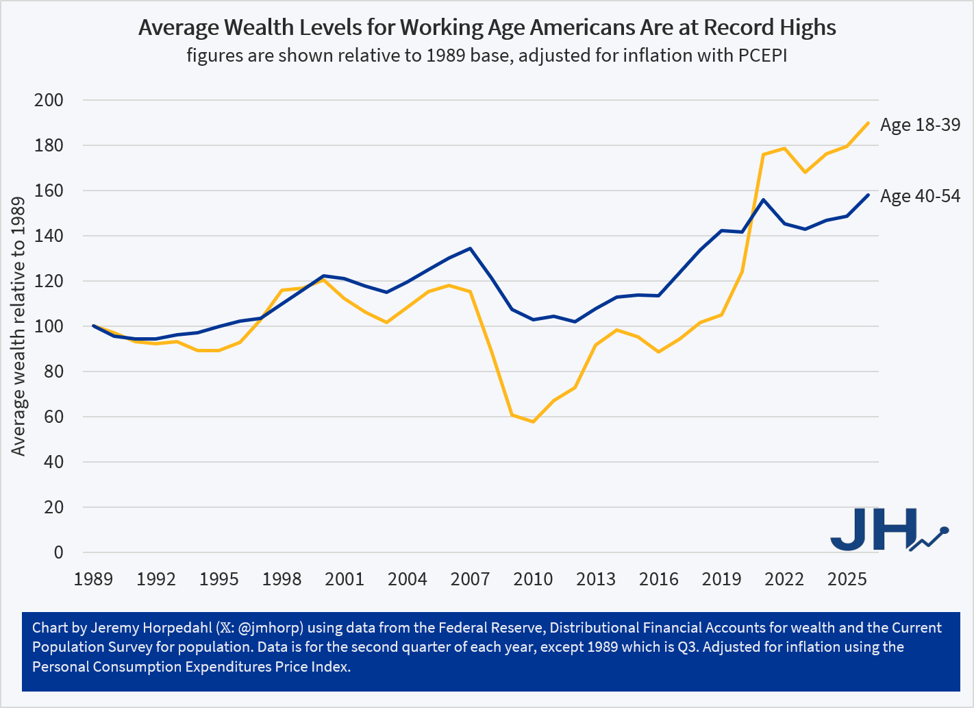
In Figure 2, I have used the Fed DFA data for age groups, which are still pretty large groups, but you can consistently compare them over time. The average wealth level of both the 18-39 group and the 40-54 group have seen substantial gains. In fact, the gains for younger cohorts have been even better than middle-aged Americans, though both saw substantial gains.
And this chart shouldn’t be affected by the lack of household formation among some younger Americans: I am using the full population as the denominator, so if anything, this will understate growth rates. Even so, the growth rate from the depths of Financial Crisis in 2010 have been substantial: 228 percent growth from 2010 to 2026 for ages 18-39. The growth rate for ages 40-54 was less dramatic, though they also didn’t experience as large of a slump from 2007-2010.
While we can always hope and work towards growth rates being better, average wealth for Americans of working age is currently at record highs, having fully recovered from both the Financial Crisis and the inflation slump of 2022.
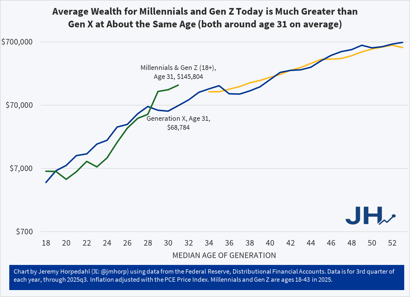
Today I am posting an update to the generational wealth chart that I have posted many times in the past. This update brings the data through the 3rd quarter of 2025 for the youngest cohort, which includes both Millennials and a growing part of Gen Z in the data from the Federal Reserve. I am somehow hesitant to post this chart, as it is starting to be data that is less useful as the younger generations age, for two reasons.
The first problem with the data is that the Fed is lumping everyone from ages 18-43 together as one generation. Given that the youngest Millennials were 29 in 2025, we are now including a significant part of Gen Z, which is OK in itself, but it becomes harder to compare with generations that encompass only 16 or 17 years of birth cohorts. Secondly, the data from the Fed’s Distributional Financial Accounts is only benchmarked every three years with the Fed’s more detailed Survey of Consumer Finances. Currently only the 2022 version of the survey is available, which is now probably a bit out of date. Based on past updates, it is entirely possible that it is underestimating wealth for the youngest cohort. But I think we will have much more certainty about this data once the 2025 SCF is available and used as a benchmark for the DFA data.
With all of those caveats aside, here is the updated chart:
As I am currently working on a book manuscript using the Survey of Consumer Finances, I will be very excited to finally have the 2025 data available. Until then, this is probably the best intergenerational comparison we can do, and it continues to look very positive for the youngest cohorts. With an average of almost $146,000 of wealth for the combined Millennial/Gen Z cohort, they are well ahead of where Gen X was even in their late 30s, and ahead of Boomers at around age 37 as well. All of this bodes well for young people, despite frequent expressions of pessimism, but we should hold off judgement until the 2025 data is fully updated.
When reading an old novel or watching a period drama movie or TV show, it is almost inevitable that some historical currency amounts will be mentioned. This is especially true when the work is dealing with money and wealth, for example the series “The Gilded Age” is about rich people in late 19th century America. So money comes up a lot. I wrote a post a few weeks ago trying to contextualize a figure of $300,000 from 1883 for that show.
A new Netflix series “The House of Guinness” is another period piece that spends a lot of time focusing on rich people (the family that produces the famous beer), as well as their interactions with poorer folks. So of course, there are plenty of historical currency values mentioned, this time denominated in British pounds (the series is primarily set in Ireland, where the pound was in use). On this series, though, they have taken the interesting approach of giving the viewers some idea of what historical currency values are worth today, by overlaying text on the screen (the same way they translate the Gaelic language into English).
For example, in Episode 4 of the first season, one of the Guinness brothers is attempting to negotiate his annual payment from the family fortune. He asks for 4,000 pounds per year. On the screen the text flashes “Six Hundred Thousand Today.”
The creators of the show are to be commended for giving viewers some context, rather than leaving them baffled or pausing the show to Google it. But is 600,000 pounds today a good estimate? Where did they get this number? As with the “Gilded Age” estimate, it’s complicated, but it is probably more than you think.
SPOILER ALERT FOR THE THIRD SEASON OF THE GILDED AGE
In Season 3 of the drama series “The Gilded Age,” one of the servants (Jack, a footman) earns a sum of $300,000 by selling a patent for a clock he invented (the total sum was $600,000, split with his partner, the son of the even wealthier neighbor to the house Jack works in). In the series, both the servants and Jack’s wealthy employers are shocked by this amount. Really shocked. They almost can’t believe it.
How can we put that $300,000 from 1883 in New York City in context so we can understand it today?
A recent WSJ article attempts to do that. They did a good job, but I think more context could help. For example, they say “Jack could buy a small regional bank outside of New York or bankroll a new newspaper.” Probably so, but I don’t think that quite conveys the shock and awe from the other characters in the show (a regional bank? Ho-hum).
First, the WSJ states that the “figure nowadays would be between $9 and $10 million.” That’s just doing a simple inflation adjustment, probably using a calculator such as Measuring Worth (it’s a good tool, and they mention it later in the story). But as the WSJ goes on to note, that probably isn’t the best way to think about that figure.
Here’s my best attempt to contextualize the $300,000 figure: as a footman, Jack probably made $7 to $10 per week. Or let’s call it $1 per day. That means Jack’s fellow servants would have had to work 300,000 days to earn that same amount of income — in other words, assuming 6 days of work per week, they would have had to work for almost 1,000 years to earn that much income. Jack appears, to his co-workers, to have earned that income almost in one fell swoop (though in reality, he spent months of his free time toiling away at the clock).
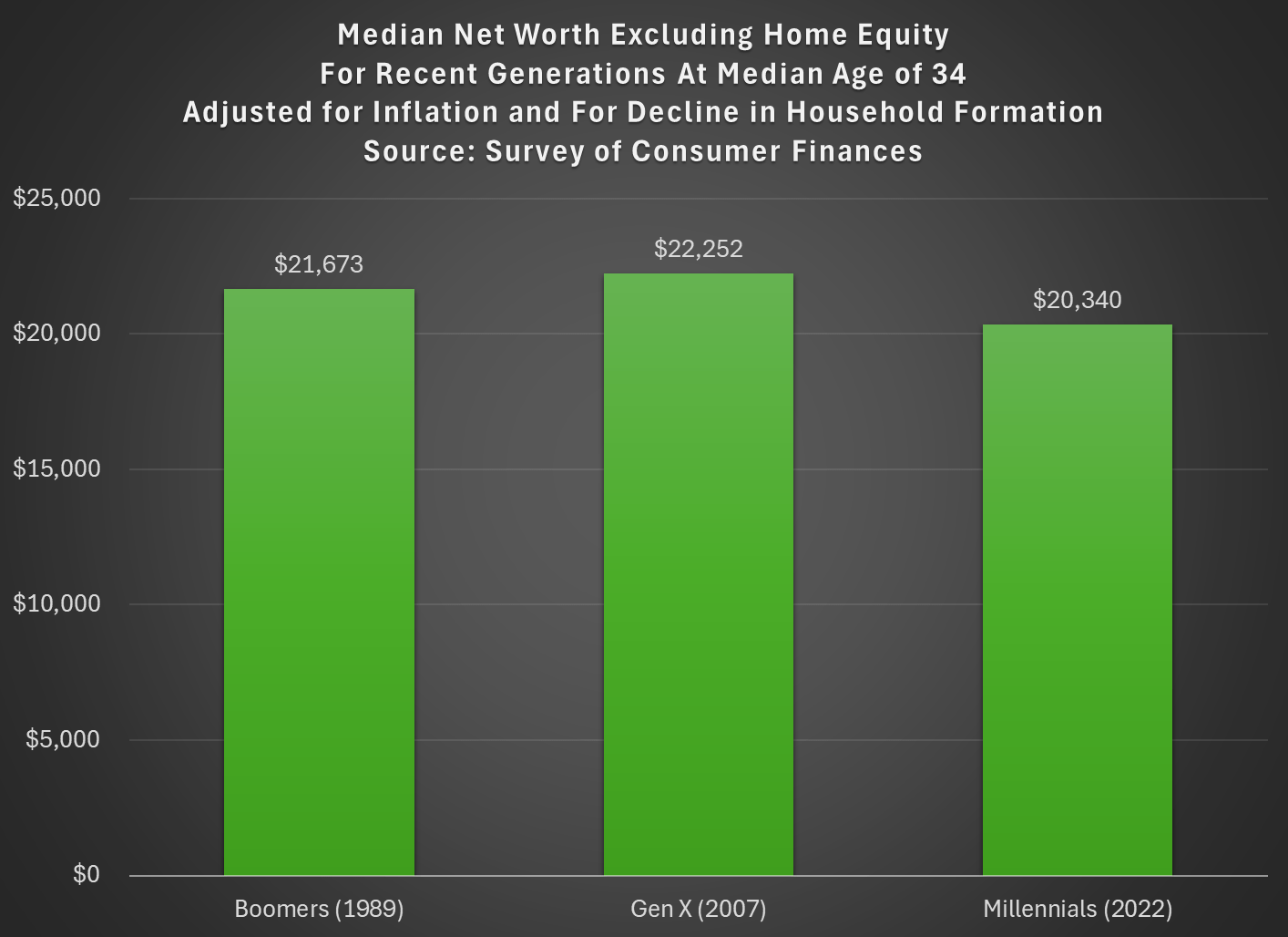
Last week I tried to address whether rising wealth for younger generations was primarily driven by rising home values. My analysis suggested that it was a cause, but not the only cause. Here’s another chart on that topic, showing median net worth excluding home equity for recent generations:
Two things are notable in the chart. For millennials, even excluding home equity they are well ahead of past generations, though of course their net worth is much smaller excluding this category of wealth (the total median net worth for millennials in 2022 was $93,800). But for Gen X in 2022 (last data in that chart), they are slightly behind Boomers, never having recovered from the decline in wealth after 2007 (primarily from the stock market decline, since we’re excluding housing).
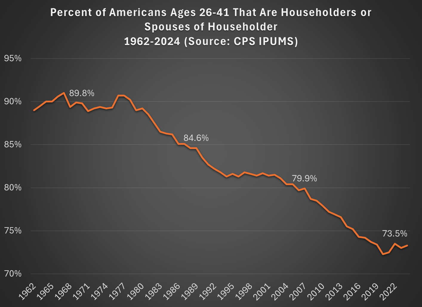
But today I want to address another general objection to the wealth data found in the Fed’s SCF and DFA programs. That objection has to do with household formation. Specifically, these surveys are calculated for households, and the age/generation indicators are for the household head (or “householder” as it is now called). And we know that household formation has been declining over time, as more young people live with parents, with roommates, etc. So the Millennial data we see in the chart above is excluding any Millennials that have not yet formed their own household.
Here’s a general picture of the decline, which has been happening gradually since about 1980. Note: I use the age group 26-41, because this is the age of Millennials in 2022 (the most recent SCF survey year). The highlighted years on the chart are when the Silent, Baby Boomer, Gen X, and Millennial generations were about the same age (26-41).
What this means is that when we are looking at households in these wealth surveys (or any survey that focuses on households) we aren’t quite comparing apples to apples. Does this mean the surveys are worthless? No! With the microdata in the SCF, we can look at not only the median value, but the entire distribution. Since the household formation rate has fallen by about 11 percentage points between Boomers in 1989 and Millennials in 2022, one solution is to look up or down the distribution for a rough comparison.
For example, if we assume all of the 11 percent of non-householders among Millennials have wealth below the median, we can make a rough correction by looking at the 39th percentile for Millennials — the 39th percentile would be the median if you included all of those 11 percent of non-householders as households. Similarly, for Gen X would move down 5 percentage points in the distribution to the 45th percentile in 2007.
The household-formation-adjusted chart does paint a more pessimistic picture than just looking at the median for each generation: the 39th percentile Millennial has about 20% less wealth than the median Boomer did at roughly the same age. Seems like generational decline! Is there any silver lining?
First, you should interpret the chart above as a worst case scenario for Millennial wealth. It assumes all non-householders have low wealth. But likely not all of them do. If instead we use the 43rd percentile of Millennials in 2022, their net worth is $61,000, slightly above Boomers at the same age. (The household formation problem isn’t going away anytime soon as generations age — even if we look at Gen Xers, with a median age of 50 in 2022, their household formation is still 6 percentage points behind Boomers at that age.)
Second, my worst case scenario almost certainly overstates the problem. If all of those 11 percent fewer Millennials not yet forming households were to get married to other millennials, it would only add half of that many households to the aggregate distribution (when two non-householders get married, it becomes one household). So instead of moving down 11 percentage points to the 39th percentile, we should only move down 5 or 6 percentiles. The 44th percentile of Millennial net worth in 2022 was $63,060 — again, compare this to Boomers in the chart above.
Finally, if we combine both of the adjustments discussed in this post, looking at wealth excluding home equity and also adjusting for the decline in household formation, we get the following chart (here I once again use the 39th percentile for Millennials and the 45th percentile for Gen X, i.e., the worst case scenario):
With this final adjustment, we get a slightly different picture. The wealth of these three generations is roughly the same at the same age. No increase in wealth, but no decline either. You could read this as pessimistic, if your assumption is that wealth should rise over time, but the general vibes out there are that young people are worse off than in the past. This wealth data suggests, once again, that the kids are doing all right.
As I have discussed in many previous blog posts, young people today have a lot more wealth than past generations at the same point in their life. But we also know that housing prices have increased dramatically in recent years, and that for most families their home is their largest source of wealth.
Does this imply that the increase in wealth young Americans have seen is primarily driven by increased housing prices? If so, this would paint a less optimistic picture of the wealth of young people today, since the value of your home that you usually can’t easily convert into other consumption.
If we look at the past 5 years (2019Q4 to 2024Q4), the total wealth US households under the age of 40 increased by $5 trillion, in nominal terms. That’s not adjusted for inflation, but we don’t need to do so because we can look at how much each asset class increased in nominal terms as well. The total value of assets for households under age 40 increased by $5.86 trillion.
Here’s how the various classes of assets have increased since 2019Q4:
Donald Trump has repeatedly said that the US was at our “richest” or “wealthiest” in the high-tariff period from 1870-1913, and sometimes he says more specifically in the 1890s. Is this true?
One possibility is tax revenue, since he often says this in the context of tariffs versus an income tax. Broadly this also can’t be true, as federal revenue was just about 3% of GDP in the 1890s, but is around 16% in recent years.
But perhaps it is true in a narrower sense, if we look at taxes collected relative to the country’s spending needs. Trump has referenced the “Great Tariff Debate of 1888” which he summarized as “the debate was: We didn’t know what to do with all of the money we were making. We were so rich.” Indeed, this characterization is not completely wrong. As economic historian and trade expert Doug Irwin has summarized the debate: “The two main political parties agreed that a significant reduction of the budget surplus was an urgent priority. The Republicans and the Democrats also agreed that a large expansion in government expenditures was undesirable.” The difference was just over how to reduce surpluses: do we lower or raise tariffs?
It does seem that in Trump’s mind being “rich” in this period was about budget surpluses. Let’s look at the data (I have truncated the y-axis so you can actually read it without the WW1 deficits distorting the picture, but they were huge: over 200% of revenues!):
It is certainly true that under parts of the high-tariff period, we did collect a lot of revenue from tariffs! In some years, federal surpluses were over 1% of GDP and 30% of revenues collected. But notice that this is not true during Trump’s favored decade, the 1890s. Following the McKinley Tariff of 1890, tariff revenue fell sharply (though probably not likely due to the tariff rates, but due to moving items like sugar to the duty-free list, as Irwin points out). The 1890s were not a decade of being “rich” with tariff revenue and surpluses.
Finally, also notice that during the 1920s the US once again had large budget surpluses. The income tax was still fairly new in the 1920s, but it raised around 40-50% of federal revenue during that decade. By the Trump standard, we (the US federal government) were once again “rich” in the 1920s — this is true even after the tax cuts of the 1920s, which eventually reduced the top rate to 25% from the high of 73% during WW1.
If we define a country as being “rich” when it runs large budget surpluses, the US was indeed rich by this standard in the 1870s and 1880s (though not the 1890s). But it was rich again by this standard in the 1920s. This is just a function of government revenue growing faster than government spending. And the growth of revenue during the 1870s and 1880s was largely driven by a rise in internal revenue — specifically, excise taxes on alcohol and tobacco (these taxes largely didn’t exist before the Civil War).
1890 was the last year of big surpluses in the nineteenth century, and in that year the federal government spent $318 million. Tariff revenue (customs) was just $230 million. There was only a surplus in that year because the federal government also collected $108 million of alcohol excise taxes and $34 million of tobacco excise taxes. In fact, throughout the period 1870-1899, tariff revenues are never enough to cover all of federal spending, though they do hit 80% in a few years (source: Historical Statistics of the US, Tables Ea584-587, Ea588-593, and Ea594-608):
One more thing: in some of these speeches, Trump blames the Great Depression on the switch from tariffs to income taxes. In addition to there really being no theory for why this would be the case, it just doesn’t line up with the facts. The 1890s were plagued by financial crises and recessions. The 1920s (the first decade of experience with the income tax) was a period of growth (a few short downturns) and as we saw above, large budget surpluses. The Great Depression had other causes.