We’re bombing Iran, and Iran is now bombing most of its neighbors. Oil prices are up ~20% since the bombing began last weekend, and stocks are down.
Iranian “Supreme Leader” Khamenei is now dead. Prediction markets sort of saw this coming; I mentioned here a month ago that markets thought it more likely than not that Khamenei would be “out of office” this year.1
Real-money US-regulated exchanges can’t directly cover the war, but others can and do, such as the international Polymarket:
Polymarket’s argument for why they offer these markets
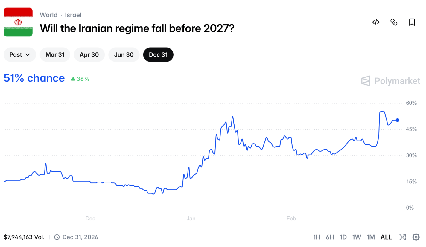
This market shows that regime change is likely, but will take time- a 51% chance by the end of the year, but only a 13% chance by the end of the month.
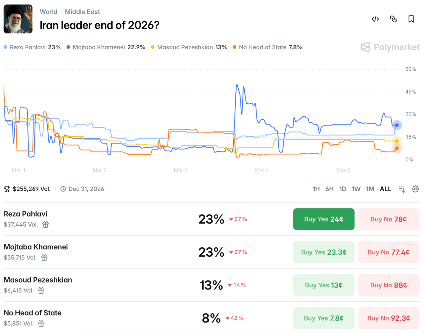
How would this be achieved? Markets see a 60% chance that there will be US troops in Iran this year, though this market could be triggered by just a few special forces operators, or by troops visiting for humanitarian purposes after domestically-driven regime change. There will likely be a US-Iran ceasefire by the end of May. It’s not clear at all who will be running Iran at the end of the year:
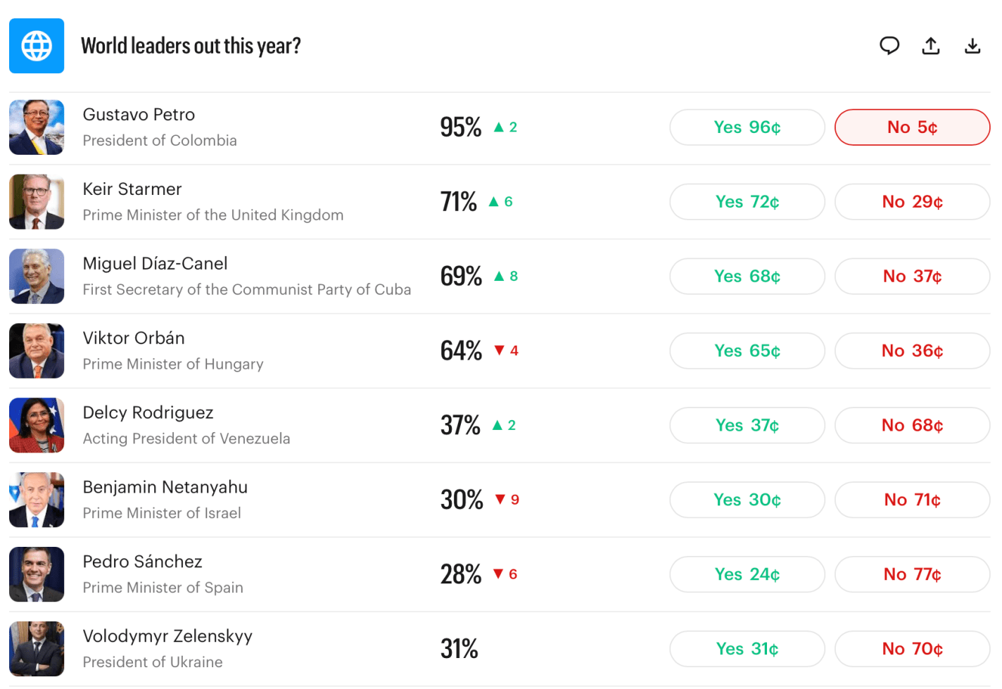
Iran is far from the only country whose future leadership is unclear. Last month I noted that the current leaders of Britain, Hungary, and Cuba would likely be out of office by year end. These are all now looking even more likely than they did a month ago:
So I’ll repeat:
Myself, I find most of these market odds to be high, and I’m tempted to make the “nothing ever happens” trade and bet that everyone stays in office. But even if all these markets are 10pp high, it still implies quite an eventful year ahead. Prepare accordingly.
US-regulated exchanges can’t offer markets on death. Kalshi’s rules stated that if Khamenei died, the market would refund everyone at current prices rather than paying as if he were “out of office”. When he died many people got mad at Kalshi- some who had bet he’d be “out of office” and were mad that they weren’t paid at 100%, others that Kalshi was offering something too close to a death market- “how else would he lose power” (even though Maduro and Assad provide clear recent examples) ↩︎
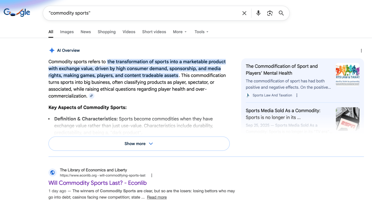
I’m trying to coin “Commodity Sports” as the term to refer to sports betting that takes place on exchanges regulated by the US Commodity Futures Trading Commission, as opposed to sports betting that takes place through casinos regulated by state gaming commissions. So far it seems to be working alright, I haven’t convinced Gemini but have got the top spot in traditional Google search:
That article- Will Commodity Sports Last?– is my first at EconLog. I’m happy to get a piece onto one of the oldest economics blogs, one where I was reading Arnold Kling’s takes on the Great Recession in real time, where I was introduced to Bryan Caplan’s writing before I read his books, and where Scott Sumner wrote for many years (though I started reading him at The Money Illusion before that).
The key idea of the piece, other than the legal oddity of sports betting sharing a legal category with corn futures, is that the Commodity Sports category is being pioneered by prediction markets like Kalshi. As readers here will know, I like prediction markets:
I love that CFTC-regulated exchanges like Kalshi and Polymarket are bringing prediction markets to the mainstream. The true value of prediction markets is to aggregate information dispersed across the world into a single number that represents the most accurate forecast of the future.
But I’m not so excited to see them expanding into sports:
Although I see huge value in prediction markets when they are offering more accurate forecasts on important issues that help policymakers, businesses, and individuals make more informed plans for our future (e.g., Which world leaders will leave office this year?, or Which countries will have a recession?)… I see much less value in having a more accurate forecast of how many receptions Jaxon Smith-Njigba will have.
Like Robin Hanson, I worry that the legal battles against Commodity Sports and the brewing cultural backlash against sports betting risk taking the most informative prediction markets down along with it.
Last January I shared a roundup of forecasts for the year from markets and professional economists. Were they any good? Here was their prediction for the US economy:
WSJ’s survey of economists reports that inflation expectations for 2025 were around 2% before the election, but are closer to 3% now. Their economists expect GDP growth slowing to 2%, unemployment ticking up slightly but staying in the low 4% range, with no recession. The basic message that 2025 will be a typical year for the US macroeconomy, but with inflation being slightly elevated, perhaps due to tariffs.
The verdicts (based on current data, which isn’t yet final for all of 2025):
Inflation: Nailed it exactly (2.7%)
GDP: We’re still waiting on Q4, but 2025 as a whole is on track to be a bit above the 2.0% forecast.
Unemployment: 4.6% as of November 2025, a bit above the 4.3% forecast
Recession: Didn’t happen, making the 22% chance forecast look fine
So the professional forecasters were probably a bit low on GDP and unemployment, but overall I’d say they had a good year. What about prediction markets?
For those who hope for DOGE to eliminate trillions in waste, or those who fear brutal austerity, the message from markets is that the huge deficits will continue, with the federal debt likely climbing to over $38 trillion by the end of the year. This is one reason markets see a 40% chance that the US credit rating gets downgraded this year.
While the US has only a 22% chance of a recession, China is currently at 48%, Britain at 80%, and Germany at 91%. The Fed probably cuts rates twice to around 4.0%.
Deficits: Nailed it, the federal debt is currently around $38.4 trillion.
US Credit Downgrade: It’s hard to score a prediction of a 40% chance of a binary event happening, but in any case Moodys downgraded the US’ credit rating in May, so that all three major agencies now rate it as not perfect.
The Fed: Cut rates a bit more than expected.
Foreign Recessions: China and Britain avoided recessions. Germany had a recession by the technical definition of Kalshi’s market, but not really in practice (FRED shows -0.2% Real GDP growth in Q2 followed by 0.00000% growth in Q3). Britain avoiding recession when markets showed an 80% chance was the biggest miss among the forecasts I highlighted.
Overall though, I’d say forecasters did fairly well in predicting how 2025 turned out, in spite of curveballs like the April tariff shock.
If you think the forecasters are no good and you can do better, you have more options than ever. Prediction markets are getting more questions and more liquidity if you’re up for putting your money where your mouth is; if you don’t want to put your own money at risk, there are forecastingcontests with prizes for predicting 2026.
Back in April I wrote about 4 different estimates of GDP growth and how well they have performed since 2023. With the 2nd quarter of 2025 GDP data coming out next week, what do the best performing predictors currently say?
In that last post, I showed that the Atlanta Fed GDPNow model and the Kalshi betting market were generally the best performers. And furthermore, averaging these two improves the predictive power a little more. As of today, the GDPNow model is predicting 2.4% growth and Kalshi is… also predicting 2.4%!
There will be a few more updates to GDPNow over the next week, and of course Kalshi is constantly updating as more people bet. But as of right now, 2.4% growth seems like a reasonable prediction. That may surprise some people, especially given all of the pessimism surrounding tariffs and policy uncertainty generally. But despite all of this, the US economy appears to be just continuing to chug along.
WSJ’s survey of economists reports that inflation expectations for 2025 were around 2% before the election, but are closer to 3% now. Their economists expect GDP growth slowing to 2%, unemployment ticking up slightly but staying in the low 4% range, with no recession. The basic message that 2025 will be a typical year for the US macroeconomy, but with inflation being slightly elevated, perhaps due to tariffs.
Kalshi has a lot of good markets up that give more detailed predictions for 2025:
For those who hope for DOGE to eliminate trillions in waste, or those who fear brutal austerity, the message from markets is that the huge deficits will continue, with the federal debt likely climbing to over $38 trillion by the end of the year. This is one reason markets see a 40% chance that the US credit rating gets downgraded this year.
While the US has only a 22% chance of a recession, China is currently at 48%, Britain at 80%, and Germany at 91%. The Fed probably cuts rates twice to around 4.0%.
Will wage growth keep pace with inflation? It’s a tossup. Corporate tax cuts are also a tossup. The top individual rate probably won’t fall below it’s current 37%.
If you want to make your own predictions for the year, but don’t want to risk money betting on Kalshi, there are several forecasting contests open that offer prizes with no risk:
ACX Forecasting Contest: $10,000 prize pool, 36 questions, must submit predictions by Jan 31st
Bridgewater Forecasting Contest: $25,000 prize pool, half of prizes are reserved for undergraduates. Register now to make predictions between Feb 3rd and March 31st. Doing well could get you a job interview at Bridgewater.
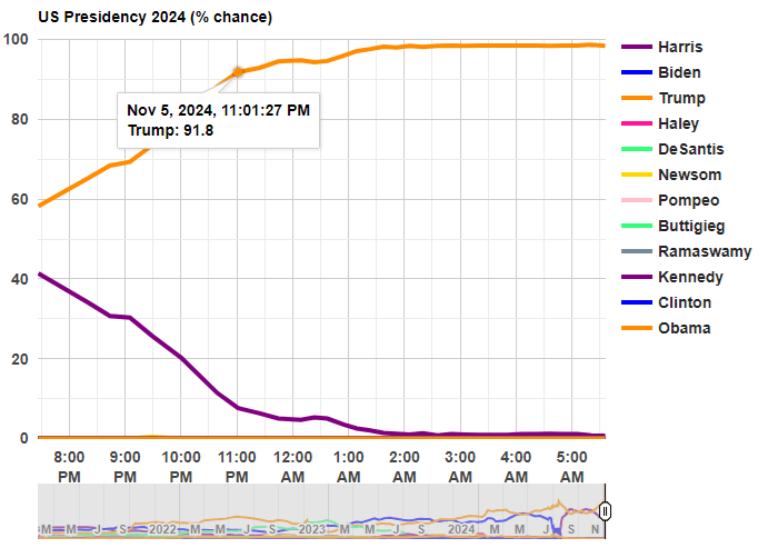
Last night was a big win for Trump, but it was also a big win for prediction markets. In January 2024, I suggested that one of the best ways to follow the election was by following prediction markets. That prediction turned out to be correct!
Before any polls had closed, prediction markets had Trump with about 60% odds of winning. That’s far from a sure thing, but it’s much better than many prediction models, which all had the race as basically a 50-50 toss-up with a very slight edge to Harris (though one simple model that I wrote about two weeks ago had Harris slightly losing the popular vote, a good call in hindsight). So going into the election results, you would have been more confident that a Trump win was a real possibility if you watched predictions markets
Last night after the results started coming in, the average over five different prediction markets from Election Betting Odds put Trump at over 90% odds by 11:00pm Eastern Time. By about 12:45am, he was already over 95%. These aren’t absolutely certain odds, but if you were watching the election night news coverage, they were still treating this as essentially a toss-up in the battleground states.
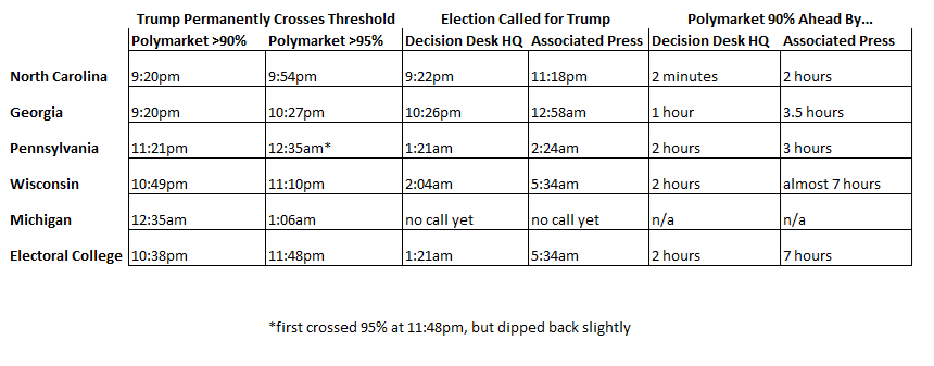
The Associated Press hadn’t even called Georgia, the second of the battleground states, by the time prediction markets were over 95% for the overall race! Decision Desk HQ, which is a very good source for calling races in real time, didn’t declare Trump the winner until 1:21am, when they called Pennsylvania (they also have a nice explanation of how they made the call). The AP didn’t declare Trump the winner until 5:34am, when they called Wisconsin.
Polymarket is the largest of the five markets in the Election Betting Odds average, and they are also a good source because they have markets for all of the battleground states (here’s the market for Michigan, which still hasn’t been called as of 11:30am on Wednesday by most news sources!). This table shows when the 90% and 95% thresholds were permanently crossed on Polymarket odds for each of the 5 early battleground states, in comparison with the DDHQ and the AP.
Notice that the 90% threshold consistently beats DDHQ by at least an hour (the one exception is North Carolina, where DDHQ called it very early — they are very good at what they do!). And the 90% threshold is consistently beating the AP by at least 3 hours.
None of this should be read as a criticism of the Associated Press. They should be cautious about predictions! But if you want to know things fast (or, before your bedtime in this case), prediction markets are clearly worth following.
How can prediction markets be so far ahead of media sources? Because there is a strong incentive to be right early: that’s how you make money in these markets! How exactly this is done is unclear, since the traders are all anonymous and we generally can’t ask them. But likely they are doing a similar analysis of counties results compared to the 2020 election, as DDHQ told us they did after the fact, just quicker (indeed, if you were watching news coverage, they were doing the same thing, just in an ad hoc way, and much more slowly).
Kalshi just announced that they will begin paying interest on money that customers keep with them, including money bet on prediction market contracts (though attentive readers here knew was in the works). I think this is a big deal.
First, and most obviously, it makes prediction markets better for bettors. This was previously a big drawback:
The big problem with prediction markets as investments is that they are zero sum (or negative sum once fees are factored in). You can’t make money except by taking it from the person on the other side of the bet. This is different from stocks and bonds, where you can win just by buying and holding a diversified portfolio. Buy a bunch of random stocks, and on average you will earn about 7% per year. Buy into a bunch of random prediction markets, and on average you will earn 0% at best (less if there are fees or slippage).
This big problem just went away, at least for election markets (soon to be all markets) on Kalshi. But the biggest benefit could be how this improves the accuracy of certain markets. Before this, there was little incentive to improve accuracy in very long-run markets. Suppose you knew for sure that the market share of electric vehicles in 2030 would over 20%. It still wouldn’t make sense to bet in this market on that exact question. Each 89 cents you bet on “above 20%” turns into 1 dollar in 2030; but each 89 cents invested in 5-year US bonds (currently paying 4%) would turn into more than $1.08 by 2030, so betting on this market (especially if you bid up the odds to the 99-100% we are assuming is accurate) makes no financial sense. And that’s in the case where we assume you know the outcome for sure; throwing in real-world uncertainty, you would have to think a long-run market like this is extremely mis-priced before it made sense to bet.
But now if you can get the same 4% interest by making the bet, plus the chance to win the bet, contributing your knowledge by betting in this market suddenly makes sense.
This matters not just for long-run markets like the EV example. I think we’ll also see improved accuracy in long-shot odds on medium-run markets. I’ve often noticed early on in election markets, candidates with zero chance (like RFK Jr or Hillary Clinton in 2024) can be bid up to 4 or 5 cents because betting against them will at best pay 4-5% over a year, and you could make a similar payoff more safely with bonds or a high-yield savings account. Page and Clemen documented this bias more formally in a 2012 Economic Journal paper:
We show that the time dimension can play an important role in the calibration of the market price. When traders who have time discounting preferences receive no interest on the funds committed to a prediction-market contract, a cost is induced, with the result that traders with beliefs near the market price abstain from participation in the market. This abstention is more pronounced for the favourite because the higher price of a favourite contract requires a larger money commitment from the trader and hence a larger cost due to the trader’s preference for the present. Under general conditions on the distribution of beliefs on the market, this produces a bias of the price towards 50%, similar to the so-called favourite/longshot bias.
We confirm this prediction using a data set of actual prediction markets prices from 1,787 market representing a total of more than 500,000 transactions.
Hopefully the introduction of interest will correct this, other markets like PredictIt and Polymarket will feel competitive pressure to follow suit, and we’ll all have more accurate forecasts to consult.
Supporters of prediction markets tend to emphasize how they are great tools for aggregating information to produce accurate forecasts. If you want to know e.g. who is likely to win the next election, you can watch every poll and listen to pundits for hours, or you can take ten seconds to check the odds. This is great for people who want information- but how do prediction markets fare as investments for their actual participants?
Zero Sum
The big problem with prediction markets as investments is that they are zero sum (or negative sum once fees are factored in). You can’t make money except by taking it from the person on the other side of the bet. This is different from stocks and bonds, where you can win just by buying and holding a diversified portfolio. Buy a bunch of random stocks, and on average you will earn about 7% per year. Buy into a bunch of random prediction markets, and on average you will earn 0% at best (less if there are fees or slippage).
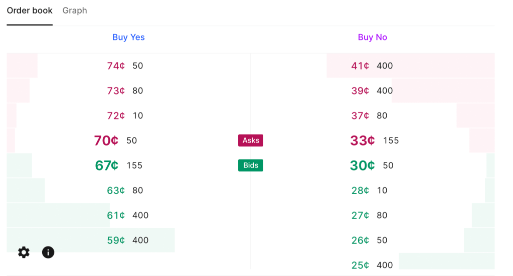
Low Liquidity
Current Kalshi order book for “Will June 2024 be the hottest June ever“. Betting $200 on either outcome could move the price by 5 cents (so move the estimated probability by 5pp).
This zero sum problem is close to inevitable based on how prediction markets work. They currently have one other big problem, though it is not inevitable, and is getting better as they grow: liquidity. There are some stocks and bonds where big institutions can buy or sell millions of dollars worth without moving the price. But in markets like Kalshi or PredictIt, I personally move prices often by betting just hundreds, or sometimes even just tens, of dollars. Buying at scale means getting worse prices, if you can even buy at all. PredictIt has a bet limit of $850 per contract for regulatory reasons. This definitely excludes institutional investors, but even for individuals it can mean many markets aren’t worthwhile. Say an outcome is already priced at 90 cents, the most you can make by betting it happens is about $94. That’s not nothing but its also not enough to incentivize lots of in-depth research, especially given the risk of losing the $850 if you are wrong and the opportunity cost of investing the money in stocks or bonds. Kalshi in theory allows bets up to $25k, but most of their markets haven’t had the liquidity to absorb a bet anywhere near that (though this could be changing).
Easy Alpha
Given these negatives, why would anyone want to participate in prediction markets, except to gamble or to generously donate their time to create information for everyone else? Probably because they think they can beat the market. Compared to the stock market, this is a fairly realistic goal. Perhaps because the low liquidity keeps out institutional investors, it isn’t that hard for a smart and informed investor to find mispricings or even pure arbitrages in prediction markets. This seems to be especially true with political prediction markets, where people often make bets because they personally like or dislike a candidate, rather than based on their actual chances of winning; that is exactly the kind of counterparty I want to be trading with.
I’ve been on PredictIt since 2018 and earned a 16% total return after fees; this was on hundreds of separate trades so I think it is mostly skill, not luck. Of course, even with this alpha, 16% total (not annual) return over 6 years is not great compared to stocks. On the other hand, I tended to put money in right before big elections and take it out after, so the money is mostly not tied up in PredictIt the whole time; the actual IRR is significantly better, though harder to calculate. On the other other hand, the actual dollar amount I made is probably not great compared to the time I put in. On yet another hand, the time isn’t a big deal if you are already following the subject (e.g the election) anyway.
Uncorrelated Alpha
The other big positive about prediction markets is that there is no reason to expect your returns there are correlated with your returns in traditional markets. Institutional investors are often looking for investments that can do well when stocks are down, and are willing to sacrifice some expected returns to get it. In fact, there may be ways to get a negative correlation between your prediction market returns and your other returns, hedging by betting on outcomes that would otherwise harm you. For instance, you can hedge against inflation by betting it will rise, or hedge against a recession by betting one happens. If you are right, you make some money by winning the bet; if you are wrong, you lose money on the bet but your other investments are probably doing well in the low-inflation no-recession environment.
Going Forward
Prediction markets have long been in a regulatory grey area in the US, but with the emergence of Kalshi and the current CFTC, everything may soon be black and white. Kalshi has won full approval from the CFTC for a variety of markets, but the CFTC is moving to completely ban betting on elections (you can comment on their proposal here until July 9th).
One great place to discuss the future of prediction markets will be Manifest, a conference hosted by play-money market Manifold in Berkeley, CA June 7-9th. It features the founders of most major US predictions markets and many of the bestwriters on prediction markets. I’ll be there, and as I write tickets are still available.
Predicting elections is hard. Poll aggregators and prediction markets can help. Many of the usual suspects like FiveThiryEight and PredictIt aren’t covering Sunday’s election in Turkey, partly due to their ownissues, and partly because US organizations often ignore foreign elections. But we do have several good predictors to consider, and they all list opposition candidate Kiliçdaroglu as a slight favorite.
Polymarket is most optimistic for the opposition, giving them a 67% chance. British betting site Smarkets gives them a 61% chance. Play-money site Manifold Markets gives them 56%. Finally, no-money prediction site Metaculus gives a 60% chance that the opposition wins, and a 79% chance that Erdogan leaves office if he loses the election. I’m not sure how the count the Swift Centre, a small closed panel of forecasters, but they are the exception in seeing Erdogan as a slight favorite.
My economist’s instinct is to trust the real-money markets more here, although Manifold and Metaculus outperformed them in the 2022 US midterms. The usual bias is to predict a win for the candidate you like more (which for Westerners on these markets means betting against Erdogan), and have real money on the line can help counteract this. On the other hand, some might use betting markets as a hedge and bet on the outcome they don’t want. In this case the betting markets are slightly more favorable to the opposition, but the gap is small.
Of course, the biggest real-money markets are those that don’t ask directly about the election: the markets for Turkish stocks and bonds. These have generally performed well in the past year as the opposition’s chances have risen, which may indicate that markets think a new Prime Minister with more conventional economic views will get inflation under control.
Last night the major party candidates for Senate in Pennsylvania had their first and only debate. I didn’t watch it, since I don’t live in Pennsylvania. But judging by my Twitter feed, a lot of people did watch it, including (bizarrely to me) lots of people who don’t live in Pennsylvania. And overnight, tons of articles were written analyzing the debate, saying who “won” the debate, and so on (“5 Things You Need to Know About the Pennsylvania Senate Debate” etc.).
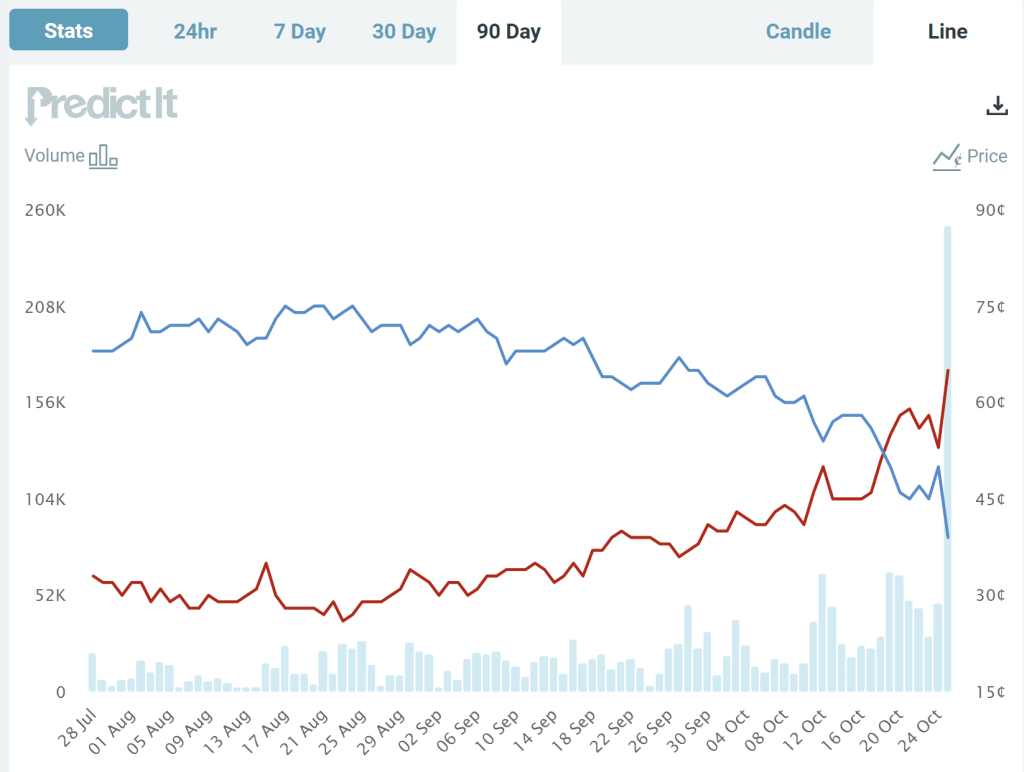
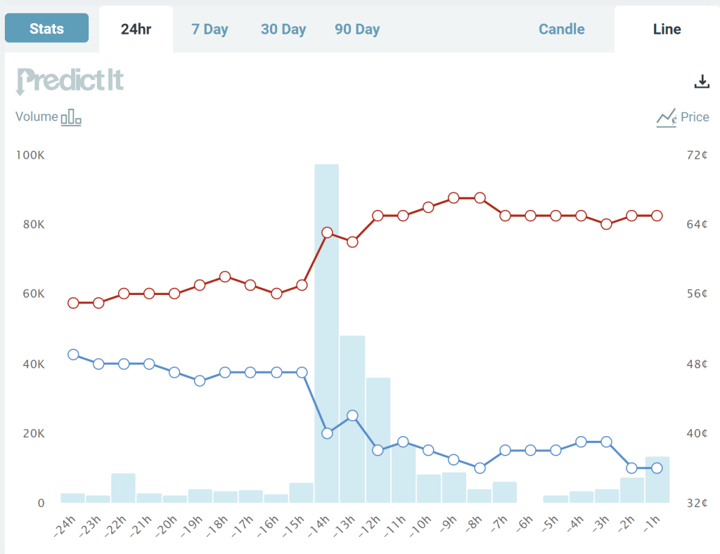
But this blog post is the only thing you need to read about that debate. And these charts are really all you need to look at.
These two charts come from the prediction market website PredictIt. The charts show the “odds” (more on that below) that each candidate will win the Pennsylvania Senate race, over a 90-day time horizon (first chart) and the last 24 hours (second chart). What do we see? The Democratic candidate has been leading for the entire race up until a week ago, though with his odds falling gradually over the past month or two.
Notice though the big jump last night during the debate. The Republican candidate moved up from odds of about 57% to odds of about 63%, close to where it stands as I write (67%). Based on this result, it’s safe to say that the Republican candidate “won” the debate, though not so decisively that the election is now a foregone conclusion. You don’t need to wait for the polls, which have consistently showed the Democratic candidate in the lead (though with the gap closing in recent weeks) — though of course, these betting odds could change as new polling data is released.