The “Reality Index” of Price Inflation Isn’t Grounded in Reality

Over the years, many people have tried to create alternatives to the CPI for measuring inflation. Probably the most famous is “Shadow Stats,” which Tim Lee has convincingly shown isn’t actually measuring price inflation (it’s just adding a fixed factor to the CPI).

But the CPI critics keep coming. One that was recently released is called the “Reality Index.” This index tries to improve on the CPI-U in two ways. First, it uses fixed weights for the items in the basket, and importantly it uses the 2024 weights and applies them to past years (this is called a Paasche index). Second, it takes out some BLS prices to avoid using hedonically adjusted prices, and other price calculations that the Reality Index author thinks are weird.

Both of these changes are problematic. I will explain why.

1. Fixed Basket of Goods/Services Doesn’t Make Sense

Many critics of the CPI complain about the shifting weights in the CPI. “We just want to measure the cost of a fixed basket over time.” But measuring a fixed basket over time isn’t actually that useful. I will explain why in a moment. But that’s not even what the Reality Index does! Instead, it takes the 2024 CPI weights (which come from the Consumer Expenditure Survey), and then consistently applies those weights to past years. The Index isn’t measuring the cost of a fixed basket of goods from some past year — it is using the 2024 basket, and assuming that’s what people consumed in the past.

The author of the Reality Index, Tom Elliott, is either confused about this or is being deliberately misleading, for example in a recent WSJ essay promoting the Index, he says “That same basket, the one the government says rose 1.87 times since 2000, has actually risen about 2.4 times.” But that’s false. To do that calculation, you would need to use the 2000 CPI weights and follow them forward to 2024 (this is called a Laspeyres index). Instead, he uses the 2024 weights and follows them backwards. He could do the calculation that he references in the WSJ essay, but he does not.

To see why this is a bad approach, let’s compare the weights in the Reality Index with a few past years. I have done my best to translate the weights for the 10 categories listed on this page to actual BLS categories, though I will admit that none of their category weights matched exactly to what I found at BLS. But I’m pretty confident it is correct.

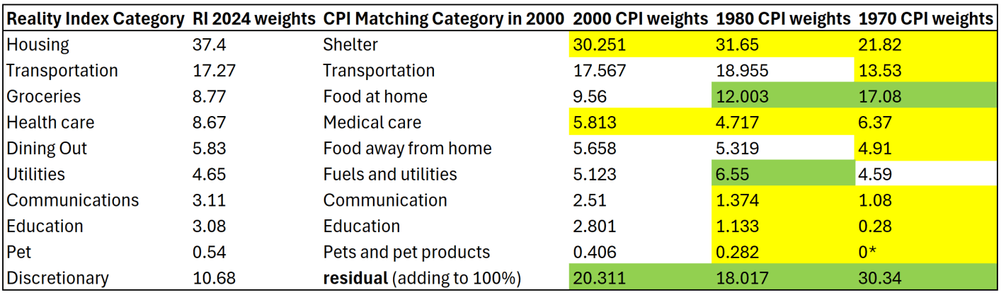
I am also pretty confident that the “discretionary” category is just a residual for everything that wasn’t in the other 9 categories, though I can’t find them explicitly saying this. Yellow highlighting indicates the category in past years was smaller than the 2024 weights. Green highlighting indicates past years were larger weights.

The first thing you might notice is that the CPI weights have changed significantly over time. Relative to 1970, housing/shelter gets almost twice as much weight today. Conversely, groceries/food at home gets about half the weight today as it had in 1970. The “discretionary” category (the residual to make it add to 100%) used to be 30 percent of a household budget, using this approach! That should really give you pause: do we really think a typical household in 1970 considered 30% of their budget to be “discretionary”? I highly doubt it. That discretionary category includes clothing, which was over 10% of household spending in 1970 (it’s around 2% today).

Related to that, you may also notice that categories which have had above average inflation over this time frame — such as housing, healthcare, and education — all have bigger weights today than in the past. Meanwhile, food and clothing have seen less price inflation, but they are weighted much less. This process will tend to overstate inflation of the past, as the CPI in 1970 placed less weight on, say, housing, so when you put more weight on it, of course the inflation rate will go up. And indeed, as the Reality Index’s historical analysis shows, the biggest gaps in inflation between the RI and CPI were in the 1970s (4.9% gap in 1979 and 4.7% gap in 1978). But this is ahistorical: people were not spending 37% of their budget on shelter in the 1970s! In fact, they were spending almost as much on groceries in 1970 as they did on shelter.

The Reality Index is essentially projecting backwards to a fake reality of the past, because it uses the 2024 weights in all past years. But this isn’t capturing anything real about the world, and it is at best an interesting thought experiment. Of course, part of the reason people now spend more of their budget on housing and healthcare is because they have gotten more expensive and to some extent crowded out other spending. But they are also categories we might expect demand to increase as incomes increase (normal goods). And notice this is the opposite of the standard critique of the CPI: as things get more expensive, critics claim the CPI assumes people spend less on those items. Instead, the CPI-U weights are updated each year based on the latest Consumer Expenditure Survey data, and goods/services with higher rates of inflation now consumer more of the weight of the CPI than in the past.

(*Note: the “pet” category is listed as 0% in 1970 because BLS didn’t itemize it separately due to it being so small. That’s of little consequence, since it is such a small share in every year — I’m surprised they didn’t just stuff pets in the discretionary category.)

2. Swapping Quality-Adjusted Measures for Nominal Prices is Often a Bad Idea

Using the 2024 weights for past years is reason enough to not find the Reality Index useful. But let me just say a few words about the substitute prices that the Reality Index uses. The changes are either trying to use something that isn’t hedonically adjusted for quality, or to overcome some of the strange calculations, especially for housing and health care.

Continue reading

Are Americans Thriving Under Trump? No, According to the Cost of Thriving Index

The Cost of Thriving Index from Oren Cass’s American Compass is an attempt to calculate how well US families are doing financially, but without using traditional inflation adjustments to income. Instead, Cass and crew have chosen 5 categories of goods and services, and tracked those over time relative to median earnings for men ages 25 and older (in the baseline model — it can also be applied to different categories of workers).

Scott Winship and I wrote a detailed critique of the COTI, which I summarized in a previous blog post. Our critique comes from several angles, including correcting several major errors in COTI, as well as arguing that standard inflation adjustments to median income are superior to this new approach.

Based on our critique, I don’t think COTI is a very good measure of how well US families are doing financially. But the COT Index still has many fans. And Cass seems to think Trump is in large part pursuing many policies that should help out US workers and families, such as Trump’s tariff policies. Thus, it will be useful to see if Trump’s policies are leading to American workers “thriving” in the first year of Trump’s presidency.

Unfortunately, even using Cass’s preferred approach, Americans don’t appear to be thriving under Trump.

Continue reading

House Rich, House Richer

The third quarter ‘All Transaction’ housing price data was just released this week. These numbers are interesting for a few of reasons. One reason is that home prices are a big component of our cost of living. Higher home prices are relevant to housing affordability. This week’s release is especially interesting because it’s starting to look like the Fed might be pausing its year 18-month streak of interest rates hikes. In case you don’t know, higher interest rates increase the cost of borrowing and decrease the price that buyers are willing to pay for a home. Nationally, we only had one quarter of falling home prices in late 2022, but the recent national growth rate in home prices is much slower than it was in 2021 through mid-2022.

Do you remember when there were a bunch of stories about remote workers and early retirees fleeing urban centers in the wake of Covid? We stopped hearing that story so much once interest rates started rising. The inflection point in the data was in Q2 of 2022. After that, price growth started slowing with the national average home price up 6.5%. But the national average masks some geographic diversity.  

Continue reading

The Dodge Caravan, Quality Improvements, and Affordability

1996 was a big year for minivans. While modern minivans had been around for about a decade by that point, 1996 marked a turning point. That year Dodge introduced what is referred to as the “third generation” of its Caravan, and it won Motor Trend’s car of the year award. That’s the first, and only time, that a minivan ever won this award. If you drive a minivan today or see one on the road, you are seeing the look, style, and features that were first introduced in 1996 (interestingly, that year also seems to have marked the peak in sales for the Chrysler family of minivans).

If you wanted to buy the cheapest possible Dodge Caravan in 1996, you would have paid about $18,500. You could always pay more for more features, as with any car, but if you wanted this “car of the year,” and you wanted it new and cheap, that was what you paid.

Dodge continued to produce the Caravan for the US market until 2020, when it was discontinued in favor of other nameplates (though it still lived on in Canada). In 2020, the base model Caravan was about $29,000 (and now only available in the “Grand” version, an upgrade in 1996).

Oren Cass has used the prices of these two minivans to make a point about price indexes, quality adjustments, and affordability. If you look at the raw prices, clearly it is more expensive. But the consumer price index tells us that the price of new cars was flat between 1996 and 2020.

So what gives?

Continue reading

What are the Richest and Poorest MSAs in the US? Cost of Living Is Probably Less Important Than You Think

Income varies a lot across the US. So does the cost of living. Does it mostly wash out when you adjust incomes for the costs of living? No, not even close. Apples-to-apples comparisons are always hard, but it’s still worth making comparisons.

Let’s use some data that Ryan Radia put together that I really like, for several reasons. He uses the 100 largest MSAs — these comprise about 2/3 of the US population. He uses median income, so outliers shouldn’t effect the income data. He uses median family income, since the more common median household income is, in my opinion, very difficult to interpret (5 college students living together are a household, and so is one elderly person living alone). And Ryan also limits it to non-elderly, married couples, and then separates the data by the employment status of each member of the couple.

As an illustration, let’s use the data for married couples with only one spouse working full-time (I have played around with the data for other working statuses, and the results are similar). Before adjusting for the cost of living, here are the top MSAs with the highest median incomes:

  1. San Jose, CA: $169,000
  2. San Francisco: $140,000
  3. Bridgeport–Stamford, CT: $130,000
  4. Seattle: $130,000
  5. Boston: $129,000
  6. Washington, DC: $123,000
  7. Hartford, CT: $110,000
  8. Oxnard–Thousand Oaks, CA: $107,390
  9. Austin: $105,420
  10. New York: $105,000
Continue reading

The Cost of Raising a Child, Revisited

Last week my post was about a new article I have with Scott Winship on the “cost of thriving” today versus 1985. That paper has gotten quite a bit of coverage, including in the Wall Street Journal, which is great but also means you are going to get some pushback. Much of it comes in the form of “it just doesn’t feel like the numbers are right” (see Alex Tabarrok on this point), and that was the conclusion to the WSJ piece too.

Here’s a response of that nature from Mish Talk: “There’s no way a single person is better off today, especially a single parent with two kids based on child tax credits that will not come close to meeting daycare needs.”

He mentions daycare costs, but never comes back to it in the post (it’s mostly about housing costs). Daycare costs are undoubtedly an important cost for families with young children (though since Cass’ COTI is about married couples with one earner, they may not be as relevant). And in the CPI-U, daycare and preschool costs only getting a weight of 0.5%. Surely that’s not reality for the families that actually do pay daycare costs! If only there was an index that applied to the costs of raising children.

In fact, there already is. Since 1960, the USDA has been keeping track of the cost of raising a child. Daycare costs are definitely given much more weight: 16% of the expenditures on children got to child care and education. And much of that USDA index (recently updated by Brookings) looks similar to what COTI includes: housing, food, transportation, health care, education, but also clothing and daycare. I wrote about it in a post last year and compared that cost to various measures of income (including single-earner families and median weekly earnings). But what if we compared it to Oren Cass’ preferred measure of income, males 25 and older working full-time? Here’s the chart.

Continue reading

The American Family Is Thriving, Even if They Only Have One Male Earner (But Most Don’t)

62 weeks. That’s how long the median male worker would need to work in a year to support a family in 2022, according to the calculations of Oren Cass for the American Compass Cost-of-Thriving Index released this year. Not only is 62 weeks longer than the baseline year of 1985 (when it took about 40 weeks, according to COTI), but there is a big problem: there aren’t 62 weeks in year. It is, by this calculation, impossible for a single male earner to support a family.

Is this true? In our new AEI paper, Scott Winship and I strongly disagree. First, we challenge the 62-week figure. With a few reasonable corrections to Cass’ COTI, we show that it is indeed possible for a median male earner to support a family. It takes 42 weeks, not 62 as reported in COTI.

But wait, there’s more. Much more. In our paper, we provide a range of reasonable estimates for how the cost of thriving has changed since 1985. In the COTI calculation, the standard of living for a single-earner family has fallen by 36 percent since 1985. In our most optimistic estimate, the standard of living has risen by 53 percent. The chart below summarizes our various alternative versions of COTI. How do we get such radically different results? Is this all a numbers game?

Continue reading

The Economics of Brushing Teeth and the Tooth Fairy

There are many papers with titles in the style of “The Economics of X” with X covering a wide variety of topics, some deadly serious (“Economics of Suicide“) and others more trivial or unintentionally hilarious (“The Economics of Sleep and Boredom” comes to mind). There is a related genre of papers on “The Political Economy of Y,” once again with papers that are both serious and occasionally silly (or sometimes deadly serious papers with silly-sounding titles, such as “The Political Economy of Coffee, Dictatorship, and Genocide“).

But perhaps the best paper of this sort is a 1974 article on the Journal of Political Economy by Alan Blinder, titled “The Economics of Brushing Teeth.” It is, as you might guess, a paper that is somewhat tongue-in-cheek (tongue-in-teeth?), but the paper carefully follows the formal style you would expect from a JPE paper in 1974. I recommend reading the paper in full, and I can assure you that it is not at all like pulling teeth. But if you prefer not to look a gift horse in the mouth, here are a few favorite parts.

The paper is, of course, full of tooth-related puns, even in the footnotes, such as this acknowledgment: “I wish to thank my dentist for filling in some important gaps in the analysis.”

There are also plenty of jokes about human capital theory, jokes that only an economist could love, such as: “The basic assumption is common to all human capital theory: that individuals seek to maximize their incomes. It follows immediately that each individual does whatever amount of toothbrushing will maximize his income.”

Another section manages to poke fun at both sociologists and economists. In reference to a fake paper (no, there is no Journal of Dental Sociology), Blinder chastises the fake sociologist for misattributing a change in brushing patterns (assistant professors brush more) to advancing hygiene standards over time. No! It must be about maximizing income: “To a human capital theorist, of course, this pattern is exactly what would be expected from the higher wages received in the higher professorial ranks, and from the fact that younger professors, looking for promotions, cannot afford to have bad breath.”

And what good is a paper without a formal model of teeth brushing? This is the kind of model that many young economists cut their teeth on in graduate school.

Continue reading