Family Income Continues to Grow in 2025 Data

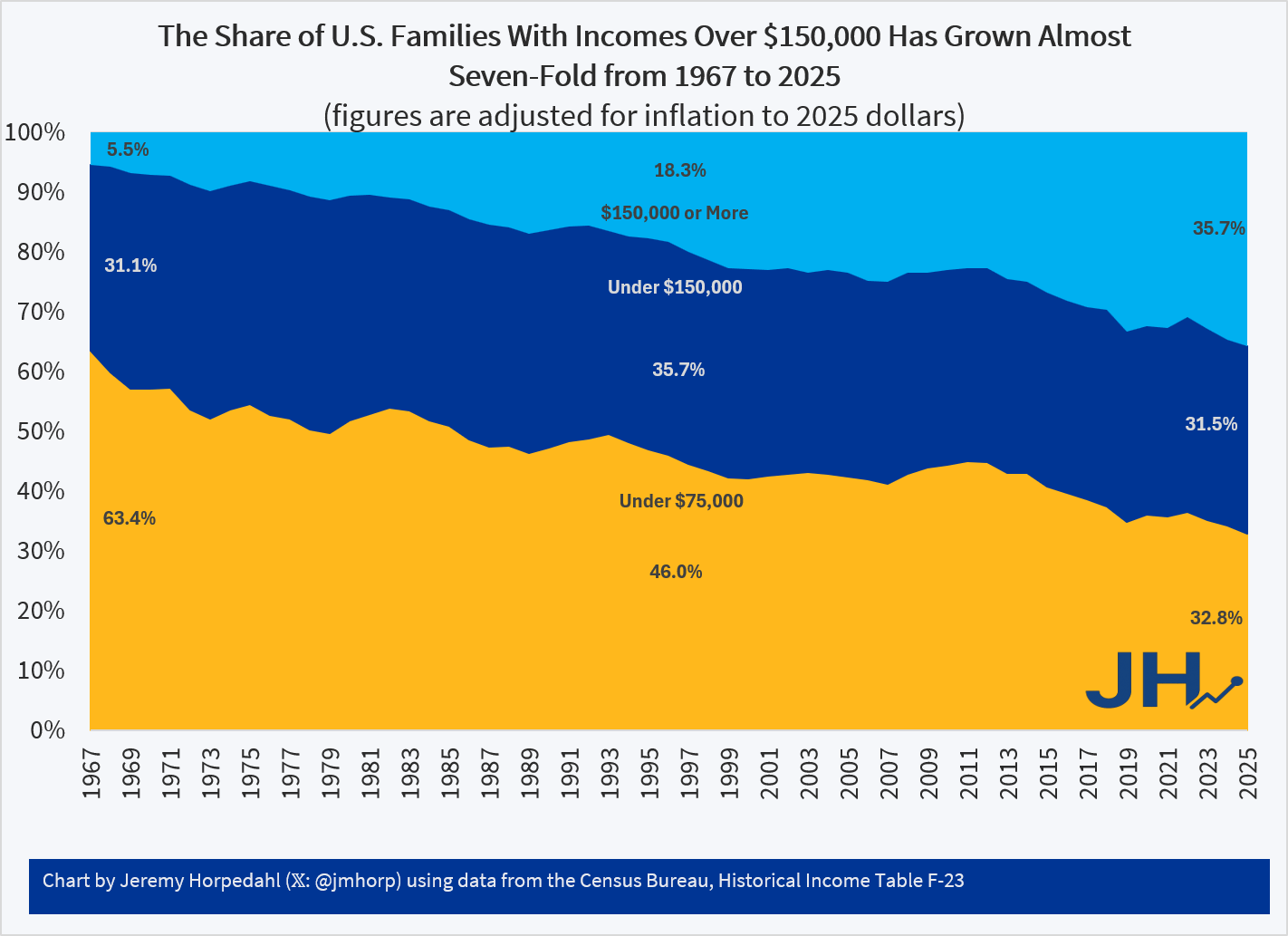
Yesterday the Census Bureau released their annual treasure trove of data from the Current Population Survey, Annual Social and Economic Supplement. Loads of new data are now available for 2025 on income, poverty, and health insurance coverage. This new data allows me to update one of my favorite charts, showing the distribution of family income in the U.S. since 1967. Census releases this data by grouping families into nine different income groups, which I have collapsed into three groups, each being as close to one-third of the total as I can get using the publicly available data.

Figure 1
See also a similar chart from Mark Perry which uses household income (rather than family income) over the same time period.

Figure 1 shows that, adjusted for inflation, the proportion of families with income over $150,000 has grown almost seven-fold since 1967. There has been a roughly constant one-third of the population between $75,000 and $150,000, and the ranks of those under $75,000 has been cut in half since 1967. Again, these dollar figures all adjusted for inflation, using the preferred deflator of the Census Bureau.

What’s even more astonishing is when we look at the number of families at various thresholds, rather than just the share, as seen in Figure 2.

Figure 2
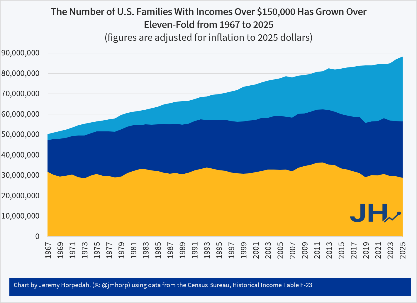
In 1967 there were fewer than 3 million families with incomes over $150,000 (in 2025 inflation-adjusted dollars). By 2025, that had grown to over 31 million families. If we look at the highest income threshold in this Census data — over $200,000 — the number of families has grown from just 1 million in 1967 to over 20 million in 2025. And there are fewer lower-income families too: the number of families under $75,000 shrunk, not just as a proportion of the total as seen in Figure 1, but even in absolute terms by almost 3 million families from 1967 to 2025.

Of course, some of these families do have more earners than in 1967, though we shouldn’t overstate that too much. Using other data from Census, we can see that the share of families with multiple earners hasn’t increased much since 1967, and especially hasn’t since the mid-1990s.

Table 1
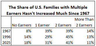
As seen in Table 1, as far back as 1967 the majority of families in the U.S. had multiple earners. Now it’s true these were not all married couples with both spouses working full-time, and hours of work in the household have risen over time — but not much since the 1990s. This data is somewhat skewed by the aging of the population, as evidenced by the rising number of families with no earners. But even if we drop those families with no earners, multiple-income families haven’t grown much: from 58% of the total in 1967 to 63% in 2025.
Median Family Income for Married Couples With Children Is Probably Higher Than You Think

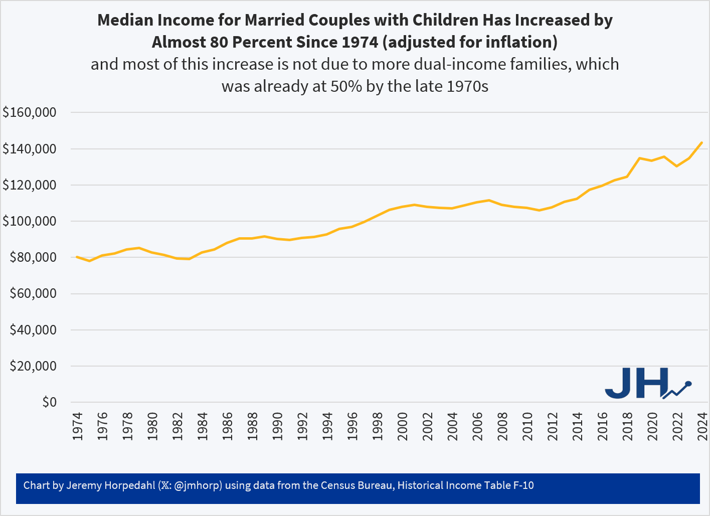
In 2024, median income for married couples with children at home was $143,400 in the US. That’s an almost 80 percent real (inflation-adjusted) increase since 1974, the first year Census reports comparable data. Is there some selection bias in who chooses to get married and have kids? Yes. Has there been an increase in dual-income families? Yes, but probably much less than you think (the median family of this type already had two earners by the late 1970s).

With those caveats, this is still pretty impressive:

One-Third of US Families Earn Over $150,000

This is from the latest Census release of CPS ASEC data, updated through 2024 (see Table F-23 at this link). In 1967, only 5 percent of US families earned over $150,000 (inflation adjusted).

Addendum: Several comments have asked how much of these trends can be explained by the rise of dual-income households. The answer is some, but not all of it, which I have written about before. Dual-income households were already the most common family structure by the 1980s. There hasn’t been an increase in total hours worked by married households since Boomers were in their 30s. You can explain some of the increase up until the Boomers by rising dual-income households, but this doesn’t explain the continued progress since the 1980s. And as Scott Winship and I have documented, even if you look just at male earnings, there has been progress since the 1980s.

Even more data on this question in a new post!

The American Middle Class Has Shrunk Because Families Have Been Moving Up

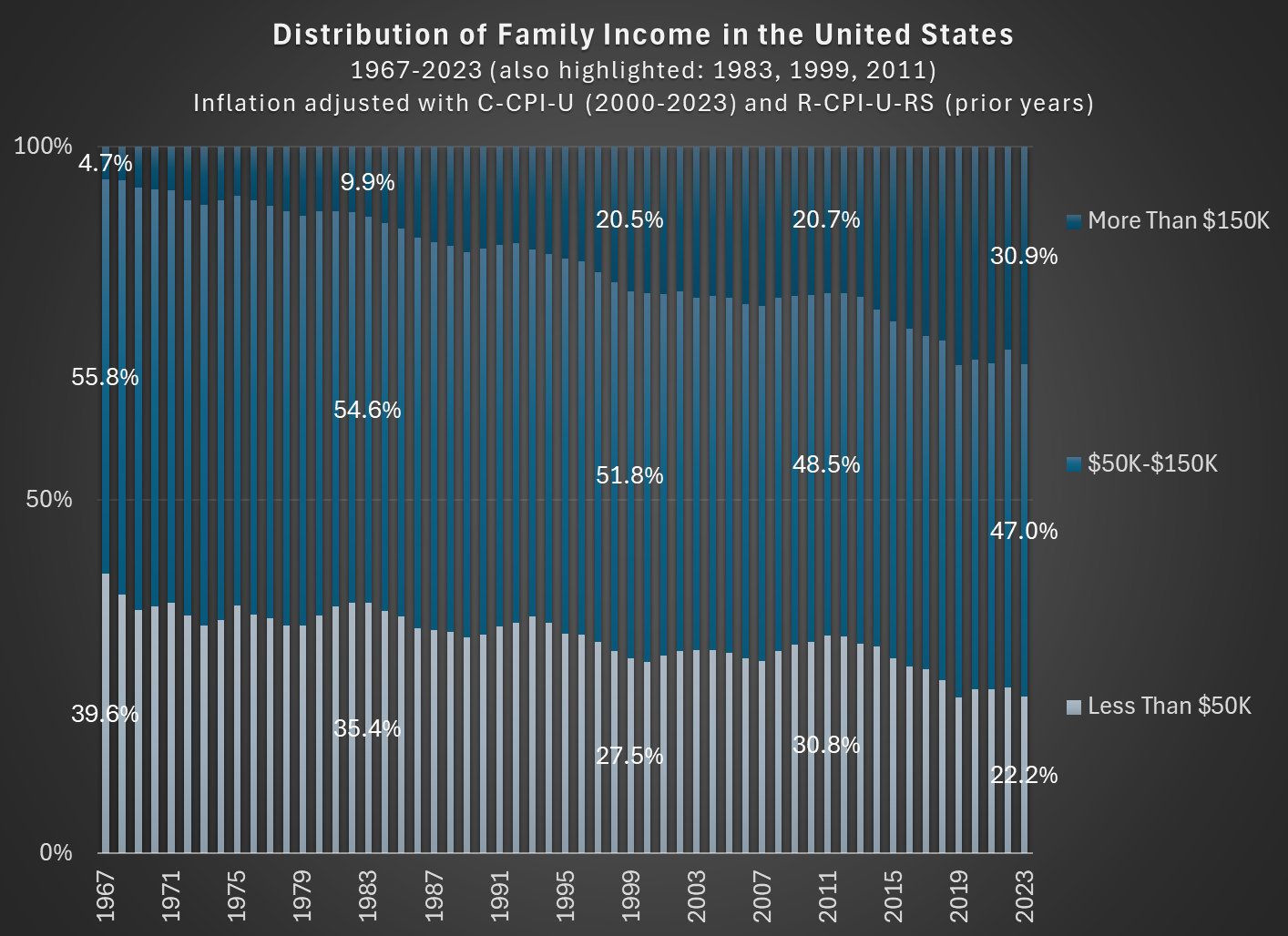
In 1967, about 56 percent of families in the US had incomes between $50,000 and $150,000, stated in 2023 inflation-adjusted dollars. In 2023, that number was down to 47 percent. So the American middle class shrunk, but why? (Note: you can do this analysis with different income thresholds for middle class, but the trends don’t change much.)

The data comes from the Census Bureau, specifically Table F-23 in the Historical Income Tables.

As you can see in the chart, the proportion of families that are in the high-income section, those with over $150,000 of annual income in 2023 dollars, grew from about 5 percent in 1967 to well over 30 percent in the most recent years. And the proportion that were lower income shrunk dramatically, almost being cut in half as a proportion, and perhaps surprisingly there are now more high-income families than low-income families (using these thresholds, which has been true since 2017). The number is even more striking when stated in absolute terms: in 1967 there were only about 2.4 million high-income households, while in 2023 there were 11 times as many — over 26 million.

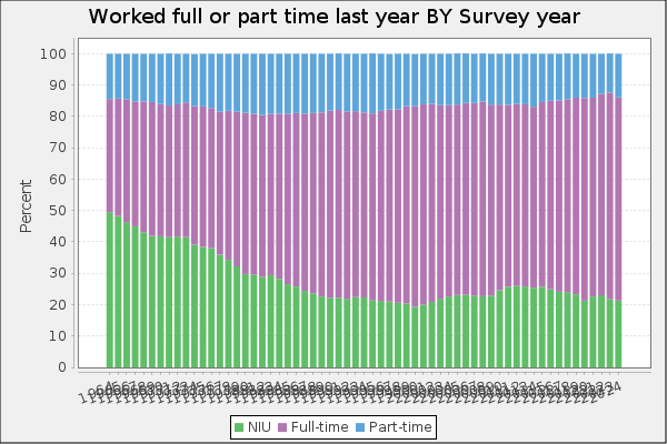
Is this increase in family income caused by the rise of two-income households? To some extent, yes. Women have been gradually shifting their working hours from home production to market work, which will increase measured family income. However, this can’t fully explain the changes. For example, the female employment-population ratio peaked around 1999, then dropped, and now is back to about 1999 levels. Similarly, the proportion of women ages 25-54 working full-time was about 64 percent in 1999, almost exactly the same as 2023 (this chart uses the CPS ASEC, and the years are 1963-2023).

But since the late 1990s, the “moving up” trend has continued, with the proportion of high-income families rising by another 10 percentage points. Both the low-income and middle-income groups fell by about 5 percentage points. Certainly some of the trend in rising family income from the 1960s to the 1990s is due to increasing family participation in the paid workforce, but it can’t explain much since then. Instead, it is rising real incomes and wages for a large part of the workforce.

The American Family Is Thriving, Even if They Only Have One Male Earner (But Most Don’t)

62 weeks. That’s how long the median male worker would need to work in a year to support a family in 2022, according to the calculations of Oren Cass for the American Compass Cost-of-Thriving Index released this year. Not only is 62 weeks longer than the baseline year of 1985 (when it took about 40 weeks, according to COTI), but there is a big problem: there aren’t 62 weeks in year. It is, by this calculation, impossible for a single male earner to support a family.

Is this true? In our new AEI paper, Scott Winship and I strongly disagree. First, we challenge the 62-week figure. With a few reasonable corrections to Cass’ COTI, we show that it is indeed possible for a median male earner to support a family. It takes 42 weeks, not 62 as reported in COTI.

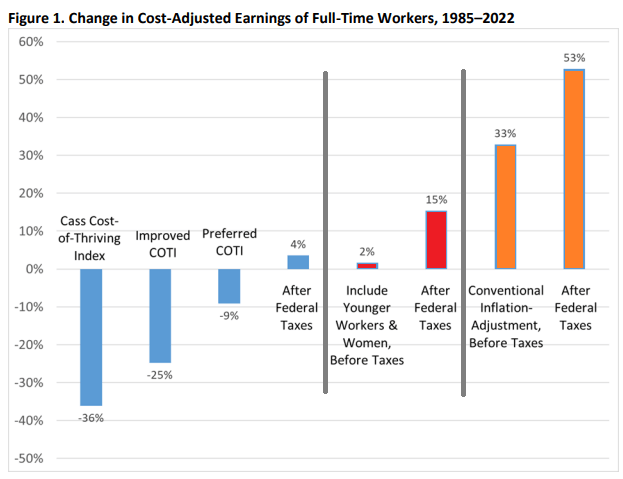
But wait, there’s more. Much more. In our paper, we provide a range of reasonable estimates for how the cost of thriving has changed since 1985. In the COTI calculation, the standard of living for a single-earner family has fallen by 36 percent since 1985. In our most optimistic estimate, the standard of living has risen by 53 percent. The chart below summarizes our various alternative versions of COTI. How do we get such radically different results? Is this all a numbers game?

Continue reading →