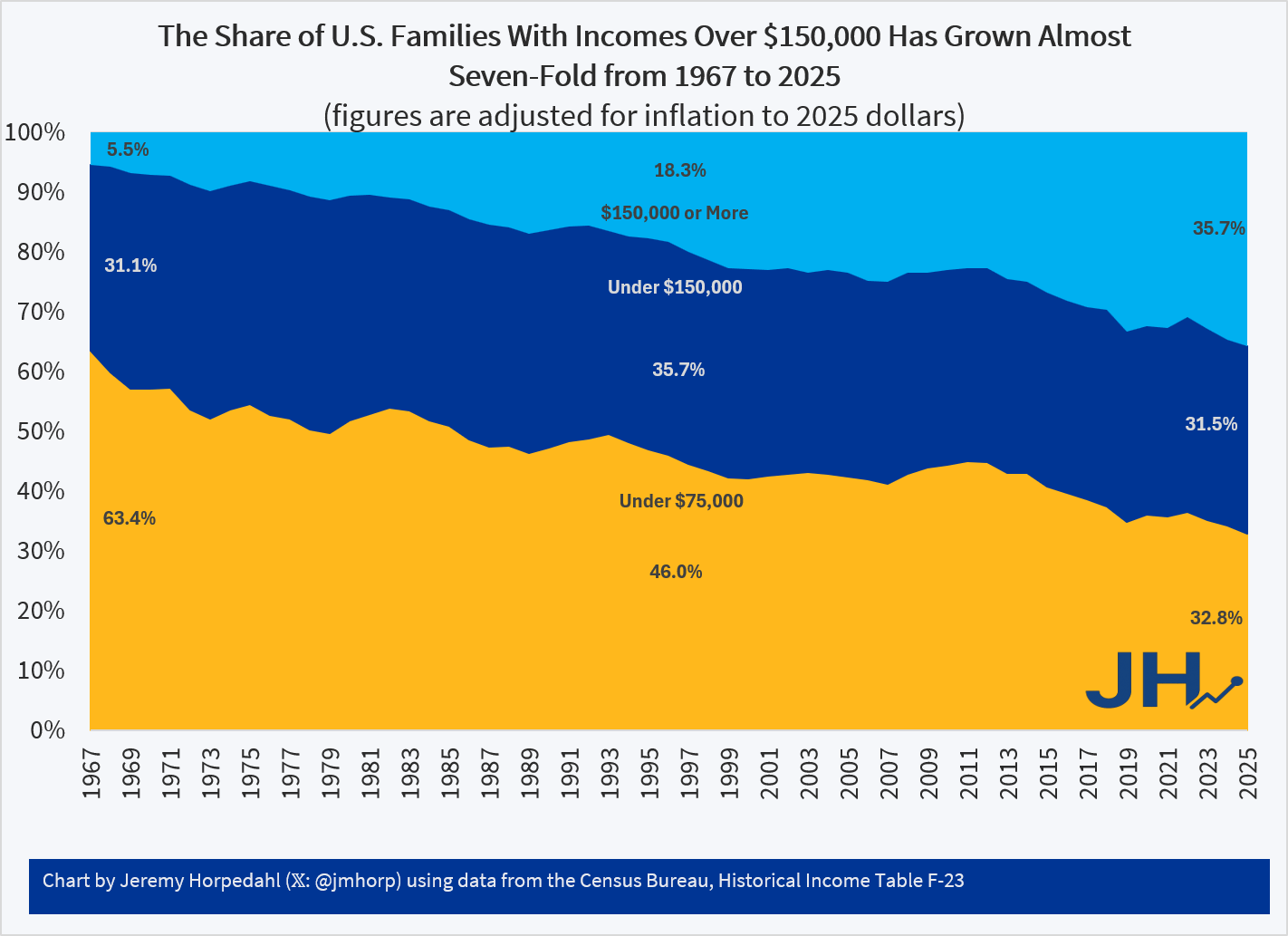
Yesterday the Census Bureau released their annual treasure trove of data from the Current Population Survey, Annual Social and Economic Supplement. Loads of new data are now available for 2025 on income, poverty, and health insurance coverage. This new data allows me to update one of my favorite charts, showing the distribution of family income in the U.S. since 1967. Census releases this data by grouping families into nine different income groups, which I have collapsed into three groups, each being as close to one-third of the total as I can get using the publicly available data.
Figure 1
See also a similar chart from Mark Perry which uses household income (rather than family income) over the same time period.
Figure 1 shows that, adjusted for inflation, the proportion of families with income over $150,000 has grown almost seven-fold since 1967. There has been a roughly constant one-third of the population between $75,000 and $150,000, and the ranks of those under $75,000 has been cut in half since 1967. Again, these dollar figures all adjusted for inflation, using the preferred deflator of the Census Bureau.
What’s even more astonishing is when we look at the number of families at various thresholds, rather than just the share, as seen in Figure 2.
Figure 2
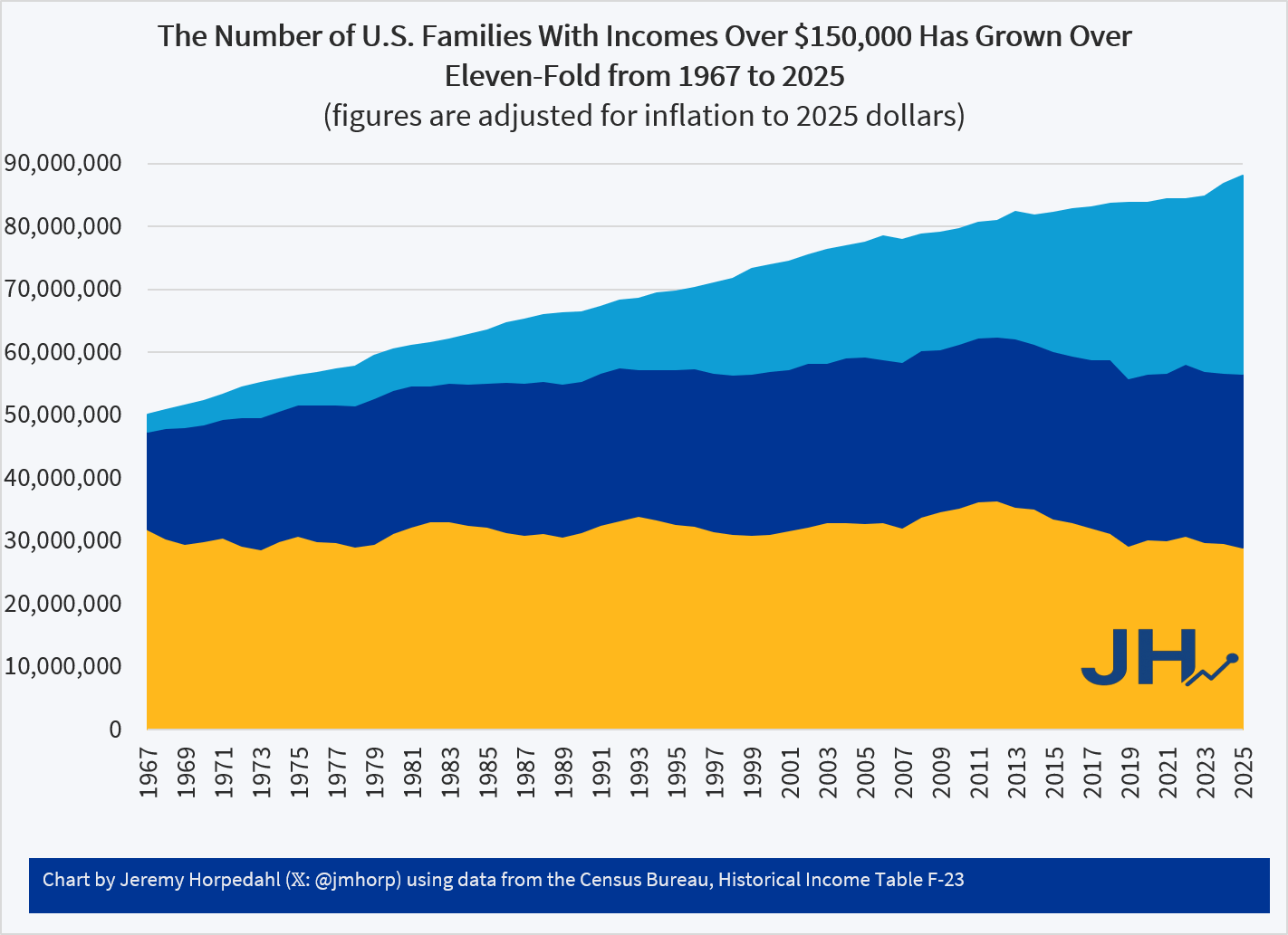
In 1967 there were fewer than 3 million families with incomes over $150,000 (in 2025 inflation-adjusted dollars). By 2025, that had grown to over 31 million families. If we look at the highest income threshold in this Census data — over $200,000 — the number of families has grown from just 1 million in 1967 to over 20 million in 2025. And there are fewer lower-income families too: the number of families under $75,000 shrunk, not just as a proportion of the total as seen in Figure 1, but even in absolute terms by almost 3 million families from 1967 to 2025.
Of course, some of these families do have more earners than in 1967, though we shouldn’t overstate that too much. Using other data from Census, we can see that the share of families with multiple earners hasn’t increased much since 1967, and especially hasn’t since the mid-1990s.
Table 1
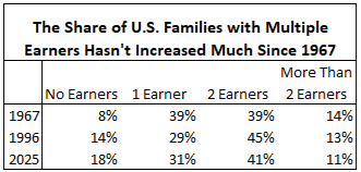
As seen in Table 1, as far back as 1967 the majority of families in the U.S. had multiple earners. Now it’s true these were not all married couples with both spouses working full-time, and hours of work in the household have risen over time — but not much since the 1990s. This data is somewhat skewed by the aging of the population, as evidenced by the rising number of families with no earners. But even if we drop those families with no earners, multiple-income families haven’t grown much: from 58% of the total in 1967 to 63% in 2025.

