I’ve just started reading Chelsea Follett’s new book The Grim Old Days, which shows just how bad things were in the past. It’s a great book, and I encourage everyone to buy it. If you want a sample of what’s in the book, check out her series of blog posts on “contemporary accounts of daily life in the past” or read her blog post summarizing some of the topics in the book.
As an economist when I think about the past, in my head I see charts. Lots of charts, full of data! Follett’s book is mostly narrative history, and it is not filled with charts and data. That’s OK, I still am very much enjoying the book. But what charts would I select to show how grim the old days were, if I wanted to take that approach to the topic?
Here are four good ones from Our World in Data.
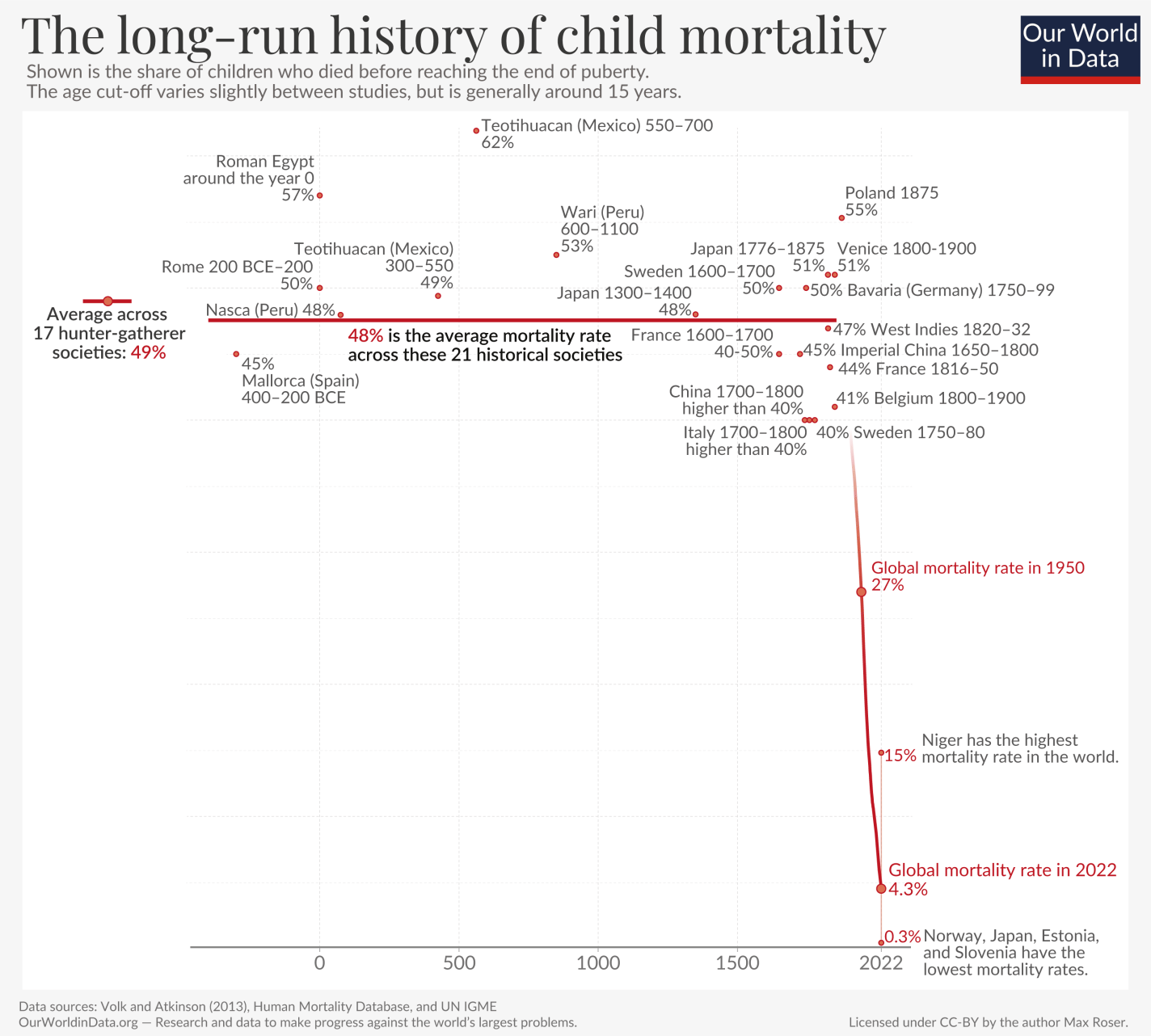
Child mortality in the past was horrible, with only about half of children surviving to adulthood (goes along with Chapters 2 and 3 of her book):
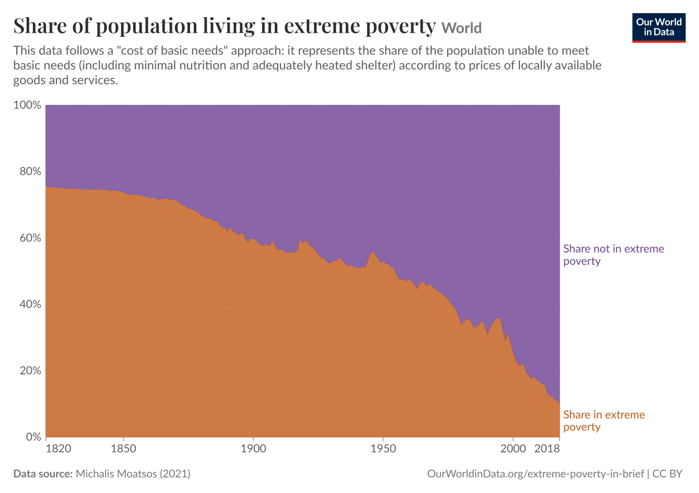
Most people were extremely poor in the past, unable to meet even the most basic needs with the income that had available (goes along with many chapters in the book, such as Chapter 13 on hunger):
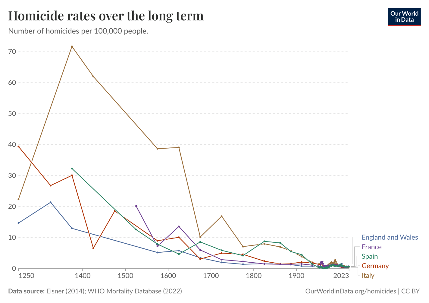
The past was extremely violent compared to modern times, with homicide rates across Europe being somewhere around 10 times higher than today (goes along with Chapter 23 in Follett’s book):
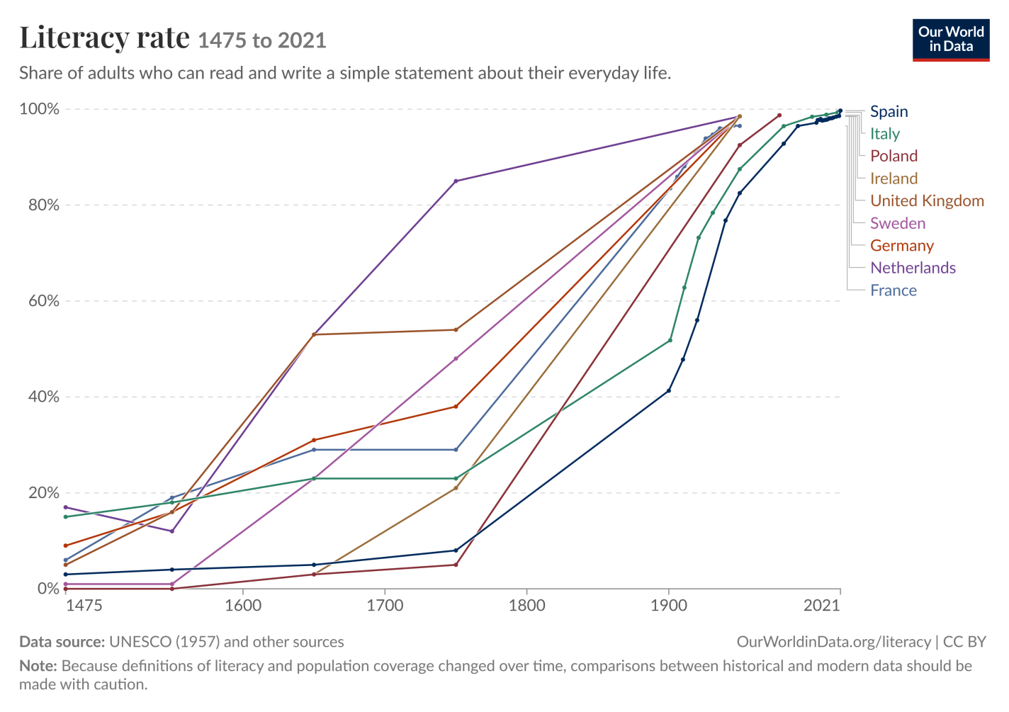
Literacy has dramatically improved and is near universal today, whereas historically at most only 1/5 of adults could read and write — even less than that in some countries (goes along with Chapter 4 from the book):