Raising kids is expensive. As an economist, we’re used to thinking about cost very broadly, including the opportunity cost of your time. Indeed, a post I wrote a few weeks ago focused on the fact that parents are spending more time with their kids than in decades past. But I want to focus on one aspect of the cost, which is what most “normal” people mean by “cost”: the financial cost.
Conveniently, the USDA has periodically put out reports that estimate the cost of raising a child. Their headline measure is for a middle-income, married couple with two children. Unfortunately the last report was issued in 2017, for a child born in 2015. And in the past 2 years, we know that the inflation picture has changed dramatically, so those old estimates may not necessarily reflect reality anymore. In fact, researchers at the Brookings Institution recently tried to update that 2015 data with the higher inflation we’ve experienced since 2020. In short, they assumed that from 2021 forward inflation will average 4% per year for the next decade (USDA assumed just over 2%).
Doing so, of course, will raise the nominal cost of raising a child. And that’s what their report shows: in nominal terms, the cost of raising a child born in 2015 will now be $310,605 through age 17, rather than $284,594 as the original report estimated. The original report also has a lower figure: $233,610. That’s the cost of raising that child in 2015 inflation-adjusted dollars.
As I’ve written several times before on this blog, adjusting for inflation can be tricky. In fact, sometimes we don’t actually need to do it! To see if it is more or less expensive to raise a child than in the past, what we can do instead is compare to the cost to some measure of income. I will look at several measures of income and wages in this post, but let me start with the one I think is the best: median family income for a family with two earners. Why do I think this is best? Because the USDA and Brookings cost estimates are for married couples who are also paying for childcare. To me, this suggests a two-earner family is ideal (you may disagree, but please read on).
Here’s the data. Income figures come from Census. Child costs are from USDA reports in 1960-2015, and the Brookings update in 2020.
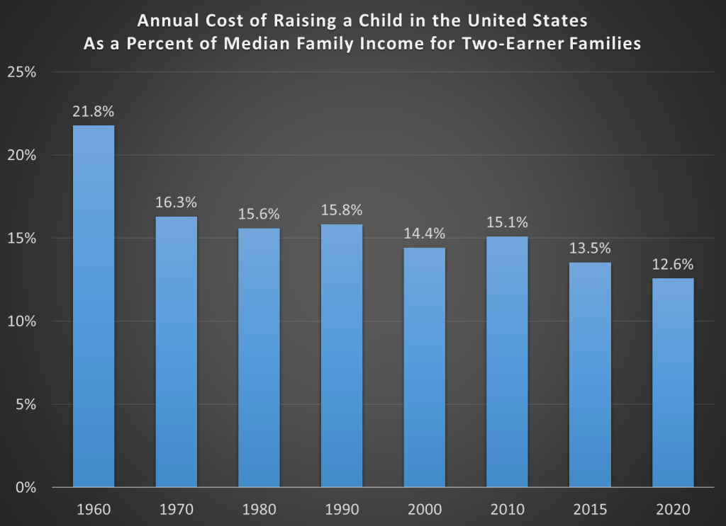
The chart shows the percent of annual median income that is needed to pay for one-child for one year. As is clear in the chart, the cost has been falling almost every decade since 1960, and in 2020 it was at its lowest level ever. Doing it this way gets around the problem of inflation adjusting. While we don’t know what the inflation rate will be over the next decade or the next 18 years, we also don’t know what the growth rate of income will be either. The only reason a 4% inflation rate would be concerning is if it exceeded the rate of growth of family income. It could, but history suggests it probably won’t.
What if we did the same calculation but only for single-earner families. USDA does produce some estimates in some years for single parents, but never for “middle income,” only above and below a certain threshold. Single earner families could include single parents, but it could also include married couples where one parent is taking care of the children (thus eliminating or significantly reducing the cost of childcare).
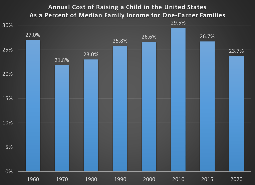
I don’t think this is the best data to use, since it lumps together very different kinds of families (single parents who definitely need childcare, and married couples that don’t really need it). Still, people always ask to see this data, so here it is. While 1970 is the lowest year in the chart, 2020 compares favorably to most of the recent history.
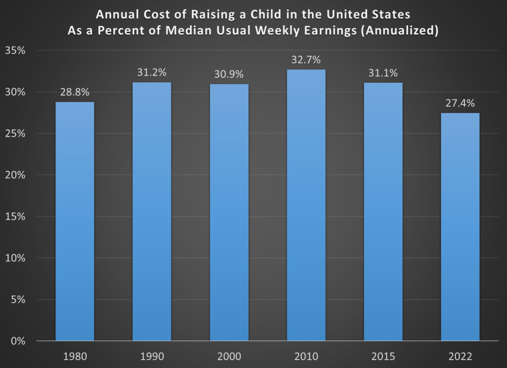
But one problem with the median income data is that it’s only current through 2020 (and 2020 was a weird year for incomes!). If we want more current data, there are several measures we can look to. One is median usual weekly earnings, which we have through the 2nd quarter of 2022. Unfortunately the data only goes back to 1979, so we can compare 1960 or 1970. But this is still a reasonable measure to use, and here’s what the chart looks like (I use the 2nd quarter from each year to make it consistent).
One final way I’ll present the data is another one we can get very up-to-date: average hourly earnings. While averages aren’t always as useful as medians, I’ll stick to the average for production and non-supervisory workers, thus taking out the high-end outliers that might pull up this average. The consistent series is only available back to 1964, so we won’t be able to see 1960 compared, but 1970 is a year we definitely want to compare given the second chart above.
Here’s the data for average hourly earnings. For this one, I express it as the number of hours you would need to work (the “time price”), rather than as a percent of annual income (it’s functionally the same thing, I just prefer this way of presenting it).
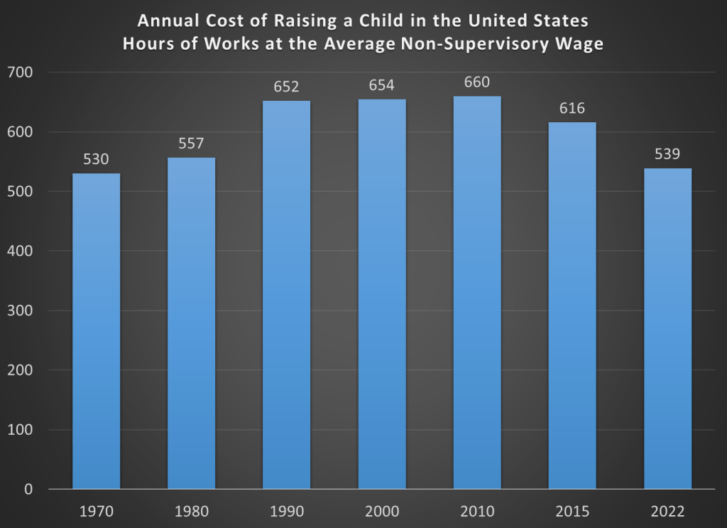
Here we see that 1970 is indeed still the most affordable year, but 2022 is very much in the ballpark. And while costs compared to wages rose steadily from 1970 to 1990, relative costs have also fallen steadily since 2010. This measure also isn’t perfect, since once again we’re mixing wage earners that are married and ones that aren’t. But it paints a similar picture to most of the other charts: while the 1970s and 1980s may have been more affordable, the very recent data looks favorable to almost all of the past 50-60 years.
None of these measures of income are ideal, but I think they all are much less pessimistic than the headlines you may have seen recently about how it now costs over $300,000 to raise a child. Big numbers can be confusing, and indeed that’s a big one! But putting this number as a fraction of your annual income or in terms of how many hours you would need to work makes the number more intelligible.

Nice work Jeremy. Thinking in time is better than thinking in money.
LikeLiked by 1 person
Might also want to consider the marginal cost of additional kids. Seems like the first one has lots of “start-up” costs.
LikeLike