Last week I presented a graphic that illustrates the changing average price of homes by state. This week, I want to illustrate something that is more relevant to affordability. FRED provides data on both median salary and average home prices by state. That means that we can create an affordability index. Consider the equation for nominal growth where i is the percent change in median salary (s), π is the percent change in home price (p), and r is the real percent change in the amount of the average home that the median salary can purchase (h).
(1+i)=(1+π)(1+r)
Indexing the home price and salary to 1 and substituting each the percent change equation (New/Old – 1) into each percent change variable allows us to solve for the current quantity of average housing that can be afforded with the median salary relative to the base period:
h=s/p-1
If h>0, then more of the average house can be purchased by the median salary – let’s vaguely call this housing affordability. Both series are available annually since 1984 through 2021 for all 50 states and the District of Columbia. The map below illustrates affordability across states. Blue reflects less affordable housing and green reflects more affordable housing since 1984.

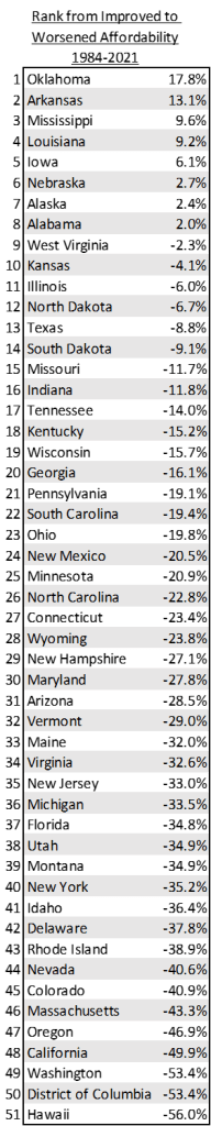
The most improved affordability is in the south while the areas with worsened affordability are in the ‘corners’ of the continental US. In particular, the five most improved and worsened states for housing affordability are in the table below.

Have you ever heard the phrase ‘house rich’? The affordability of purchasing a home can also be construed as the complement of housing wealth. That is, the benefit to the buyer is the inverse of the benefit to the seller. Buying a home in Hawaii with a Hawaiian income is no joke and no picnic. But selling a Hawaiian home is a lucrative prospect relative to income.
Below is the entire list of states.

3 thoughts on “House Rich – House Poor”