This is the third and final installment of my series on portfolio performance measures among separate assets groups. First, I summarize the earlier posts, then I introduce relative performance measures. I start with the Markowitz cloud of possible portfolio weights, returns, and volatilities.
Absolute measures of performance contrast the realized portfolio performance with the performances that were possible simply by calculating the difference in, say, return or volatility. The drawback of this method is that different spreads of statistics can affect these differences apart from portfolio performance. That is, even if a portfolio of assets return was very high, some reference return can still be much higher and make the performance look poor.
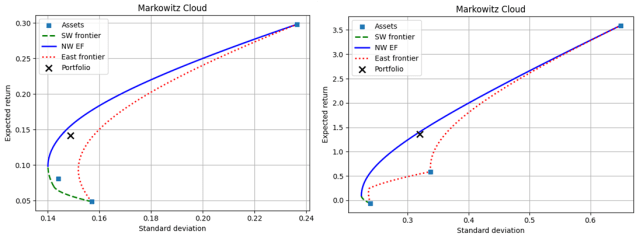
Quasi-relative measures tackle this problem of different spreads by calculating the percentile of possible returns or volatilities. This allows us to compare portfolio returns to what was possible even among portfolios of different assets with Markowitz clouds of different volatility ranges. The drawback of quasi-relative measures is that the return at some percentile of possible returns is not the same as the return of the same percentile among possible portfolios. Said another way, each possible rate of return in the Markowitz cloud is not equally as likely. So, a low percentile among possible returns be due to a very high and unlikely return.
It should be obvious that returns and volatilities among possible portfolio weights are not equally likely. To help visualize the idea, see the below 3D quadratic for a simplified example that represents a portfolio of three assets. The x-axis represents returns and the z-axis represents standard deviation. The y-axis represents the weight on the 3rd assets (returns and weights map directly to one another linearly). The set of possible portfolios lie on the surface of the quadratic function.
Continue reading


