This is the third and final installment of my series on portfolio performance measures among separate assets groups. First, I summarize the earlier posts, then I introduce relative performance measures. I start with the Markowitz cloud of possible portfolio weights, returns, and volatilities.
Absolute measures of performance contrast the realized portfolio performance with the performances that were possible simply by calculating the difference in, say, return or volatility. The drawback of this method is that different spreads of statistics can affect these differences apart from portfolio performance. That is, even if a portfolio of assets return was very high, some reference return can still be much higher and make the performance look poor.
Quasi-relative measures tackle this problem of different spreads by calculating the percentile of possible returns or volatilities. This allows us to compare portfolio returns to what was possible even among portfolios of different assets with Markowitz clouds of different volatility ranges. The drawback of quasi-relative measures is that the return at some percentile of possible returns is not the same as the return of the same percentile among possible portfolios. Said another way, each possible rate of return in the Markowitz cloud is not equally as likely. So, a low percentile among possible returns be due to a very high and unlikely return.
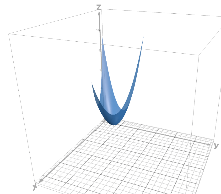
It should be obvious that returns and volatilities among possible portfolio weights are not equally likely. To help visualize the idea, see the below 3D quadratic for a simplified example that represents a portfolio of three assets. The x-axis represents returns and the z-axis represents standard deviation. The y-axis represents the weight on the 3rd assets (returns and weights map directly to one another linearly). The set of possible portfolios lie on the surface of the quadratic function.
Relative performance measures tackle the problem of different return and volatility likelihoods by instead calculating the percentile of returns among the uniform distribution of possible portfolio weights. So, even if there is a large difference between the 98th and 99th percentile return, we can know that our portfolio had an asset allocation with a return that was nearly as high as it could have been.
To help visualize the problem, see the above quadratic. It represents all of the volatilities at each return. It approximates a Markowitz cloud for three assets. For the sake of demonstration, let’s say that the surface of the paraboloid represents all of the possible portfolios and their return and volatility. Clearly, not all intervals of returns include the same number of possible portfolios.
The relative performance measures essentially calculate what proportion of the triangular area in x-y space, which represents the possible portfolio allocations, has better returns or volatilities. The underlying logic is that all portfolio allocations are equally likely. Now we can say something like “the realized portfolio had higher returns than 80% of all possible portfolio allocations” or “the realized portfolio return had an 80% probability of being greater than a randomly drawn portfolio allocation”.
However, even this percentile among possible allocations method has drawbacks. Specifically, having a return or volatility percentile among possible portfolio allocations doesn’t communicate how much room there is for improvement. We might want to know the proportion of possible portfolios that would result in both higher return and lower volatility. Such portfolios are strictly dominant even if they result in only one better stat – much like a pareto improvement. The figure below illustrates the strictly dominating allocations in the 2D Markowitz cloud. Dominating allocations are in area A, and dominated allocations are in area F.
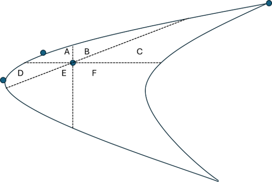
We can express the size of areas in weight-space to identify the proportion of possible portfolios that a specific allocation dominates or is dominated by. Clearly, an A area of zero places the allocation on the efficient frontier. This is where the drawback rears its head. Differently shaped Markowitz clouds can result in different proportional areas, A or F, merely due to the shape of the cloud. For example, it might be narrow and elongated along an upward diagonal, creating relatively small A & F areas. The alternative would be downward diagonal clouds with relatively large A & F areas. So, the areas are still reflecting information about the cloud shape rather than the portfolio performance among possible allocations.
Therefore, we can go the percentile route again. Not only might we care about the particular A or F areas. But we can calculate the A or F for all possible portfolios and then identify the percentile of our specific portfolio. Call these Q_A and Q_F, where Q_A is the proportion of allocations that have larger A areas and Q_F is the proportion of allocations that have smaller F areas. Again, the efficient frontier allocations are unique, having Q_A values that are near 1.
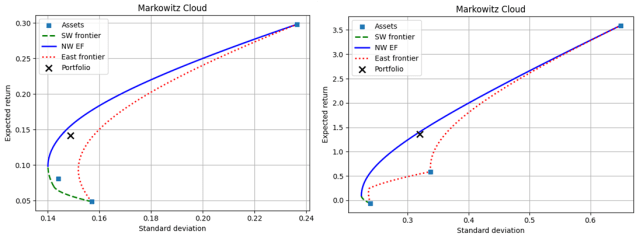
Going back to the initial utility and tech portfolios from my last posts (remember those?), we can now compare their performances relative to how they could have performed without the unique shapes of their Markowitz clouds impacting the performance measures, focusing solely on performance. Below are the stats for the two portfolios. In contrast to the last post, I add the EF portfolio with the smallest dissimilarity index to the list of reference portfolios.
            stat |   w_o    |     Max r|Same sd          Min sd|Same r             Min Var              Max Return             Max Sharpe             EF Min Diss
  ---------------------------------------------------------------------------------------------------------------------------------------------------------------------
       P_r_minus | 0.547952 |  0.621813  +0.073861 |  0.547952  +0.000000 |  0.263720  -0.284232 |  1.000000  +0.452048 |  1.000000  +0.452048 |  0.263720  -0.284232 |
    P_sigma_plus | 0.541085 |  0.541085  +0.000000 |  0.675113  +0.134028 |  1.000000  +0.458915 |  0.000000  -0.541085 |  0.000000  -0.541085 |  1.000000  +0.458915 |
  P_sharpe_minus | 0.550323 |  0.646407  +0.096084 |  0.568301  +0.017978 |  0.273282  -0.277042 |  1.000000  +0.449677 |  1.000000  +0.449677 |  0.273282  -0.277042 |
             A_i | 0.025924 |  0.000000  -0.025924 |  0.000000  -0.025924 |  0.000000  -0.025924 |  0.000000  -0.025924 |  0.000000  -0.025924 |  0.000000  -0.025924 |
             F_i | 0.114928 |  0.162859  +0.047932 |  0.223032  +0.108104 |  0.263743  +0.148816 |  0.000000  -0.114928 |  0.000000  -0.114928 |  0.263743  +0.148816 |
  ---------------------------------------------------------------------------------------------------------------------------------------------------------------------
             Q_A | 0.498932 |  1.000000  +0.501068 |  1.000000  +0.501068 |  1.000000  +0.501068 |  1.000000  +0.501068 |  1.000000  +0.501068 |  1.000000  +0.501068 |
             Q_F | 0.686663 |  0.778490  +0.091827 |  0.880023  +0.193361 |  0.944089  +0.257426 |  0.022326  -0.664337 |  0.022326  -0.664337 |  0.944089  +0.257426 |
            stat |   w_o    |     Max r|Same sd          Min sd|Same r             Min Var              Max Return             Max Sharpe             EF Min Diss
  ---------------------------------------------------------------------------------------------------------------------------------------------------------------------
       P_r_minus | 0.548036 |  0.565593  +0.017557 |  0.548036  +0.000000 |  0.011168  -0.536868 |  1.000000  +0.451964 |  1.000000  +0.451964 |  0.497371  -0.050664 |
    P_sigma_plus | 0.515893 |  0.515893  -0.000000 |  0.541248  +0.025355 |  1.000000  +0.484107 |  0.000000  -0.515893 |  0.000000  -0.515893 |  0.608625  +0.092732 |
  P_sharpe_minus | 0.568080 |  0.601188  +0.033108 |  0.585039  +0.016959 |  0.011308  -0.556772 |  1.000000  +0.431920 |  1.000000  +0.431920 |  0.535923  -0.032157 |
             A_i | 0.005925 |  0.000000  -0.005925 |  0.000000  -0.005925 |  0.000000  -0.005925 |  0.000000  -0.005925 |  0.000000  -0.005925 |  0.000000  -0.005925 |
             F_i | 0.069876 |  0.081426  +0.011550 |  0.089307  +0.019430 |  0.011173  -0.058704 |  0.000000  -0.069876 |  0.000000  -0.069876 |  0.105974  +0.036098 |
  ---------------------------------------------------------------------------------------------------------------------------------------------------------------------
             Q_A | 0.491555 |  1.000000  +0.508445 |  1.000000  +0.508445 |  1.000000  +0.508445 |  1.000000  +0.508445 |  1.000000  +0.508445 |  1.000000  +0.508445 |
             Q_F | 0.811881 |  0.854009  +0.042128 |  0.885071  +0.073190 |  0.426713  -0.385168 |  0.034362  -0.777519 |  0.034362  -0.777519 |  0.954960  +0.143079 |
The first columns of the above tables describe our utility (top) and tech (bottom) allocations. The two portfolios are nearly identical as measured by their position among other portfolios when ranked by return, volatility, and Sharpe ratio. The utility portfolio is dominated by more other possible portfolios, measured by A_i, meaning there is more room for pareto improvement. However, examining the nearly identical Q_A for both portfolios, that amount of pareto improvement space lies at about the 50th percentile for both allocations. The reader can examine the stats for the reference portfolios on their own.
One thing that I didn’t mention is that, while both of the above portfolios have three assets, the relative performance measures described here can contrast any two portfolios, even if the number of assets differs. The only limitation is our computational capacity.
Bartsch, Zachary. 2025. “Portfolio Efficient Frontiers & Diagnostics for Python.”
Ave Maria University. https://github.com/zacharybartsch/frontier_segments
*An earlier version included an image that misrepresented the shape. The earlier version also misstated that the probability was represented as a fraction of the paraboloid surface rather than in x-y (weight) space.
