I’ve discussed the ways to teach supply and demand in the past. Regardless, almost all principles of economics classes require a book. But even digital books are often just intangible versions of the hard copy. Supply and demand are illustrated as static pictures, using arrows and labels to do the leg-work of introducing exogenous changes. There’s often a text block with further explanation, but it lacks the kind of multi-sensory explanation that one gets while in a class.
In a class, the instructor can gesticulate and vary their speech explain the model, all while drawing a graph. That’s fundamentally different from reading a book. Studying a book requires the student to repeatedly glance between the words and the graph and to identify the appropriate part of the graph that is relevant to the explanation. For new or confused students, connected the words to one of many parts of a graph is the point of failure.
This is part of why the Marginal Revolution University videos do well. They’re well produced, with context and audio-overlaid video of graphs. It’s pretty close to the in-person experience sans the ability to ask questions, but includes the additional ability to rewind, repeat, adjust the speed, display captions, and share.
But what might be a surprise to some is that a lot of digital text books are published by big, hulking companies not known for their dynamism. Often, digital textbooks include additional support – for the instructor rather than the student. Some recent and not-so-recent innovations include:
- Publisher powepoints
- Question Banks
- Auto-graded assignments with increasingly customizable policy rules (these are not great)
- Attempting to measure reading and engagement
- Accompanying videos
- LMS integration (connecting to Blackboard & Canvas)
These are all great for the professor and sometimes for the students. Much of the innovations in student learning has come from 3rd parties such as Perusall, which allows students to make collaborative notes on readings, and Panopto, which allows students to answer milestone questions throughout a video lecture.
It seems to me that textbook publishers will soon be outcompeted if they can’t improve how they teach students. Video is great, but is often not searchable, and includes much more than is desired for a single example. There’s gotta be content somewhere between reading and video that helps student grasp the ideas without the presence of a labor-intensive instructor.
I don’t have the answer and presumably there are more than one method that will be helpful. For me, supply and demand is the topic that is best characterized by the above limitations. For now, my modest contribution is the gif. It’s simple, requires little processing and storage, and clearly shows how the curves and endogenous details change. Maybe I should have added the dotted lines extending from the point of equilibrium to the axes, but this is what I’ve got for now. (Feel free to link to or copy them)
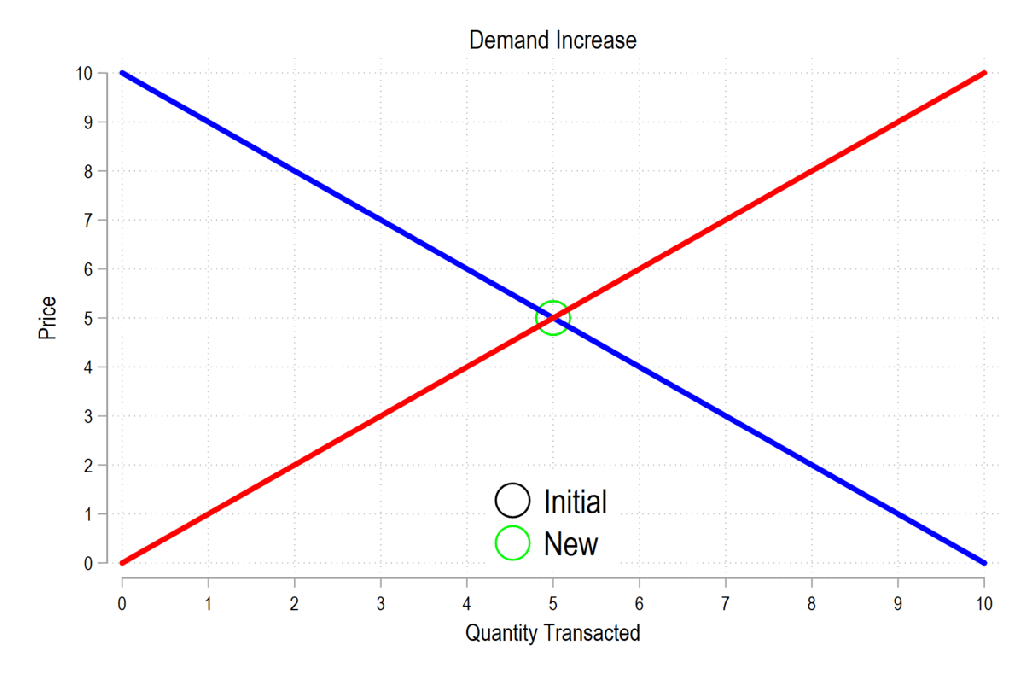
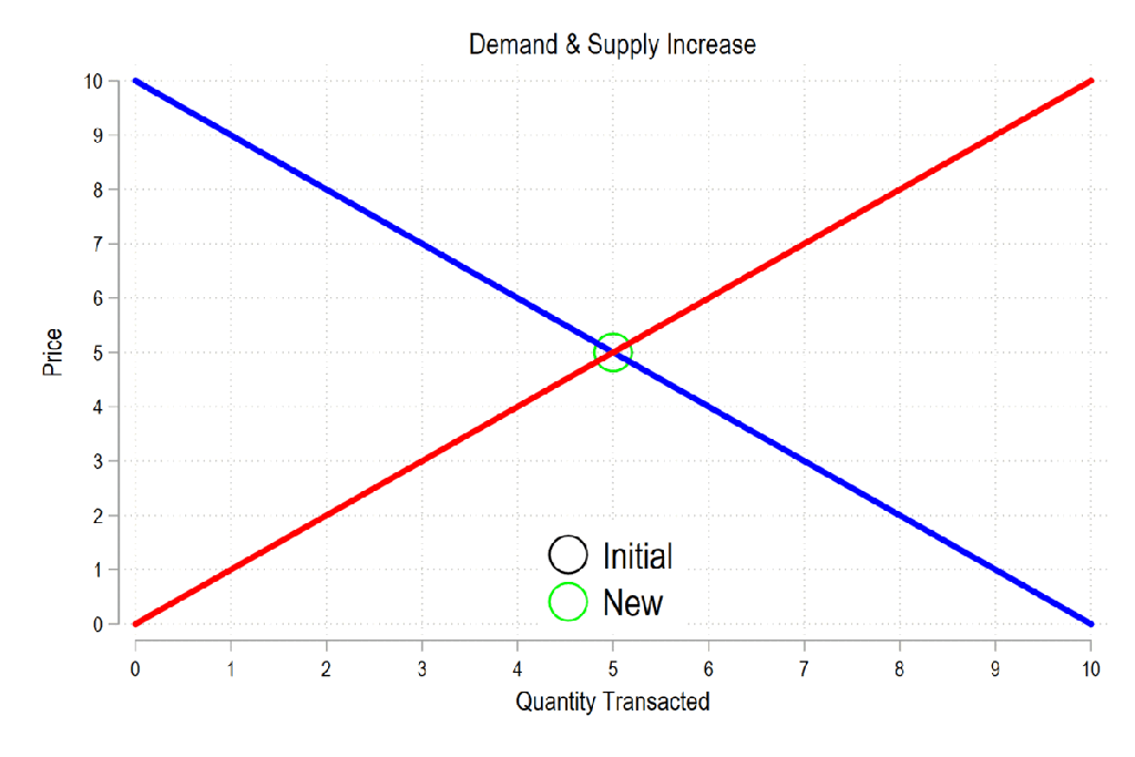
Below are four gifs that I use to illustrate a change in demand and supply to my students. On principle, I only show students one direction of change so that they must understand the mechanics in order to solve for the the other direction of change.
First, here’s an illustration of demand rising. The result is that price and quantity both rise.
Second, here’s an illustration of supply rising. The result is that price declines and quantity rises.

Third, here’s an illustration of both demand and supply rising. The result is that quantity rises, but that the price change depends on the relative magnitude of the change in curves. The ability to pause the gif, depending on the platform, allows a student to see that price can be higher or lower depending on how much supply shifts.
Fourth, here’s the same thing, but with an increase in demand and a decrease in supply. The price rises unambiguously, with the quantity being dependent on the magnitudes.


It would be great if there were some way to control the gifs. Maybe a play/pause button?
LikeLike
Thanks!
You can pause and play depending on the platform. For example, if you have the gifs in a word doc, then you can pause and play.
Idk the different platforms which have this feature.
LikeLike
Thanks for the MRU callout! We totally agree about the limitations of static images–and even video–to illustrate changes in supply and demand. That’s why we created our Interactive Practices, which let the student (or teacher) play with the S&D graph. Currently 13 different S&D interactives, and more are on the way: https://practice.mru.org/
LikeLike
Hi Sir, great resources shared. Wondering if I can have your permission to use them in my economics class?
LikeLike
Thanks, you’re very welcome to use these. Please link to this page when you do. You may also want to see my other posts concerning taxes and government purchases. Enjoy!
LikeLike