You see a lot of nostalgia for the recent past. People pining for the simpler life of the 1950s, or claims that wages have stagnated since the late 1970s or early 1980s. I’ve tried to take these arguments seriously and respond to them, such as in a paper I wrote with Scott Winship and summarized in a blog post last June. But occasionally, you find really weird economic nostalgia, like for the 1890s. Yes, the 1890s, not the 1990s.
Here’s one example: a cartoon shared on social media of workers being oppressed in the 1890s, with the caption “the problem has only gotten worse.” That post received 2 million views on Twitter, possibly because many people are criticizing it, but it also has a lot of retweets and likes.
If it was just one semi-viral social media post from an anonymous Twitter account, we could easily dismiss it. But 1890s economic nostalgia has been coming from another important place lately: President Elect Trump. Of course he is nostalgic for the policies of the 1890s. But on occasion, Trump will say things like “Go back and look at the 1890’s, 1880’s with McKinley and you take a look at tariffs, that was when we were at our richest” (emphasis added).
Really, our richest in the 1890s? Can this be true? Are the anonymous socialist Twitter accounts correct? Let’s look at the data. But the answer probably won’t surprise you: your intuition is correct, we are much better off today than the 1890s, in almost every way of looking at it economically.
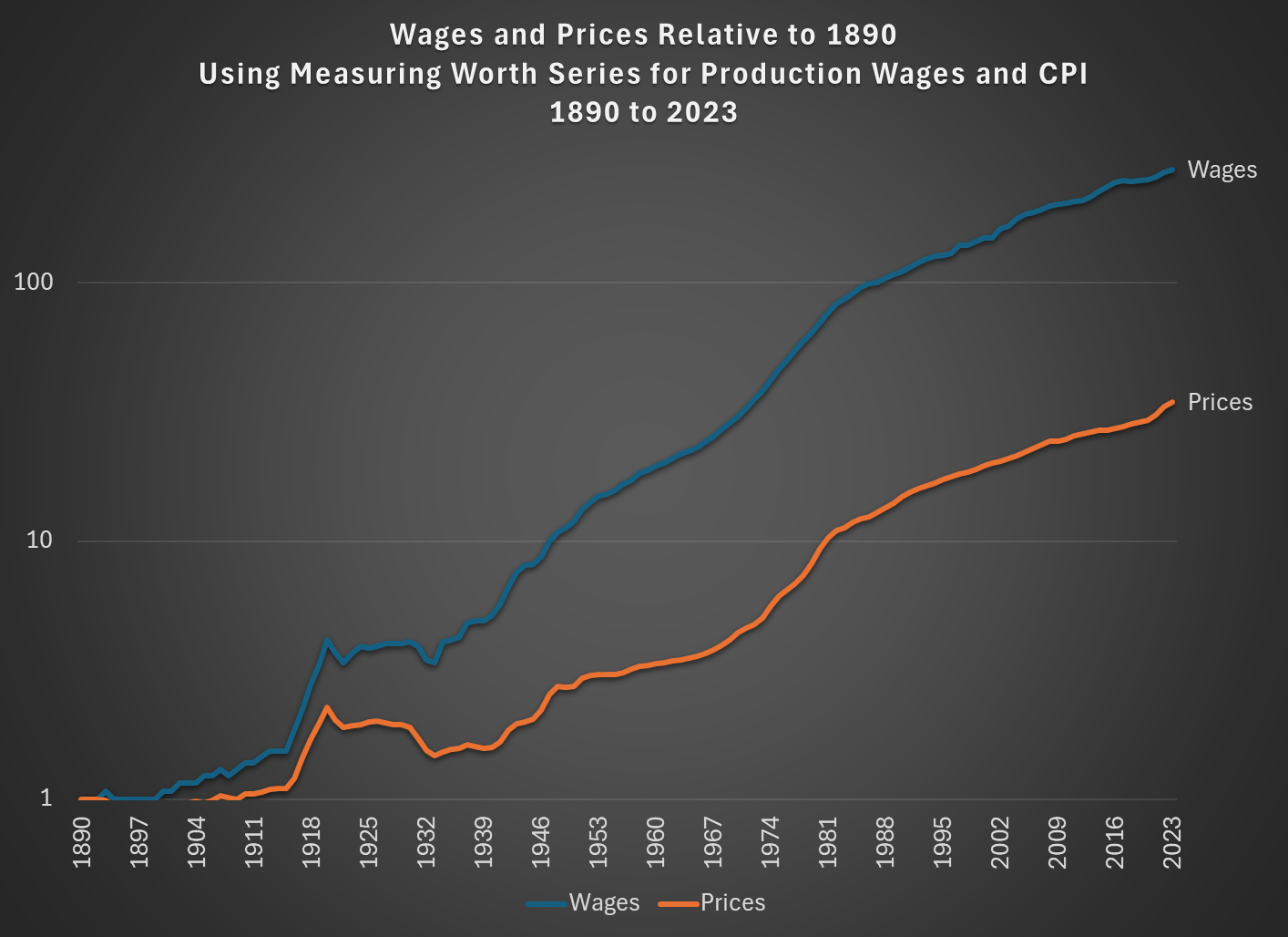
Let’s start with the basics: wages. As the 1894 cartoon depicts correctly, wages were quite low back then. Using the Measuring Worth historical wage series for production workers, we see that they earned on average 13 cents per hour. For non-supervisory workers in 2024, they earn around $30 per hour. So workers earn, in nominal terms, 231 times as much money today as they did in 1890.
Of course, prices are also higher today. How much higher? We can also use Measuring Worth data for this question, with their historical CPI series. Comparing the 1890 CPI value to the 2024 value, we see that prices in the economy are, on average, about 35.5 times higher than 1890. That’s a big increase, no doubt: something that cost a nickel in 1890 would cost almost $2 today if it rose at the average price level over this period. But the bottom line is that wages have increased much faster than prices. The problem of low wages hasn’t “gotten worse” — just the opposite! An hour of labor at the average wage should buy many more goods and services than in 1890.
Here’s the data in a chart. Note: I am using the Measuring Worth series for wages throughout the chart, even though it starts to incorporate the value of non-wage benefits in the early 20th century. Also, I’m using a logarithmic scale:
But is this a good comparison? A historical price index like the CPI is very useful, but also has a number of challenges. For one, consumers are buying a radically different basket of goods and services than they did in 1890. Around 1890 consumers spent about 41% of their budget on food, 15% on clothing, another 15% on housing, 6% on fuel/light, and 23% on other expenses. In 2023, spending on food and clothing was much lower at 13% and 2.6%, while spending on housing was much higher: around 33% of consumer spending. That 33% figure for housing includes the 6% that consumers still spend on utilities (which of course includes more than just fuel and light today), but that means the “other” category is now over half of the budget — including, of course, many things that weren’t even available in 1890. Price indices try to take these changes into account in reasonable, but they also make some people skeptical of their usefulness.
Can we compare specific prices from 1890 to today so we can look at “time prices,” as I did in a recent post on 1924 and 1971? For some goods, we certainly can.
For example, here are the retail prices of 9 different grocery items relative to wages in 1890 and 2024 (for 2024 I use the most recent 12 months, which is Dec. 2023 to Nov. 2024, from BLS average price data):
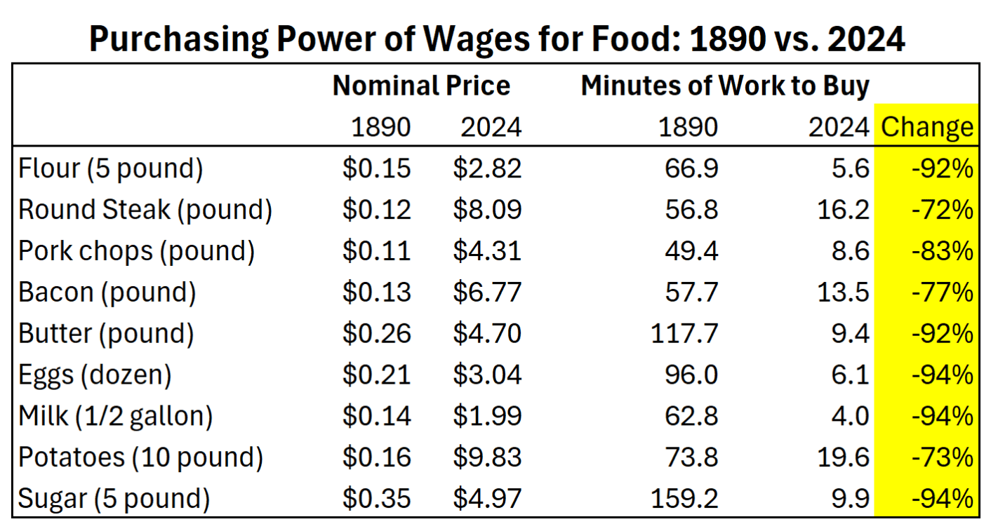
Food prices are undeniably lower than 1890 relative to wages, with these grocery staples taking anywhere from 72% to 94% fewer hours of work to purchase.
Clothing prices are a bit more difficult to compare, given the changes in the quality of clothing and the variety of prices and styles at any one time. Nonetheless, they are clearly cheaper. For example, in the 1898 Sears and Roebuck catalog, we see that a men’s ready-made suit was as low as $3.45, well in 2024 at Macy’s they start around $100 (of course, you could always pay more — both then and now). Relative to wages, men’s suits are 87% more affordable today. Likewise, a girl’s dress could be had for as low as $1.35 in 1898, while you can buy a decent one at Macy’s today for around $50. The girl’s dress is 84% more affordable.
The massive decreases in food and clothing prices could be offset by the cost of housing. Indeed, the 1894 cartoon that I referenced at the beginning of this post was specifically about rent, not the cost of living generally. Housing costs are even more difficult to compare over time, given the wide variation in quality at any point in time, as well as the gradual increase in quality over time. But here’s the best we can probably do.
First, we can look at some historical average rent prices. In Boston in 1897, monthly rent for tenements ranged from $8-12 (for 4-6 bedrooms). In Wheeling, WV in 1893, there was a similar range of prices for houses ($9 for three rooms, $11 for four rooms). In Des Moines, Iowa in 1894, once again we see lots of renters paying in the $8-12 range. So, as a very rough rule of thumb, perhaps $10/month would be the average rent in many places in the US in the 1890s.
Average rent today in the US also varies extremely widely, but we can use gross monthly rent from the Census ACS as a starting point, which had a median value of $1,406 in 2023. That means rent in 2023 was about 140 times as much as the 1890s in nominal terms. But relative to the larger increase in wages, rent was 37% more affordable in 2023.
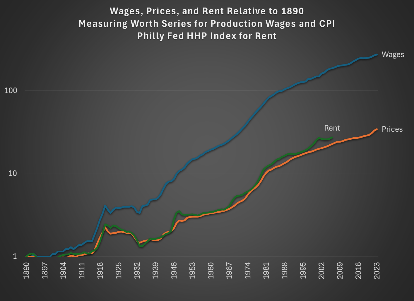
As a gut-check on this, we can use the excellent new historical series on housing prices from the Philadelphia Fed (see this paper explaining the data). For CPI skeptics, this is a useful paper, as it shows that the CPI probably understated housing inflation from 1914-2006: the Philly Fed index shows a 25.2-fold increase in nominal rents, but the CPI rent component only shows a 10.7-fold increase. Usefully for purposes of this post, the data series goes all the way back to 1890 too. From 1890 to 2006 (the end-point of the series), nominal housing rents increased 27.5-fold. Nominal wages rose from 13 cents to $16.74 in 2006, a 128.7-fold increase. That’s a 79% decrease in the wage-adjusted cost (79% more affordable!), which is even better than my baseline estimate of 37% from the prior paragraph. Of course, this is only through 2006, and there has likely been some decrease in affordability since 2006, but it still suggests rent is getting more affordable over time — not getting worse!
We can add the HHP rent component to the chart as well (even though it only goes through 2006):
In the 1890s food, clothing, and rent made up 71% of the average family’s consumer spending, and as much as 75% for the poorest families. The real cost of these goods has decreased over time, when we compare them to the massive wage gains since 1890. While there are many challenges with affordability today, especially with rent and housing, in no way were Americans better off economically in the 1890s.

2 thoughts on “Economic Nostalgia: 1890s Edition”