BLS is slowly (actually, it probably feels very quick for those working on it!) catching up on data releases that were delayed during the federal government shutdown. This week, we saw the release of the November jobs report, which also includes data from October, even though there was no separate release for October. Well, kinda.
For the household survey (which is used to calculate the unemployment rate, among many other measures of the labor market), there is no October report. Because there is no data to be collected. Look at Table A in the employment situation report, and you will see no data in the column for October 2025. Look at the FRED page for the unemployment rate, and you will notice a gap in October. As I wrote a few weeks ago, this is not the end of the world, but it is rather sad for a gap to show up in a series that consistently ran for 933 months back to 1948.
So what is in the jobs report? Lots of new information. A few related areas that have gotten a lot of attention this week are the changes in federal government employment vs. private sector employment, and the changes in native-born vs. foreign-born employment.
The White House is certainly framing it in these terms: “Since President Trump took office, 100% of the job growth has come in the private sector and among native-born Americans.”
But is this true? You can certainly see this in some of the data, but caution should be used.
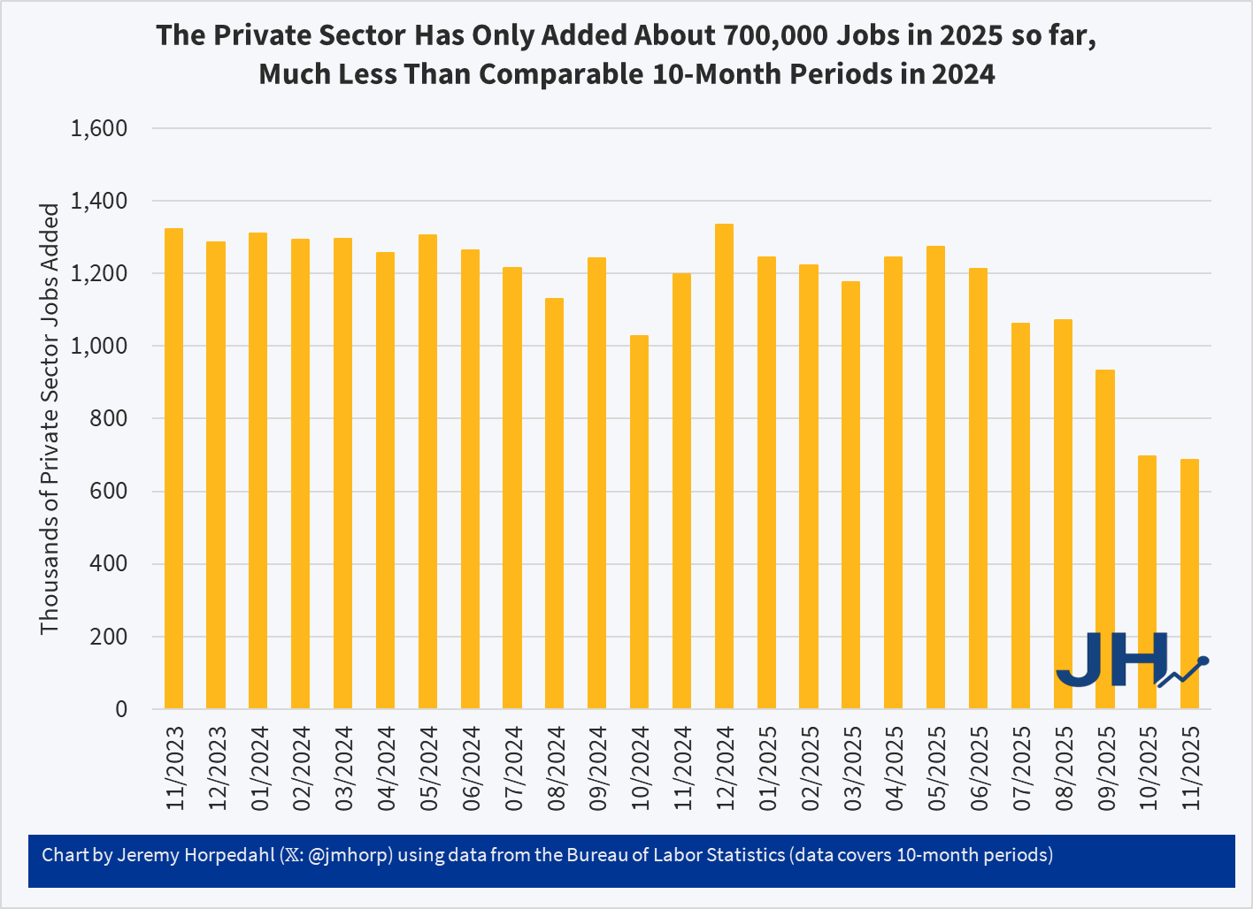
For example, from January to November 2025, there were 687,000 private-sector jobs added according to the CES, while total job growth (private and government) was 499,000 jobs. That much is true, assuming the data is correct. And BLS generally does a very good job calculating these, but keep in mind these are catch-up reports from a government shutdown, and it includes a month where you had one of the largest drops in federal employment in US history, due to the deferred resignation program. Keep in mind also that there was a very large downward revision to CES data last year, and there will probably be another big one in February 2026, so interpret any single month (or two) with extreme caution.
But based on the currently available data, yes, it appears that all (more than all!) of the net job growth under Trump has been in the private sector. However, 687,000 private-sector jobs is not exactly robust job growth. A year ago the comparable number was running around 1.2 million jobs for a similar timeframe, so private-sector job growth has been cut in half. Positive growth, but weak by recent standards.
However, from the White House’s perspective, maybe this slow growth isn’t a problem. Maybe it’s what they wanted, if that smaller rate of job growth is all going to native-born Americans. And indeed in the same press release as quoted above, the White House brags that “2.7 million native-born Americans GAINED employment, while 972,000 foreign-born workers LOST employment.”
Here is where the data gets especially hard to interpret. Notice first that these numbers don’t seem to add up: 2.7 million minus 972,000 is over 1.7 million jobs added, on net. But the CES job growth data only shows 687,000 private sector jobs, or just 499,000 total jobs, added over the same time frame. We might expect a difference, since these are from different surveys (native/foreign from the CPS, total jobs from CES), but a difference of 1 million jobs in just 10 months is pretty big!
But the problem runs even deeper: you can’t actually use the native-born and foreign to look at changes in levels! The data isn’t designed to make these kinds of comparisons.
Jed Kolko is an expert in using CPS data on these questions, and here is how he explained it back in an August post:
“But these charts and commentaries are a multiple-count data felony. The statistical agencies explicitly warn that these data are not suitable for sizing and trending the foreign-born and native-born populations. In fact, the apparent boom in native-born employment is just a statistical artifact, arising from arcane rules about how the data are constructed and population levels are determined.”
Without getting into those arcane rules, Kolko does explain how we can use this data to get clues about how native-born vs. foreign-born workers are doing:
“The right way to see how native-born Americans are doing is to look at their unemployment rate.”
Keep in mind he wrote this back in August, so this isn’t an ad hoc explanation for the data that came out this week to fit a particular narrative. And what have those unemployment rate data shown us recently? Thankfully, Kolko produced this chart yesterday:
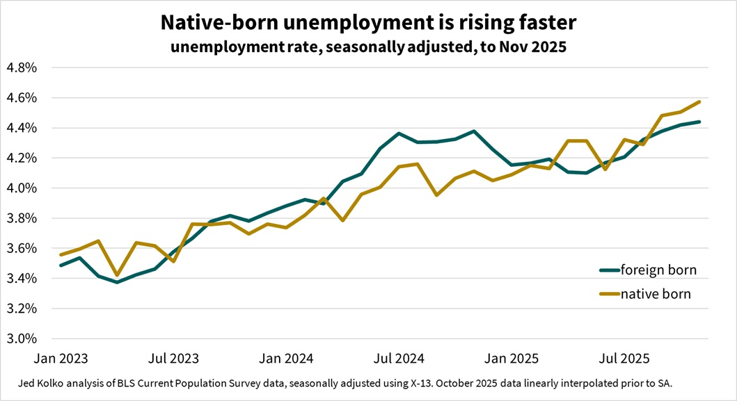
You will notice a few things in the chart. First, both native and foreign unemployment rates have been rising. Second, the rate for native-born Americans is slightly higher than for foreigners. We shouldn’t over-interpret one month of data: the CPS is a sample, and foreign-born is a small share of that sample. Small samples can fluctuate a lot from month-to-month (quite clear eyeballing the data), and the data from BLS isn’t seasonally adjusted (though Kolko has kindly seasonally adjusted it for us).
So don’t focus too much on the rate for natives being higher. But the trends since January 2025 don’t show a massive growth of jobs for native-born Americans. If anything their labor market situation is somewhat worse, looking to be about 0.4 percentage points higher than January 2025. But do keep in mind that looking at unemployment rates in this particular data is superior to looking at employment levels. You shouldn’t be looking at employment levels or their changes at all with this data.
The quick version of the labor market on these two issues: yes, most job growth has been in the private sector, but that growth has been historically weak. No, the weakness in job growth can’t be easily explained by pitting native-born Americans against foreigners, since both have seen their unemployment rates rise slightly this year — the job market is worse for both groups of workers.
One final correction to the Trump press release, this statement: “Americans’ real wages are on track to rise by 4.2% in the first full year of the Trump Administration.”
Unlike most of the other data in the release, they don’t provide a link to the source data, so we will have to guess. They are probably talking about private-sector hourly wages, which are up 3.1% in the first 10 months of his term, and then making a projection. But this is wrong: those are nominal wages, not real wages. Yes, the wages will probably end up exceeding CPI inflation, which will likely be around 3% this year. But that will mean real wage growth is around 1%, not 4.2%. A slight error, perhaps, but a strange one given that the administration has focused so much on inflation during the Biden administration. Despite them claiming this growth is “far outpacing inflation and a complete reversal from the Biden era,” it is in fact just barely outpacing inflation.
It will be somewhat ironic if wages grow 4.2% in 2025 and CPI inflation is 3.0%, because that’s exactly what the numbers were in 2024.

2 thoughts on “Job Market Data is Back! Did All Job Growth Go to Native-Born Americans in the Private Sector?”