Ray Fair at Yale runs one of the oldest models to use economic data to predict US election results. It predicts vote shares for President and the US House as a function of real GDP growth during the election year, inflation over the incumbent president’s term, and the number of quarters with rapid real GDP growth (over 3.2%) during the president’s term.
Currently his model predicts a 49.28 Democratic share of the two-party vote for President, and a 47.26 Democratic share for the House. This will change once Q3 GDP results are released on October 30th, probably with a slight bump for the dems since Q3 GDP growth is predicted to be 2.5%, but these should be close to the final prediction. Will it be correct?
Probably not; it has been directionally wrong several times, most recently over-estimating Trump’s vote share by 3.4% in 2020. But is there a better economic model? Perhaps we should consider other economic variables (Nate Silver had a good piece on this back in 2011), or weight these variables differently. Its hard to say given the small sample of US national elections we have to work with and the potential for over-fitting models.
But one obvious improvement to me is to change what we are trying to estimate. Presidential elections in the US aren’t determined by the national vote share, but by the electoral college. Why not model the vote share in swing states instead?
Doing this well would make for a good political science or economics paper. I’m not going to do a full workup just for a blog post, but I will note that the Bureau of Economic Analysis just released the last state GDP numbers that they will prior to the election:
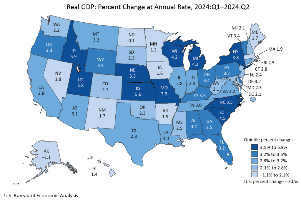
Mostly this strikes me as a good map for Harris, with every swing state except Nevada seeing GDP growth above the national average of 3.0%. Of course, this is just the most recent quarter; older data matters too. Here’s real GDP growth over the past year (not per capita, since that is harder to get, though it likely matters more):
| Region | Real GDP Growth Q2 2023 – Q2 2024 |
| US | 3.0% |
| Arizona | 2.6% |
| Georgia | 3.5% |
| Michigan | 2.0% |
| Nevada | 3.4% |
| North Carolina | 4.4% |
| Pennsylvania | 2.5% |
| Wisconsin | 3.3% |
Still a better map for Harris, though closer this time, with 4 of 7 swing states showing growth above the national average. I say this assuming as Fair does that the candidate from the incumbent President’s party is the one that will get the credit/blame for economic conditions. But for states I think it is an open question to what extent people assign credit/blame to the incumbent Governor’s party as opposed to the President. Georgia and Nevada currently have Republican governors.
Overall I see this as one more set of indicators that showing an election that is very close, but slightly favoring Harris. Just like prediction markets (Harris currently at a 50% chance on Polymarket, 55% on PredictIt) and forecasts based mainly on polls (Nate Silver at 55%, Split Ticket at 56%, The Economist / Andrew Gelman at 60%). Some of these forecasts also include national economic data:
Gelman suggests that the economy won’t matter much this time:
We found that these economic metrics only seemed to affect voter behaviour when incumbents were running for re-election, suggesting that term-limited presidents do not bequeath their economic legacies to their parties’ heirs apparent. Moreover, the magnitude of this effect has shrunk in recent years because the electorate has become more polarised, meaning that there are fewer “swing voters” whose decisions are influenced by economic conditions.
But while the economy is only one factor, I do think it still matters, and that forecasters have been underrating state economic data, especially given that in two of the last 6 Presidential elections the electoral college winner lost the national popular vote. I look forward to seeing more serious research on this topic.
