We all like high returns on our investments. We also like low volatility of those returns. Personally, I’d prefer to have a nice, steady 100% annual return year after year. But that is not the world we live in. Instead, there are a variety of returns with a diversity of volatilities. A general operating belief is that assets with higher returns tend to be associated with greater return volatility. The phrase ‘scared money don’t make money’ implies that higher returns are risky. The Sharpe ratio is a tool that helps us make sense of the risk-reward trade-off.
Let’s start with the definition.

By construction, the risk-free return is guaranteed over some time period and can be enjoyed without risk. Practically speaking, this is like holding a US treasury until maturity. We assume that the US government won’t default on its debt. Since there is no risk, the volatility of returns over the time period is zero.
Since an asset’s return doesn’t mean much in a vacuum, we subtract the risk-free return. The resulting ‘excess return’ or ‘risk premium’ tells us the return that’s associated with the risk of the asset. Clearly, it’s possible for this difference to be negative. That would be bad since assets bear a positive amount of risk and a negative excess return implies that there is no compensation for bearing that risk.
The standard deviation of an asset’s returns are a measure of risk. An asset might have a higher or lower value at sale or maturity. Since the future returns are unknown and can end up having any one of many values, this encapsulates the idea of risk. Risk can result in either higher or lower returns than average!
Putting all the pieces together, the excess return per risk is a measure of how much an asset compensates an investor for the riskiness of the returns. That’s the informational content of the Sharpe ratio, which we can calculate for each asset using historical information and forecasts. Once we’ve boiled down the risk and reward down to a single number, we can start to make comparisons across assets with a more critical eye.
Sometimes friends or students will discuss their great investment returns. They achieve the higher returns by adopting some amount of risk. That’s to be expected. But, invariably, they’ve adopted more risk than return! That means that their success is somewhat of a happy accident. The returns could easily have been much different, given the volatility that they bore.
Let’s get graphical.
Consider a graph in (standard deviation, return) space. In this space we can plot the ordered pair for some portfolios. The risk-free return occurs on the vertical intercept where the return is positive and the standard deviation is zero. Say that a student was thrilled with asset A’s 23.5% return and that it’s standard deviation of returns was 16%. Meanwhile, another student was happy with asset B’s 13.5% return and 5% standard deviation. With a risk-free rate of 3.5%, the Sharpe ratios are 1.25 & 2 respectively. We can plot the set of standard deviation and return pairs that would share the same constant Sharpe ratio (dotted lines). Solving for the asset return:


The above is simply a linear function relating the return and standard deviation. In particular, it says that for any constant Sharpe ratio, there is a linear relationship between possible asset returns and standard deviations. The below graph plots the two functions that are associated with the two asset Sharpe ratios. The line between the risk-free coordinate and the asset coordinate identifies all of the return-standard deviation combinations that share the same Sharpe ratio. This line is known as the iso-Sharpe Line.
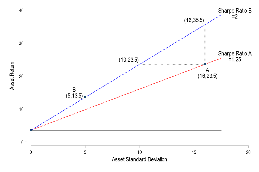
With this tool in hand, we can better interpret the two student asset performances. There are a couple of ways to think about it. If asset A’s 23.5% return had been achieved with an asset that shared the Sharpe ratio of asset B, then it would have had risk that was associated with a standard deviation of only 10%. Similarly, if asset A’s volatility remained constant but enjoyed the returns of asset B’s Sharpe ratio, then its return would have been 35.5% rather than 23.5%. In short, a higher Sharpe ratio – and a steeper iso-Sharpe line – imply a bigger benefit for each unity of risk. The only problem is that a such an nice asset may not exist.
Continue reading