In last week’s post, I described how short volatility funds work. They are short (as opposed to long) near-term VIX futures. This means that when a market panic hits and VIX (as measure of volatility) spikes, the prices of these short vol funds plunge, along with stock prices. But as optimism returns to the markets, prices of short vol funds start to recover, as do stocks.
Thus, both short vol funds and general stock funds are reasonable ways to play a market panic. If (!!!) you manage to call the bottom and buy there, you can hold for maybe a couple of weeks until prices recover, and then sell at a profit. I tried to do just that with the market meltdown last month in the wake of the president’s tariff ultimatums: I bought some short vol funds (SVXY, which is a moderate -0.5X VIX fund, and the more aggressive -1X fund SVIX), and also some leveraged stock funds. I discussed leveraged funds here.
I chose to buy into SSO, a 2X leveraged S&P 500 stock fund, whose daily price moves up (or down) by twice the percentage as does the S&P. Obviously, if you think stocks will go up say 10% in the next month, you will make more money by buying a fund that will go up 20% instead, which is why I bought a 2X fund rather than a plain vanilla (1X) stock fund. A related fund, which I did not buy this time, is UPRO, which is a 3X stock fund.
Things are always clear in hindsight. After the smoke of battle clears, you can see right where the bottom was. But it is not clear when you are in the thick of it. I erred by committing much of my dry powder trading funds too early, maybe halfway through the big drop. C’est la vie. It’s hard to improve on that for next time. But a significant learning, that I will act on during the next panic, was how differently short vol versus leveraged stocks recovered from the crash. They both plunged and recovered, but leveraged stocks recovered much better.
It turns out that much of the time, the price movements over say a six-month period of SVXY and SSO largely match each other, so these are useful for comparisons for trading short vol versus leveraged stocks. For instance, below is a chart of SVXY (orange line) and SSO (green line) over the past six months or so. The blue arrow notes the April crash, which bottomed roughly April 8. For November through early April, the price movements of the two funds roughly matched. By April 8, both had plunged to a level some 35% lower than their starting prices. However, by May 12, SSO had recovered to -10% (relative to starting), which is about where it was in late March (green level line drawn in). SVXY, however, remained 21% below its start.
Chart of SVXY ( -0.5X VIX ETF, Orange line) and SSO (2X Stock fund, green line), Nov 2024-May 2024. Blue arrow marks April 2025 volatility spike/stock crash. Chart from Seeking Alpha.
Thus, from its nadir (-35%) to its recovery as of Tuesday, May 12, SSO gained by 38% (i.e., ratioing 0.90/0.65), whereas SVXY gained only 21% (from ratioing 0.79/0.65). Also, it looks like SVXY will not regain its earlier price levels any time soon. So SSO looks like the winner here.
We can do a similar comparison between the -1X VIX fund SVIX and the 3X stock fund UPRO. These two funds are plotted below, along with a plain (1X) S&P 500 stock fund, SPY (in blue). SVIX (orange) and UPRO (green) trend pretty closely for October through March. When the April crash came, SVIX dropped much harder, down to a heart-stopping -59%, compared to -44% for UPRO. SPY dropped only to -15%. SPY comes to a full recovery (0%) by May 12, while UPRO recovers only to -13% [1]. SVIX has recovered only to -21%. If you managed to buy each of these funds on April 8, and sold them today, you would have made the following gains:
SPY 17% ; UPRO 55%; SVIX 43%. Clearly the winner here in short term trading of the April crash is the 3X stock fund UPRO.
Chart of SVIX ( -1X VIX ETF, Orange line), UPRO ( 3X Stock fund, green line), and SPY (1X Stock fund, blue line), Oct 2024-May 2024. Chart from Seeking Alpha.
As a cross check, below is a plot of SVXY (orange) and SSO (green) covering the August, 2024 volatility spike. This was a peculiar event, discussed here, where volatility went crazy for a couple of days, while stock prices experienced only a moderate drop. If (!!!) you timed it just right, and bought at the bottom and sold a week or so later, you could have made good money on SVXY. But zooming out to the larger picture, SVXY never came close to recovering its old highs, whereas SSO just kept going up and up (green arrow). So SSO seems like a safer trading vehicle: it is a reasonable buy-and-hold, whereas SVXY may be hazardous to your portfolio’s health if you don’t get the timing perfect.
Chart of SVXY ( -0.5X VIX ETF, Orange line) and SSO ( 2X Stock fund, green line), Oct 2023-Oct 2024. Blue arrow marks early August 2024 volatility spike. Chart from Seeking Alpha.
Over certain longer (say one-year) periods, there are regimes where short vol could out-perform leveraged stocks (discussed earlier), but that is the exception, rather than the rule.
Disclaimer: Nothing here should be considered advice to buy or sell any security.
ENDNOTE
[1] While UPRO changes X3 the change of SPY on a daily basis, for reasons discussed earlier, the longer-term performance of UPRO diverges from a simple X3 relationship with SPY. In volatile times, UPRO tends to fall well below a 3X performance over say a six-month period.
As of the market open today, tech stocks (e.g. the NASDAQ 100 fund QQQ) are down more than 10% from their recent highs. The broader S&P 500 fund SPY is down about 8%. Hands are wringing…what does it all mean?
By applying standard definitions, we can know exactly what it means:
A pullback is a market drop of 5-10% and is very short term. It is a dip from a recent high during an ongoing bull market while upward momentum is still intact, and is a normal adjustment to a market cycle.
The market is in “correction phase” after a drop between 10-20% and can last a few months. These moves are typically met with higher volatility. Corrections can be violent as investors’ fear levels rise and panic selling may hit the market.
Real time news and social media can intensify this fear as investors may follow the herd mentality. The average market correction lasts anywhere between two and four months and is frequently accompanied by adverse market conditions. However, corrections are often seen as ideal times to buy high-value stocks at discounted prices.
So, technically, the S&P has experienced a “pullback”, while the NASDAQ 100 has undergone a “correction”. Just to round out the infernal trinity of market moves with a definition of a “bear market”:
A bear market occurs after a drop of 20+% over at least a two-month time frame. In a bear market, investor confidence has been shattered and many investors will sell their stocks for fear of further losses. Trading activity tends to decrease as do dividend yields.
Bear markets tend to become vicious cycles when rallies are sold and not bought This happened in 2000 and 2007 and can typically be seen on charts as the market makes lower lows and lower highs. Bear markets tend to occur in the contraction phase of the business cycle and last, on average, approximately 16 months.
You don’t know if you are really in a bear market until things get really bad, at which point it is probably too late to sell. (Amateurs get discouraged and sell AFTER stocks have dropped, which is why the average investor does appreciably worse than the accounts of dead people where stocks just sit there without being traded). When stocks recover at least 20% following a bear market over at least a two-month period, that is defined as the start of a new bull market regime.
Having a correction (i.e. 10-20% dip) in the middle of a bull market year is pretty normal. Although whole-year market returns have been positive for 34 out of the past 45 years, the typical year experiences a correction averaging 14%.
None of this vocabulary clarification answers the practical question of how bad will the current pullback/correction get? As usual, I read argument on both sides. The bears are saying (a) what they have been saying since 2018 or so, that the market is unrealistically overvalued, and (b) the macroeconomic world is about to fall apart, which they have also been saying for years. This time may be different, with the new administration’s erratic policies, but history shows that so far, the market is not much correlated to who is in the West Wing.
The bulls are saying (a) the market values did get run up unrealistically after the election and with AI hype, so the current pullback is just a healthy reset to a level for resuming further market growth, and (b) despite negative talking, the actual numbers show decent employment and GDP, so macro is OK (and it is very rare to have an actual bear market absent a serious bad macroeconomic driver).
If I really knew the answer here, I would be writing this from my private Caribbean island. But I’ll share how I am playing it. For the past 15 years or so, it has nearly always worked well to buy in after a say 10% correction. What seemed so gut-wrenching and scary at the time almost always turns into just a blip on the endlessly rising market charts in hindsight.
I had set aside some “dry powder” funds specifically to take advantage of buying opportunities like now. So, I am manfully mastering my fears and buying small amounts every couple days of 2X levered funds like SSO and QLD. (See here for discussion of such funds, they go up or down $2 for every $1 the underlying S&P or NASDAQ go up or down, so it’s kind of like being able to buy twice as much stock for the same dollar amount. But as usual, caveat emptor).
But I am not going all-in on any particular day. It is always frustrating to miss buying right at the bottom, but nobody rings a bell there, either. I have searing memories of March 2020 and of 2008 when just when you thought the bottom was in, it dropped out the next day or week.
Disclaimer: Nothing here should be considered advice to buy or sell any security.
For many people nowadays, investing in “stocks” means buying a fund like SPY or VOO which tracks the large cap S&P 500 index, or maybe QQQ or QQQM which track the tech-heavy NASDAQ 100 index. These types of funds are exchange-traded funds (ETFs), which very low annual fees (around 0.2% or so). These are so-called passive funds, which mechanically buy and sell stocks such that their holdings match what is in their respective indices. No extra judgment on stock picking is required.
An alternative is to pick stocks yourself, or to buy into a fund with active management, where humans (and their algorithms) try to buy stocks which will beat the passive indices, and try to avoid losing stocks. The active versus passive debate has been going on for decades. There will always be some active funds that outperform in any given year. These successes help keep the allure of active management alive. On average, though, the performance of active funds (before fees) is generally not much different than the passive funds. Thus, with their added fees, the active funds are net losers.
However, there are always cheerful fund managers with a story on how they have a plan to kill it this year, and there are investors willing to buy those stories. Sometimes these fund managers take financial advisors out for expensive lunches, and, behold, said advisors then recommend these actively managed funds to their clients. And so, there are plenty of active funds that still exist. New ones are minted every year, even as some older ones go out of business.
A problem with benchmarking against a cap-weighted fund like SPY or QQQ is that these passive indices are actually very effective. These work as closet momentum-rewarding funds: as the share price of, say, Microsoft goes up and up (presumably because of accelerating earnings), its representation among the biggest 500 companies (by stock capitalization) goes up. Thus, the better, growing companies automatically keep making bigger contributions to the indices, while fading companies sink to lower and lower per cent weighting. That works well to relentlessly home in on the relatively few stocks that account for the gains of the entire market, and to weed down all those other firms, most of which are net losers on stock price over time. This algorithm governing the cap weighted funds is tough for active management to beat.
Having stated these challenges, I’d like to compare performance of some actively-managed funds that have shown enhanced performance in recent years. The problem is, of course, we cannot know if this outperformance will continue. But hopefully looking at performance and discussing the underlying strategies of the funds may help investors decide if they would like to participate in any of them.
Two broad categories of stock funds are growth and value. Growth looks at how fast a firm is increasing revenues, earnings, etc. Most tech stocks command high share prices because of their growth prospects, rather than current earnings (although many of the current big tech leaders generate gobs of cash). Value looks at measures such as price/earnings and price/sales and price/book value, hoping to find undervalued firms whose price does not yet reflect the underlying value. Tech funds are generally under-represented in the value category.
Here we will look at five good actively-managed ETFs, and compare total returns (with dividends reinvested) to the S&P 500 fund SPY. They all claim to incorporate both growth and value into their stock picking. These five funds are:
SPGP – This is a supposed “growth at a reasonable price” fund, which seems to weight value more than growth. In top ten holdings, there is only one tech stock, a 2.7% weighting of Nvidia. There are four petroleum companies, and diverse smattering of other types of firms.
GARP – Another “growth at a reasonable price” (note “G.A.R.P.”) fund. This tilts heavily toward growth: seven of the top ten holdings are tech, with 5.43% Nvidia.
PVAL – As indicated in the name (Putnam Focused Large Cap Value), this is a value fund, but with some growth considerations – – The top ten are: Walmart (retail), Exxon Mobil (petro), Thermo Fisher Scientific, Citigroup, Bank of America (finance), Oracle (tech), UnitedHealth Group (healthcare), Coca-Cola, NXP Semiconductors, and PulteGroup (homebuilder).
MOAT – – “VanEck Morningstar Wide Moat” – This fund seeks to replicate the performance of the Morningstar® Wide Moat Focus Index, which in turn tries to identify a diverse group of U.S. large companies with wide “moats”, that give them sustainable advantages over competitors. Four measures are used to determine a corporation’s dominance: Intangible Assets (brands, patents, proprietary technologies); Switching Costs (inconvenient for the customer to find an alternative); Network Effect (when customers use one service, they adopt additional company services); Cost Advantage.
FFLC – This fund uses “fundamental analysis” and looks for companies that can take advantage of trends in “technological advances, product innovation, economic plans, demographics, social attitudes, and other factors”. An analysis of the fund’s holdings (heavy in big tech; 6% Nvidia) shows a strong focus on growth and momentum, with a moderate value weighting.
All these funds have plausible rationales for choosing the stocks they do. A big question is always: how much of a company’s promise is already reflected in its stock price? If everyone else has already figured out that, say, Microsoft will have high sustained earnings growth, then maybe the current share price is so high that it will not go up any faster than the broad market.
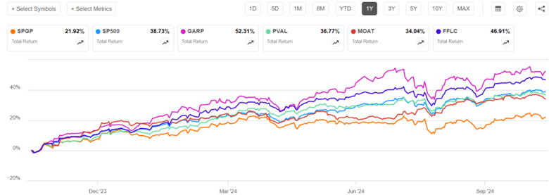
Now for the charts. I will discuss 1-year, 3-year, and 5-year charts, so we can see how the fund strategies worked in different market regimes. The one-year chart covers the raging bull market of the past twelve months, especially in AI-related tech/growth stocks. The 3-year chart encompasses a lengthy bear episode that occupied most of 2022, in reaction to the raising of interest rates to tamp down inflation. The 5-year chart includes the brief but sharp pandemic panic March-April 2020, sandwiched in a huge rise in internet-related big tech stocks 2019-2021.
One-Year Chart
Over the past one year, GARP (52% return) soared way above S&P 500 (blue line, 39%), but with high volatility, consistent with its heavy growth/tech exposure. FFLC steadily pulled ahead of SP500 over the past twelve months, racking up a 47% return. PVAL and MOAT finished close to SP500, while tech-poor SPGP flat-lined in the most recent six months and so got left far behind.
Three-Year Chart (End Oct 2021-end Oct 2024)
The defining features of the past three years were a roughly 21% bear market decline in S&P 500 during Jan-Oct 2022, followed by a strong recovery, which was interrupted by a moderate slump July-Oct 2023. FFLC and PVAL performed nearly identically for the first third of this time period (through early March, 2023). They dropped much less than SP500 in 2022, and so by early March, 2023 they were some 15% ahead of SP500. PVAL’s lead over SP500 shrank a bit over the next twelve months, and then widened March-July 2024, to give PVAL (43%) a 16% advantage over SP500 (27%) at the end of three years. FFLC just kept steadily widening its lead over SP500, ending with a 58% return over this three-year time period. MOAT and SPGP also fell less than SP500 in 2022, but fell more than PVAL and FFLC, and they did not keep pace with the tech-led surge in 2023-2024. In the end, MOAT finished essentially even with SPY, and SPGP finished lower (18%). Tech-heavy GARP crashed harder than SP500 in 2022, but more than made up for it with the 2024 tech-fest, finishing well above SP500 and tied with PVAL at 43%.
I won’t show the full five-year chart, since some of the funds did not start prior to that period. But I will make a few semi-quantitative comments. The five-year time period is a little kinder to SPGP – this fund showed a fairly consistent lead over SP500 in 2021 as well as 2022, and so got rave reviews then in the investing literature. It was only in the past six months that it performed so poorly.
FFLC got off to a rocky start, falling about 10% behind SP500 in 2020-2021, although its winning ways since then gave it the overall best 5-year performance. GARP and MOAT pretty much kept pace with SP500 Oct 2019-Oct 2021, so their five-year performance vs SP500 is about the same as for three-year (GARP soundly beat SP500, MOAT roughly tied).
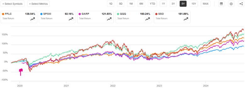
One more chart (below), a five-year comparison of SP500 to FFLC (overall winner among the active funds discussed above) and GARP (tech-heavy) to QQQ (passive, tech-heavy, tracks NASDAQ 100 stocks) and SSO (its stock price moves up and down 2X the daily price movement of S&P500). GARP didn’t start operation till early 2020 (marked by red arrow on chart), to its curve should be shifted up to make a fair comparison with the others; with this correction, it would end up roughly tied with FFLC, with both these funds beating SP500 by about 33% (135% return vs 92%). But even these stellar active funds were soundly beaten by QQQ and even more by the passive 2X fund SSO. Holders of SSO, however, would have suffered heart-stopping drawdowns along the way (e.g. over 50% loss in market value in early 2020).
Readers can draw their own conclusions from this flyover of results. Just like you can fool people some of the time, any active fund may beat “the market” (e.g., S&P 500) some of the time. Some active funds seem to beat the market most of the time. But it is most unlikely that any given fund will beat it all of the time. The S&P 500 algorithm is actually pretty effective. It may behoove the investor to make their own judgement as to what market regime we are in or are about to be in, and to choose active funds which are more likely to thrive in that regime.
I am motivated to include some FFLC (for overall consistent good performance) and PVAL (for a bit of crash protection) in my holdings. But I recognize that their performance could deteriorate in the future, if their investing style no longer works in some new market regime. SPGP is a cautionary example, going from rock star in 2021-2022 to awful in 2024. Even FFLC had an unfavorable first year of operation. The tech giants that dominate QQQ continue to also dominate earnings growth, so QQQ may continue to outpace SP500.
As far as SSO, I earlier wrote on strategies for 2X returns using 2X funds or call options. If you think stocks are going to keep going up, it can make sense to hold these 2X funds. Many advisors, though, recommend against just buy and hold because of the enormous possible losses in a crash; too many investors panic and sell at a low price in that situation. I hold some QLD, which is a 2X QQQ fund, but only as a minor component of my portfolio. Also, if I can overcome fear in the moment, I plan to swap out of plain vanilla stock funds and into a 2X fund like SSO after the next big dip in the market, and then swap back out of SSO after the market recovers.
Disclaimer: Nothing here should be considered advice to buy or sell any security.
Most years, stocks go up, by something like 9%. Wouldn’t it be nice to invest in a fund that went up double those amounts? Such funds exist. They use futures or other derivatives to move up (or down!) by double, or even triple, the percentage that the underlying stock or index moves, on a daily basis.
For instance, a common unleveraged fund (ETF) is SPY that roughly tracks the S&P 500 index of large U.S. stocks is SPY. SSO is a 2X fund, which gives double the returns of SPY, on a daily basis. UPRO is a 3X fund, giving triple the returns. 2X funds exist for many different asset classes, including semiconductor stocks, treasury bill, and crude oil – see here. And similarly for 3X funds.
Since all the action in stocks these days seems to be in large tech companies, I will focus on the NASDAQ 100 index universe. The leading unleveraged fund there is QQQ. The 2X version is QLD, and the 3X is TQQQ. Let’s look at how these three funds performed over the past twelve months:
QQQ is up a respectable 36%, but QLD is up by 70%, and TQQQ by a mouth-watering 106%. You could have doubled your money in the past twelve months simply by investing in a 3X fund instead of holding boring 1X QQQ.
These leveraged funds can be utilized in more than one way. One approach is to just put the monies you have allocated for stocks into such funds, and hope for higher returns. Another approach is to put, say half of your speculative funds into a 2X fund (to get roughly the same stock exposure as putting all of it into a 1X fund), and then use the remaining half to put into other investments, or to keep as dry powder to give you the option to buy more equities if the market crashes.
What’s not to like about these funds? It turns out that a year of daily doubling of returns does not necessarily add up to doubling of yearly returns. There is “volatility drag” associated with all the exaggerated moves up and down. As an illustration of how this works, suppose you held a stock that went down by 50% one day, say from a price of $100 to $50. The next day, it went back up by 50%. But this would only get you back to $75, not $100.
It turns out that with these leveraged funds, as long as stocks are generally going up, the yearly returns can match or even exceed the 2X or 3X targets. But in a period with a lot of volatility, the yearly returns can fall far short. And in a down year, the combination of the leverage and the volatility drag lead to truly horrific losses. For instance, here is what 2022 looked like for these funds:
QQQ was down by 31%, which is bad enough. But imagine your $10,000 in TQQQ melting down to $3,300 that year.
And here is the chart from January 2022 to the present:
QQQ is up 27% in the past 2.5 years, 2X QLD is up only 16%, while 3X TQQQ is actually down by 6%, as it could not recovery from 2022.
This was a kind of a worst-case scenario, since 2022 was an exceptionally bad year for QQQ, coming off a fabulous 2021. A chart of the past five years, which includes the 2020 Covid crash and recovery, and the 2022 crash and subsequent recovery still shows the leveraged funds coming out ahead over the long term:
The net returns on QLD (321%) were about double QQQ (158%), while the more volatile TQQQ return (386%) was plenty high, but fell well short of three times QQQ.
In my personal investing, I hold some QLD as a means to free up funds for other investments I like. But if I smell major market trouble coming, I plan to swap back into plain QQQ until the storm clouds pass.
There are some other ways to get roughly double returns, which suffer less from volatility drag than these 2X funds. I will address those in subsequent posts.
Disclaimer: As usual, nothing here should be considered advice to buy or sell any investment.